How drinkware brands do high-performing email campaigns
1. PROMiXX: A Leak-Proof Shaker That Delivers by Design
Objective
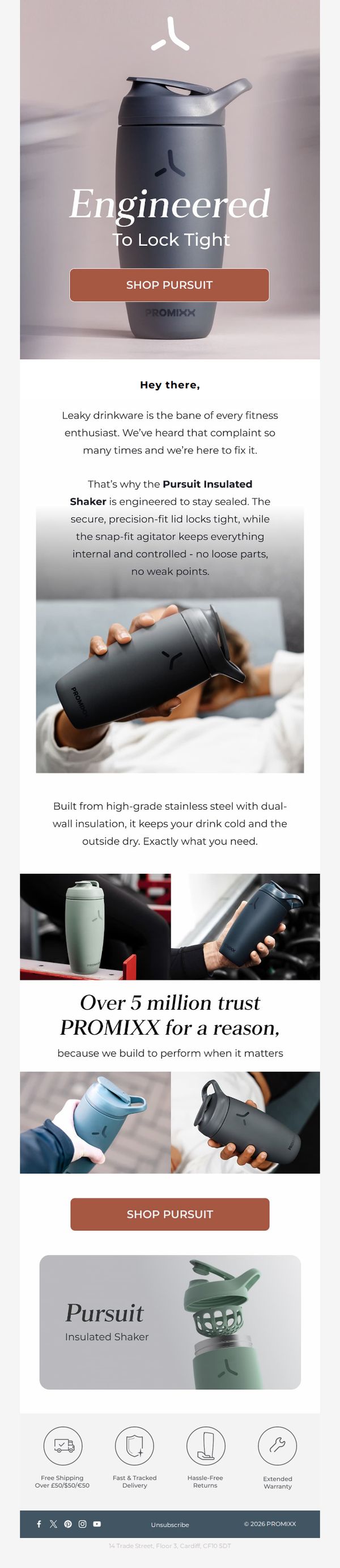
This email aims to convert fitness enthusiasts frustrated with leaky shakers by showcasing the PROMiXX Pursuit Insulated Shaker’s engineering, durability, and performance. It positions the product as the reliable solution they’ve been searching for, backed by social proof and trust signals.
Why this works
The email opens with a bold, problem-first headline that immediately resonates with the target audience’s pain point, leaky shakers, creating instant emotional alignment before introducing the solution.
How to implement
By emphasizing engineering precision and material quality, like dual-wall insulation and stainless steel, the copy transforms a simple shaker into a performance-driven tool, elevating perceived value beyond basic functionality.
Pro Tip
Add a subtle countdown timer or limited-stock indicator near the CTA to create urgency, especially since the product is positioned as a high-performance solution for time-sensitive fitness routines. • Include a short video or animated GIF in the hero section demonstrating the lid locking mechanism or agitator in action, visual proof of 'engineered to lock tight' would significantly boost trust and reduce skepticism.
2. TOSSWARE: Think outside the glass ✨
Objective
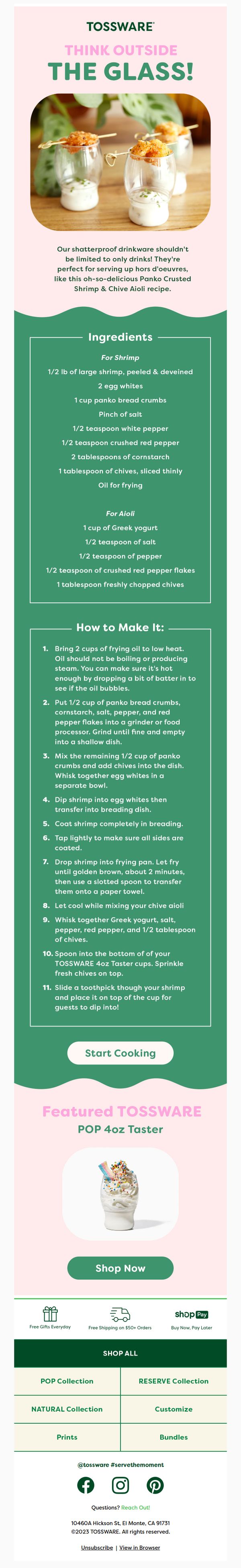
This email aims to showcase the versatility of TOSSWARE’s shatterproof drinkware by positioning it as an elegant solution for serving appetizers, not just beverages. It drives product discovery and conversion by pairing a visually appealing recipe with direct purchasing options.
Why this works
The email brilliantly reframes disposable drinkware as a stylish serving vessel for gourmet appetizers, expanding perceived use cases and elevating the product’s perceived value beyond its basic function.
How to implement
By embedding a full, step-by-step recipe with ingredient lists and cooking instructions, the brand creates an immersive culinary experience that subtly reinforces product utility while keeping the user engaged longer.
Pro Tip
Add a subtle countdown timer or limited-edition badge near the 'Shop Now' CTA to create urgency, especially since the recipe implies event or party use, which benefits from time-sensitive framing. • Include a customer testimonial or social proof snippet under the recipe, perhaps from a host who used TOSSWARE for appetizers, to reinforce trust and validate the product’s versatility beyond the brand’s own claims.
3. TOSSWARE: Think Green 💚♻️
Objective
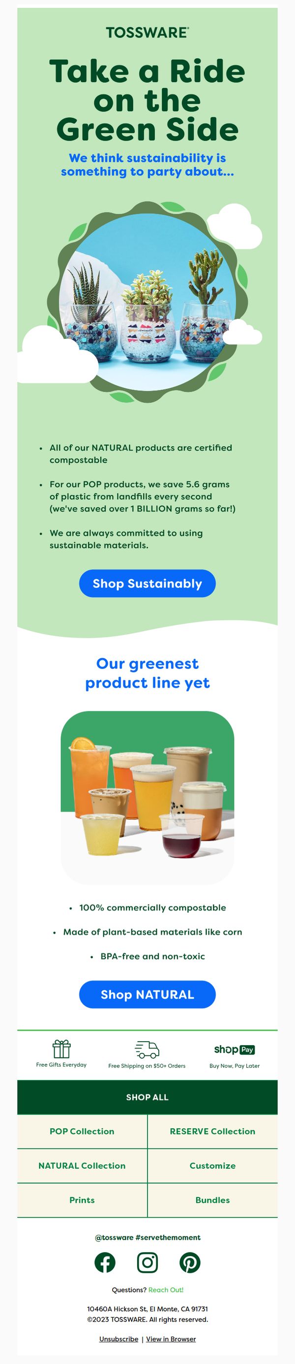
This email aims to position TOSSWARE as a sustainability-driven brand by highlighting eco-friendly product benefits and encouraging immediate purchases through compelling environmental impact stats and clear CTAs. It seeks to convert environmentally conscious consumers by aligning brand values with customer values.
Why this works
The email brilliantly frames sustainability as a celebratory, shareable lifestyle choice, not a sacrifice, by using playful language like 'Take a Ride on the Green Side' and visual metaphors like succulents in cups to make eco-consciousness feel joyful and aspirational.
How to implement
By quantifying environmental impact with specific, memorable metrics, '5.6 grams of plastic saved every second' and '1 BILLION grams saved so far', the campaign transforms abstract eco-values into tangible, emotionally resonant achievements that build trust and urgency.
Pro Tip
Add a countdown timer or limited-availability badge near the 'Shop Sustainably' CTA to create urgency around the sustainability message, since environmental impact stats already imply momentum, leveraging that momentum to drive immediate action. • Include a short customer testimonial or social proof near the product grid to reinforce trust in the '100% commercially compostable' claim, especially since the audience may be skeptical of greenwashing, real user validation would strengthen credibility.
4. Seed & Sprout: The smoothie hack we’re loving💪
Objective
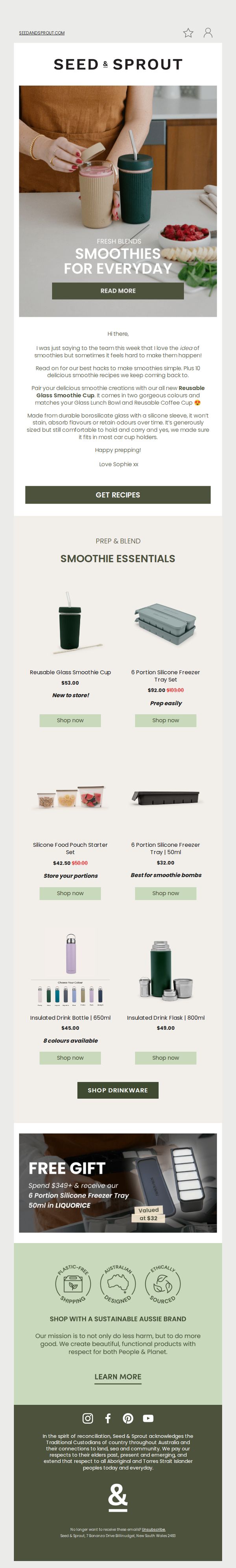
This email aims to inspire everyday smoothie-making by sharing practical hacks and recipes while promoting Seed & Sprout’s reusable drinkware and prep tools. It encourages immediate engagement through a recipe download and drives product sales with a compelling free gift offer.
Why this works
The email brilliantly ties lifestyle aspiration to product utility by positioning smoothie-making not as a chore but as a joyful, everyday ritual supported by thoughtfully designed, sustainable tools that fit seamlessly into real life.
How to implement
By embedding a free gift offer directly beneath the product grid, the campaign creates a natural escalation path, first showcasing products, then rewarding commitment with added value, which lowers purchase hesitation and boosts conversion likelihood.
Pro Tip
Add a subtle countdown timer or stock indicator next to the free gift offer to create urgency, since the current static presentation may reduce perceived scarcity and delay purchase decisions. • Include a short customer testimonial or social proof near the product grid, such as a quote about how the Smoothie Cup changed their morning routine, to reinforce credibility and emotional resonance before the CTA.
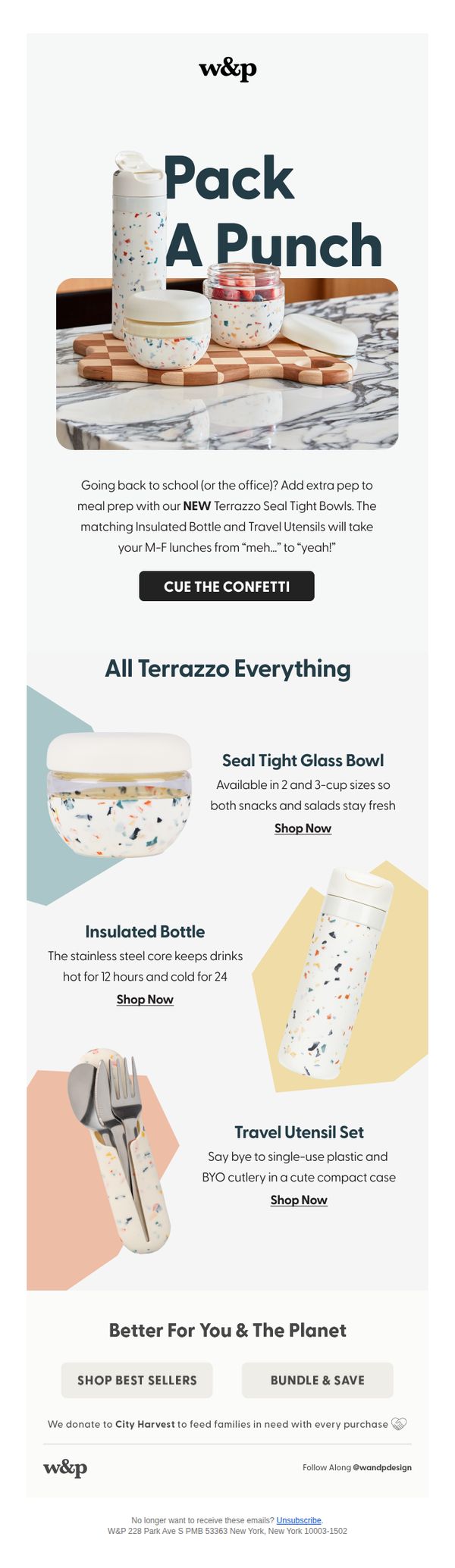
5. W&P: Back To School, But Make It Cool
Objective
This email aims to reposition back-to-school meal prep as stylish and exciting by promoting W&P’s Terrazzo collection, targeting students and professionals who want functional, design-forward lunch gear that elevates everyday routines while subtly appealing to eco-conscious values.
Why this works
The email brilliantly reframes back-to-school prep as a lifestyle upgrade rather than a chore, using playful language like 'Pack A Punch' and 'Cue The Confetti' to emotionally align functional products with joy and personal expression.
How to implement
By grouping the Terrazzo collection as a cohesive system, bowls, bottles, utensils, the campaign encourages bundle thinking without hard-selling, making it easy for customers to visualize a complete, stylish lunch solution that feels curated and intentional.
Pro Tip
Add a visual countdown timer or limited-edition badge near the CTA to create urgency around the Terrazzo launch, since the current design lacks temporal incentive despite the celebratory tone. • Reposition the 'Better For You & The Planet' section higher, perhaps right after the hero, to anchor the campaign in values early, making the eco-angle a motivator rather than an afterthought for socially conscious shoppers.