How eye care brands do patient-first email campaigns
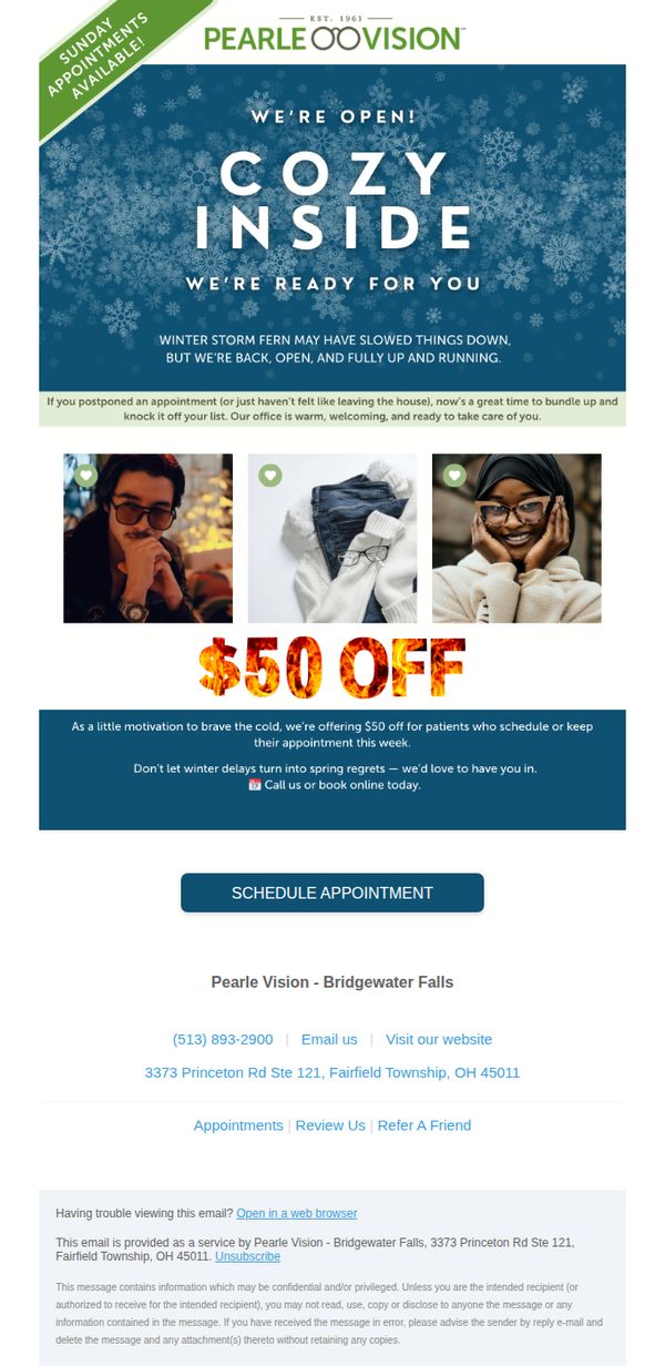
1. Pearle Vision: We're Open, Warm, and Ready for You ❄️
Objective
To re-engage customers who may have postponed eye care appointments during winter weather by offering a timely $50 discount, encouraging them to book while emphasizing a warm, welcoming in-office experience.
Why this works
The email cleverly ties seasonal discomfort, winter storms and staying indoors, to a compelling reason to act now, transforming weather-related delays into a persuasive motivator for booking eye care appointments.
How to implement
By using warm, human-centered visuals and phrases like 'cozy inside' and 'we’re open, warm, and ready for you,' the campaign emotionally reassures customers that the experience will be comforting, not clinical or rushed.
Pro Tip
Add a countdown timer or urgency indicator near the CTA to reinforce the limited-time nature of the $50 offer, increasing conversion by leveraging scarcity psychology. • Include a brief testimonial or patient quote near the offer section to build social proof and reduce perceived risk, especially for those hesitant to return post-winter delays.
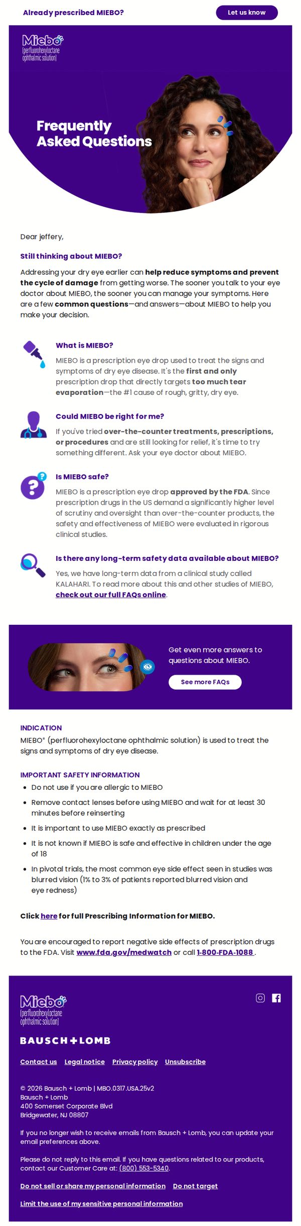
2. MIEBO: Curious about MIEBO?
Objective
This email aims to educate potential patients who are considering MIEBO for dry eye disease by answering common questions and encouraging them to discuss the prescription with their eye doctor. It seeks to reduce hesitation by providing clear, reassuring information backed by clinical data and FDA approval.
Why this works
The email smartly frames MIEBO not as a product to buy, but as a medical solution to discuss with a doctor, this positions it as trustworthy and clinically grounded, which builds confidence in hesitant patients.
How to implement
By leading with a personalized salutation and a gentle nudge about preventing symptom escalation, the email creates urgency without pressure, making the reader feel cared for rather than sold to.
Pro Tip
Add a secondary CTA button near the top, such as 'Talk to Your Doctor Today', to reinforce the primary action and reduce friction for readers who are ready to act after the first paragraph. • Include a short patient testimonial or quote in the education section to humanize the clinical data and provide social proof, which can help overcome skepticism from readers still on the fence.
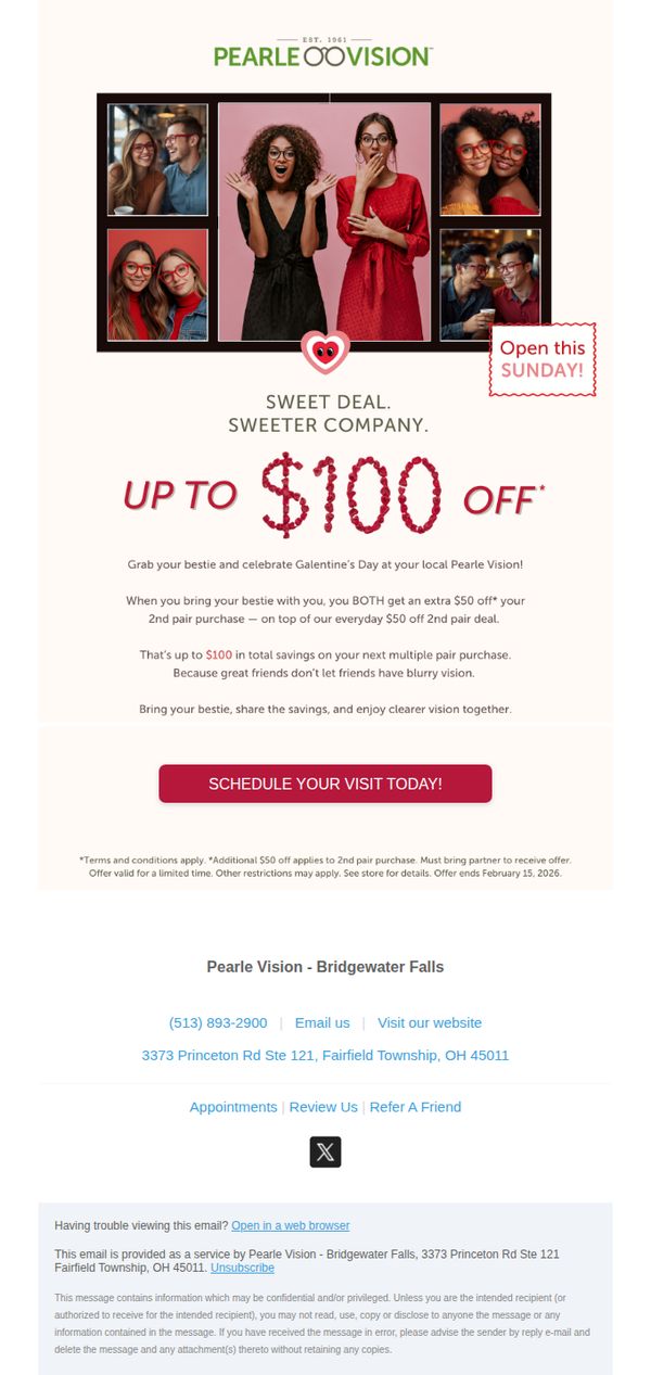
3. Pearle Vision: Sweet Deal. Sweeter Company. Up to $100 off!
Objective
This email aims to drive in-store visits by encouraging customers to bring a friend for a shared Valentine’s Day discount, leveraging social bonding to increase purchase volume and customer retention through a limited-time offer.
Why this works
The campaign brilliantly ties emotional connection to a practical discount, positioning eyewear as a shared experience rather than a solo purchase, which increases perceived value and drives dual conversions.
How to implement
By framing the offer around ‘Galentine’s Day’ and using candid photos of friends laughing together, the email taps into cultural trends while making the promotion feel personal, joyful, and socially relevant.
Pro Tip
Add a small countdown timer or urgency badge near the CTA to reinforce the February 15 deadline visually, since the current text-based reminder is buried at the bottom and easily missed. • Include a brief testimonial or customer quote near the offer section, such as ‘My bestie and I saved $100 and got matching frames!’, to build social proof and reduce hesitation around bringing a friend.
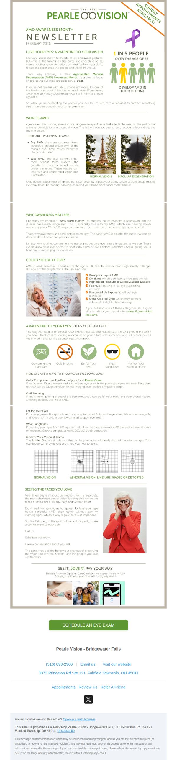
4. Pearle Vision: Love Your Eyes: A Valentine to Your Vision
Objective
This email aims to raise awareness about Age-Related Macular Degeneration (AMD) during February while encouraging recipients to prioritize their eye health through proactive steps like scheduling a comprehensive eye exam. It frames vision care as an act of self-love and long-term connection with loved ones.
Why this works
Pearle Vision brilliantly ties AMD Awareness Month to Valentine’s Day by reframing eye health as an act of love, not just for others, but for your future self who still wants to see sunsets and read to grandchildren, making prevention feel emotionally urgent and deeply personal.
How to implement
The email avoids fear-based messaging by focusing on empowerment, it clearly explains AMD types, risk factors, and actionable prevention steps like quitting smoking and using the Amsler Grid, turning a potentially intimidating topic into a manageable, proactive health journey with simple, visual guidance.
Pro Tip
Add a subtle countdown timer or urgency indicator near the CTA (e.g., ‘Book your February exam, limited slots available’) to leverage the time-sensitive nature of AMD Awareness Month and reduce procrastination, especially since the email already mentions Sunday appointments are available. • Include a short, bulleted ‘What to Expect’ section under the CTA to reduce friction, for example: ‘10-min check-in | Painless imaging | Personalized report’, because many older adults may delay exams due to uncertainty about the process, not lack of motivation.
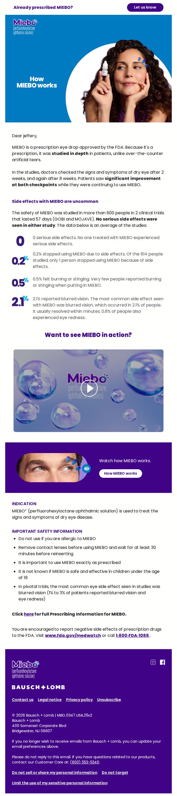
5. MIEBO: The science behind MIEBO
Objective
This email aims to educate patients about the clinical efficacy and safety of MIEBO, a prescription eye drop for dry eye disease, while reinforcing trust through FDA approval and real study data to encourage continued use or discussion with their doctor.
Why this works
The email strategically opens with a personalized salutation and immediately establishes credibility by highlighting FDA approval and clinical trial depth, which reassures patients that MIEBO is not just another OTC solution but a medically validated treatment.
How to implement
By translating complex clinical data into digestible, visually distinct statistics, like 0% serious side effects and 2.1% blurred vision, the email makes safety information feel approachable and reassuring, reducing patient anxiety without oversimplifying the science.
Pro Tip
The primary CTA 'Let us know' is vague and lacks urgency or clear next steps; replacing it with a more action-oriented phrase like 'Tell us about your experience' or 'Schedule a follow-up with your doctor' would better align with the educational objective and drive patient engagement. • The email lacks a visual hierarchy that guides the eye from clinical proof to safety data to the video CTA; adding subtle dividers, icons, or progressive color shading between sections would improve flow and help patients absorb information in a logical, persuasive sequence.