Kidswear email designs from top brands
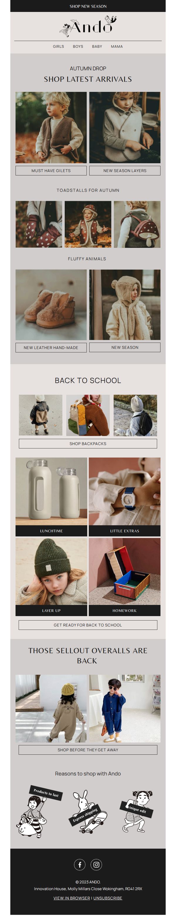
1. Ando: NEW SEASON + BACK TO SCHOOL
Objective
To drive immediate engagement and sales by highlighting the new autumn collection and back-to-school essentials, encouraging parents to shop early before popular items sell out again.
Why this works
The email masterfully blends seasonal storytelling with product discovery by grouping items into thematic collections like 'Toadstalls for Autumn' and 'Fluffy Animals,' making browsing feel playful and intuitive for parents shopping for kids.
How to implement
By featuring 'Those Sellout Overalls Are Back' with urgency-driven copy and visuals, the campaign leverages FOMO effectively without being pushy, turning past customer behavior into a persuasive social proof mechanism that drives immediate action.
Pro Tip
Add a subtle countdown timer or 'Limited Stock' badge under the 'Those Sellout Overalls Are Back' section to amplify urgency and encourage faster decision-making without disrupting the clean layout. • Reposition the 'SHOP LATEST ARRIVALS' CTA to appear immediately after the hero section instead of buried under product grids, ensuring the primary action is visible before the user scrolls, increasing conversion likelihood.
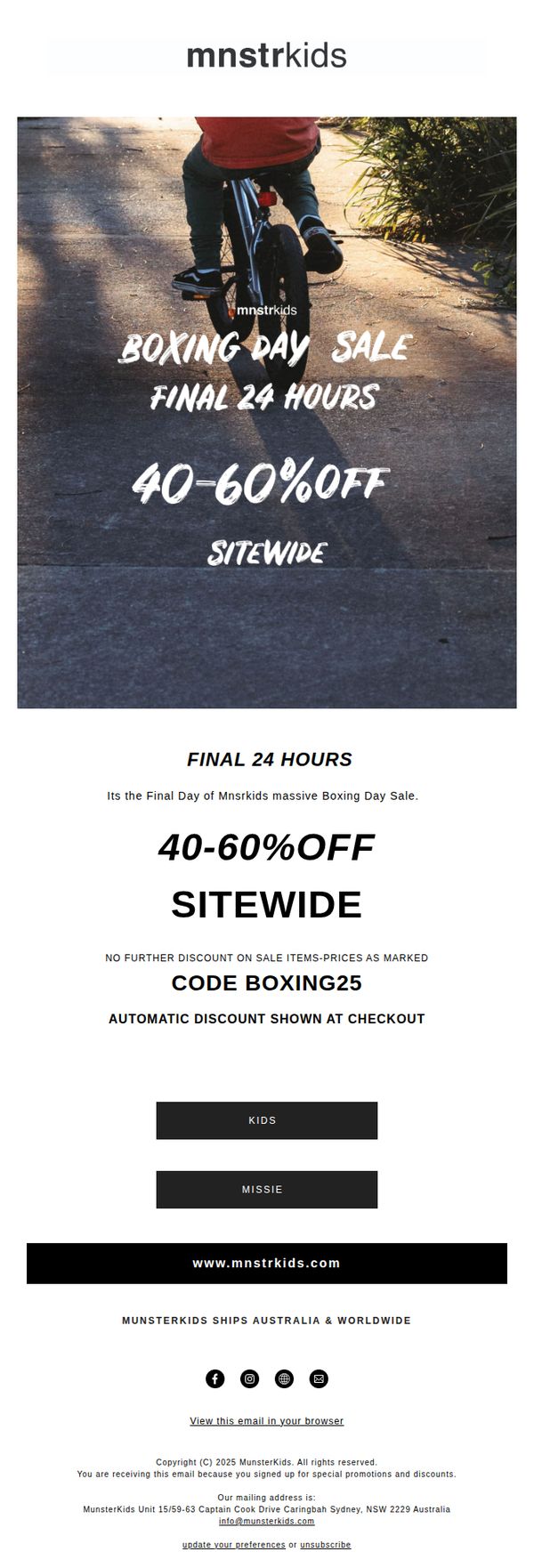
2. Munsterkids: BOXING DAY SALE IS LIVE 🌈 🛹 40-60% OFF SITEWIDE
Objective
This email aims to drive immediate purchases by creating urgency around the final 24 hours of MunsterKids’ Boxing Day Sale, offering 40-60% off sitewide to incentivize last-minute shoppers before the promotion ends.
Why this works
The email leverages time-sensitive urgency with 'Final 24 Hours' prominently displayed twice, tapping into FOMO to convert hesitant shoppers who might otherwise delay their purchase until the sale ends.
How to implement
By clearly stating the discount range (40-60% off) and including a promo code (BOXING25) with automatic checkout application, the email removes friction and builds trust through transparent, no-surprise pricing.
Pro Tip
Add a countdown timer beneath the 'FINAL 24 HOURS' headline to visually reinforce urgency and create a psychological trigger that encourages immediate clicks rather than delayed browsing. • Include a small 'Best Sellers' or 'Top Picks' product grid beneath the CTA buttons to guide indecisive shoppers toward high-converting items, reducing decision fatigue and increasing average order value.
3. Maisonette: Early Access: Extra 15% Off Our Friends & Family Sale
Objective
This email aims to reward loyal customers with early access to a Friends & Family Sale, encouraging immediate purchases by offering an extra 15% off orders over $150 while highlighting curated seasonal products across categories like baby gear, winter wear, and Valentine’s decor.
Why this works
The email strategically frames the discount as an exclusive perk for 'friends & family,' creating emotional urgency and loyalty while positioning the sale as a curated, insider opportunity rather than a generic promotion.
How to implement
By organizing product recommendations into themed bullet points, Valentine’s decor, baby essentials, winter gear, it guides shoppers through seasonal needs without overwhelming them, making browsing feel intuitive and personally relevant.
Pro Tip
Add a visual hero section with lifestyle imagery or a banner showcasing top sale items to immediately capture attention and reinforce the emotional appeal of gifting or preparing for winter, rather than relying solely on text. • Include a countdown timer or urgency indicator near the promo code to emphasize the limited-time nature of the offer, which could increase conversion by creating real-time scarcity without altering the existing message.
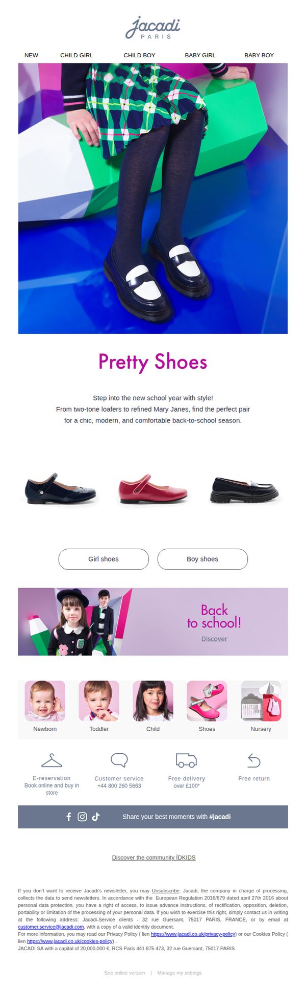
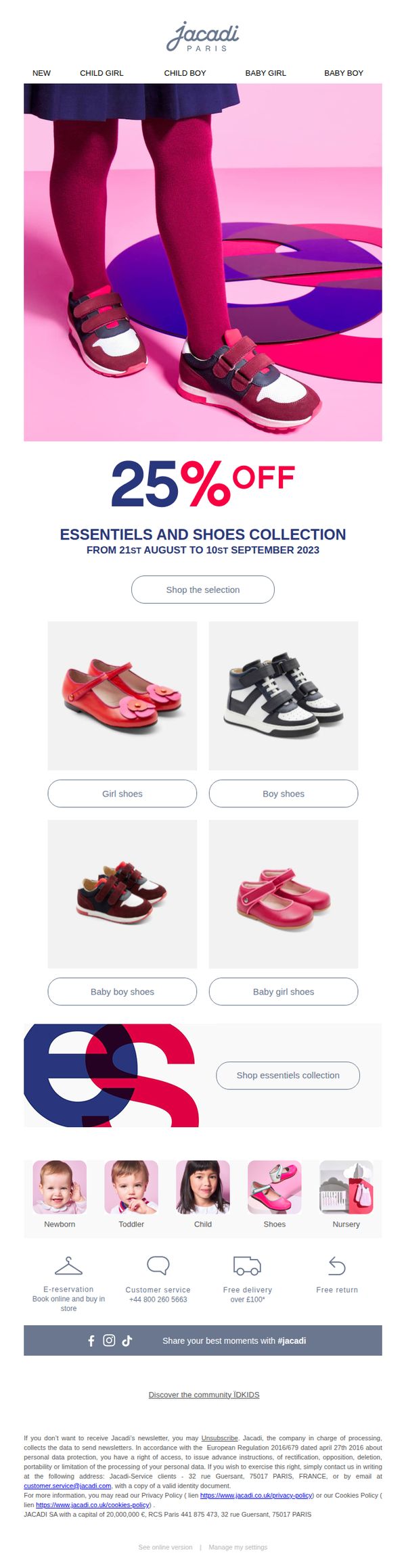
4. Jacadi: Back to school with stylish shoes
Objective
This email aims to drive back-to-school shoe purchases by showcasing stylish, age-appropriate footwear for children while positioning Jacadi as a chic and modern choice for parents preparing for the new school year.
Why this works
The email smartly ties seasonal relevance to product appeal by framing school shoes as fashion statements, helping parents feel they’re buying style and comfort, not just necessities, for their child’s new routine.
How to implement
Using a clean, age-segmented product grid with clear category buttons (Girl shoes, Boy shoes) reduces decision fatigue and guides parents directly to relevant options without overwhelming them with choices.
Pro Tip
Add a limited-time discount or urgency cue (e.g., 'Back-to-School Sale Ends Soon') near the CTA to increase conversion by leveraging FOMO, especially since the email lacks any time-sensitive incentive. • Include a short testimonial or parent review near the product grid to build social proof, parents are more likely to trust peer validation when choosing schoolwear for their children.
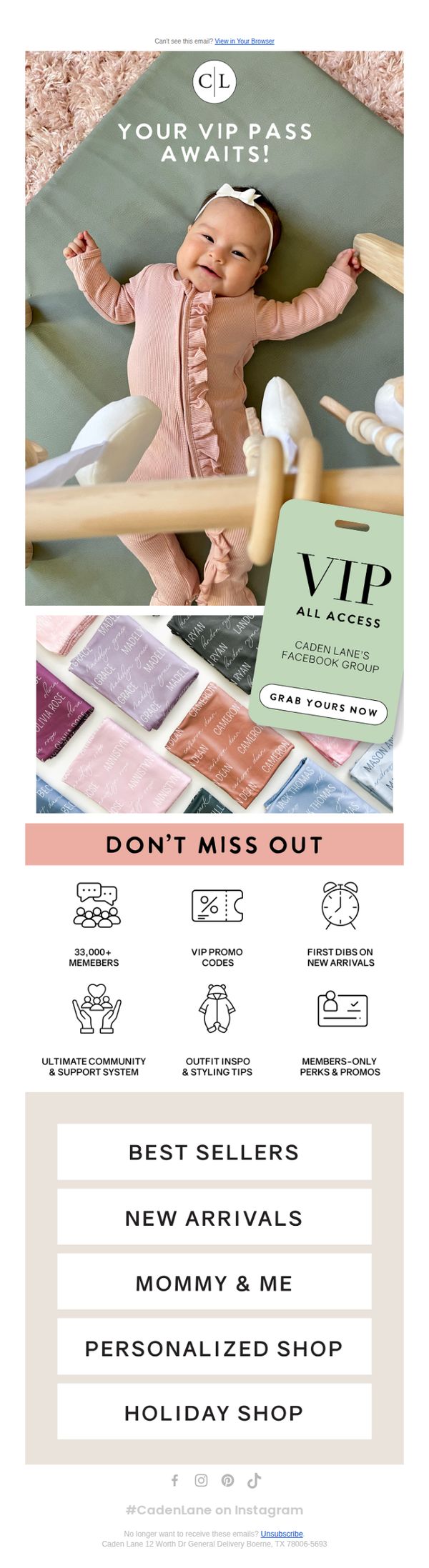
5. Caden Lane: 🎟️Your VIP Pass
Objective
This email aims to convert subscribers into engaged community members by offering exclusive access to Caden Lane’s private Facebook group, where they can unlock VIP perks, early product access, and personalized styling support. It positions membership as a valuable, insider experience rather than just a promotional list.
Why this works
The email brilliantly frames community access as a VIP pass rather than a group invite, transforming a simple Facebook group into an exclusive, aspirational experience that taps into FOMO and social belonging, a powerful psychological lever for conversion.
How to implement
By visually anchoring the offer to a smiling baby in branded apparel, the email instantly connects emotional warmth with product desirability, making the VIP pass feel like a natural extension of the parenting journey rather than a sales pitch.
Pro Tip
The CTA 'GRAB YOURS NOW' is visually buried under the VIP tag graphic; repositioning it above or beside the tag with higher contrast would improve click-through by making the action more immediately discoverable. • The email lacks a clear value hierarchy, the 'DON’T MISS OUT' section lists six benefits equally, which dilutes impact; prioritizing 2-3 top perks with icons and short descriptions would strengthen persuasion and reduce decision fatigue.
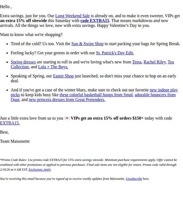
6. Maisonette: A Little Extra Love ❤️ 15% Off for VIPs ❤️
Objective
To reward VIP customers with an exclusive 15% discount during a long weekend sale, encouraging immediate purchases by highlighting seasonal collections and new arrivals while reinforcing brand loyalty through personalized messaging.
Why this works
The email brilliantly ties seasonal urgency to VIP exclusivity, making the 15% discount feel like a personal gift rather than a generic promotion, which deepens emotional connection and drives conversion.
How to implement
By curating themed shopping suggestions, like St. Patrick’s Day edits and Easter launches, the brand transforms a simple discount into a discovery experience, guiding customers to relevant categories without overwhelming them.
Pro Tip
Add a visual hero banner or product carousel above the text to immediately showcase top-selling spring items or Easter launches, increasing visual appeal and reducing reliance on text-only navigation. • Include a countdown timer next to the promo code expiration to amplify urgency, especially since the offer ends early Saturday morning, this could nudge procrastinators to act before the window closes.
7. Jacadi: Shop 25% off shoes for back to school !
Objective
This email aims to drive immediate sales by promoting a limited-time 25% discount on shoes and essentials for the back-to-school season, targeting parents shopping for children across multiple age groups and genders.
Why this works
The email smartly anchors its entire message around a time-sensitive back-to-school discount, creating urgency while aligning with a high-intent seasonal shopping moment that parents are already mentally prepared to act on.
How to implement
By visually segmenting shoes by gender and age group with clear category buttons, the campaign reduces decision fatigue and guides parents directly to the most relevant products, increasing the likelihood of conversion without overwhelming them.
Pro Tip
Add a countdown timer beneath the offer headline to reinforce urgency, since the promotion ends September 10th, this would create real-time pressure without requiring users to mentally calculate the remaining days. • Include a short testimonial or social proof near the CTA, such as '92% of parents say these shoes last all school year,' to build trust and reduce hesitation around purchasing footwear for active kids.
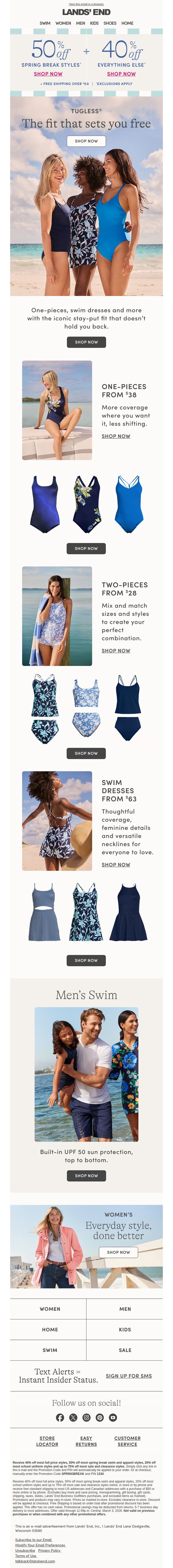
8. Lands' End: Starts today: 50% off spring break styles!
Objective
This email aims to drive immediate sales by promoting a limited-time discount on spring break swimwear and apparel, while also encouraging broader category exploration through tiered offers and cross-category navigation.
Why this works
The email strategically layers discounts, 50% off spring break styles and 40% off everything else, to create urgency while expanding the perceived value beyond a single category, making the offer feel more inclusive and compelling.
How to implement
By visually segmenting swimwear into one-pieces, two-pieces, and swim dresses with clear pricing and benefit-driven copy, the email reduces decision fatigue and guides shoppers toward specific product types based on their preferences and needs.
Pro Tip
Add a countdown timer beneath the headline to reinforce urgency for the 50% off spring break styles, since the offer expires March 3 and the current design lacks a visual time-sensitive cue to drive immediate action. • Replace the generic 'SHOP NOW' CTA buttons under each product category with benefit-driven variations like 'Find Your Perfect Fit' or 'Get Sun Protection Now' to increase emotional resonance and conversion relevance per section.
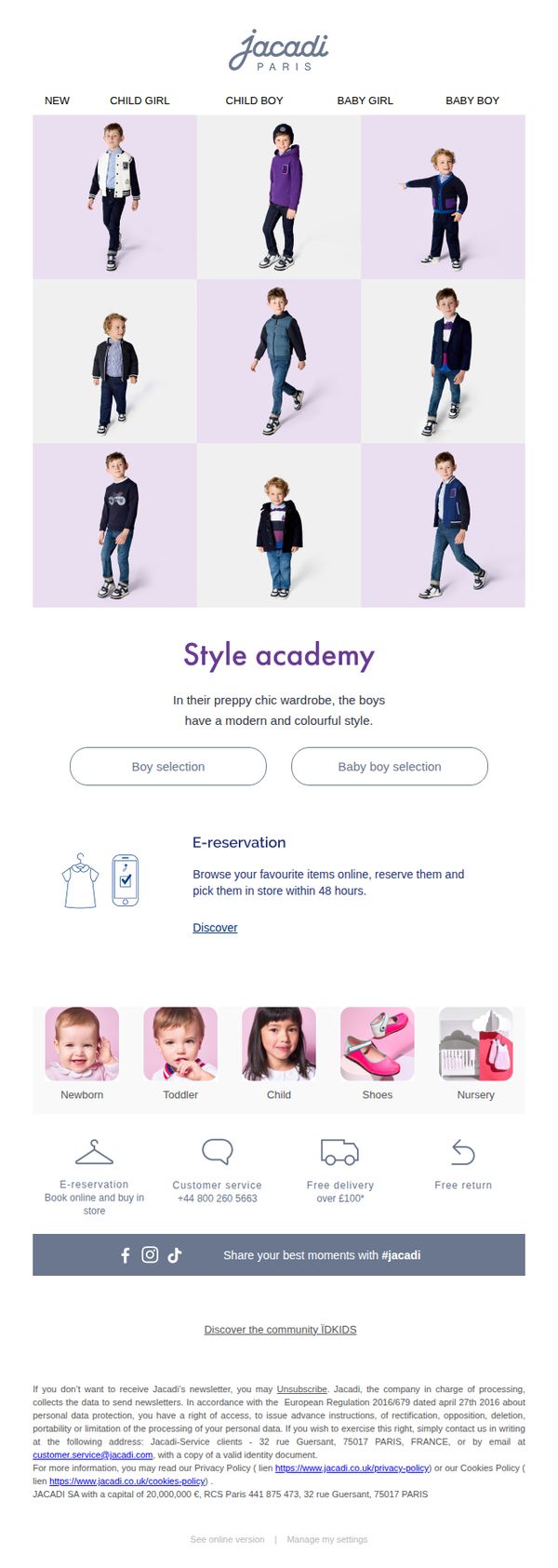
9. Jacadi: A preppy chic Back to school with Jacadi 📚
Objective
This email aims to inspire parents to shop for their children’s back-to-school wardrobes by showcasing Jacadi’s preppy chic style across age groups and genders, while encouraging immediate browsing and in-store pickup through a seamless e-reservation feature.
Why this works
Jacadi brilliantly uses a clean, grid-based product layout to showcase diverse age groups and styles without overwhelming the viewer, making it easy for parents to instantly identify relevant categories for their child’s school needs.
How to implement
The 'Style Academy' section frames the collection as an educational, curated experience rather than just a sale, which elevates the brand’s authority and subtly reassures parents they’re making a stylish, informed choice for their child’s wardrobe.
Pro Tip
The primary CTA 'Discover' is too vague and buried below the category grid; it should be replaced with a stronger, benefit-driven action like 'Reserve Your Child’s Look Now' and placed directly under the 'Style Academy' headline to align with the campaign’s urgency and convenience angle. • The email lacks a visual hierarchy that guides the eye from hero imagery to the CTA, adding a subtle directional arrow or color accent near the 'Boy selection' and 'Baby boy selection' buttons would improve conversion by reducing decision fatigue and reinforcing the next step.
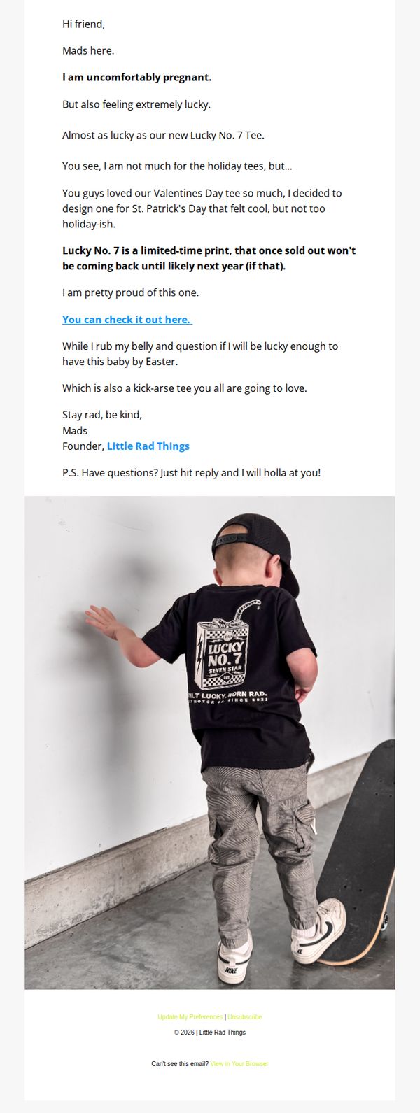
10. Little Rad Things: Lucky No. 7 or as my kids say... 6/7
Objective
This email aims to introduce and drive urgency around the limited-edition Lucky No. 7 tee by tying it to the founder’s personal pregnancy announcement, creating emotional resonance while encouraging immediate purchase before the item sells out.
Why this works
The founder’s authentic, vulnerable storytelling, tying her pregnancy to the product launch, creates a powerful emotional hook that transforms a simple tee drop into a shared moment of celebration and community.
How to implement
Positioning the tee as a limited-time print with a clear ‘won’t return until next year’ message leverages scarcity without sounding pushy, making the purchase feel like joining an exclusive, meaningful moment.
Pro Tip
Add a visual countdown timer or 'Only X left' indicator near the CTA to amplify urgency, since the email mentions limited availability but doesn’t visually reinforce scarcity in the moment of decision. • Include a small product grid or size/color swatches directly in the email to reduce friction, subscribers shouldn’t have to click through just to see available options, especially when the CTA is the only interactive element.