How Security brands do high-trust email campaigns


1. American Security: New Dealer Registration
Objective
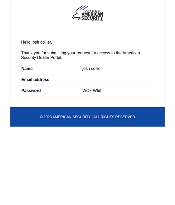
This email confirms the successful submission of a dealer registration request and provides the user with their login credentials to access the American Security Dealer Portal, encouraging immediate account activation.
Why this works
The email immediately personalizes the experience by addressing the recipient by name, which builds trust and reinforces that this is a tailored, legitimate communication rather than a generic system message.
How to implement
By clearly displaying the user’s login credentials in a clean, tabular format, the email reduces friction and cognitive load, making it effortless for the new dealer to take the next step without searching or guessing.
Pro Tip
Add a visible, clickable button labeled 'Log in to your Dealer Portal now' above the credential table to guide the user toward immediate action instead of relying on implied next steps. • Include a brief sentence or link explaining what the Dealer Portal offers, such as pricing, order tracking, or marketing materials, to motivate the user to log in by highlighting the value they’ll unlock.
2. IDEMIA: Thanks for subscribing our Newsletter
Objective
This email aims to confirm the recipient’s interest in IDEMIA by prompting them to validate their subscription through a clear, single-action CTA, thereby ensuring list hygiene and initiating a permission-based communication journey.
Why this works
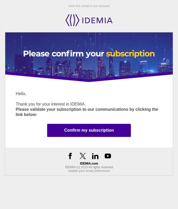
The email leverages a visually striking hero banner with a futuristic cityscape and bold color contrast to immediately capture attention while reinforcing brand identity through consistent typography and logo placement.
How to implement
By using a simple, direct subject line and opening greeting, the email reduces cognitive load and builds trust early, making the recipient feel acknowledged rather than marketed to, which increases conversion likelihood.
Pro Tip
Add a brief value proposition or benefit reminder (e.g., 'Get exclusive insights on digital identity trends') just above the CTA to reinforce why confirming matters, increasing perceived value and conversion motivation. • Include a secondary, low-friction option like 'No thanks, I’ll opt out' or a link to update preferences directly in the body to reduce spam complaints and improve sender reputation by honoring user intent.
3. IDEMIA: Thanks for subscribing our Newsletter
Objective
This email aims to confirm the recipient’s interest in IDEMIA and prompt them to validate their subscription by clicking a confirmation link, thereby securing permission for future communications.
Why this works
The email opens with a warm, personalized greeting that acknowledges the subscriber’s interest, creating immediate rapport and reducing friction in the confirmation process.
How to implement
Using a bold, contrasting CTA button with clear action-oriented text ensures the primary goal, subscription validation, is unmistakable and effortless to complete.
Pro Tip
Add a subtle countdown timer or urgency cue near the CTA to encourage immediate action, since delayed confirmation often leads to abandoned subscriptions. • Include a brief value preview, such as 'Get exclusive insights on digital identity trends', to reinforce why confirming is worth the user’s time and attention.
4. American Security: [American Security Safes - High Security Safes for Home & Business] Registration Denied
Objective
The email aims to inform the recipient that their registration attempt for American Security Safes has been denied, likely to prompt them to re-engage or correct their information while reinforcing brand authority around high-security solutions.
Why this works
The email leverages urgency and exclusivity by immediately stating access has been denied, which can trigger curiosity and motivate the recipient to revisit their registration attempt or contact support for clarification.
How to implement
By embedding the brand name and value proposition, 'High Security Safes for Home & Business', even in a rejection message, the email reinforces brand positioning and keeps the product top-of-mind despite the negative outcome.
Pro Tip
Add a clear, empathetic explanation for the denial, such as 'We couldn’t verify your details', followed by a direct CTA like 'Update Your Information' to guide users toward resolution instead of confusion. • Include a secondary CTA or support contact (e.g., 'Contact Our Security Team') to reduce friction and prevent user drop-off, turning a negative experience into an opportunity for customer service engagement.