Proven Astrid & Miyu email designs you can use
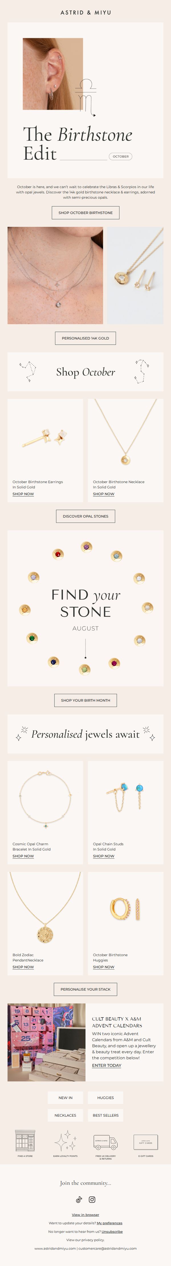
1. You'll love this month's birthstone
Objective
This email aims to drive engagement and sales by celebrating October’s birthstone, opal, through personalized, zodiac-themed jewelry offerings, while also promoting a seasonal collaboration and encouraging exploration of birth month collections across the year.
Why this works
The email brilliantly ties emotional astrology with product discovery by spotlighting Libra and Scorpio zodiac signs alongside October’s opal birthstone, making the jewelry feel personally meaningful rather than just decorative.
How to implement
Instead of overwhelming with options, the campaign uses a clean, circular birthstone wheel to invite exploration of all months, turning a simple product category into an interactive, curiosity-driven journey that boosts cross-month engagement.
Pro Tip
The 'Shop October' product grid lacks visual hierarchy, consider enlarging the hero product image or adding a subtle 'Best Seller' badge to guide attention and reduce decision fatigue for first-time buyers. • The CTA 'SHOP OCTOBER BIRTHSTONE' appears only once above the fold; repeat it after the 'Find Your Stone' section to re-engage users who scroll past the initial offer without clicking.
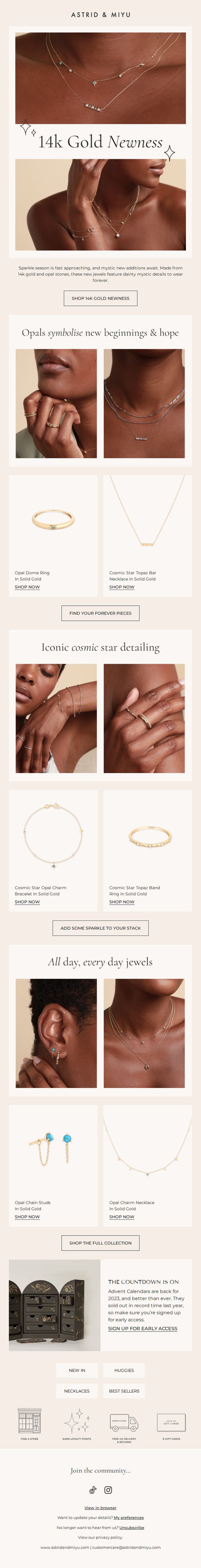
2. New In: 14k Gold Treasures
Objective
To introduce and drive sales of the new 14k gold jewelry collection by highlighting its mystical opal details and cosmic star motifs, while also promoting early access to limited-edition Advent Calendars to create urgency and exclusivity.
Why this works
The email masterfully ties emotional symbolism, opals for new beginnings and cosmic stars for mysticism, to product features, making the jewelry feel personally meaningful rather than just decorative, which deepens customer connection and justifies premium pricing.
How to implement
By grouping products into thematic sections like 'Iconic cosmic star detailing' and 'All day, every day jewels,' the email guides the shopper through curated narratives rather than overwhelming them with a generic grid, enhancing discoverability and emotional resonance with each collection.
Pro Tip
Add a subtle countdown timer next to the Advent Calendar CTA to amplify urgency, since the email mentions record-breaking sales last year but doesn’t visually reinforce the time-sensitive nature of early access. • Integrate customer testimonials or social proof near the product grids, especially for bestsellers or new items, to reduce perceived risk and increase conversion confidence for first-time buyers unfamiliar with the 14k gold line.
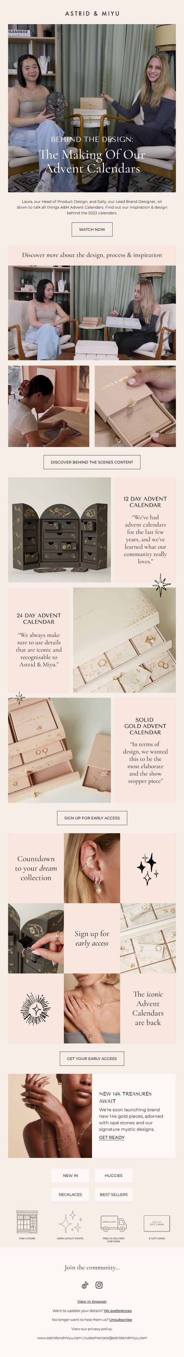
3. Behind the Design: 2023 Advent Calendars
Objective
This email aims to build anticipation and emotional connection around Astrid & Miyu’s 2023 Advent Calendars by revealing the design story behind them, while encouraging early sign-ups and teasing upcoming 14K gold collections to drive pre-launch engagement and sales.
Why this works
By featuring the designers in a candid, behind-the-scenes format, the email humanizes the brand and transforms product development into a compelling narrative that builds trust and emotional investment before the sale even begins.
How to implement
The strategic use of product close-ups paired with designer quotes creates a storytelling rhythm that educates while subtly reinforcing brand identity, making each calendar feel like a curated experience rather than just a seasonal product.
Pro Tip
Add a visible countdown timer near the 'Sign Up for Early Access' CTA to create urgency and reinforce the limited-time nature of early access, which is currently implied but not visually emphasized. • Include a brief customer testimonial or social proof near the product grid to validate the calendars’ popularity, since the email relies heavily on designer insight but lacks third-party validation to strengthen purchase confidence.
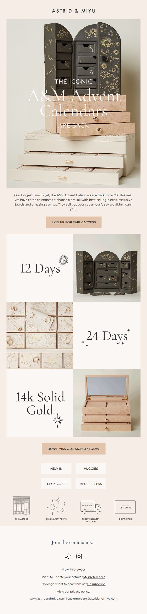
4. Our iconic Advent Calendars are back
Objective
To generate early excitement and drive pre-launch sign-ups for Astrid & Miyu’s limited-edition 2023 Advent Calendars by highlighting their exclusivity, best-selling contents, and time-sensitive availability. The email aims to convert curiosity into action before the calendars sell out.
Why this works
The email leverages urgency and exclusivity by framing the Advent Calendars as a ‘biggest launch yet’ that sells out yearly, which taps into FOMO while validating the product’s popularity through social proof.
How to implement
By visually segmenting the three calendar options, 12 Days, 24 Days, and 14k Solid Gold, the email simplifies decision-making for shoppers while subtly elevating perceived value through material and structure differentiation.
Pro Tip
Add a countdown timer or limited-quantity indicator near the CTA to amplify urgency, since the email mentions annual sell-outs but doesn’t visually reinforce scarcity in real time. • Include a short testimonial or social proof snippet under each calendar variant to build trust and reduce hesitation, especially for high-value items like the 14k Solid Gold edition.
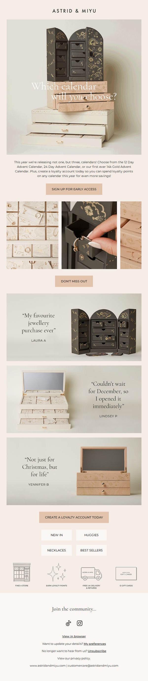
5. Meet our three Advent Calendars
Objective
This email aims to generate excitement and early sign-ups for Astrid & Miyu’s three new Advent Calendars by highlighting their unique designs and encouraging loyalty account creation for exclusive savings. It positions the calendars as must-have holiday gifts with emotional and practical appeal.
Why this works
The email brilliantly frames the Advent Calendars not just as holiday novelties but as collectible, luxurious experiences by showcasing their intricate designs and emphasizing the emotional payoff of daily reveals, which elevates perceived value beyond the price point.
How to implement
By featuring real customer quotes that highlight both immediate gratification and long-term sentiment, like 'Not just for Christmas, but for life', the campaign taps into deeper emotional triggers that turn a seasonal product into a meaningful keepsake, boosting conversion potential.
Pro Tip
Add a visual comparison grid or side-by-side thumbnail carousel under the hero section to help customers quickly differentiate between the 12-day, 24-day, and 14k Gold calendars, reducing decision fatigue and increasing clarity without requiring extra clicks. • Include a subtle countdown timer or 'Early Access Ends In [X] Days' indicator next to the CTA to create urgency, since the current 'SIGN UP FOR EARLY ACCESS' lacks time sensitivity, which could reduce conversion momentum for hesitant shoppers.
6. New season, new pearls
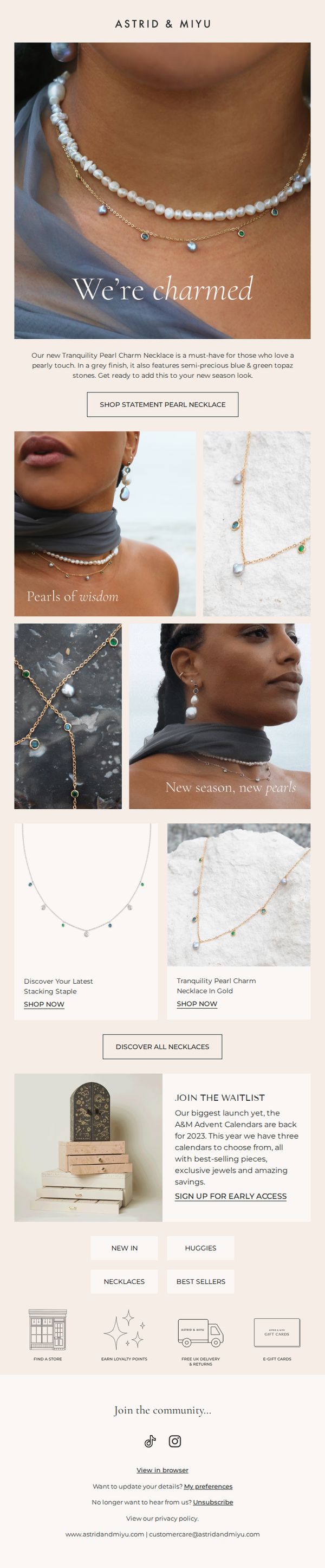
Objective
This email aims to introduce Astrid & Miyu’s new seasonal pearl jewelry collection, highlighting the Tranquility Pearl Charm Necklace as a key piece while driving immediate engagement through product discovery and early access sign-ups for upcoming Advent Calendars.
Why this works
The email masterfully blends aspirational lifestyle imagery with clear product storytelling, using phrases like 'We’re charmed' and 'Pearls of wisdom' to emotionally anchor the collection while still driving direct product engagement through strategic CTAs.
How to implement
By featuring both model shots and clean product displays, the campaign balances emotional appeal with practical shopping cues, helping customers visualize wearability while maintaining a luxury aesthetic that aligns with the brand’s identity.
Pro Tip
Add a subtle countdown timer or limited-quantity indicator near the 'SHOP STATEMENT PEARL NECKLACE' CTA to amplify urgency, especially since the email promotes a 'new season' launch that benefits from perceived scarcity. • Reposition the 'JOIN THE WAITLIST' section higher in the email, ideally after the hero or product grid, to capture attention before users scroll past, since early access sign-ups are a secondary but high-value conversion goal.
7. New In: Initial Pendants
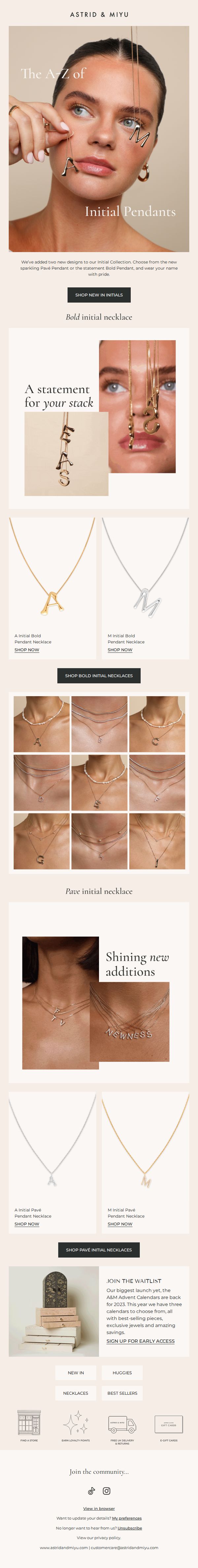
Objective
To introduce and drive sales of two new initial pendant designs, the sparkling Pavé Pendant and the statement Bold Pendant, while encouraging customers to explore the full A-Z collection and build personalization through stacking and layering.
Why this works
The email brilliantly uses a model’s face to frame the initial pendants as wearable art, turning letters into emotional symbols of identity and pride, a subtle but powerful psychological hook that elevates the product beyond mere jewelry.
How to implement
By visually grouping the A-Z collection in a grid, the campaign transforms a simple product range into a personalized journey, inviting customers to find their letter and imagine layering it with others, a smart way to encourage multiple purchases and deeper engagement.
Pro Tip
Add a brief customer testimonial or social proof near the product grid to reinforce trust, for example, a short quote like 'My initials are my daily reminder of who I am' to emotionally validate the personalization angle. • Include a small visual icon or tag next to the Bold and Pavé pendants indicating metal options (e.g., gold/silver) to reduce friction for customers comparing styles and help them visualize customization before clicking.
8. Let's unbox our new calendars
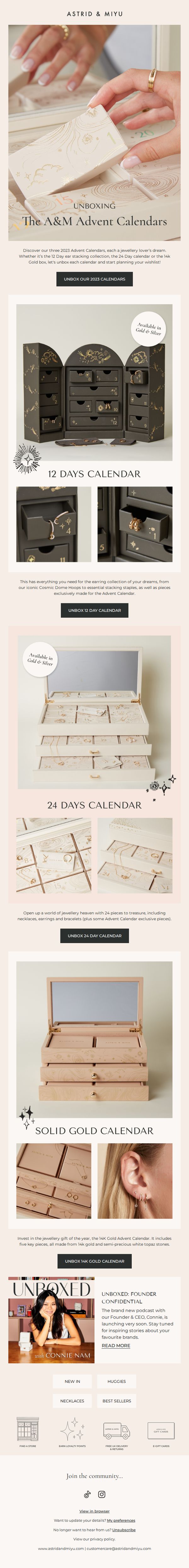
Objective
To generate excitement and drive pre-orders for Astrid & Miyu’s 2023 Advent Calendars by showcasing their unique designs, exclusive jewelry pieces, and gifting appeal through an immersive unboxing experience. The email aims to convert curiosity into immediate action by highlighting limited-edition offerings and emotional value.
Why this works
The email masterfully blends storytelling with product discovery by framing each calendar as a narrative journey, not just a product, but a curated experience that invites the reader to imagine unboxing joy day by day, which emotionally anchors the purchase decision.
How to implement
By emphasizing exclusivity, such as 'Advent Calendar exclusive pieces' and '14K gold with semi-precious stones', the campaign taps into luxury psychology, making each calendar feel like a limited-edition collector’s item rather than a seasonal gimmick, thereby justifying premium pricing.
Pro Tip
Add a subtle countdown timer near the CTA to create urgency around pre-order availability, especially since Advent Calendars are time-sensitive gifts, this would nudge hesitant shoppers toward immediate action without disrupting the elegant layout. • Include a small visual comparison grid or icon-based feature matrix (e.g., number of pieces, materials, exclusives) between the three calendars to help shoppers quickly differentiate value tiers and make confident decisions without scrolling back and forth.
9. What's coming to an A&M store near you
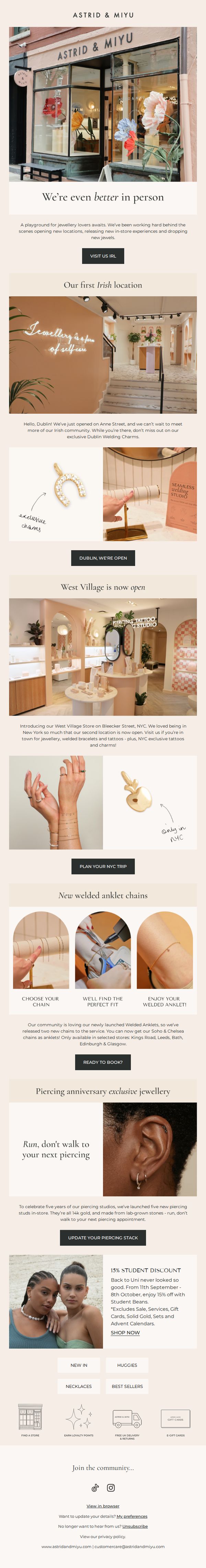
Objective
This email aims to excite customers about Astrid & Miyu’s new physical store openings in Dublin and NYC while promoting exclusive in-store products and experiences. It also drives traffic to physical locations by highlighting limited-edition items and local offers.
Why this works
By framing store openings as community events rather than just retail expansions, the email builds emotional connection and positions each location as a unique experience worth visiting in person.
How to implement
The strategic use of location-specific exclusives, like Dublin’s Welding Charms and NYC’s tattoo offerings, creates urgency and FOMO, encouraging travelers and locals alike to plan visits for unique products they can’t get online.
Pro Tip
Add a visual map or clickable store locator in the header or hero section to immediately help users identify which new location is closest to them, reducing friction in planning a visit. • Include a countdown timer or limited-quantity badge on the piercing anniversary jewelry section to reinforce urgency and encourage faster decision-making for time-sensitive exclusives.
10. In our moonstone era

Objective
This email aims to immerse subscribers in the brand’s moonstone-themed collection by evoking emotional resonance through celestial storytelling, while driving product discovery and early access sign-ups for the upcoming Advent Calendar launch.
Why this works
The email masterfully blends mystical storytelling with product presentation, using moonstone symbolism to create an emotional narrative that elevates jewelry from accessory to talisman, deepening customer connection beyond aesthetics.
How to implement
By curating collections around thematic phrases like 'Serenity' and 'Mystic hues & celestial tones,' the brand transforms browsing into an experiential journey, encouraging customers to envision how each piece fits into their personal story or mood.
Pro Tip
The 'Discover Newness' CTA is visually underwhelming and lacks urgency; replacing it with a more emotionally resonant phrase like 'Embrace Serenity Now' or adding a subtle countdown timer would better align with the mystical theme and drive immediate action. • The product grid lacks consistent visual hierarchy, some items have 'SHOP NOW' buttons while others don’t, and image sizes vary; standardizing layout and ensuring every product has a clear, clickable CTA would improve conversion flow and reduce friction.