Proven HubSpot email designs you can use

1. Hey there, I like your sweater 👚
Objective
This email aims to educate marketers on leveraging AI ethically and effectively through expert insights from Ashley Faus, while subtly promoting HubSpot’s ICP GPT tool as a practical solution for understanding customer behavior without relying on biased human feedback.
Why this works
By framing AI as an unbiased focus group, this email reframes a technical tool as a human-centered solution, making complex marketing concepts feel approachable and immediately actionable for overwhelmed practitioners.
How to implement
The strategic use of a real executive’s voice and personal anecdotes transforms abstract marketing theory into relatable, memorable advice, proving that authority and authenticity can coexist without sounding corporate or salesy.
Pro Tip
Add a subtle visual cue or icon next to the 'Study your customers' CTA to reinforce its importance and improve click-through rates, currently, it blends into the text-heavy layout and lacks visual hierarchy. • Include a short, one-sentence testimonial or social proof near the CTA from a real user who successfully built their ICP with the GPT tool, this would strengthen trust and reduce perceived risk before conversion.
2. In which we get witchy... 🧙♀️
Objective
This email aims to entertain and educate marketers by showcasing real-world marketing wisdom from a destination marketing expert, while subtly promoting HubSpot’s customer profiling tools through a Halloween-themed narrative that ties creativity to measurable business outcomes.
Why this works
By framing marketing lessons within a whimsical Halloween narrative, this email transforms complex concepts like persona segmentation and customer journey mapping into memorable, emotionally resonant stories that readers are more likely to internalize and apply.
How to implement
The strategic use of a real-world expert’s quirky personal anecdotes, like living near the Hocus Pocus house, builds instant credibility and warmth, making the content feel less like a sales pitch and more like a fireside chat with a seasoned industry wizard.
Pro Tip
Add a subtle visual indicator or icon next to the 'USE IT FOR FREE' CTA to reinforce urgency or exclusivity, such as a small witch hat or 'Limited Time' badge, since the Halloween theme is underutilized in the conversion area. • Include a short testimonial or quote from a HubSpot customer who used the Customer Profile Sheet to improve their marketing ROI, directly beneath the CTA to strengthen social proof and reduce friction for hesitant users.
3. How powerful is social proof? 💪
Objective
This email aims to educate marketers on the strategic placement of social proof to boost conversions, using a real-world A/B test from HubSpot as evidence, while encouraging readers to continue engaging with the newsletter series for more tactical insights.
Why this works
Placing social proof higher on the page, even in a minimal, unobtrusive format, can significantly increase conversions because users often don’t scroll far enough to see it when buried at the bottom, making visibility a critical conversion lever.
How to implement
Testing small layout changes, like separating customer logos from testimonials into distinct visual zones, can yield surprising performance gains without overhauling the entire page, proving that micro-optimizations often deliver macro results.
Pro Tip
Add a visual heat map or scroll-depth indicator near the social proof section to reinforce Rebecca Hinton’s claim that only 50% of users see it at the bottom, making the data more tangible and persuasive. • Include a secondary CTA above the fold that links directly to the A/B test results or case study page, allowing readers who are convinced by the headline to dive deeper without scrolling past the main content.
4. The woman who puts America to sleep
Objective
This email aims to engage readers by telling the compelling origin story of Kathryn Nicolai, founder of Nothing Much Happens, while subtly positioning sleep and storytelling as valuable, marketable solutions to America’s insomnia crisis. It also encourages social sharing and newsletter retention.
Why this works
The email masterfully blends human storytelling with data-driven context, using Kathryn Nicolai’s personal journey to frame a broader cultural problem, insomnia, making the content emotionally resonant while still grounded in market relevance.
How to implement
By embedding infographics that visualize sleep statistics and economic costs, the campaign transforms abstract problems into tangible, relatable insights, helping readers internalize the value of sleep solutions without feeling lectured or sold to.
Pro Tip
Add a clear, secondary CTA after the first infographic, such as 'Discover how storytelling helps people sleep', to guide readers toward deeper engagement before they reach the bottom of the long-form narrative. • Include a brief, bulleted 'Why This Matters' summary after the 'Cost of Insomnia' section to reinforce the business case for sleep solutions and connect Kathryn’s story directly to reader pain points or opportunities.
5. 🎁 Gift local
Objective
This email aims to engage subscribers by delivering curated, thought-provoking business and tech news while subtly promoting HubSpot’s resources and partnerships. It also seeks to drive traffic to external content and encourage newsletter sharing through referral incentives.
Why this works
The email masterfully blends editorial storytelling with subtle product promotion, making the CTA feel like a natural next step rather than a sales pitch, which increases conversion likelihood without compromising reader trust.
How to implement
By featuring a startup like Giftphoria that aligns with HubSpot’s values, supporting local businesses and innovation, the email builds emotional resonance and positions the brand as a curator of meaningful, forward-thinking ideas beyond just software.
Pro Tip
The primary CTA 'Download the Doc' is buried in the middle of the email and visually underwhelming; it should be duplicated above the fold with stronger visual contrast and clearer value framing like 'Get 1000+ Marketing Prompts Instantly'. • The 'Giftphoria' section, while interesting, lacks a direct tie-back to HubSpot’s tools or audience relevance; adding a line like 'Perfect for HubSpot users looking to personalize customer experiences' would strengthen strategic alignment.
6. 💰 Cash for connections
Objective
The email aims to engage readers by blending quirky cultural commentary with actionable business insights, encouraging them to explore HubSpot’s marketing resources while subtly promoting referral-based revenue opportunities through Nolodex. It also seeks to position The Hustle as a must-read for marketers by highlighting timely trends and unconventional growth tactics.
Why this works
The email masterfully blends humor and hard data to make marketing trends feel personal and urgent, turning dry statistics into relatable stories that readers want to share, a technique that boosts both engagement and organic reach.
How to implement
By spotlighting unconventional business models like Nolodex’s referral-based networking, the email positions itself as a curator of next-gen growth strategies, giving readers a competitive edge while subtly validating the value of their own professional networks.
Pro Tip
The primary CTA 'Read the report' is buried under a visually dominant graphic and lacks urgency or benefit-driven language; repositioning it above the fold with a value-driven label like 'Get the Big Game Marketing Playbook' would increase click-throughs. • The referral incentive mentioned in the header ('3 referrals away from earning a Hustle Essentials kit') is disconnected from the rest of the content; adding a visual progress bar or a dedicated section linking referrals to the Nolodex story would strengthen campaign cohesion and conversion intent.
7. Small 🍆 energy
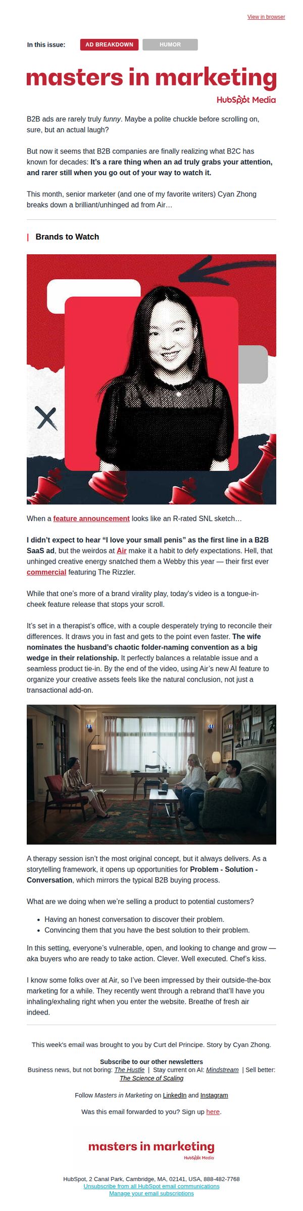
Objective
This email aims to entertain and educate marketing professionals by analyzing a bold, humorous B2B ad from Air, while subtly positioning HubSpot as a thought leader in creative marketing strategy. It invites readers to reflect on how unconventional storytelling can drive engagement and conversion in B2B contexts.
Why this works
The email brilliantly leverages humor and cultural references to disarm B2B readers, proving that even enterprise audiences crave personality and surprise, making complex marketing concepts feel accessible and memorable through storytelling.
How to implement
By framing a product feature as a therapeutic solution to a relatable workplace problem, the campaign turns technical functionality into emotional resonance, mirroring how real buyers make decisions through vulnerability and trust, not just specs.
Pro Tip
Add a secondary CTA near the product analysis section, like 'See how Air’s AI feature works →', to capitalize on reader interest while they’re emotionally engaged, rather than waiting until the footer to prompt action. • Include a short quote or testimonial from a real marketer who found value in Air’s ad or HubSpot’s breakdown, to add social proof and reinforce credibility without disrupting the editorial tone.
8. 💊 3 bitter pills 🤢
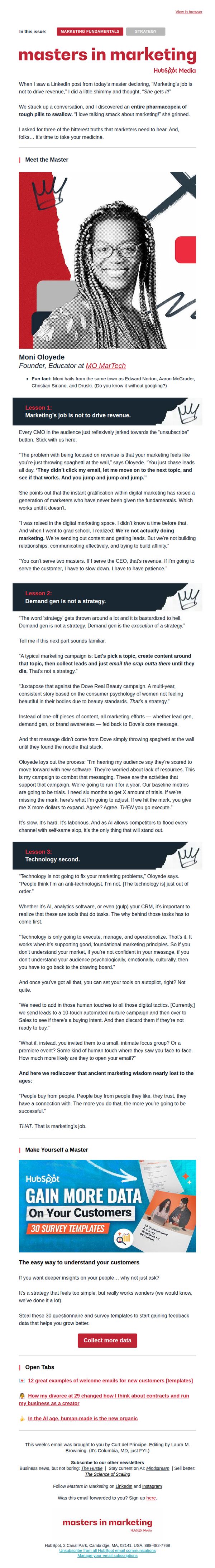
Objective
This email aims to challenge marketers’ conventional thinking by delivering three uncomfortable but essential truths about marketing strategy, while positioning HubSpot as a thought leader that prioritizes foundational principles over flashy tactics. It seeks to engage, provoke reflection, and ultimately drive traffic to HubSpot’s resources for deeper learning.
Why this works
The email masterfully uses provocative framing, calling marketing truths 'bitter pills', to immediately capture attention and position the content as valuable, even if uncomfortable, creating a psychological pull that encourages readers to lean in rather than scroll away.
How to implement
By featuring a real expert with personality and relatable background details, like her hometown ties to marketing legends, the email builds instant credibility and human connection, making abstract marketing concepts feel grounded, trustworthy, and worth listening to.
Pro Tip
The CTA 'Collect more data' is too generic and doesn’t reflect the email’s bold, provocative tone, rewording it to something like 'Get the 30 templates that help you stop chasing leads and start building real customer relationships' would better align with the message and increase conversion intent. • The 'Open Tabs' section at the bottom feels disconnected from the main content and dilutes the campaign’s focus, replacing it with a micro-testimonial or a short quote from Moni Oloyede reinforcing one of the three lessons would strengthen message retention and authority.
9. Why lawyers buy so many billboards

Objective
This email aims to educate readers on the strategic and financial rationale behind lawyers’ heavy investment in billboard advertising, while subtly positioning HubSpot as a thought leader in marketing analytics and B2B insights by leveraging data-driven storytelling.
Why this works
The email masterfully blends humor and data to demystify a niche marketing behavior, lawyers buying billboards, making complex industry spending trends accessible and entertaining for a broad business audience.
How to implement
By spotlighting real-life attorney ad campaigns with quirky slogans and high-impact visuals, the email transforms dry statistics into memorable, emotionally resonant stories that stick with readers long after they’ve scrolled past.
Pro Tip
Add a subtle countdown timer or urgency cue near the CTA to encourage immediate sharing, especially since the email’s viral, curiosity-driven hook thrives on real-time engagement. • Integrate a mini interactive element, like a clickable map or toggle between years, in the 'Market Shares' section to boost engagement and reinforce the data visualization’s impact.
10. Our last email to you...
Objective
This email aims to re-engage inactive subscribers by gently acknowledging their lack of engagement, offering a graceful exit, and incentivizing them to stay by highlighting valuable free resources tailored for busy marketers.
Why this works
The email brilliantly reframes churn as a thoughtful gesture, using empathy to validate the subscriber’s inactivity rather than guilt-tripping them, which builds trust and leaves the door open for re-engagement.
How to implement
By offering a curated bundle of free, high-value resources specifically for ‘busy marketers,’ the campaign speaks directly to the recipient’s pain point, making the offer feel personalized and immediately useful without requiring a time commitment.
Pro Tip
Add a subtle countdown timer next to the 'unsubscribe in two days' notice to create urgency without pressure, encouraging immediate action from subscribers who may still be on the fence. • Include a single short testimonial or social proof snippet under the P.S. section, e.g., '92% of marketers who grabbed these resources said they saved 3+ hours this week', to reinforce credibility and value before the CTA.