Bite email campaign ideas that work
1. Don't miss the best prices of 2025.
Objective
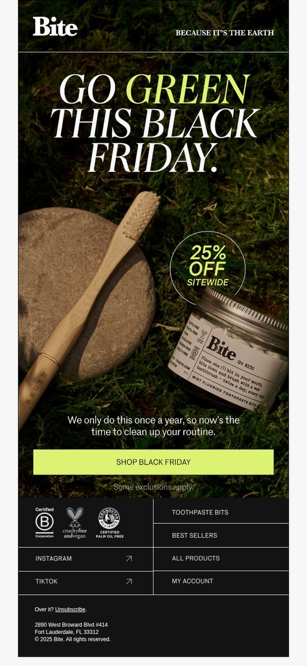
This email aims to drive urgency and conversion by promoting Bite’s annual Black Friday sale with a 25% sitewide discount, encouraging customers to refresh their oral care routines while aligning with the brand’s eco-conscious values.
Why this works
By anchoring the Black Friday promotion to an environmental mission, 'GO GREEN THIS BLACK FRIDAY', Bite transforms a sales event into a values-driven moment that resonates with eco-conscious shoppers without compromising conversion intent.
How to implement
The visual pairing of natural materials like bamboo and moss with the product creates an immediate sensory connection to sustainability, subtly reinforcing the brand’s earth-friendly promise while making the discount feel earned rather than opportunistic.
Pro Tip
Add a countdown timer near the CTA to heighten urgency, since the current design relies solely on text to convey limited-time value, a missed opportunity to visually reinforce scarcity in a high-impulse context like Black Friday. • Include a small testimonial or social proof snippet beneath the offer, such as 'Over 50,000 customers switched to Bite this year,' to reduce friction for new buyers who may need reassurance before acting on a discount.
2. Just so you know.
Objective
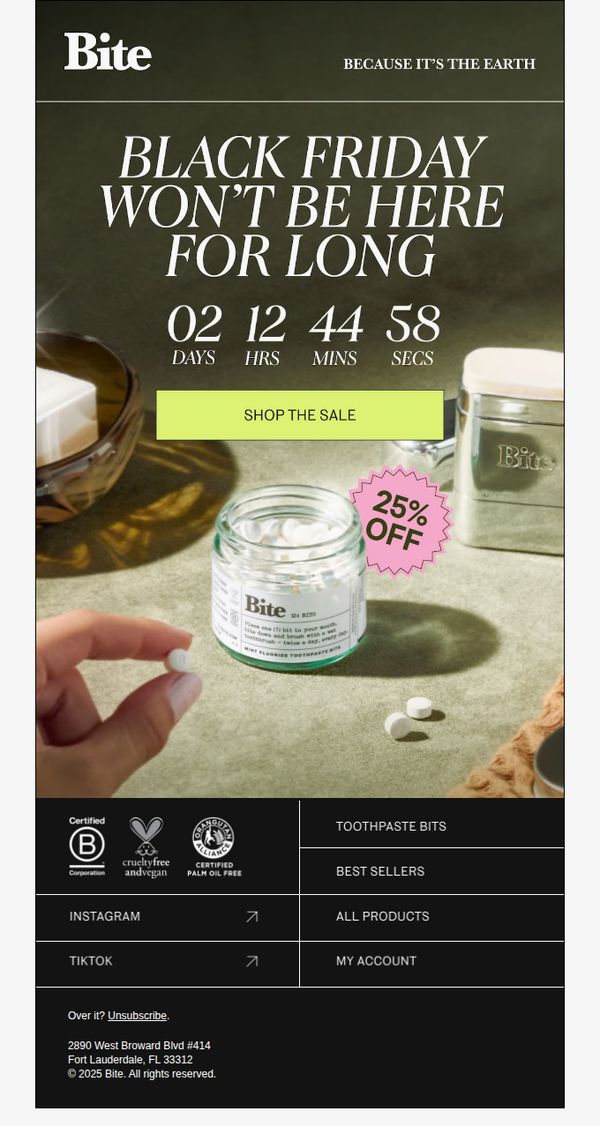
This email aims to create urgency around Bite’s Black Friday sale by highlighting its limited-time nature and encouraging immediate purchases through a prominent countdown and discount offer. It also reinforces brand values like sustainability and ethical sourcing to align with eco-conscious consumers.
Why this works
The email masterfully combines urgency with brand ethos by pairing a ticking Black Friday countdown with the tagline 'BECAUSE IT’S THE EARTH,' making the sale feel like a values-driven opportunity rather than just a discount event.
How to implement
Placing a bright, contrasting CTA button directly beneath the countdown timer creates an intuitive visual path that guides the eye from scarcity signal to action, reducing friction and increasing conversion likelihood for time-sensitive shoppers.
Pro Tip
Add a micro-copy line under the countdown timer clarifying what the timer is counting down to, e.g., 'Sale ends at midnight', to eliminate ambiguity and strengthen urgency for users who may not immediately infer the deadline. • Include a small visual indicator or icon next to the '25% OFF' badge showing whether the discount applies sitewide or only to select items, to prevent cart abandonment from mismatched expectations at checkout.
3. Play Favorites
Objective
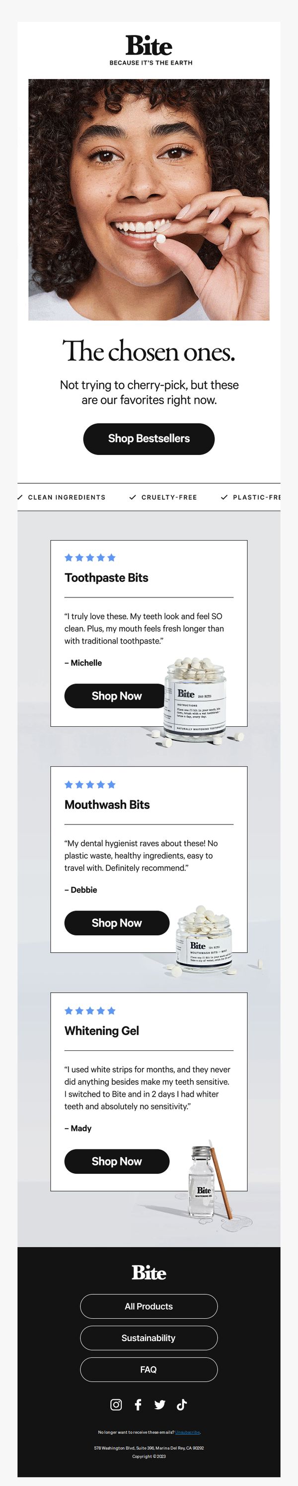
This email aims to drive engagement and conversions by showcasing Bite’s most-loved products through authentic customer testimonials, while reinforcing brand values like sustainability and clean ingredients to build trust and encourage purchases.
Why this works
By spotlighting real customer reviews alongside product visuals, Bite transforms social proof into a persuasive storytelling tool that builds credibility and reduces purchase hesitation for new customers.
How to implement
The clean, minimalist layout with bold typography and ample white space directs attention to key products and testimonials, making the email feel premium while ensuring effortless navigation and readability across devices.
Pro Tip
Add a subtle countdown timer or limited-availability indicator near the CTA to create urgency, especially since the email highlights 'favorites', implying scarcity or high demand, which could boost conversion rates. • Include a brief comparison or benefit summary (e.g., 'Why Bite Bits > Traditional Toothpaste') under each product testimonial to reinforce value proposition without forcing the reader to infer benefits from reviews alone.
4. Thinking of trying?
Objective
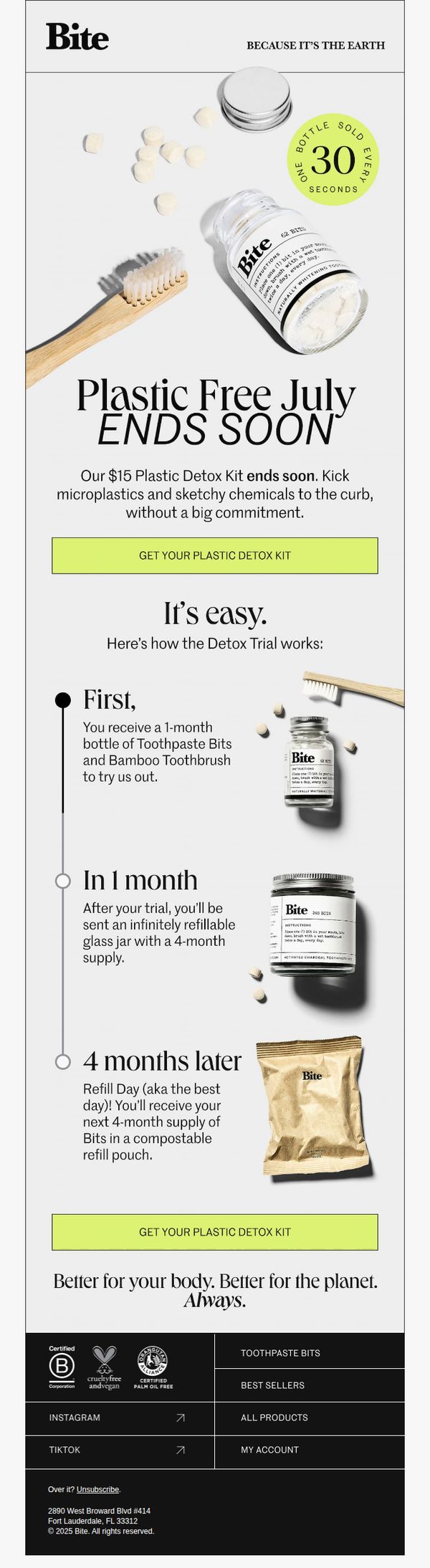
This email aims to convert curious prospects into first-time buyers by promoting a limited-time $15 Plastic Detox Kit trial, emphasizing ease of use, environmental benefits, and a low-commitment onboarding experience that transitions into a subscription.
Why this works
The email brilliantly frames the trial as a guilt-free 'detox' from plastic and chemicals, turning a simple product sample into an emotionally resonant environmental mission that appeals to conscious consumers without overwhelming them.
How to implement
By visually mapping the 4-month journey with clear milestones and product imagery, the email reduces perceived risk and builds anticipation, making the subscription feel like a natural, rewarding progression rather than a sales trap.
Pro Tip
Add a small countdown timer or 'X kits left' indicator near the hero headline to amplify urgency, since the 'ends soon' message lacks concrete scarcity cues that could nudge hesitant readers to act immediately. • Include a short testimonial or user stat (e.g., '92% of trial users continue after 4 months') in the education section to build social proof and reinforce the value of the transition from trial to subscription.
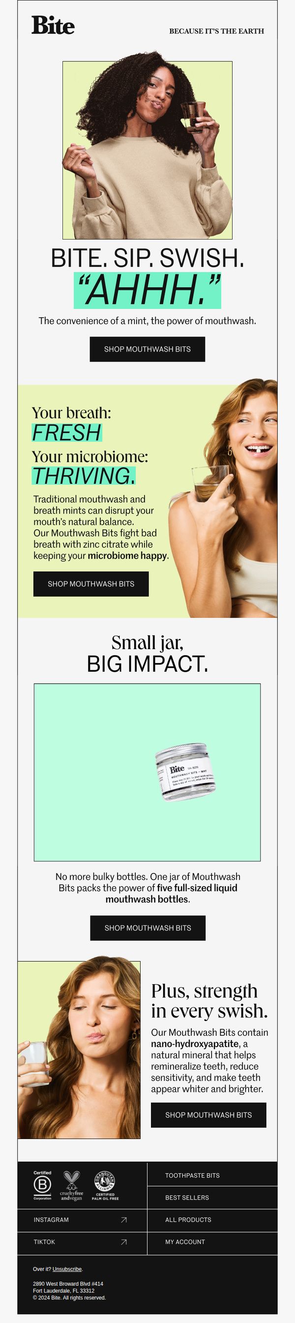
5. Rethink your rinse.
Objective
To reframe mouthwash as a convenient, eco-conscious, and microbiome-friendly experience by introducing Bite’s Mouthwash Bits, encouraging immediate purchase through clear benefits and repeated CTAs.
Why this works
The email brilliantly reframes a mundane oral care step into a sensory ritual with the tagline 'BITE. SIP. SWISH. “AHHH.”', turning functional use into an emotionally satisfying moment that invites curiosity and delight.
How to implement
By positioning the product as both eco-friendly and scientifically grounded, highlighting zinc citrate for breath and nano-hydroxyapatite for enamel, the email builds trust through dual appeals to environmental values and oral health expertise without sounding clinical.
Pro Tip
Add a subtle visual indicator, like a progress bar or checkmark, next to each benefit section to subtly guide the reader through the value stack, reinforcing that they’re moving toward a complete solution. • Include a micro-testimonial or user stat (e.g., '92% felt fresher within 30 seconds') near the first CTA to add social proof without disrupting the clean layout, increasing perceived credibility and urgency.
6. Game changer.
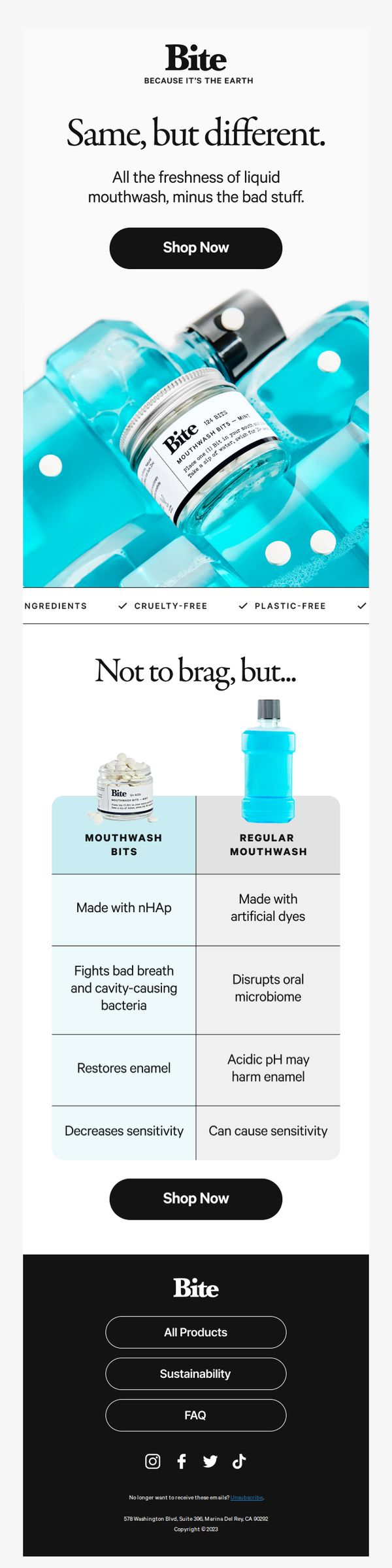
Objective
This email aims to position Bite’s Mouthwash Bits as a superior, eco-conscious alternative to traditional liquid mouthwash by highlighting its benefits and ethical credentials, encouraging immediate purchase through clear CTAs.
Why this works
The email brilliantly reframes a common product category by contrasting Bite’s mouthwash bits with traditional liquid mouthwash, turning a simple comparison into a compelling value proposition that speaks to both health and sustainability-conscious consumers.
How to implement
By using clean, minimalist visuals and a bold color palette, the email creates instant visual credibility, allowing the product’s eco-friendly benefits, cruelty-free, plastic-free, nHAp-infused, to stand out without overwhelming the reader with clutter or noise.
Pro Tip
Add a short testimonial or user rating near the comparison table to build social proof and reduce perceived risk for first-time buyers considering switching from traditional mouthwash. • Include a subtle urgency element, like a limited-time discount or low-stock indicator, near the second 'Shop Now' button to nudge hesitant readers toward immediate conversion.
7. Here's the deal.
Objective
To remind subscribers that Bite’s 25% off Black Friday sale is ending soon and encourage immediate purchase by highlighting that the discount is already applied to their cart, reducing friction to checkout.
Why this works
The email creates urgency without being pushy by stating the sale is 'almost over' while reassuring the reader that the discount is already applied, reducing decision fatigue and encouraging instant action.
How to implement
By framing the offer as 'best prices of the year' and linking to best sellers, the brand leverages social proof and perceived value to guide users toward high-converting products without overwhelming them with choices.
Pro Tip
Add a visual countdown timer near the CTA to reinforce urgency and create a stronger psychological trigger for immediate action, since the current text-only urgency may not be compelling enough for distracted readers. • Include a small hero image or product thumbnail of a top-selling item next to the CTA to provide visual context and increase click-through rates by anchoring the offer to a tangible product.
8. Wearing white after Labor Day?
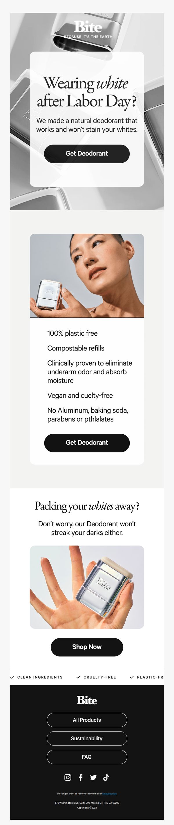
Objective
This email aims to drive conversions for Bite’s natural deodorant by reframing a seasonal fashion myth, wearing white after Labor Day, as a relatable, confidence-boosting moment for the modern consumer. It positions the product as the practical, eco-conscious solution to a common wardrobe concern.
Why this works
The email brilliantly hijacks a cultural fashion rule, wearing white after Labor Day, to create instant relatability, then pivots to position the deodorant as the unsung hero that lets customers break norms without worry, turning a style concern into a product benefit.
How to implement
By visually and textually reinforcing that the deodorant won’t stain whites or darks, the campaign eliminates a key purchase barrier with humor and clarity, making the product feel indispensable for everyday life rather than just another eco-friendly option.
Pro Tip
Add a subtle countdown timer or limited-edition badge near the CTA to create urgency, since the Labor Day hook implies a time-sensitive cultural moment that could be leveraged more aggressively to boost immediate conversions. • Include a micro-testimonial or user stat (e.g., '92% of users say it never stained their clothes') near the product benefits to reinforce social proof and reduce skepticism around the 'won’t stain' claim, which is central to the campaign’s appeal.
9. Big news.
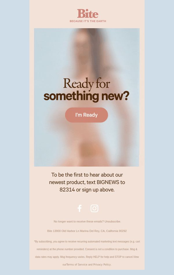
Objective
This email aims to build anticipation and collect early opt-ins for Bite’s upcoming product launch by creating curiosity through a teaser message and offering exclusive access to subscribers. It leverages FOMO and direct SMS sign-up to grow a warm, engaged audience ahead of the reveal.
Why this works
The email brilliantly uses mystery and minimalism to spark curiosity, by asking 'Ready for something new?' without revealing details, it turns the audience into eager participants rather than passive recipients, which boosts engagement and opt-in rates.
How to implement
Including a dual-channel opt-in (web and SMS) with a clear, branded keyword (BIGNEWS) makes it effortless for users to choose their preferred communication method while also expanding the brand’s permission-based marketing reach across platforms with minimal friction.
Pro Tip
Add a subtle visual cue or micro-animation near the 'I'm Ready' button to draw attention, the current static design risks blending into the background, especially on mobile, which could reduce click-through rates despite strong copy. • Include a brief teaser line under the CTA (e.g., 'First 500 sign-ups get early access + a free sample') to strengthen the incentive and reduce ambiguity, this would convert curiosity into concrete action without spoiling the surprise.
10. Think your mouth is clean? Not yet.
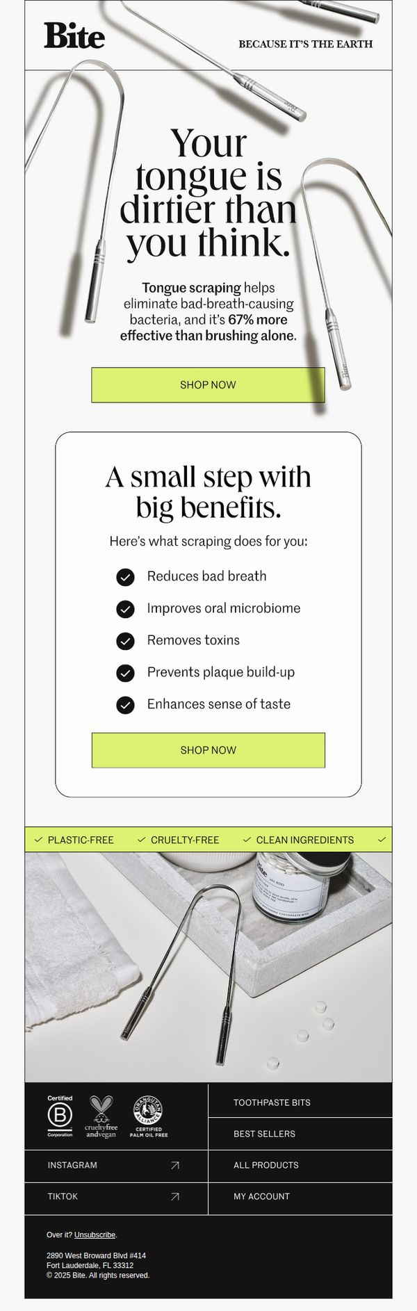
Objective
This email aims to educate recipients about the hidden dirtiness of their tongue and persuade them to adopt tongue scraping as a daily oral hygiene habit by highlighting its superior effectiveness over brushing alone. It drives immediate action through dual CTAs that lead to product purchase.
Why this works
The email opens with a provocative, curiosity-driven headline that immediately challenges the reader’s assumptions about oral hygiene, creating an emotional hook strong enough to stop the scroll and invite deeper engagement with the message.
How to implement
By quantifying the benefit, '67% more effective than brushing alone', the campaign transforms a vague wellness claim into a concrete, science-backed advantage that builds credibility and justifies the behavior change it’s asking for.
Pro Tip
Add a subtle countdown timer or limited-time offer badge near the CTA to create urgency, since the current design lacks any temporal incentive that could nudge hesitant buyers toward immediate conversion. • Include a short customer testimonial or quote beneath the benefits list to humanize the claims, social proof would reinforce trust in the 67% efficacy stat and make the health benefits feel more relatable and real.