Chubbies email gallery from real brands


1. CHUBBSIE BUBBSIE
Objective
This email aims to reintroduce and drive sales for Chubbies’ signature 'Chubbie' loungewear by positioning it as the ultimate comfort uniform for seasonal downtime, while also promoting kid-sized versions and encouraging new subscriber signups through a giveaway incentive.
Why this works
Chubbies brilliantly frames its loungewear as a ‘battle uniform’ for couch-bound seasonal relaxation, turning comfort into a playful, aspirational identity that resonates emotionally with its audience’s desire to unwind without guilt.
How to implement
By featuring a real brand icon, Greg @geeeti, the email builds authenticity and community, making the product feel less like a transaction and more like joining a tribe of people who prioritize fun, comfort, and personality in their downtime wardrobe.
Pro Tip
The CTA 'SHOP THE COMF' is clever but ambiguous, consider adding a secondary, clearer CTA like 'Shop All Chubbies' beneath it to reduce friction for users unfamiliar with the brand’s slang, especially in the hero section where intent is highest. • The product grid lacks consistent visual hierarchy, some items have descriptive labels while others don’t, and the layout feels cluttered. Standardizing image size, adding brief benefit-driven captions, and using a 2x2 grid would improve scannability and reduce decision fatigue.
2. Early. Exclusive. One-Of-A-Kind. New. Fresh. Arrivals.
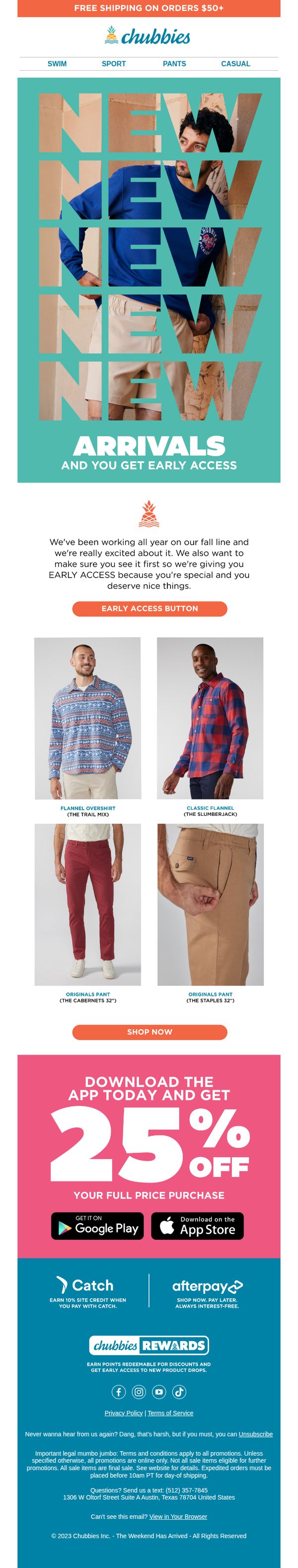
Objective
This email aims to drive immediate engagement and sales by offering subscribers early access to Chubbies’ new fall collection, while simultaneously incentivizing app downloads with a 25% discount to boost mobile conversion and loyalty program sign-ups.
Why this works
The email brilliantly leverages exclusivity by framing early access as a reward for loyal subscribers, making them feel valued and creating urgency without resorting to generic sales language or pressure tactics.
How to implement
By visually stacking the word 'NEW' in bold typography over lifestyle imagery, the campaign instantly communicates freshness and excitement, aligning product visuals with emotional messaging to reinforce the launch’s significance.
Pro Tip
The 'EARLY ACCESS BUTTON' lacks visual hierarchy, it’s visually buried between text and product images; repositioning it directly under the hero section with a contrasting color would increase click-through rates. • The product grid lacks hover or tap indicators for mobile users, adding subtle visual cues like 'Tap to View' or animated borders would improve usability and reduce friction for first-time shoppers.
3. DOMINATE THE GREENS
Objective
This email aims to drive sales of Chubbies’ golf-themed apparel by positioning the collection as essential for embodying the confident, playful spirit of a 'Golf Club President,' while also promoting a seasonal Lederhosen offer to capture Oktoberfest shoppers.
Why this works
Chubbies brilliantly leans into humor and aspirational identity by framing their golf line not just as clothing, but as the uniform of a fictional 'Golf Club President,' making the purchase feel like stepping into a role rather than just buying apparel.
How to implement
The email smartly uses real-life scenarios, like casual golfing and post-round celebration, to show how the products fit into customers’ lifestyles, making the collection feel relevant, attainable, and fun rather than overly performance-driven or elite.
Pro Tip
Add a subtle countdown timer or limited-quantity indicator near the 'DOMINATE THE GREENS' CTA to create urgency, since the golf collection is tied to a seasonal lifestyle moment that benefits from FOMO-driven action. • Include a short customer testimonial or social proof snippet under the hero section, perhaps from someone who actually bought the gear for a golf outing, to bridge the gap between humor and real-world validation.
4. You flannel, I flannel
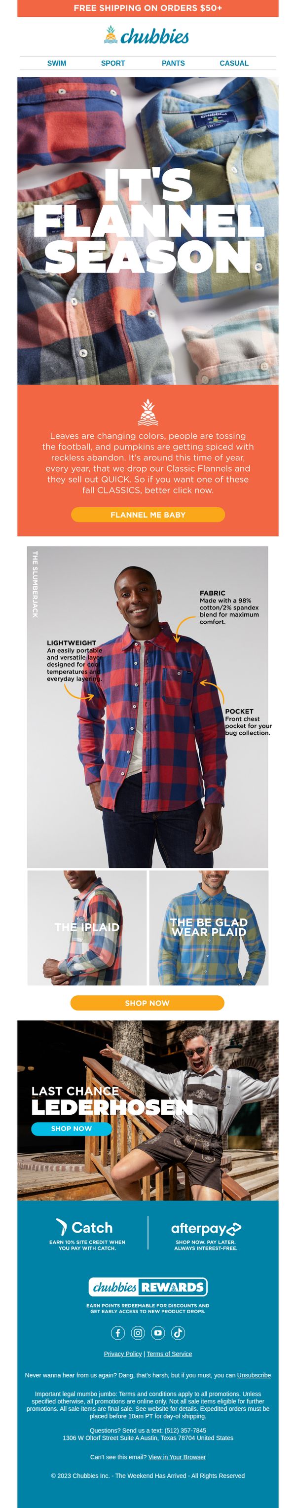
Objective
This email aims to drive immediate sales of Chubbies’ seasonal flannel shirts by creating urgency around limited-time availability while reinforcing the brand’s playful, fall-themed identity. It also subtly promotes cross-category interest with a Lederhosen offer to broaden engagement.
Why this works
The email brilliantly ties seasonal behavior, fall foliage, football, and pumpkin spice, to product urgency, making the flannel launch feel culturally timely and emotionally resonant rather than just promotional.
How to implement
By spotlighting specific product features like lightweight fabric and chest pockets with clean visual callouts, the email transforms a simple shirt into a lifestyle essential, helping shoppers justify the purchase with tangible benefits.
Pro Tip
Add a countdown timer or limited-quantity indicator under the 'FLANNEL ME BABY' CTA to amplify urgency and reduce hesitation, especially since the copy already implies scarcity. • Include a small customer testimonial or social proof near the product grid to validate the flannel’s comfort or popularity, this would strengthen trust and reduce perceived risk for first-time buyers.
5. CHUBBSIE BUBBSIE
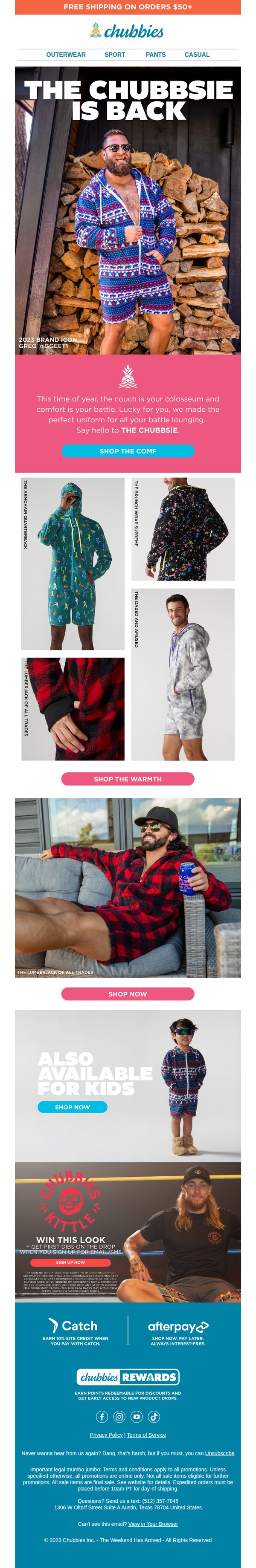
Objective
This email aims to reintroduce and drive sales for Chubbies’ signature 'Chubbie' loungewear by positioning it as the ultimate comfort uniform for seasonal downtime, while also promoting kid-sized versions and loyalty incentives to expand customer reach and lifetime value.
Why this works
Chubbies brilliantly frames its loungewear as a ‘battle uniform’ for couch-bound comfort, turning a casual product into a playful, emotionally resonant lifestyle statement that speaks directly to its audience’s seasonal mindset.
How to implement
By featuring real brand ambassadors like Greg @GEEETI and showcasing multiple product variants with witty names, the email builds authenticity and visual variety without overwhelming the shopper, making exploration feel fun rather than forced.
Pro Tip
The CTA ‘SHOP THE COMF’ is clever but ambiguous, consider adding a secondary, clearer CTA like ‘See All Chubbies’ beneath it to reduce friction for first-time shoppers unsure what ‘COMF’ refers to. • The product grid lacks consistent visual hierarchy, some images are cropped tightly while others show full-body shots, which can confuse the eye; standardizing image framing would improve scannability and perceived professionalism.
6. GET YOUR AUTOGRAPH BOOKS READY
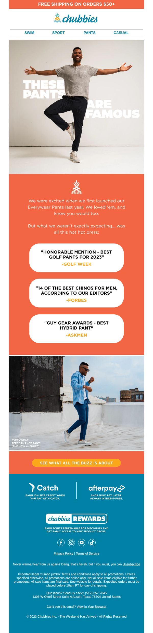
Objective
This email aims to build excitement around Chubbies’ Everwear Pants by highlighting their critical acclaim and popularity, encouraging recipients to explore the product and make a purchase. It leverages social proof and media recognition to validate quality and drive traffic to the product page.
Why this works
Chubbies brilliantly turns third-party accolades into social proof by featuring quotes from Golf Week, Forbes, and AskMen, transforming media praise into persuasive, trust-building ammunition that reassures shoppers they’re buying a culturally validated product.
How to implement
The email uses a playful, personality-driven tone, like 'GET YOUR AUTOGRAPH BOOKS READY', to position the pants as celebrity-worthy, making the product feel aspirational while staying true to the brand’s fun, irreverent voice that resonates with its audience.
Pro Tip
Add a visual product grid or carousel beneath the testimonials to showcase different colorways or styles of the Everwear Pants, this would reduce the need for users to click through and increase immediate visual engagement with the product. • Include a subtle countdown timer or limited-availability message near the CTA to create urgency, since the email references 'hot hot press,' leveraging scarcity would align with the hype and motivate faster action.
7. Rule The Orchards / Pumpkin Patch / Beer Garden / Tailgate
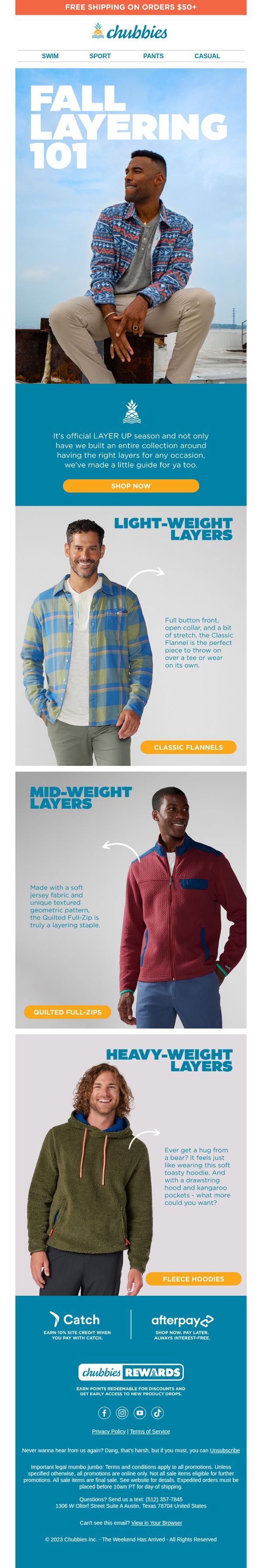
Objective
This email aims to drive fall apparel sales by educating customers on how to layer outfits for seasonal activities like tailgating and pumpkin patches, while promoting a curated collection that simplifies styling decisions. It blends lifestyle inspiration with product education to convert interest into purchases.
Why this works
Chubbies brilliantly ties seasonal activities like tailgating and orchard visits to specific product categories, making the email feel personally relevant while subtly guiding shoppers toward context-appropriate layering solutions.
How to implement
By organizing products into weight-based categories, light, mid, and heavy, the brand transforms a potentially overwhelming shopping experience into an intuitive, educational journey that builds confidence in purchase decisions.
Pro Tip
Add a subtle countdown timer or seasonal urgency cue near the CTA to reinforce the limited-time nature of fall layering needs and encourage immediate action before weather shifts. • Include a mini visual guide or icon next to each layer category (light/mid/heavy) showing ideal temperature ranges or activity types to help customers self-select the right product faster.
8. The Weekender Presents: The 8 Types of People at Every 4th of July Cookout
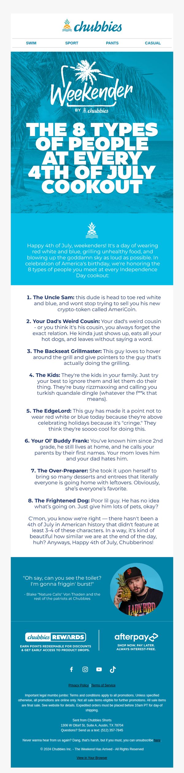
Objective
This email aims to entertain and engage subscribers by humorously categorizing common cookout personalities, while subtly reinforcing Chubbies’ brand identity as fun, relatable, and perfect for casual summer gatherings. It also drives brand loyalty through community-building and rewards program promotion.
Why this works
The email brilliantly uses humor and cultural relevance to turn a holiday into a shared experience, making readers feel seen and entertained while keeping the brand voice playful and unmistakably Chubbies.
How to implement
By personifying common cookout archetypes, the campaign creates instant relatability and encourages social sharing, turning a simple email into a conversation starter that strengthens emotional connection to the brand.
Pro Tip
Add a visual product grid or hero image of Chubbies shorts styled for a 4th of July cookout to connect the humor directly to shoppable items, increasing conversion potential without breaking the tone. • Include a micro-interaction or poll (e.g., 'Which cookout type are you?') to boost engagement and collect user data, turning passive readers into active participants who feel personally invested in the brand.
9. Do you like pants?
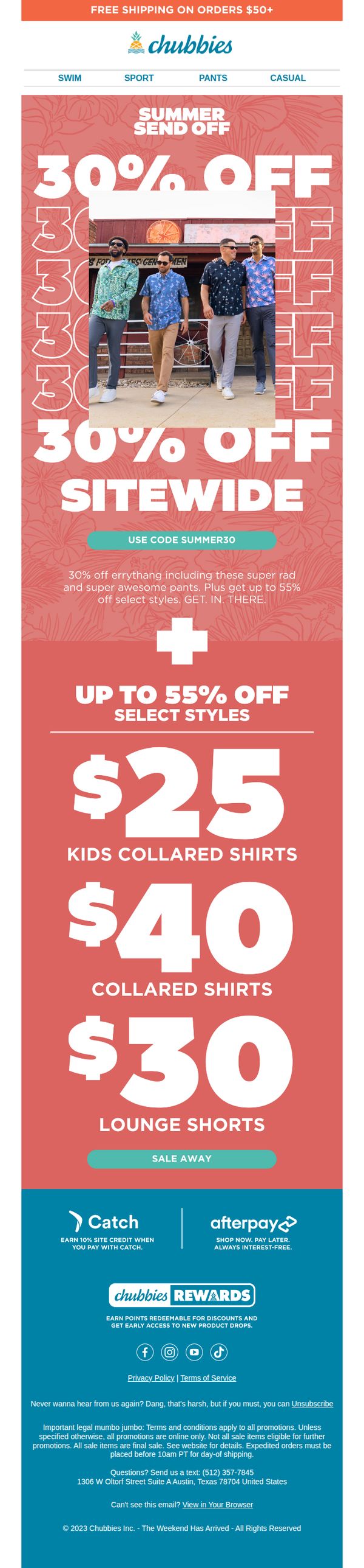
Objective
This email aims to drive immediate sales by promoting a limited-time summer sale with sitewide discounts and highlighted product deals, while reinforcing brand personality through playful copy and vibrant visuals.
Why this works
The email leverages bold, playful typography and a vibrant coral background to instantly communicate summer energy and urgency, making the discount feel like a fun event rather than a generic sale.
How to implement
By combining a sitewide discount with specific price points for key categories like collared shirts and lounge shorts, the campaign simplifies decision-making and creates multiple entry points for different customer segments.
Pro Tip
Add a countdown timer near the CTA to amplify urgency, since the 'Summer Send Off' implies a limited window, this would nudge hesitant shoppers to act before the sale ends. • Include a small testimonial or social proof snippet near the product grid (e.g., 'Over 10,000 pairs sold this week') to validate the 'super rad and super awesome pants' claim and reduce perceived risk.
10. You're gonna want to open this email.
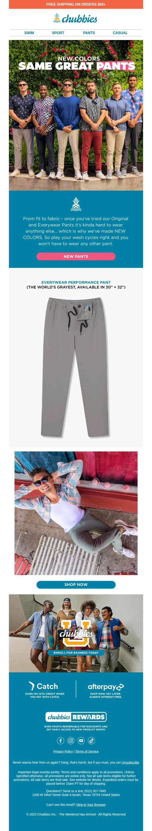
Objective
The email aims to drive immediate engagement and sales by teasing new pant colors while reinforcing brand loyalty through humor and social proof. It encourages recipients to explore the latest collection and take advantage of free shipping on qualifying orders.
Why this works
The email opens with a playful, curiosity-driven subject line that feels personal and urgent, making the recipient feel like they’re being let in on something exclusive, a tactic that boosts open rates without relying on discounts.
How to implement
By featuring a diverse group of real-looking models in relaxed, joyful settings, the brand builds emotional connection and social proof, subtly signaling that these pants are for everyone, not just a narrow fashion demographic.
Pro Tip
The hero section’s CTA 'NEW PANTS' is visually prominent but lacks urgency or benefit-driven language, consider testing variants like 'Grab New Colors Before They’re Gone' to better align with the FOMO tone of the subject line. • The product grid only shows one pant style, adding a small carousel or grid of 2–3 top-selling color variants would increase visual engagement and help users self-select without needing to click through.