Clinique - US email gallery from real brands
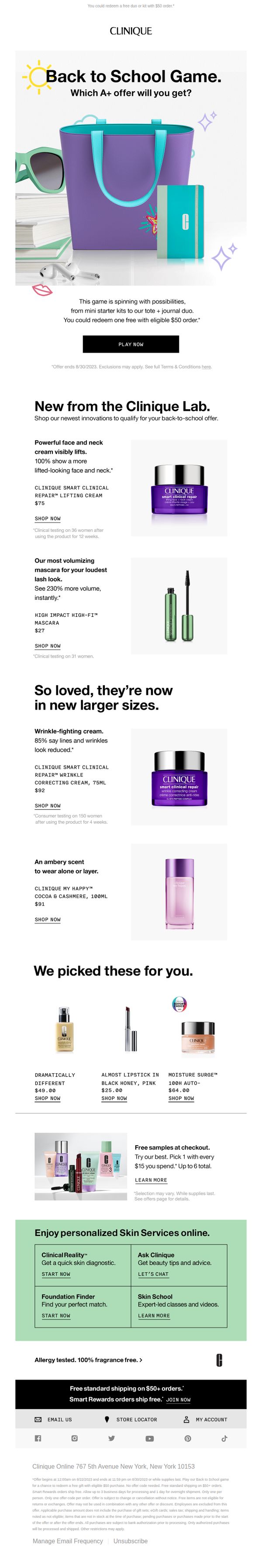
1. Don’t miss out! Spin to win an A+ offer.
Objective
This email aims to drive immediate engagement and sales by inviting subscribers to play a gamified 'Back to School Game' for a chance to win free products with a $50 purchase, while also showcasing new and popular products to encourage browsing and conversion.
Why this works
The gamified 'Back to School Game' creates instant curiosity and urgency by framing the offer as a fun, interactive experience rather than a static discount, which increases click-through rates and emotional investment in the brand.
How to implement
Strategically placing new product launches alongside customer favorites with clear clinical claims and pricing builds trust and reduces decision fatigue, making it easier for shoppers to justify adding items to cart during a promotional window.
Pro Tip
Add a visible countdown timer near the 'PLAY NOW' CTA to reinforce urgency, since the offer ends 8/30/2023, this would create psychological pressure to act immediately rather than defer. • Reposition the 'Free samples at checkout' offer higher in the email, perhaps right after the hero section, to leverage the excitement of the game and incentivize spending before users scroll to product grids.
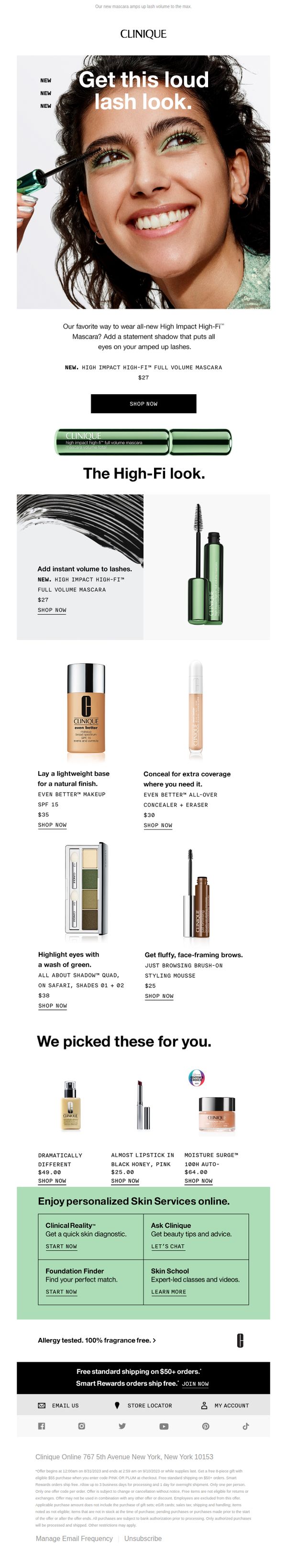
2. NEW. A loud lash look.
Objective
To introduce and drive immediate sales of Clinique’s new High Impact High-Fi™ Full Volume Mascara by showcasing its dramatic lash-enhancing effect and pairing it with complementary products for a complete ‘High-Fi’ makeup look.
Why this works
The email brilliantly anchors the entire campaign around a single, emotionally resonant visual, a radiant model with bold lashes, which instantly communicates the product’s transformative power without needing excessive text.
How to implement
By strategically pairing the new mascara with complementary products like green eyeshadow and concealer, the email creates a compelling ‘complete look’ narrative that encourages bundle purchases while subtly educating customers on product synergy.
Pro Tip
Add a subtle countdown timer or limited-availability indicator near the hero CTA to create urgency around the new mascara launch, which could boost conversion rates by leveraging scarcity psychology. • Include a short customer testimonial or social proof snippet under the hero image, even just one sentence, to reinforce trust and validate the ‘loud lash look’ claim with real-user endorsement.
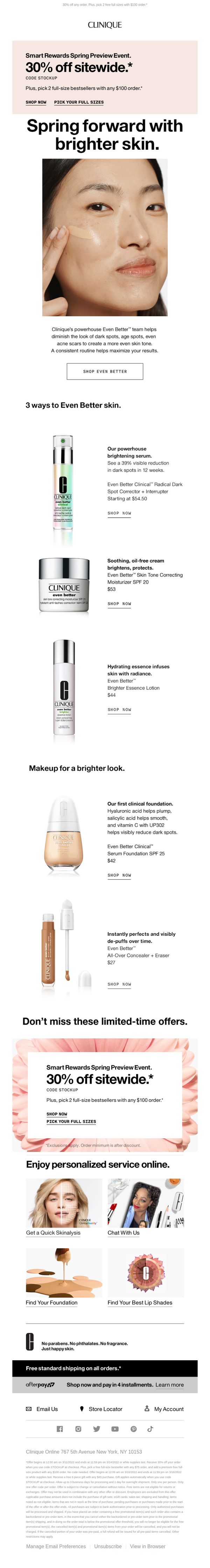
3. 3 ways to brighter skin. 30% off.
Objective
This email aims to drive immediate sales by promoting Clinique’s spring preview event with a 30% sitewide discount while highlighting the Even Better skincare line’s efficacy for brighter, more even skin. It also encourages product discovery through personalized service tools and cross-selling with makeup items.
Why this works
The email brilliantly ties product education to emotional benefit by framing each Even Better product around a specific skin concern, dark spots, texture, radiance, making the science feel personal and results-driven rather than clinical.
How to implement
By repeating the 30% off offer twice with identical copy and visual treatment, Clinique reinforces urgency without overwhelming the reader, ensuring the discount remains top-of-mind even as the user scrolls through product details.
Pro Tip
The CTA ‘SHOP NOW’ appears repeatedly but lacks visual hierarchy, consider varying button styling or placement to guide users toward high-margin or new products first, rather than treating all CTAs as equal. • The ‘Makeup for a brighter look’ section feels disconnected from the core skincare message; reframe it as a complementary routine (e.g., ‘Complete Your Brightening Regimen’) to strengthen narrative flow and cross-sell relevance.
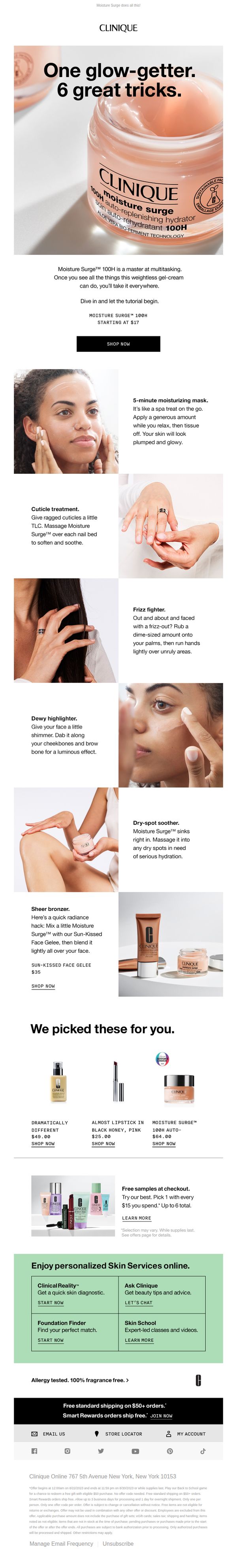
4. One glow-getter, 6 tricks 🤯
Objective
To showcase the versatility of Clinique’s Moisture Surge™ 100H by demonstrating six unexpected, multi-use beauty hacks that encourage purchase through practical, lifestyle-driven value. The goal is to position the product as an essential multitasker that justifies its price point through everyday utility.
Why this works
By framing a single product as a multitasking hero with six distinct beauty hacks, Clinique transforms a basic moisturizer into a must-have lifestyle tool, making the value proposition feel personal and indispensable rather than transactional.
How to implement
The email strategically uses lifestyle-focused visuals paired with concise, benefit-driven copy for each hack, like using the moisturizer as a cuticle treatment or frizz fighter, which builds emotional resonance and encourages experimentation beyond the face.
Pro Tip
Add a visual countdown timer or urgency indicator near the 'Starting at $17' price point to create scarcity and nudge immediate action, especially since the offer is time-bound and tied to a Back to School promotion. • Integrate a quick interactive element, such as a 'Which Hack Is Right for You?' quiz or toggle between hacks, to increase engagement and personalize the experience, making the multitasking message feel more tailored to individual needs.
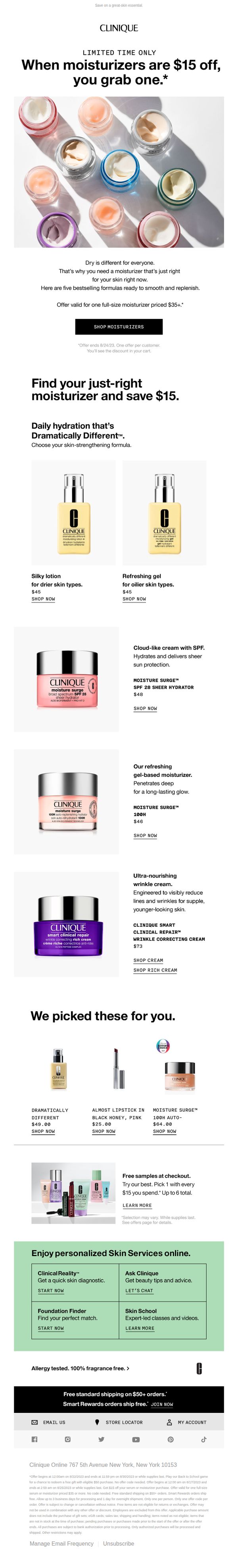
5. Get a stellar moisturizer. Take $15 off!
Objective
This email aims to drive immediate purchases of Clinique moisturizers by highlighting a limited-time $15 discount on full-size products priced $35+, while guiding customers to find their ideal formula based on skin type and concerns.
Why this works
The email brilliantly frames the discount as a personalized solution, not just a sale, by pairing each moisturizer with a specific skin type, making the offer feel tailored and urgent rather than generic.
How to implement
By showcasing five distinct moisturizers with clear benefits and pricing, the campaign reduces decision fatigue while subtly encouraging exploration, turning a simple discount into a discovery experience that builds brand trust.
Pro Tip
Add a countdown timer near the hero section to visually reinforce the urgency of the limited-time offer, which could increase conversion by creating real-time scarcity pressure. • Include a short customer testimonial or star rating next to each moisturizer in the product grid to build social proof and reduce perceived risk for first-time buyers.
6. Double cleanse for great skin 🤗
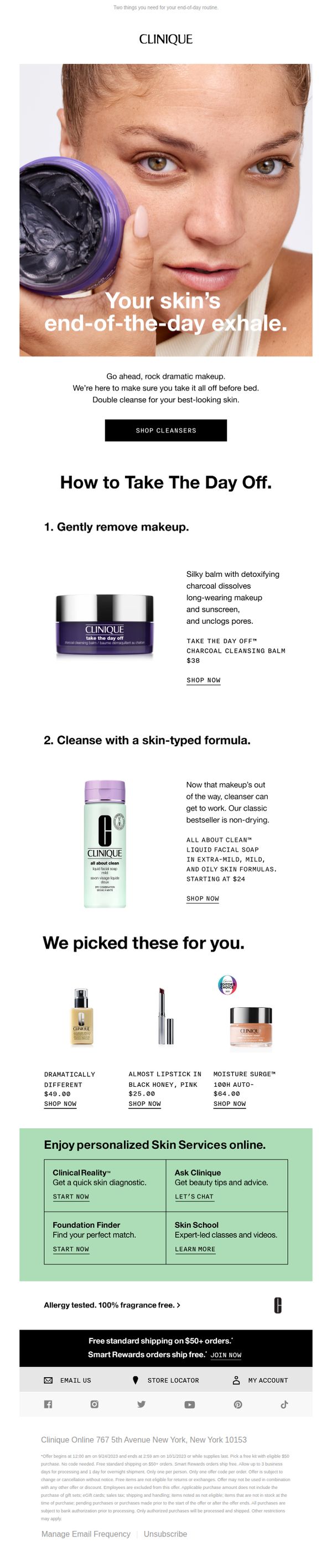
Objective
To encourage customers to adopt a double-cleansing skincare routine by showcasing Clinique’s targeted products and reinforcing the brand’s commitment to gentle, effective, fragrance-free formulas that support healthy skin at the end of the day.
Why this works
The email brilliantly reframes cleansing as a luxurious, necessary ritual rather than a chore by calling it 'Your skin’s end-of-the-day exhale,' which emotionally resonates with users seeking self-care after a long day.
How to implement
By breaking down the double cleanse into two clear, step-by-step product recommendations, first makeup removal, then skin-type-specific cleansing, the email educates while guiding purchase decisions without overwhelming the reader.
Pro Tip
Add a subtle countdown timer or urgency indicator near the 'SHOP CLEANSERS' CTA to nudge immediate action, especially since the offer ends on 10/1/2023 and this detail is buried in fine print at the bottom. • Reposition the cross-sell product grid ('We picked these for you') higher in the flow, perhaps after the second cleansing step, to capitalize on momentum when the user is already convinced of the routine’s value.
7. Get skin glowing and help support a great cause.
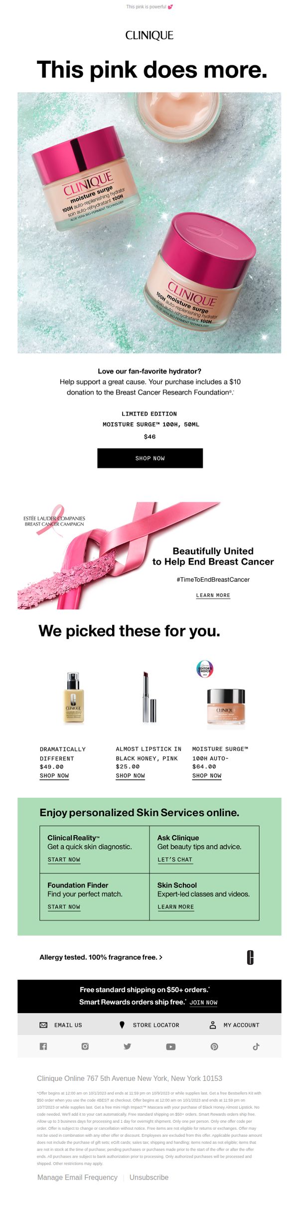
Objective
This email aims to drive sales of Clinique’s limited-edition Moisture Surge 100H hydrator while simultaneously promoting brand purpose by highlighting a $10 donation to the Breast Cancer Research Foundation with each purchase, blending product appeal with social impact.
Why this works
The email masterfully ties product desirability to social impact by positioning the pink Moisture Surge as both a beauty essential and a charitable act, making the purchase feel emotionally rewarding beyond its functional benefit.
How to implement
By featuring a limited-edition product with a clear donation incentive, the campaign creates urgency and purpose-driven motivation, encouraging immediate action while aligning with consumers’ values around breast cancer awareness.
Pro Tip
Add a visible countdown timer or stock indicator near the 'SHOP NOW' button to amplify urgency for the limited-edition product, since the current design lacks real-time scarcity cues that could boost conversion. • Reposition the 'We picked these for you' product grid higher or integrate it into the hero section to reduce scroll depth, ensuring cross-sell items are seen before users disengage, especially since the hero CTA is isolated above.
8. Super-concentrated. Supercharged. And 30% off.
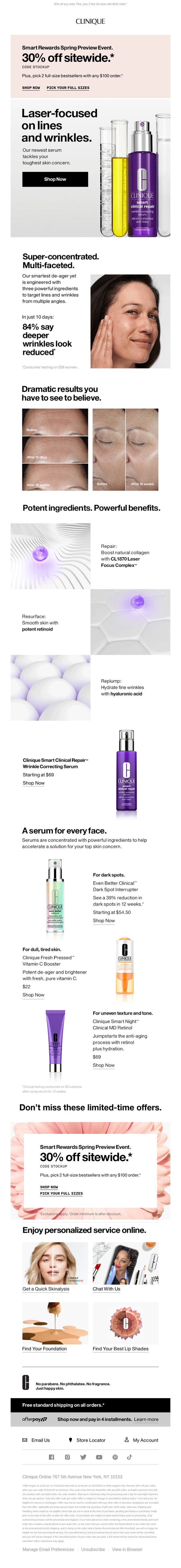
Objective
This email aims to drive immediate sales by promoting a limited-time 30% sitewide discount while spotlighting the new Smart Clinical Repair Serum as the hero product, encouraging customers to try high-impact anti-aging solutions with social proof and ingredient transparency.
Why this works
The email masterfully combines scientific credibility with emotional appeal by using clinical before-and-after visuals and consumer stat claims, making the serum’s anti-aging results feel both measurable and personally achievable for the reader.
How to implement
By repeating the 30% off offer in both the header and a dedicated banner with soft floral visuals, the campaign reinforces urgency without overwhelming the reader, creating a seamless bridge between promotion and product education that keeps the discount top-of-mind.
Pro Tip
Add a countdown timer beneath the 30% off banner to amplify urgency, since the offer’s end date (3/24/2022) is buried in fine print and not visually reinforced where the CTA lives. • Reposition the 'Shop Now' CTA button in the hero section to the right of the product image instead of below the headline, improving visual flow and reducing the scroll needed to reach the primary action.
9. ⏰ Last day to play! Win a back-to-school offer.
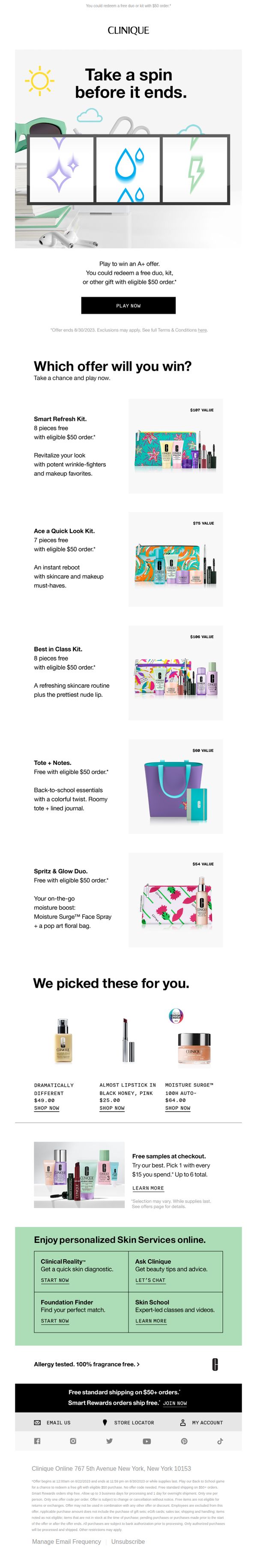
Objective
This email aims to drive immediate purchases by creating urgency around a back-to-school promotion where customers can spin to win free gifts with a $50 order, while also showcasing curated product picks and personalized skincare services to deepen engagement and conversion.
Why this works
The email brilliantly leverages gamification with a 'spin to win' mechanic that transforms a standard promotion into an interactive, fun experience, making the act of spending $50 feel like a rewarding game rather than a transaction.
How to implement
Each gift kit is presented with a clear value proposition, emotional hook, and visual appeal, like the 'Best in Class Kit' tied to school readiness, making it easy for shoppers to imagine the benefit and justify the purchase threshold.
Pro Tip
Add a visible countdown timer near the 'PLAY NOW' CTA to amplify urgency, since the offer ends at 11:59 PM on 8/30/2023, this would visually reinforce the 'last day' subject line and reduce hesitation. • Include a small testimonial or social proof snippet under the 'Which offer will you win?' section to build trust, e.g., '92% of players won a kit last week', to reduce perceived risk and encourage more spins.
10. Have you tried Moisture Surge? 💦
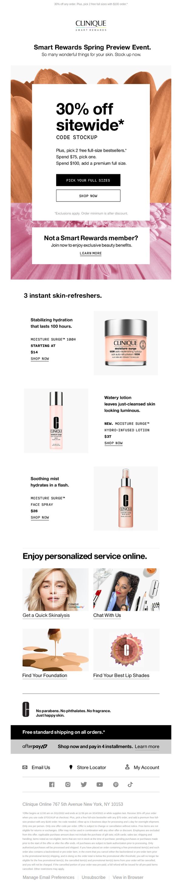
Objective
This email aims to drive immediate sales by promoting a limited-time 30% sitewide discount while encouraging new and existing customers to explore and purchase Clinique’s Moisture Surge line. It also seeks to grow the Smart Rewards membership by highlighting exclusive benefits.
Why this works
The email brilliantly anchors its promotion around a hero product line, Moisture Surge, by showcasing three distinct formats with clear benefits, pricing, and direct CTAs, making it easy for customers to choose and convert without decision fatigue.
How to implement
By layering a time-sensitive discount with a tiered free gift incentive (spend $75 or $100), the campaign creates urgency and perceived value, nudging customers to increase their cart size while feeling rewarded for their loyalty or first-time purchase.
Pro Tip
Add a countdown timer beneath the hero offer to visually reinforce urgency and scarcity, which would increase conversion pressure without altering the existing offer structure or copy. • Reposition the 'Not a Smart Rewards member?' section directly beneath the primary CTA to capture non-members at the moment of highest intent, rather than burying it below the hero image where it’s easily overlooked.