Condé Nast Traveller UK emails worth copying
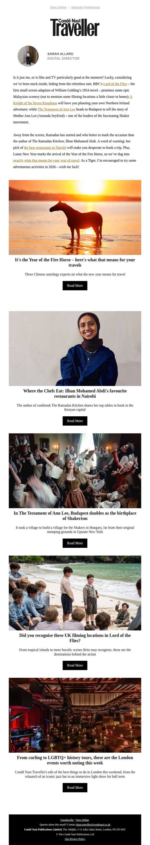
1. TV is so good right now – these are the locations I'm adding to my travel bucket list
Objective
To inspire readers to plan future travel by connecting popular TV and film locations with real-world destinations, leveraging cultural moments and expert recommendations to position Condé Nast Traveller as a trusted source for experiential travel inspiration.
Why this works
The email brilliantly taps into current pop culture by linking trending TV shows like 'Lord of the Flies' and 'The Testament of Ann Lee' to real travel destinations, making the content feel timely, relevant, and emotionally resonant for viewers who want to live out their screen fantasies.
How to implement
By featuring expert voices like Ilhan Mohamed Abdi and tying them to specific cities like Nairobi, the email builds authority and trust while offering curated, insider knowledge that transforms generic travel tips into personalized, actionable recommendations readers are more likely to act on.
Pro Tip
Add a subtle visual hierarchy to the 'Read More' buttons, perhaps varying size or color based on content priority, to guide readers toward the most compelling or highest-converting articles first, improving engagement flow without overwhelming the clean design. • Include a short, personalized subject line teaser in the preheader text (e.g., 'Your next trip? Inspired by the shows you’re bingeing') to reinforce the email’s hook and increase open-to-click conversion by aligning with the reader’s immediate emotional trigger.
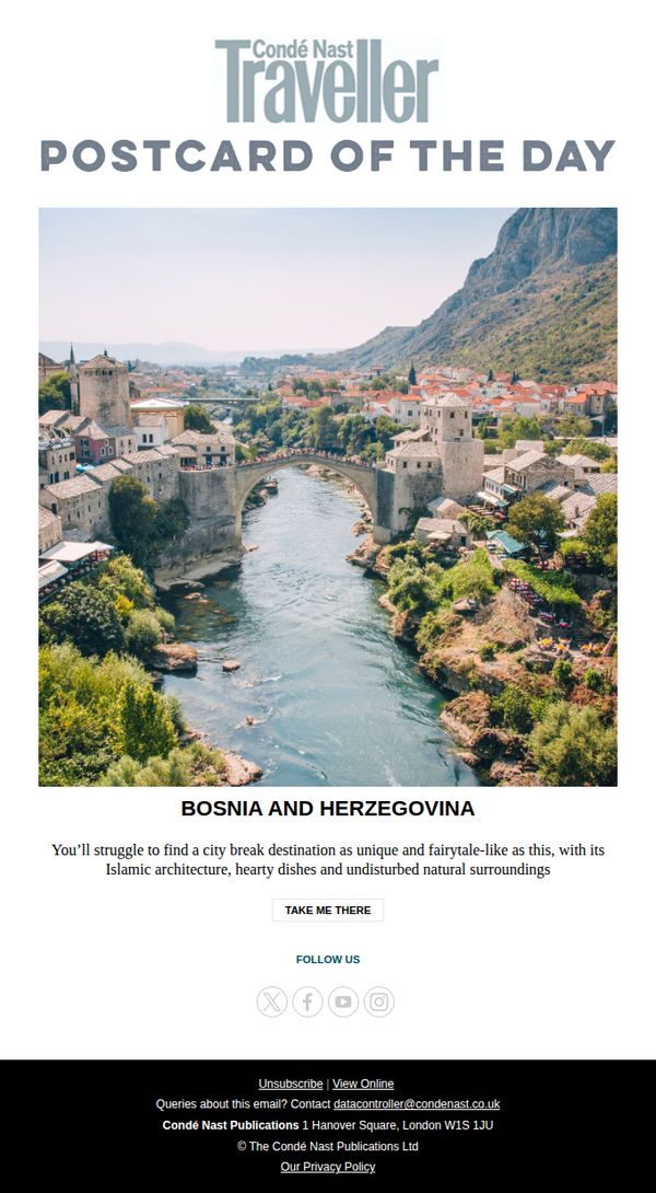
2. Is this the most magical city in Europe?
Objective
To inspire readers to explore Bosnia and Herzegovina by showcasing its unique, fairytale-like charm through a visually stunning postcard-style image and evocative description, encouraging immediate engagement via a clear call-to-action.
Why this works
The email masterfully uses a single breathtaking hero image paired with minimalist copy to evoke wanderlust, proving that sometimes less text and more visual storytelling create the strongest emotional pull for travel audiences.
How to implement
By framing Bosnia and Herzegovina as 'the most magical city in Europe' in the subject line and reinforcing it with descriptors like 'fairytale-like' and 'undisturbed natural surroundings,' the campaign taps into curiosity and escapism, key motivators for luxury and experiential travelers.
Pro Tip
Add a subtle countdown timer or limited-time offer tag near the CTA to create urgency, since the current design lacks any temporal incentive to act immediately despite the aspirational tone. • Include a micro-testimonial or quote from a traveler beneath the destination description to build social proof and credibility, which would strengthen persuasion without cluttering the clean layout.
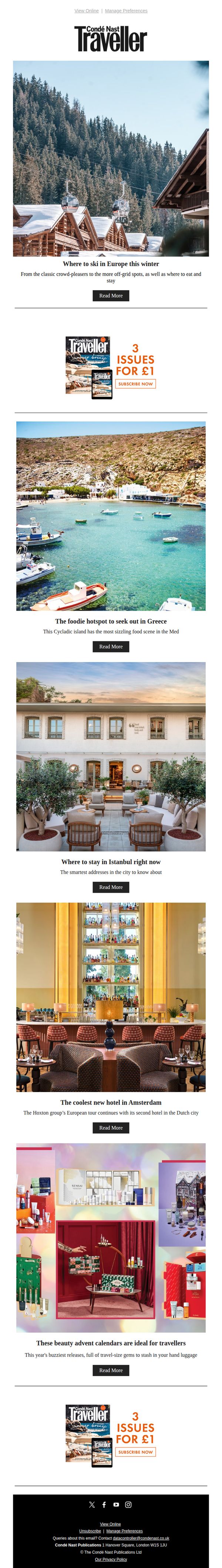
3. Where to ski in Europe this winter
Objective
This email aims to inspire winter travel by showcasing top European ski destinations while also promoting other seasonal travel content and magazine subscriptions. It seeks to engage readers with visually rich stories and drive clicks to deeper editorial content and subscription offers.
Why this works
The email opens with a high-impact hero image and headline that immediately taps into seasonal wanderlust, making the reader feel the crisp mountain air and the thrill of planning a ski trip before they even scroll further.
How to implement
By interspersing subscription offers between editorial content blocks, the campaign subtly monetizes reader interest without disrupting the storytelling flow, a smart balance between value and conversion that keeps the experience feel editorial-first.
Pro Tip
Add a subtle visual indicator (like a small icon or badge) next to the 'Read More' buttons to signal content type, e.g., 'Ski Guide', 'Hotel Review', 'Beauty Gift', helping readers prioritize based on interest and reducing bounce from mismatched expectations. • Reposition the subscription offer after the first two content blocks instead of immediately after the hero, this allows readers to build trust with the content first, making the subscription CTA feel like a natural next step rather than an early sales pitch.
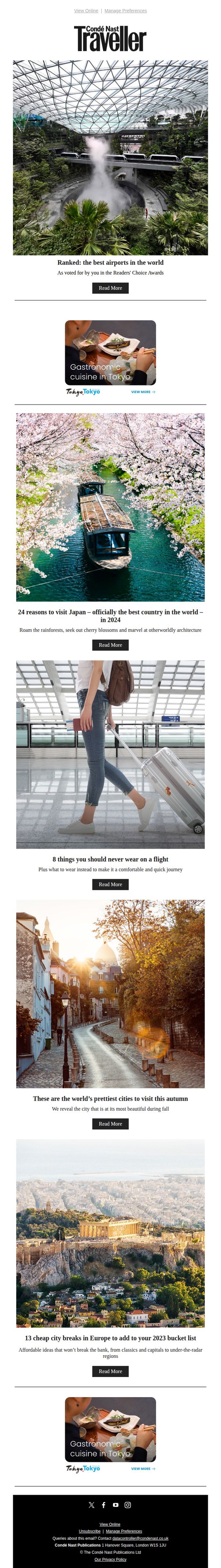
4. Ranked: the best airports in the world
Objective
To engage readers with curated travel content that inspires wanderlust and positions Condé Nast Traveller UK as a trusted authority on global destinations, while driving clicks to in-depth articles through compelling visuals and editorial headlines.
Why this works
The email leverages emotionally resonant imagery, like cherry blossoms over a canal or mist rising in a futuristic airport, to instantly transport the reader, making abstract travel concepts feel tangible and urgent.
How to implement
By anchoring content to timely, award-backed claims such as 'officially the best country in the world in 2024,' the campaign taps into social proof and FOMO, giving readers a reason to trust and act now.
Pro Tip
Add a subtle visual hierarchy to the CTA buttons, such as color variation or iconography, for top-performing stories (e.g., ‘Best Airports’) to guide attention based on editorial priority or user behavior data. • Include a micro-copy line beneath each headline indicating article length or reading time (e.g., ‘5-min read’) to reduce friction for skimmers and increase perceived value before clicking.