How eyewear brands do glasses email marketing
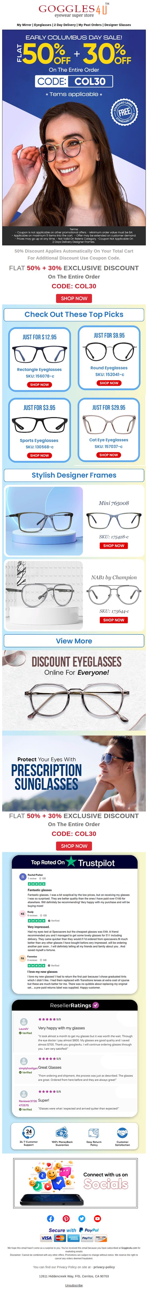
1. Goggles4u: ❤ Early Columbus Day Sale Starts NOW.
Objective
This email aims to drive immediate sales by promoting an early Columbus Day discount event with a layered discount structure, while also building trust through social proof and customer reviews to reduce purchase hesitation.
Why this works
The email brilliantly layers discounts, 50% off automatically plus 30% with a code, to create a perception of exclusivity and urgency, making the offer feel more valuable than a single flat discount while encouraging immediate action.
How to implement
By featuring real customer reviews from Trustpilot and ResellerRatings with star ratings and personal stories, the campaign builds authentic social proof that directly addresses price-quality skepticism, which is critical for a value-driven eyewear brand.
Pro Tip
Add a countdown timer near the hero section to reinforce urgency, since the 'Early Columbus Day Sale' implies time sensitivity but currently lacks a visual cue to prompt immediate action. • Include a small icon or badge next to the 'FREE STANDARD LENSES' seal indicating it’s a limited-time perk, to elevate perceived value and prevent it from being overlooked as a standard feature.
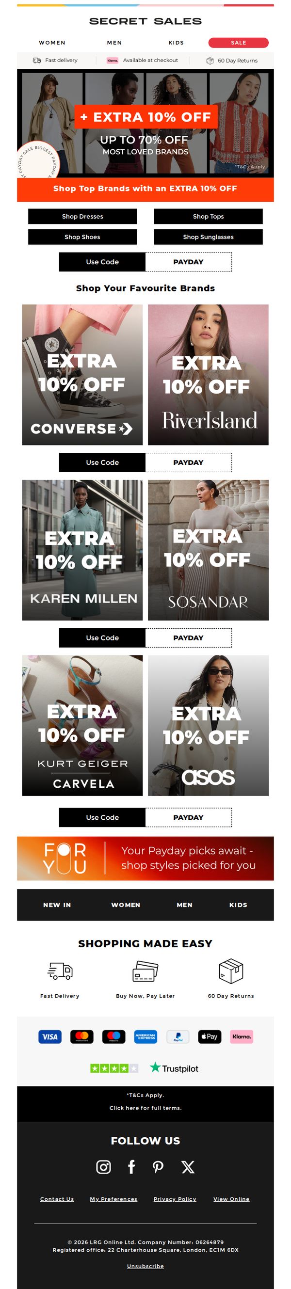
2. Secret Sales - UK: The Federico edit: up to 70% off Boohoo, Asos River Island & more
Objective
This email aims to drive immediate sales by highlighting a limited-time discount event featuring major fashion brands, while encouraging users to redeem an extra 10% off through a Payday promotion to increase conversion urgency.
Why this works
The email brilliantly leverages brand recognition by featuring household names like ASOS and Converse in bold, high-contrast tiles, instantly signaling value and trust to shoppers scanning for familiar labels during a sale event.
How to implement
By layering an extra 10% off on top of existing discounts, the campaign creates a psychological double-win for the customer, not just saving money, but feeling like they’ve unlocked a secret, exclusive deal that others might miss.
Pro Tip
Add a countdown timer in the hero section to amplify urgency, since the offer is time-sensitive, a visible clock would push hesitant shoppers to act before the extra 10% discount expires. • Include a short testimonial or social proof snippet near the brand grid (e.g., 'Over 50,000 shoppers used this code last week') to reduce perceived risk and reinforce the popularity of the deal.
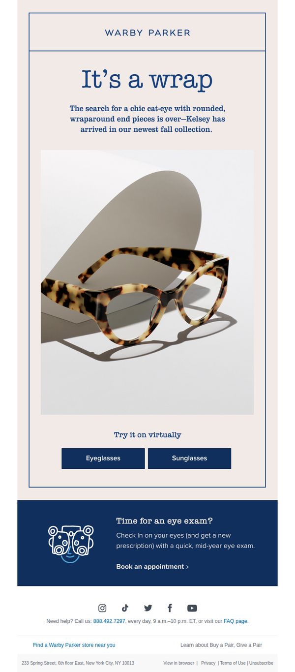
3. Warby Parker: Cat-eye *and* wraparound?
Objective
To introduce and drive interest in Warby Parker’s new Kelsey frame by highlighting its unique cat-eye and wraparound design, while encouraging virtual try-ons and promoting eye exam bookings to support overall customer engagement and conversion.
Why this works
The email brilliantly merges product innovation with emotional appeal by framing the new Kelsey glasses as the solution to a long-standing style dilemma, combining cat-eye elegance with wraparound comfort in a way that feels both aspirational and attainable for the modern shopper.
How to implement
By offering a virtual try-on option with clear, dual-category buttons for eyeglasses and sunglasses, the campaign removes friction from the discovery phase, making it effortless for users to visualize the product in their own lives without leaving the email.
Pro Tip
Add a subtle countdown or limited-edition badge near the hero image to create urgency around the new Kelsey frame, encouraging faster engagement from users who respond to scarcity cues. • Include a micro-testimonial or social proof snippet, like 'Loved by 10K+ customers', directly under the product image to reinforce credibility and reduce hesitation before virtual try-on.
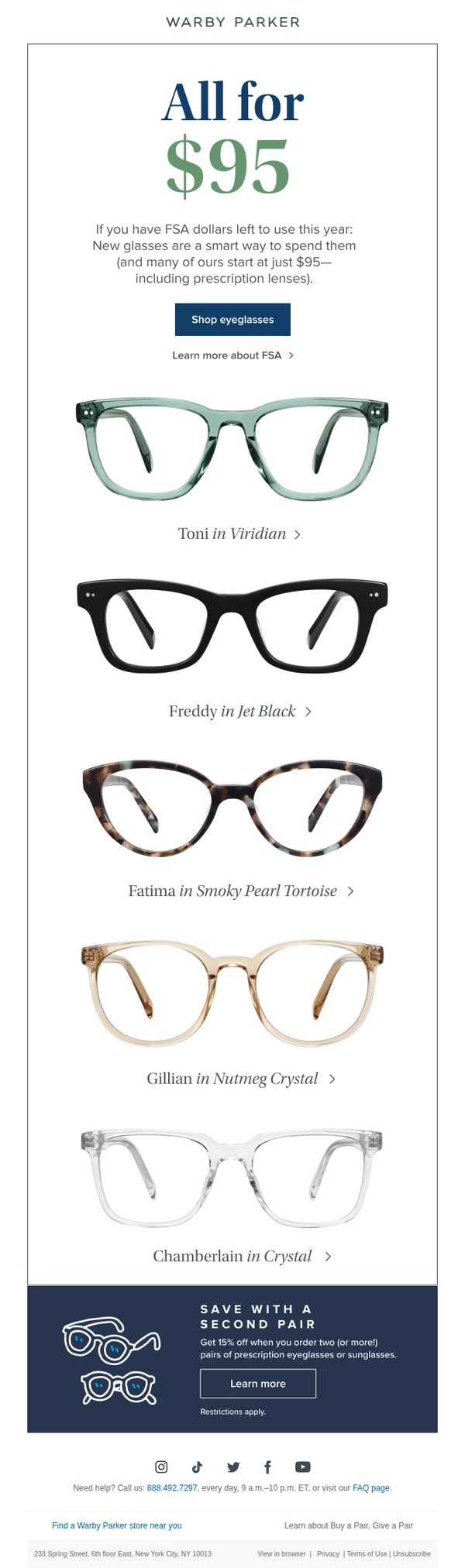
4. Warby Parker: $95 then, $95 now
Objective
This email aims to drive immediate purchases by reminding recipients they can use remaining FSA funds to buy affordable prescription eyewear starting at $95, while also promoting a secondary purchase discount to increase order value.
Why this works
The email brilliantly ties a time-sensitive financial incentive (FSA dollars) to a tangible product benefit, making the purchase feel urgent and financially smart rather than just another retail offer.
How to implement
By showcasing five distinct frames with clear names and color variants, the email reduces decision fatigue while still offering variety, helping customers visualize themselves in different styles without overwhelming them.
Pro Tip
Add a subtle countdown timer or FSA deadline reminder near the hero section to heighten urgency, since FSA funds expire annually and many users forget the cutoff date. • Include a small icon or badge next to each frame indicating ‘FSA-eligible’ or ‘$95+’ to reinforce price transparency and reduce friction for users scanning quickly.
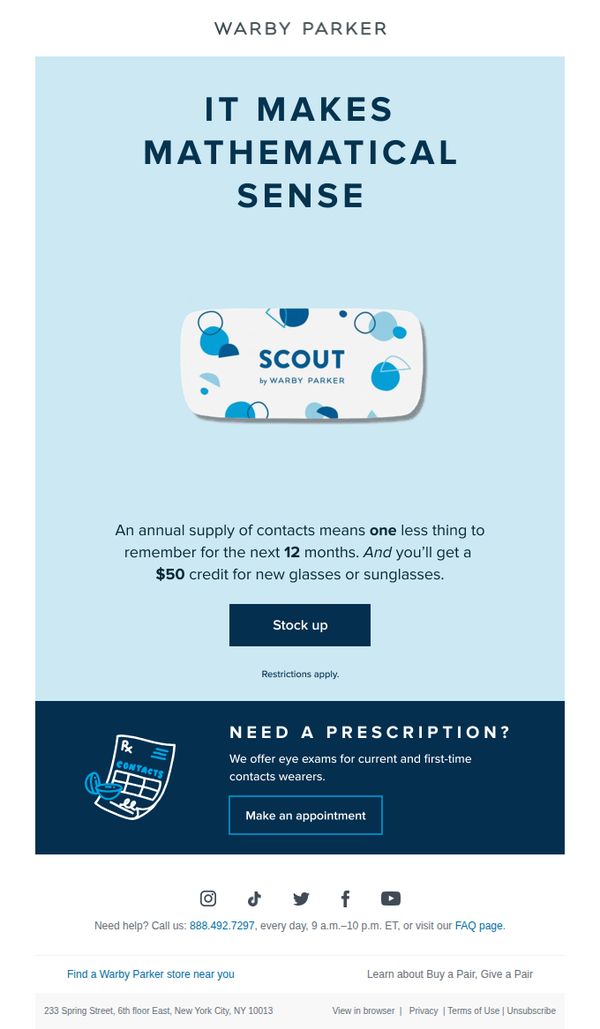
5. Warby Parker: The numbers don’t lie
Objective
This email aims to drive conversions for Warby Parker’s Scout contact lens subscription by emphasizing convenience and value, positioning it as a mathematically smart choice that reduces mental load while offering a $50 credit toward future eyewear purchases.
Why this works
Warby Parker brilliantly frames the contact lens subscription as a 'mathematical' decision, turning a routine purchase into a smart, rational choice that appeals to logic-driven consumers seeking simplicity and long-term value.
How to implement
The email leverages a compelling dual incentive, convenience of an annual supply plus a $50 credit, which transforms a functional product into a strategic lifestyle upgrade, making the offer feel both practical and rewarding.
Pro Tip
Add a subtle countdown timer or urgency indicator near the 'Stock up' CTA to nudge procrastinators, since the offer implies long-term value, a time-sensitive element could boost immediate conversion without undermining the 'mathematical sense' message. • Include a micro-testimonial or stat (e.g., '92% of subscribers say they never run out') near the offer to reinforce social proof and reduce perceived risk, especially for first-time contact lens buyers who may hesitate despite the credit incentive.
6. TIJN: Let the Joy Spin 🎠 Happy New Year of the Horse 🧧
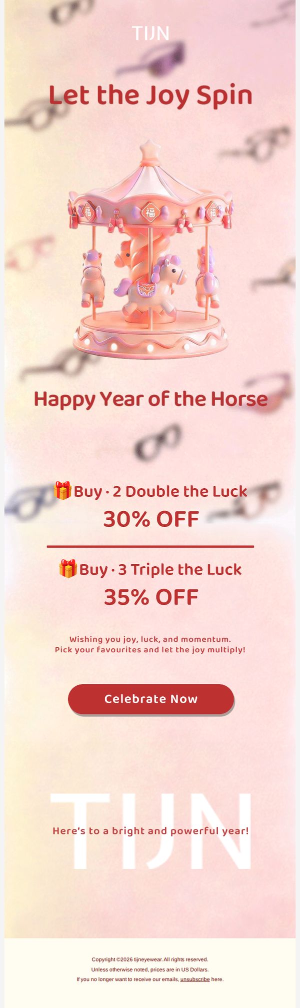
Objective
This email aims to drive immediate sales by tying a festive New Year promotion to the Year of the Horse, encouraging customers to buy multiple items for escalating discounts while evoking emotional joy and luck through thematic visuals and messaging.
Why this works
The email brilliantly merges cultural celebration with commerce by using the Year of the Horse as a narrative hook, making the discount feel like a festive ritual rather than a transactional offer, which deepens emotional resonance with the audience.
How to implement
By structuring discounts as 'Buy 2 Double the Luck' and 'Buy 3 Triple the Luck,' the campaign transforms quantity-based incentives into emotionally rewarding experiences, subtly encouraging higher cart values while reinforcing the theme of abundance and fortune.
Pro Tip
Add a subtle countdown timer near the CTA to create urgency around the limited-time offer, especially since the New Year theme implies temporal relevance, which could significantly boost conversion rates. • Include a small visual grid or carousel preview of 2–3 popular products eligible for the discount to reduce decision fatigue and guide users toward high-converting items without cluttering the layout.
7. Warby Parker: August at a glance
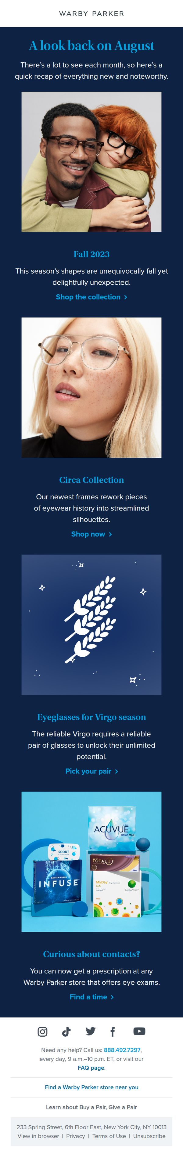
Objective
This email aims to recap August’s new product launches and seasonal collections while driving engagement through targeted CTAs that guide subscribers toward shopping the latest frames and exploring contact lens options. It also seeks to reinforce brand storytelling by connecting eyewear to personality and seasonal identity.
Why this works
The email brilliantly ties seasonal identity to product launches, framing eyewear not just as accessories but as expressions of personality and astrological alignment, making the shopping experience feel personal and culturally relevant.
How to implement
By blending lifestyle imagery with clear, benefit-driven copy, the campaign transforms product discovery into an emotional journey, encouraging subscribers to envision themselves in the frames rather than simply evaluating specs or prices.
Pro Tip
Add a subtle countdown timer or limited-time badge near the 'Fall 2023' and 'Circa Collection' CTAs to create urgency and nudge immediate action, especially since seasonal collections often have finite availability. • Include a short testimonial or social proof snippet under the 'Eyeglasses for Virgo season' section to validate the astrological positioning, for example, a quote like 'As a Virgo, I finally found frames that match my precision and style' to strengthen emotional resonance.
8. Warby Parker: We’re the eyewear whisperers
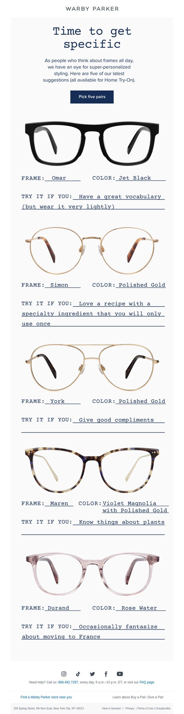
Objective
This email aims to drive engagement and conversions by encouraging recipients to explore and select five personalized eyewear frames through Warby Parker’s Home Try-On program, using playful, personality-driven recommendations to make the experience feel tailored and fun.
Why this works
Warby Parker turns product selection into a personality quiz by pairing each frame with a quirky, relatable lifestyle cue, making the decision feel less like shopping and more like self-discovery, which increases emotional engagement and reduces choice paralysis.
How to implement
The email leverages humor and specificity in its 'Try It If You' prompts to create memorable, shareable moments that resonate with the brand’s witty, approachable voice, turning a functional product grid into a delightful, scroll-stopping experience that feels uniquely Warby Parker.
Pro Tip
Add a subtle visual indicator or icon next to each frame’s 'TRY IT IF YOU' line to signal personality alignment, like a tiny emoji or badge, so users can quickly scan and emotionally connect with frames without reading every line. • Include a micro-testimonial or social proof snippet beneath the CTA button, such as '92% of customers found their perfect pair in their first 5 picks', to reduce hesitation and reinforce the value of the Home Try-On program.
9. BARNER: Last Chance 15% off
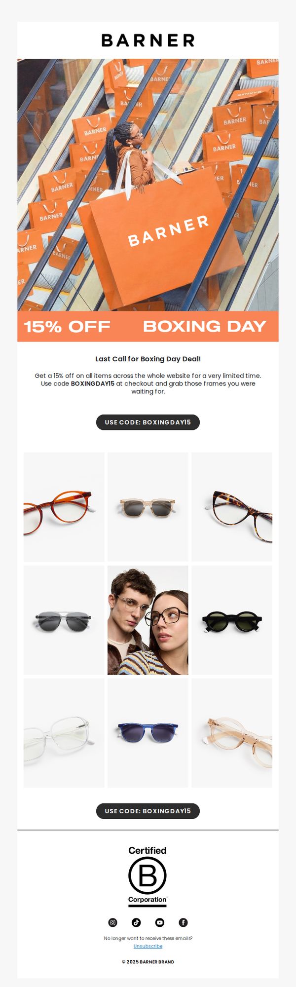
Objective
This email aims to drive immediate sales by creating urgency around a limited-time 15% discount for Boxing Day, encouraging subscribers to redeem the offer before it expires.
Why this works
The email leverages visual storytelling by featuring a shopper surrounded by branded bags on an escalator, subtly communicating abundance and excitement while reinforcing brand identity through consistent color and logo placement.
How to implement
By repeating the promo code twice, once near the offer copy and again beneath the product grid, the email reduces friction for users who may skim, ensuring the CTA remains top-of-mind without requiring scrolling back up.
Pro Tip
Add a visible countdown timer beneath the offer headline to amplify urgency, since 'limited time' is mentioned but not visually reinforced, which could reduce conversion pressure for hesitant shoppers. • Include a short testimonial or customer review snippet near the product grid to build social proof, especially since the email relies heavily on visual appeal but lacks third-party validation to support purchase confidence.
10. Warby Parker: We’re thinking big
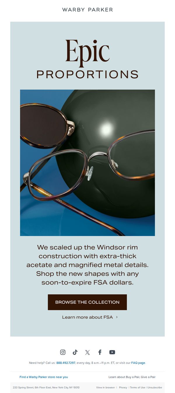
Objective
This email aims to drive urgency and excitement around a limited-time offer by highlighting a newly scaled-up eyewear collection while encouraging immediate action using soon-to-expire FSA dollars. It positions the product as both stylish and timely for end-of-year healthcare spending.
Why this works
The email brilliantly ties product innovation, scaling up the Windsor rim with premium materials, to a timely financial incentive, making the purchase feel both indulgent and practical for FSA users racing against the calendar year.
How to implement
By using bold, minimalist typography and a high-contrast product image against a calming background, the design instantly communicates luxury and clarity, allowing the product to command attention without visual clutter or competing messaging.
Pro Tip
Add a subtle countdown timer or 'FSA deadline: [date]' badge near the CTA to visually reinforce urgency and prevent users from delaying action, especially since FSA expiration is time-sensitive and often forgotten. • Include a micro-testimonial or social proof snippet, such as '92% of FSA users bought glasses before year-end', to validate the offer’s relevance and nudge hesitant shoppers by showing peer behavior.