Warby Parker email gallery from real brands

1. Accents from another era
Objective
To drive engagement and sales by showcasing the Circa Collection, vintage-inspired eyewear frames that reinterpret classic designs with modern silhouettes, while also encouraging in-store eye exams to support overall brand experience and conversion.
Why this works
The email brilliantly frames new products as a revival of heritage design, using phrases like 'With an eye to the archives' to evoke nostalgia while positioning the collection as fresh and modern, which deepens emotional connection without sacrificing contemporary appeal.
How to implement
By pairing each frame with its material and lens pairing, such as 'DANTE in Cacao Crystal with Riesling', the email transforms product specs into storytelling elements, making technical details feel luxurious and intentional rather than clinical or overwhelming.
Pro Tip
Add a subtle countdown timer or limited-edition badge near the 'Shop Circa Collection' CTA to create urgency and highlight exclusivity, since the vintage-inspired theme implies scarcity and time-sensitive appeal. • Integrate a short testimonial or customer quote near the product grid to reinforce social proof, especially since the collection is positioned as a curated revival, real user validation would strengthen perceived authenticity and desirability.
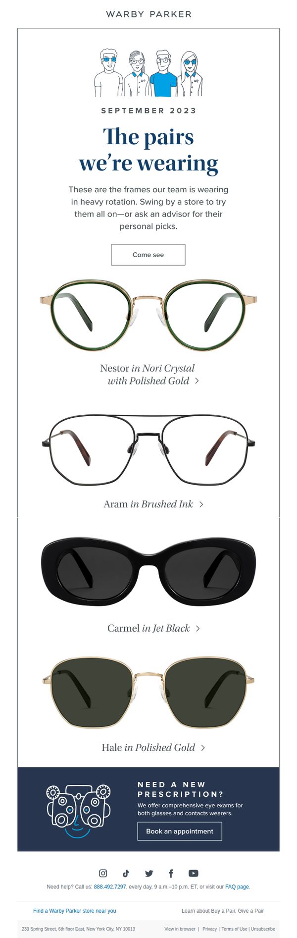
2. Preferential treatment
Objective
This email aims to drive in-store visits and personal engagement by showcasing the eyewear currently favored by Warby Parker’s own team, positioning them as trusted style guides while subtly encouraging readers to try frames in person or consult an advisor for tailored recommendations.
Why this works
By featuring the exact frames worn by their team, Warby Parker creates authentic social proof that feels personal and trustworthy, making readers more likely to believe these styles are genuinely loved and worth trying on themselves.
How to implement
The invitation to ‘ask an advisor for their personal picks’ transforms a product showcase into a consultative experience, subtly positioning the brand as helpful and human rather than transactional, which builds emotional connection and reduces purchase hesitation.
Pro Tip
Add a subtle visual indicator, like a small ‘Team Favorite’ badge or star icon, next to each frame name to reinforce social proof and help readers instantly recognize which styles are most popular internally. • Include a short testimonial quote or name from one team member next to their favorite frame to humanize the picks further and give readers a relatable voice behind each recommendation.
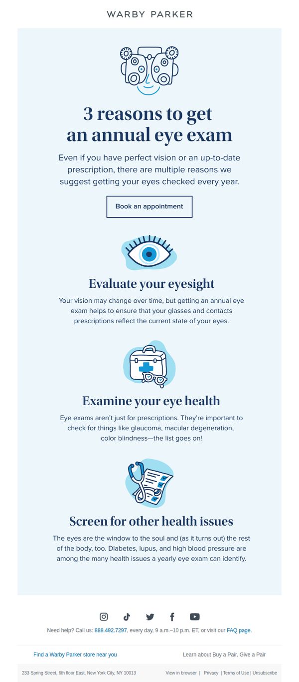
3. A once-a-year eye exam
Objective
This email aims to encourage recipients to schedule an annual eye exam by highlighting its health benefits beyond vision correction, positioning Warby Parker as a trusted partner in overall eye and systemic health.
Why this works
Warby Parker smartly reframes the annual eye exam not as a chore but as a vital health checkpoint, subtly aligning their brand with wellness and preventative care rather than just eyewear sales.
How to implement
By breaking down the value of eye exams into three digestible, benefit-driven sections with simple icons, the email reduces cognitive load and makes complex health information feel approachable and actionable.
Pro Tip
Add a subtle countdown or urgency cue near the CTA (e.g., 'Book by [date] for priority scheduling') to nudge procrastinators without compromising the educational tone. • Include a short testimonial or stat (e.g., '92% of patients discovered a health issue during their Warby Parker eye exam') to build social proof and reinforce the exam’s life-saving potential.
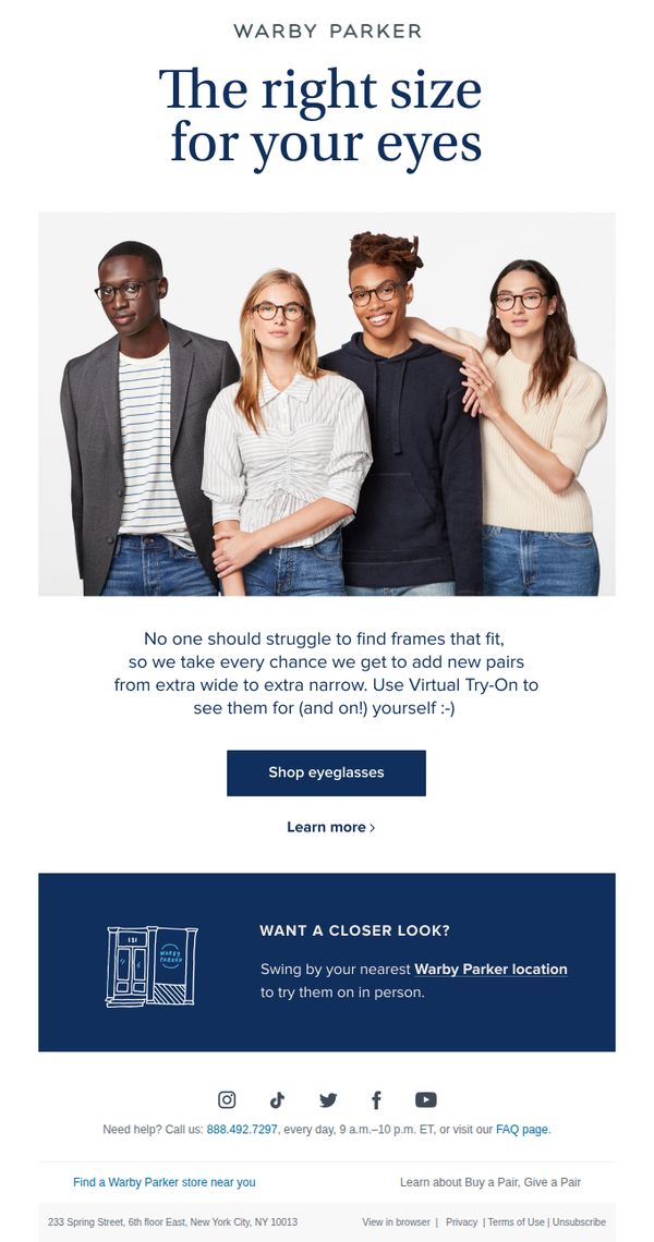
4. From extra narrow to extra wide
Objective
This email aims to reassure customers that Warby Parker offers eyeglass frames for every face shape and size, encouraging them to explore the full range using the Virtual Try-On tool or visit a physical store for a personalized experience.
Why this works
Warby Parker brilliantly reframes size diversity as an inclusive brand strength, turning potential customer frustration into a reason to engage by emphasizing they cater to every face, from extra narrow to extra wide, with zero compromise on style or fit.
How to implement
The email leverages social proof subtly but effectively by featuring a diverse group of real-looking models wearing frames, which builds trust and helps customers visualize themselves in the product without needing explicit testimonials or reviews.
Pro Tip
Add a small visual indicator or icon next to the 'Shop eyeglasses' CTA to suggest it leads to a size-filtered collection, helping users immediately understand they can browse by fit rather than just style. • Include a brief FAQ snippet under the hero section, such as 'How do I know my frame size?', to preemptively address a common barrier and reduce hesitation before the user even reaches the CTA.
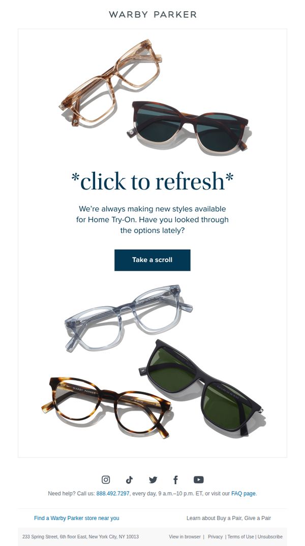
5. Fresh frames for Home Try-On
Objective
This email aims to re-engage customers by reminding them of new frames available for Warby Parker’s Home Try-On program, encouraging them to explore fresh styles and reignite interest in trying on glasses at home.
Why this works
The email leverages curiosity by implying the recipient may have missed new arrivals, creating a gentle nudge to revisit the Home Try-On experience without sounding pushy or salesy.
How to implement
Using a playful, low-pressure CTA like 'Take a scroll' reduces friction and invites exploration, making the action feel casual and aligned with the brand’s approachable, lifestyle-driven tone.
Pro Tip
Add a subtle countdown or 'New Arrivals This Week' badge near the CTA to create urgency and signal freshness, encouraging immediate engagement rather than passive browsing. • Include a micro-testimonial or social proof snippet (e.g., '92% of customers found their perfect pair in 3 tries') near the offer section to reinforce trust and reduce perceived risk in trying on frames.
6. Learn your frame measurements
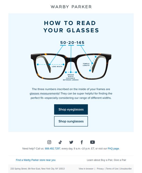
Objective
This email aims to educate subscribers on how to interpret the measurements inscribed on their eyeglass frames, empowering them to make more informed purchasing decisions when shopping for new glasses or sunglasses online.
Why this works
Warby Parker turns a technical detail, frame measurements, into an empowering educational moment, helping customers feel confident about fit without needing to visit a store, which reduces friction in online purchasing.
How to implement
By visually labeling each part of the frame with clear annotations and numbers, the email transforms potentially confusing specs into an intuitive, digestible guide that builds trust through transparency and simplicity.
Pro Tip
Add a short video or animated GIF demonstrating how to locate and read the numbers on an actual pair of glasses, which would increase engagement and reduce confusion for visual learners. • Include a personalized recommendation prompt like 'Enter your current frame measurements to find your perfect match' to bridge education with immediate action and boost conversion intent.
7. We’re the eyewear whisperers
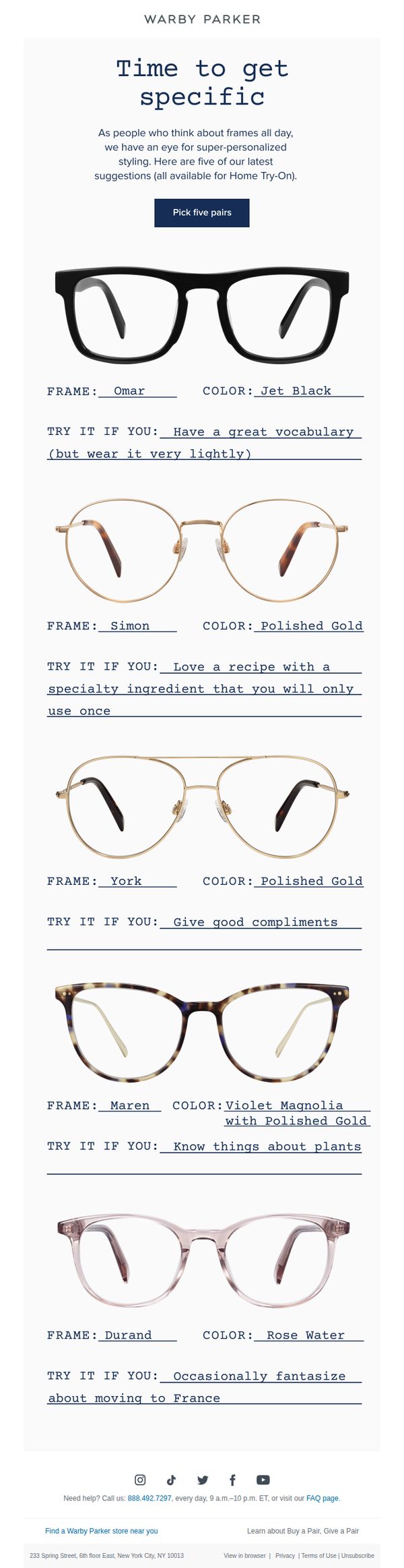
Objective
This email aims to drive engagement and conversions by encouraging recipients to explore and select five personalized eyewear frames through Warby Parker’s Home Try-On program, using playful, personality-driven recommendations to make the experience feel tailored and fun.
Why this works
Warby Parker turns product selection into a personality quiz by pairing each frame with a quirky, relatable lifestyle cue, making the decision feel less like shopping and more like self-discovery, which increases emotional engagement and reduces choice paralysis.
How to implement
The email leverages humor and specificity in its 'Try It If You' prompts to create memorable, shareable moments that resonate with the brand’s witty, approachable voice, turning a functional product grid into a delightful, scroll-stopping experience that feels uniquely Warby Parker.
Pro Tip
Add a subtle visual indicator or icon next to each frame’s 'TRY IT IF YOU' line to signal personality alignment, like a tiny emoji or badge, so users can quickly scan and emotionally connect with frames without reading every line. • Include a micro-testimonial or social proof snippet beneath the CTA button, such as '92% of customers found their perfect pair in their first 5 picks', to reduce hesitation and reinforce the value of the Home Try-On program.
8. Introducing Memory Metal
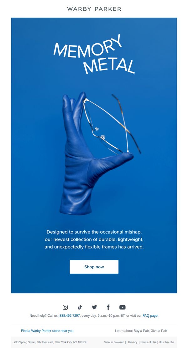
Objective
To introduce Warby Parker’s new Memory Metal eyewear collection by highlighting its durability and flexibility, encouraging immediate exploration and purchase through a clear, benefit-driven message and prominent call to action.
Why this works
The email instantly communicates product value by framing Memory Metal as engineered for real-life mishaps, turning durability into an emotional benefit rather than just a technical spec, which resonates with everyday users who fear breaking their glasses.
How to implement
Using a single bold visual, a gloved hand bending frames, creates instant intrigue and demonstrates flexibility without needing extra text, proving that minimalist design can powerfully convey product superiority when paired with smart copy.
Pro Tip
Add a brief testimonial or social proof near the CTA to reinforce trust, for example, a quote like 'I’ve dropped these three times and they still look new' would validate durability claims and reduce purchase hesitation. • Include a subtle visual cue or icon next to the CTA (like a small arrow or sparkle) to draw the eye and increase click-through, especially since the hero image is strong but the button blends slightly into the blue background.
9. Have insurance? Get an eye exam!
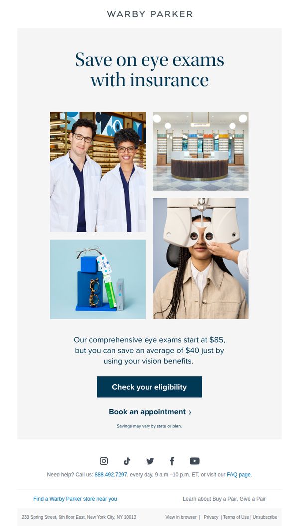
Objective
This email aims to encourage recipients with vision insurance to take advantage of discounted eye exams at Warby Parker by highlighting potential savings and simplifying the eligibility check process. It seeks to convert insurance holders into booked appointments.
Why this works
The email immediately anchors the value proposition in savings, not just price, by stating customers can save $40 on average, which reframes the offer as a smart financial decision rather than a simple discount.
How to implement
By featuring real staff and in-store imagery, Warby Parker builds trust and familiarity, subtly signaling professionalism and comfort, key emotional drivers for a service as personal as an eye exam.
Pro Tip
Add a brief testimonial or stat like '92% of insured customers saved $40 or more' near the savings claim to reinforce credibility and reduce perceived risk for hesitant users. • Include a small visual indicator (e.g., a checkmark icon or progress bar) next to 'Check your eligibility' to imply simplicity and speed, reducing psychological friction for users unsure about the process.
10. Easy eyewear savings await
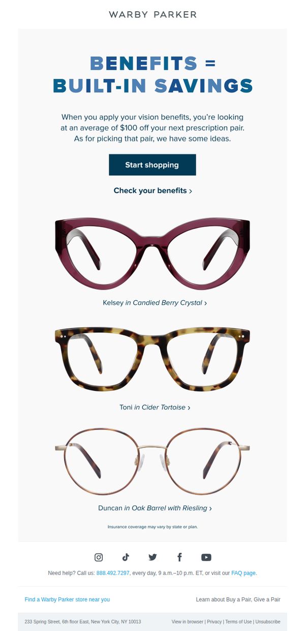
Objective
This email aims to convert subscribers into customers by highlighting built-in vision insurance savings, averaging $100 off, while guiding them toward curated eyewear picks that match their benefits. It simplifies the decision-making process by pairing savings with product recommendations.
Why this works
The email brilliantly reframes insurance benefits as 'built-in savings', a psychologically appealing twist that positions discounts as automatic value rather than a complex reimbursement process, reducing friction for hesitant buyers.
How to implement
By showcasing only three thoughtfully named frames with clear style descriptors, the email avoids overwhelming the reader while still offering variety, making it easier for users to visualize themselves in a pair and move toward purchase.
Pro Tip
Add a subtle countdown timer or urgency indicator near the CTA to nudge users who may delay action, especially since insurance benefits often have annual limits or expiration dates that could motivate faster decisions. • Include a mini testimonial or social proof snippet under each frame (e.g., 'Loved by 2,300+ customers') to reinforce trust and reduce perceived risk, especially for first-time buyers unfamiliar with Warby Parker’s fit or quality.