honeygrow campaign emails worth copying
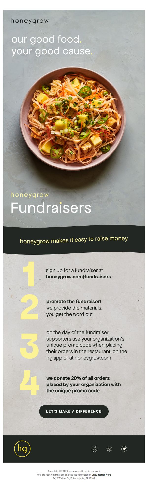
1. Our good food, your good cause.
Objective
This email aims to recruit community organizations to partner with honeygrow for fundraising events by highlighting the ease of setup, promotional support, and the 20% donation commitment. It positions honeygrow as a socially responsible brand that empowers causes through food.
Why this works
The email brilliantly ties the brand’s core product, fresh, vibrant food, to a higher purpose by framing every meal as a contribution to a cause, which emotionally resonates with mission-driven organizations and builds brand loyalty through shared values.
How to implement
By breaking down the fundraising process into four simple, numbered steps, the email removes perceived complexity and creates a clear, low-friction path to participation, making it easy for busy organizers to visualize success without feeling overwhelmed.
Pro Tip
Add a visual progress bar or countdown timer near the CTA to create urgency and motivate immediate sign-up, especially since fundraising events often rely on time-sensitive participation. • Include a short testimonial or quote from a past partner organization to build social proof and credibility, reinforcing that the process works and that real groups have successfully raised money through this program.
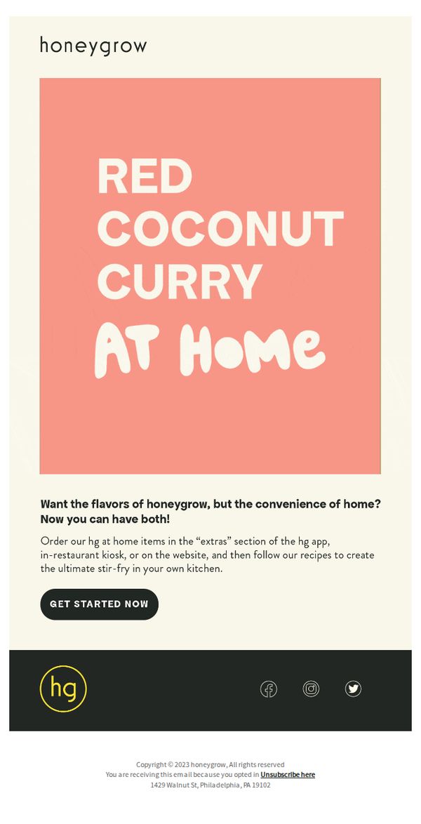
2. Want to make hg at home?
Objective
The email aims to drive customers to order honeygrow’s at-home meal kits by highlighting the convenience of recreating restaurant-quality dishes like Red Coconut Curry in their own kitchens, while promoting the brand’s digital platforms for ordering.
Why this works
The email brilliantly bridges the gap between restaurant experience and home cooking by positioning the at-home kit as a way to enjoy honeygrow’s signature flavors without sacrificing convenience, making it irresistible to loyal fans and curious newcomers alike.
How to implement
By clearly directing users to multiple ordering touchpoints, the app, kiosk, and website, the campaign removes friction and meets customers where they already are, increasing the likelihood of conversion through seamless accessibility.
Pro Tip
Add a visual of the actual Red Coconut Curry kit or a step-by-step prep image to build trust and reduce perceived effort, seeing the ingredients or process can significantly boost conversion for first-time home cooks. • Include a short testimonial or user-generated photo from someone who successfully made the dish at home to reinforce social proof and alleviate concerns about replicating restaurant quality in a home kitchen.
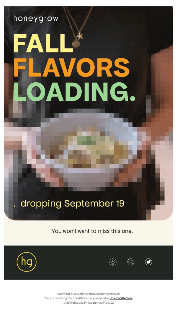
3. S0m3thing is C0ming
Objective
To build anticipation and excitement for the upcoming launch of honeygrow’s fall flavors by teasing their arrival on September 19, encouraging recipients to stay engaged and return to the brand when the flavors drop.
Why this works
The email masterfully uses cryptic, playful typography in the subject line to spark curiosity and drive opens, turning a simple announcement into a mystery that recipients feel compelled to solve.
How to implement
By teasing the flavor drop with bold, color-blocked typography over a blurred food image, the email creates visual intrigue while preserving the surprise, a smart balance between tease and transparency that fuels anticipation.
Pro Tip
Add a subtle countdown timer or 'Save the Date' visual element under the September 19 date to create urgency and help users mentally prioritize the launch in their calendar. • Include a micro-teaser like 'Think warm spices, cozy noodles, and autumnal crunch' to hint at flavor profiles without spoiling the surprise, deepening emotional connection and relevance for fall lovers.
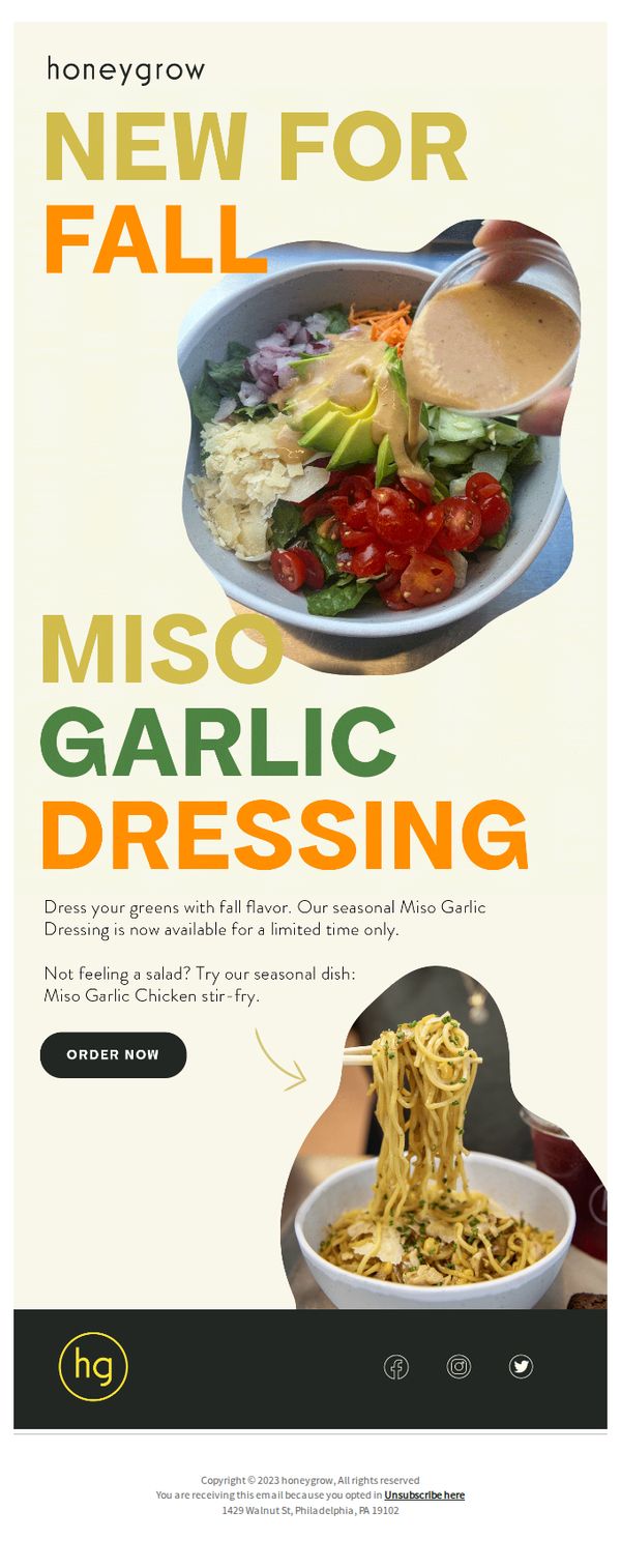
4. New fall flavor: Miso Garlic
Objective
To drive immediate purchases of honeygrow’s limited-time Miso Garlic Dressing by highlighting its seasonal appeal and versatility across dishes, while encouraging urgency through scarcity messaging.
Why this works
The email brilliantly ties the new dressing to the seasonal shift by using ‘New for Fall’ as a headline, creating emotional resonance and timely relevance that nudges customers to act before the flavor disappears.
How to implement
By visually demonstrating the dressing on both a salad and a stir-fry, the campaign effectively communicates versatility, reassuring customers that the product fits multiple meal preferences and increases perceived value beyond a single use case.
Pro Tip
Add a small countdown timer near the CTA to visually reinforce the limited-time offer, which could increase conversion by making the urgency feel more immediate and tangible to the reader. • Include a short customer testimonial or star rating next to the product description to build social proof, especially since the dressing is new and customers may need reassurance before trying a novel flavor.
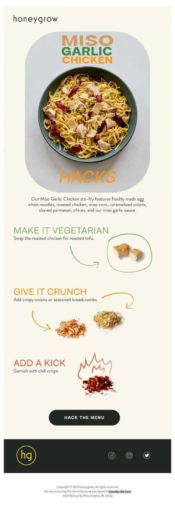
5. Miso Garlic Hacks
Objective
This email aims to inspire customers to personalize their Miso Garlic Chicken dish by showcasing creative, easy-to-implement menu hacks, ultimately driving engagement and encouraging orders through customization.
Why this works
The email brilliantly turns a single menu item into a customizable experience by offering three distinct, visually supported hacks that empower customers to feel like co-creators of their meal, not just passive buyers.
How to implement
Each hack is presented with a bold, color-coded headline and a simple visual cue, like a circled ingredient or flame icon, making the customization options instantly scannable and emotionally engaging for time-pressed diners.
Pro Tip
Add a small countdown timer or urgency cue near the CTA to encourage immediate action, since the email’s educational tone currently lacks a time-sensitive nudge to convert interest into an order. • Include a mini testimonial or social proof snippet, like '92% of customers who tried the tofu hack ordered again', beneath the 'Make It Vegetarian' section to reinforce the popularity and success of the suggested modifications.
6. Get $25 off hg catering
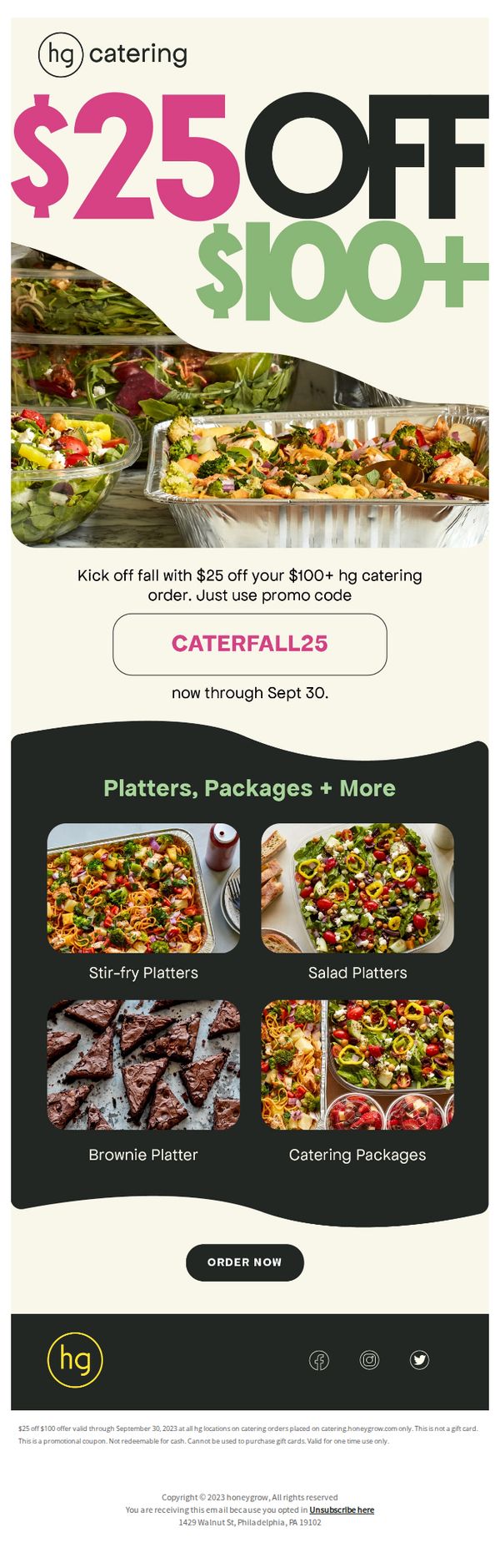
Objective
This email aims to drive immediate catering orders by offering a time-sensitive $25 discount on orders over $100, encouraging recipients to act before the September 30 deadline while showcasing appealing platter options to inspire purchase.
Why this works
The email immediately grabs attention by leading with a bold, color-contrasted discount headline that visually communicates value without requiring the reader to scroll or decode fine print.
How to implement
By featuring high-quality, appetizing photos of actual platters alongside clear labels, the campaign effectively reduces decision fatigue and builds desire through visual storytelling that mirrors real-world catering experiences.
Pro Tip
Add a countdown timer beneath the promo code to visually reinforce urgency and encourage faster decision-making, especially since the offer expires soon and psychological scarcity boosts conversion. • Include a short testimonial or social proof near the product grid, such as 'Over 500 teams chose our Stir-fry Platter for their last event', to build trust and reduce perceived risk for first-time catering customers.
7. Introducing our fall stir-fry
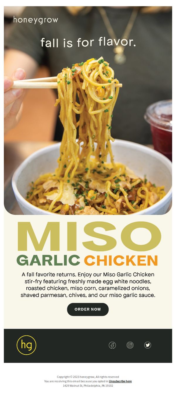
Objective
To reintroduce and drive immediate orders for honeygrow’s seasonal Miso Garlic Chicken stir-fry by highlighting its fall-inspired ingredients and crave-worthy presentation. The email aims to convert subscribers into customers by evoking seasonal nostalgia and emphasizing freshness and flavor.
Why this works
The email leverages seasonal emotion by opening with 'fall is for flavor,' instantly connecting the dish to autumnal cravings and creating a timely, sensory-driven reason to act now rather than later.
How to implement
By listing specific, high-quality ingredients like 'freshly made egg white noodles' and 'shaved parmesan,' the copy builds trust and appetite simultaneously, turning a simple menu item into a gourmet experience worth ordering.
Pro Tip
Add a limited-time offer or urgency element (e.g., 'Available only through October') near the CTA to increase conversion by tapping into FOMO, since the email currently lacks any time-bound incentive. • Include a small testimonial or customer quote beneath the product description to build social proof, for example, 'Our #1 fall dish last year!', which would reinforce credibility and reduce decision friction.
8. Say hello to our new juice 👋
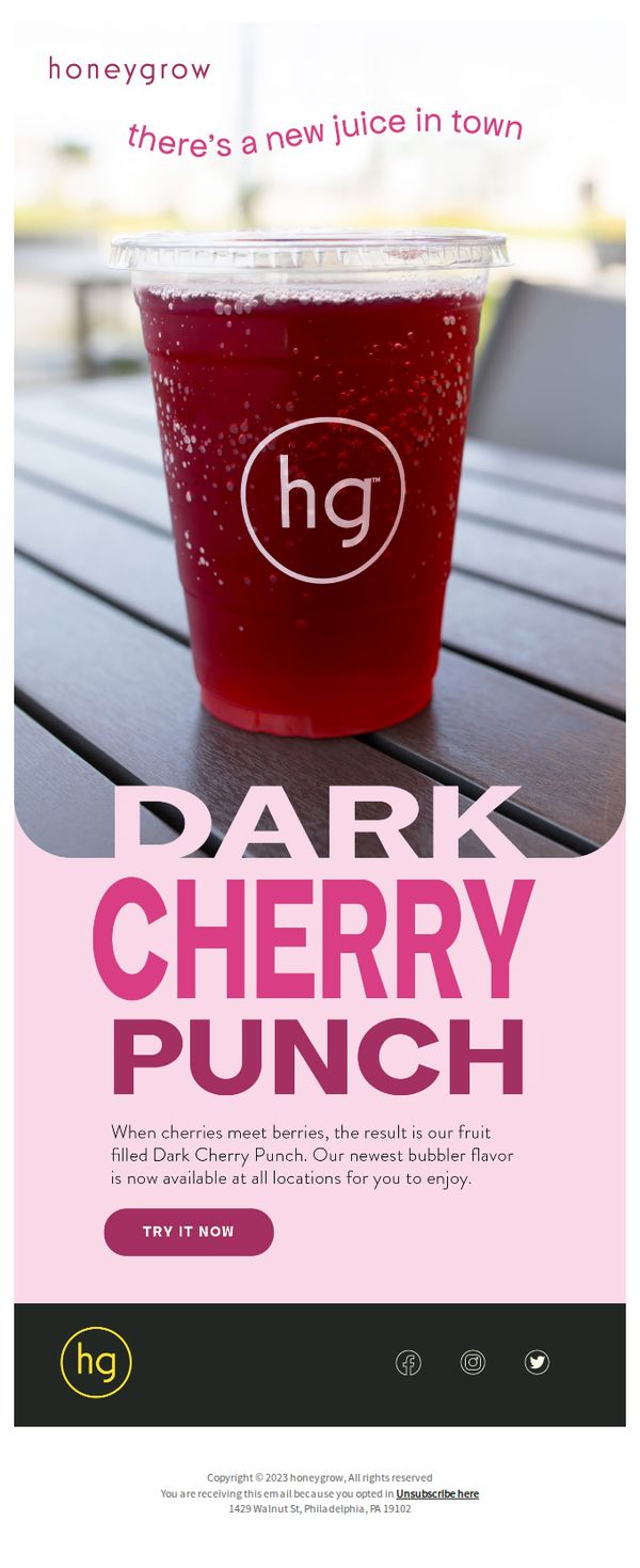
Objective
To announce and drive trial of honeygrow’s new Dark Cherry Punch beverage by highlighting its fruit-filled, bubbly flavor profile and availability across all locations, encouraging immediate purchase through a prominent CTA.
Why this works
The email instantly captures attention by anthropomorphizing the new juice with a friendly ‘hello’ and ‘in town’ phrasing, making the product feel like a welcomed guest rather than just another menu item.
How to implement
By visually centering the vibrant, sparkling Dark Cherry Punch in a real-world setting, outdoors on a wooden table, the campaign creates an inviting, lifestyle-driven context that subtly suggests casual enjoyment and social sharing.
Pro Tip
Add a limited-time offer or urgency cue (e.g., ‘First 100 orders get a free upgrade’) near the CTA to convert interest into immediate action, since the current design lacks any incentive or time-sensitive motivation. • Include a small visual or icon indicating the drink’s availability at ‘all locations’, perhaps a map pin or store locator link, to reduce friction for customers unsure if the product is accessible near them.
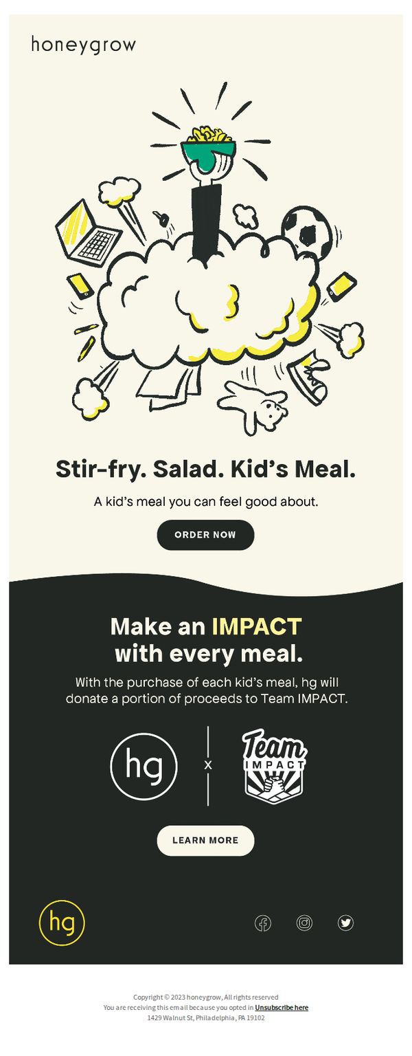
9. An A+ Kid’s Meal
Objective
To promote honeygrow’s new kid’s meal by emphasizing its healthy, customizable nature while tying it to a charitable cause through Team IMPACT, encouraging immediate orders from parents who value both nutrition and social impact.
Why this works
The email brilliantly frames the kid’s meal not just as food but as a guilt-free parenting win, combining nutrition, customization, and emotional reassurance in a single compelling message that speaks directly to caregiver values.
How to implement
By visually anchoring the meal in a playful, energetic illustration filled with kid-centric symbols like soccer balls and laptops, the design instantly communicates fun and relatability without sacrificing the brand’s clean, wholesome aesthetic.
Pro Tip
Add a brief bullet list under the hero headline specifying what’s included in the kid’s meal (e.g., ‘Choose your protein, veggies, sauce & side’) to reduce decision friction and clarify value before the CTA. • Place a secondary CTA like ‘See Kids’ Menu Options’ or ‘View Nutrition Info’ near the bottom section to cater to parents who need more details before committing, improving conversion funnel depth.