How SaaS, ecommerce, and creators run Educational emails
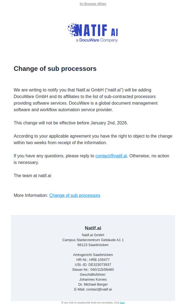

1. Natif.ai: Notification of Addition of Sub-Processors – DocuWare GmbH
Objective
This email aims to formally notify customers of a legal and operational change, the addition of DocuWare GmbH as a sub-processor, while ensuring compliance with contractual obligations and offering a clear window for objection.
Why this works
The email opens with a direct, unambiguous subject line and header that immediately signals the purpose, a regulatory update, which builds trust by respecting the recipient’s time and legal awareness.
How to implement
By clearly stating the effective date and objection window, the message empowers recipients with agency, turning a potentially passive notification into an actionable, rights-based communication that aligns with GDPR and contractual transparency.
Pro Tip
Add a brief explanation of why DocuWare GmbH is being added, e.g., to enhance document automation capabilities, to frame the change as a value-add rather than just a compliance notice, reducing potential customer concern. • Include a short FAQ or 'Why This Matters' section to preempt common questions, such as data security implications or how this affects existing workflows, which would reduce inbound support queries and increase clarity.
2. The Guardian: The great British skill shortage | First Edition
Objective
This email aims to inform subscribers about the UK’s critical skills shortage and the government’s flawed immigration policies, while subtly encouraging long-term reader support through a donation appeal at the end. It positions The Guardian as an essential source of in-depth, independent journalism on complex societal issues.
Why this works
The email opens with a bold, provocative headline that immediately frames the issue as urgent and politically consequential, drawing readers in by challenging a popular policy assumption and promising deeper analysis from a credible source.
How to implement
It strategically embeds a compelling human story, a nurse helping an elderly patient, to emotionally anchor the policy discussion, making abstract labor shortages feel personal and morally urgent without sacrificing journalistic rigor.
Pro Tip
The primary CTA 'Support us →' appears twice, once at the top and once at the bottom, but lacks urgency or emotional framing; adding a micro-copy line like 'Help us keep investigating the truth' next to the button would strengthen conversion by tying support directly to the article’s mission. • The 'Five big stories' section uses numbered bullets but doesn’t visually prioritize them; adding subtle icons or color-coded tags (e.g., red for breaking, blue for analysis) would help readers quickly identify content relevance and improve scanability without cluttering the layout.
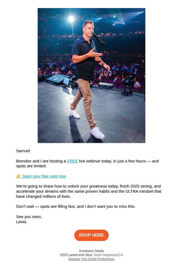
3. Lewis Howes: 🌟 Join Our Free Webinar TODAY!
Objective
This email aims to drive immediate registrations for a live webinar by creating urgency and personal connection through Lewis Howes’ direct address, while positioning the event as a high-value, limited-access opportunity to unlock personal greatness and mindset transformation.
Why this works
The email opens with a personal salutation and a direct, conversational tone from Lewis, which builds instant rapport and makes the recipient feel individually invited rather than mass-emailed, increasing emotional engagement and trust.
How to implement
By anchoring the webinar’s value to tangible outcomes, unlocking greatness, finishing 2025 strong, and adopting a proven mindset, the message speaks directly to the reader’s aspirations, making the abstract promise feel actionable and results-driven.
Pro Tip
Add a brief testimonial or social proof snippet near the CTA, such as 'Over 50,000 people transformed their mindset with this webinar', to reinforce credibility and reduce hesitation for first-time attendees. • Include a mini-agenda or bullet-point preview of what attendees will learn during the webinar to clarify value and help recipients visualize the payoff, reducing ambiguity that might delay RSVPs.
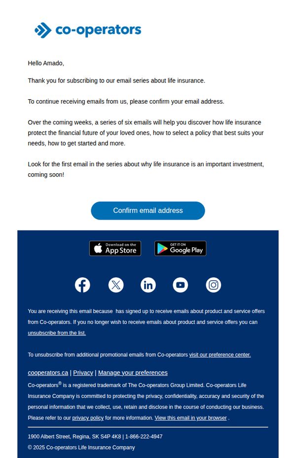
4. Co-operators: Thanks for signing up!
Objective
This email aims to confirm the recipient’s subscription to a life insurance educational email series while setting expectations for upcoming content. It also encourages immediate action by prompting email verification to ensure continued delivery of valuable, personalized guidance.
Why this works
The email immediately personalizes the experience by addressing the recipient by name and clearly stating the value of the upcoming email series, which builds trust and anticipation for future content without overwhelming the reader.
How to implement
By framing the email series as a six-part educational journey focused on protecting loved ones and selecting the right policy, the brand positions itself as a helpful guide rather than a sales-driven entity, which reduces subscriber resistance.
Pro Tip
Add a brief preview or teaser of the first email’s topic (e.g., 'Why Life Insurance Is an Important Investment') directly under the CTA to increase curiosity and reinforce the value of confirming the subscription. • Include a subtle visual cue or icon next to the 'Confirm email address' button, such as a checkmark or envelope, to visually reinforce the action’s purpose and reduce cognitive friction for users unfamiliar with double opt-in processes.
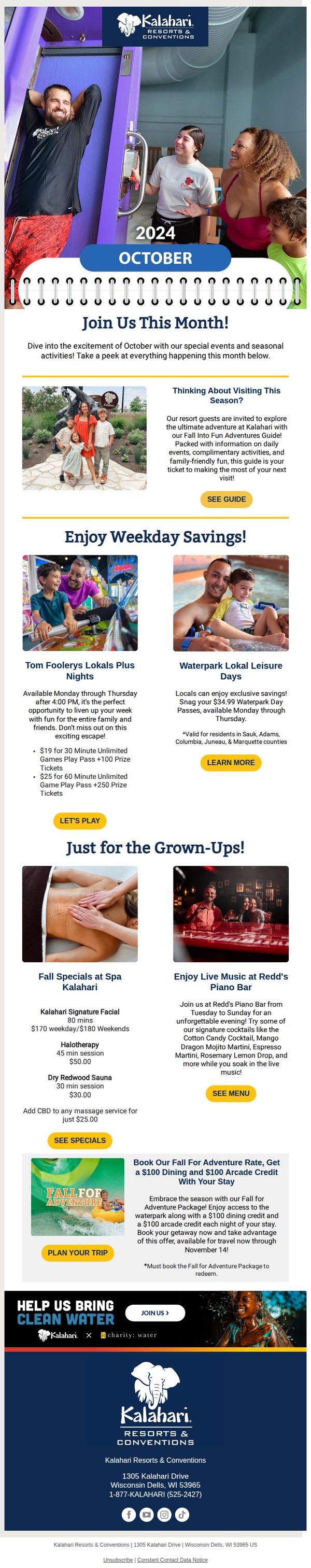
5. Kalahari Resorts: Harvest the Fun: Fall Activities at Kalahari!
Objective
This email aims to drive October visitation to Kalahari Resorts by highlighting seasonal events, exclusive weekday deals, and adult-focused amenities, encouraging immediate booking through time-sensitive offers and personalized local promotions.
Why this works
The email smartly segments offers by audience, families get game nights and waterpark deals, while adults are targeted with spa specials and live music, making each reader feel personally addressed and increasing conversion relevance.
How to implement
By anchoring the campaign to a specific month and tying promotions to local residency, the email creates urgency and exclusivity, turning a generic seasonal offer into a hyper-targeted, time-bound invitation that feels both timely and tailored.
Pro Tip
Add a countdown timer next to the 'Fall for Adventure' package offer to visually reinforce the November 14 deadline, increasing urgency and reducing decision latency for hesitant bookers. • Reposition the 'SEE GUIDE' CTA under the 'Thinking About Visiting This Season?' section to appear immediately after the value proposition, reducing friction for readers ready to explore further without scrolling.
6. ClickFunnels: People have stopped Googling
Objective
This email aims to alert ClickFunnels users that AI search tools like ChatGPT are now influencing customer discovery, urging them to optimize their funnels for AI visibility before competitors do. It positions ClickFunnels as the essential tool to capture this emerging traffic wave.
Why this works
The email brilliantly reframes a technological shift, AI replacing Google, as an urgent, personalized business opportunity, making readers feel they’re on the verge of missing a massive, industry-wide advantage if they don’t act now.
How to implement
By citing real-world examples like ChatGPT answering 700 million weekly queries and naming Claude and Gemini, the email builds undeniable credibility and urgency without sounding alarmist, grounding the message in tangible, relatable data.
Pro Tip
Add a visual element like a mini infographic or icon next to the CTA button to break up the text-heavy layout and draw the eye toward the guide download, increasing click-through likelihood. • Include a short, bold testimonial or case study snippet from a ClickFunnels user who already optimized for AI and saw results, this would strengthen social proof and reduce perceived risk for hesitant readers.
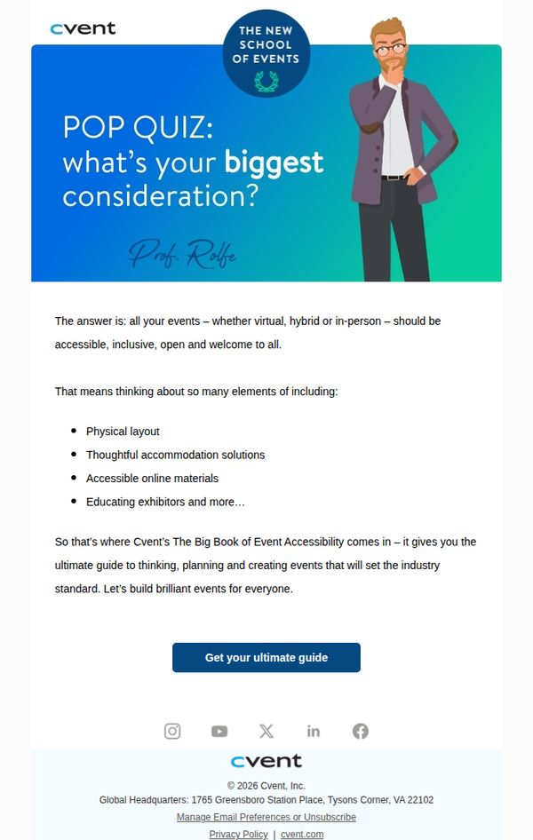
7. Cvent : The only guide you need to inclusive events
Objective
This email aims to position Cvent as a thought leader in inclusive event planning by offering a valuable, educational resource, their 'Big Book of Event Accessibility', to encourage engagement and guide event professionals toward more equitable practices.
Why this works
The email opens with a clever pop quiz that immediately engages the reader by personalizing the topic of inclusivity, making the audience reflect on their own event planning priorities before offering the solution.
How to implement
It frames accessibility not as a compliance checkbox but as a strategic advantage, positioning Cvent’s guide as the industry standard for building brilliant, welcoming events that appeal to everyone, which elevates perceived value.
Pro Tip
Add a brief testimonial or quote from an event planner who used the guide to improve accessibility, this would build social proof and reinforce credibility right before the CTA. • Include a small visual icon or badge near the CTA indicating the guide is free or instantly downloadable, reducing friction by clarifying there’s no cost or wait time.
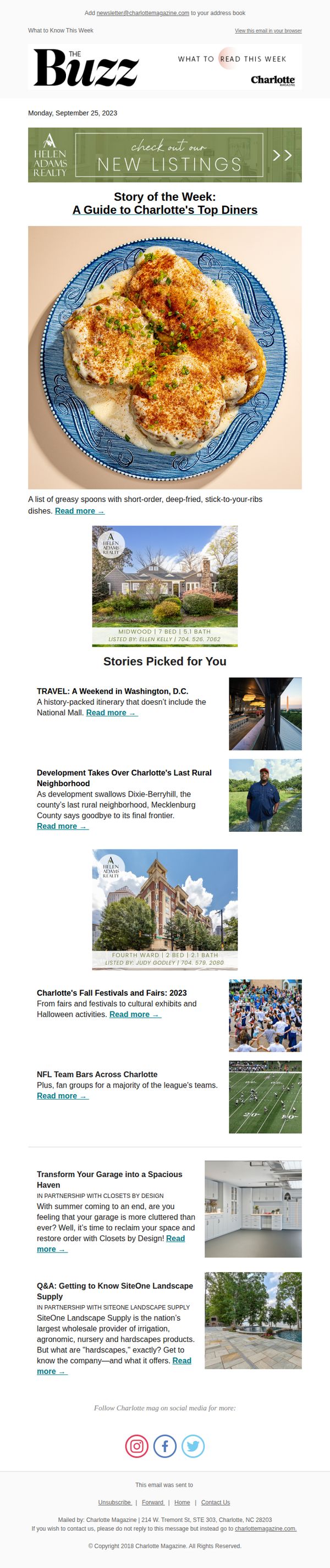
8. Charlotte Magazine: A Guide to Charlotte's Top Diners
Objective
To engage local readers by highlighting Charlotte’s top diners and related lifestyle content, encouraging clicks to explore stories and fostering community connection through curated local experiences.
Why this works
The email opens with a mouthwatering hero image and a punchy headline that instantly taps into local pride and appetite, making readers feel like insiders who are being let in on the city’s best-kept culinary secrets.
How to implement
By pairing each story with a compelling sub-headline and a high-res photo, the email creates visual rhythm and emotional hooks that guide the reader smoothly from one article to the next without overwhelming them with text.
Pro Tip
Add a clear, visually distinct primary CTA button beneath the hero section, such as 'Explore All Diners Now', to reduce friction and guide readers toward the main story instead of relying solely on text links. • Include a short testimonial or quote from a local food critic or regular diner patron under the hero image to build social proof and reinforce the credibility of the guide before readers scroll further.
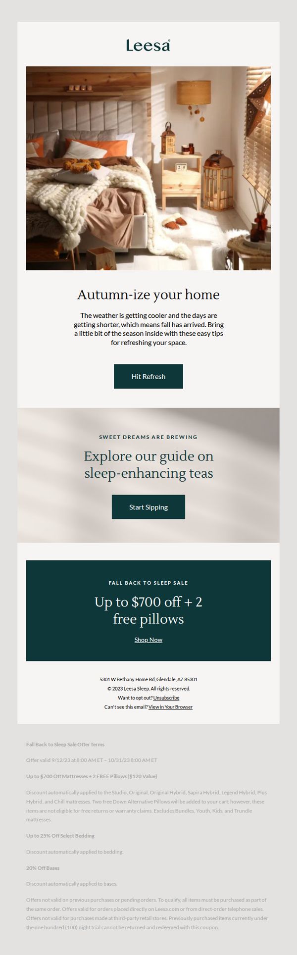
9. Leesa: Time to autumn-ize your home
Objective
The email aims to drive seasonal engagement by encouraging recipients to refresh their home for fall, while promoting Leesa’s sleep-enhancing products and a limited-time sale with significant discounts and free pillows to boost conversions.
Why this works
Leesa masterfully ties seasonal emotion to product utility by framing fall as a time to cozy up and refresh your space, making the purchase feel timely, comforting, and emotionally resonant rather than purely transactional.
How to implement
The email blends lifestyle inspiration with hard-hitting offers, using warm visuals and soft copy to build desire, then anchoring it with a bold, benefit-packed CTA that promises both savings and added value through free pillows.
Pro Tip
Add a countdown timer to the offer section to create urgency around the sale’s end date, which would reinforce the limited-time nature of the discount and encourage faster decision-making. • Include a small testimonial or customer review snippet near the CTA to build social proof, especially since the offer is high-value, this would help reduce perceived risk and increase trust in the deal’s legitimacy.
10. Square: Set up your point of sale
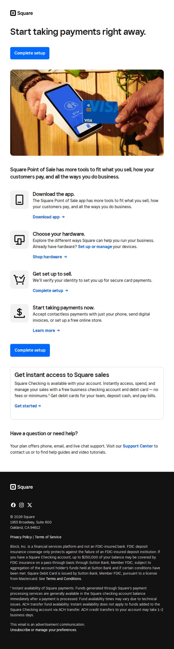
Objective
This email aims to guide new or prospective users through the initial setup of Square’s point-of-sale system, encouraging immediate action by simplifying onboarding into payment acceptance, hardware selection, and business management tools.
Why this works
The email strategically breaks down onboarding into four digestible steps, download, choose hardware, set up, and start selling, making a complex process feel approachable and actionable for time-strapped business owners.
How to implement
By embedding the primary CTA 'Complete setup' both above and below the step-by-step guide, the email reinforces urgency and reduces friction, ensuring users never lose sight of the next action regardless of scroll depth.
Pro Tip
Add a visual progress indicator or checklist next to each setup step to give users a sense of momentum and completion, which can increase conversion by reducing perceived effort. • Include a short testimonial or trust badge near the 'Start taking payments now' section to alleviate security concerns, especially for users unfamiliar with contactless or digital invoicing.