Hygge & West campaign ideas that work
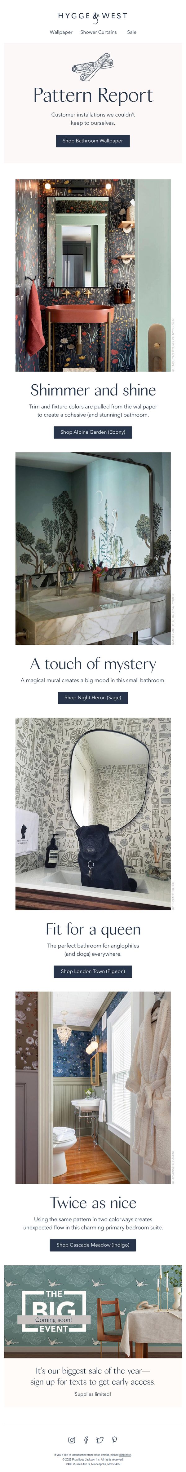
1. Pattern Report: Next-level bathrooms
Objective
This email aims to inspire customers with real-life bathroom transformations using Hygge & West wallpaper while driving direct sales through pattern-specific CTAs. It also teases an upcoming major sale to build anticipation and grow SMS subscriber engagement.
Why this works
The email brilliantly uses customer-submitted bathroom installations as social proof, turning real homes into aspirational mood boards that validate the wallpaper’s transformative power while making the product feel attainable and stylish.
How to implement
Each bathroom vignette is paired with a clever, personality-driven headline and a specific pattern name with color variant, which not only educates the shopper but also reduces decision fatigue by anchoring inspiration to shoppable SKUs.
Pro Tip
Add a subtle visual indicator or icon next to each 'Shop [Pattern]' button to show whether the pattern is in stock or low-quantity, reducing friction for shoppers who may abandon if they discover out-of-stock items post-click. • Include a mini testimonial or designer credit beneath each bathroom photo (e.g., 'Designed by @hendleyandco') to strengthen credibility and give social proof a human face, making the installations feel more authentic and less staged.
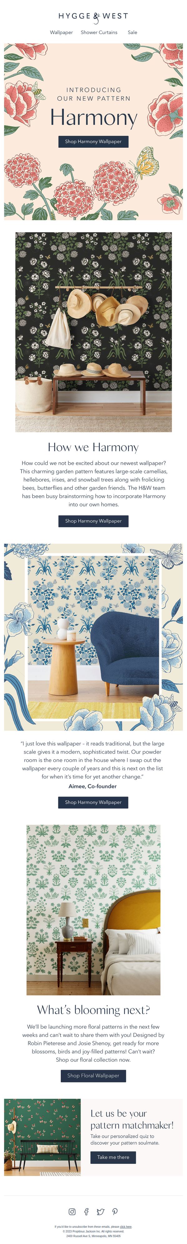
2. How we Harmony
Objective
To introduce and drive sales of the new 'Harmony' wallpaper collection by showcasing its design, versatility, and emotional appeal through lifestyle imagery and founder storytelling. The email also teases upcoming floral patterns to build anticipation and encourage exploration of the broader collection.
Why this works
The email masterfully blends product launch with storytelling by letting the co-founder personally endorse the wallpaper, which builds trust and emotional resonance while subtly validating the design’s versatility for real homes.
How to implement
Each wallpaper variant is presented in a distinct, aspirational room setting, from entryway to bedroom, which helps customers visualize the product in their own spaces and reduces purchase hesitation through contextual inspiration.
Pro Tip
Add a subtle countdown timer or limited-edition badge near the 'Shop Harmony Wallpaper' CTA to create urgency, especially since the email positions this as a new, exclusive launch that may appeal to early adopters. • Include a small visual cue or icon next to each room photo indicating the wallpaper colorway (e.g., 'Midnight Garden,' 'Coastal Blue,' 'Spring Green') to help users quickly distinguish options without scrolling back to read descriptions.
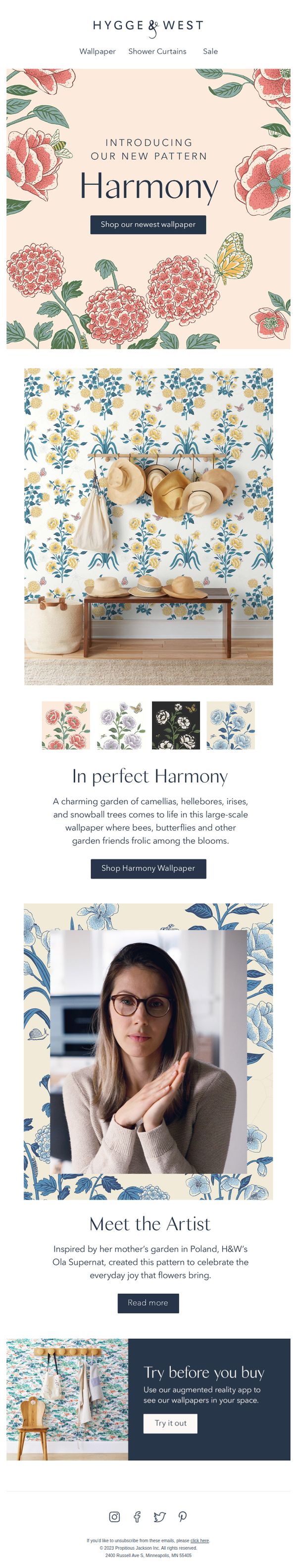
3. Say hello to our newest wallpaper!
Objective
To introduce and drive sales of the new 'Harmony' wallpaper pattern by showcasing its aesthetic appeal, storytelling, and interactive features. The email aims to convert interest into purchases by highlighting design inspiration and offering a virtual try-on experience.
Why this works
The email masterfully blends product launch excitement with emotional storytelling by introducing the artist’s personal inspiration, making the wallpaper feel not just decorative but deeply human and meaningful to potential buyers.
How to implement
By featuring a lifestyle image with hats and a bench against the wallpaper, the campaign visually demonstrates real-world application, helping customers imagine the product in their own homes without needing to mentally translate flat swatches.
Pro Tip
Add a subtle countdown timer or limited-edition badge near the CTA to create urgency, since the email currently lacks any time-sensitive incentive that could nudge immediate action. • Reposition the 'Meet the Artist' section higher in the flow, right after the hero, to strengthen emotional connection before diving into product details, which may increase perceived value and trust before the purchase decision.
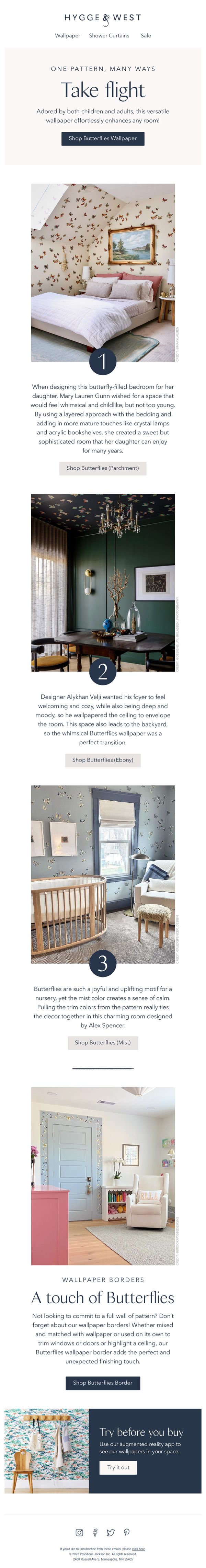
4. See one of our most versatile patterns in action
Objective
This email aims to showcase the versatility of the Butterflies wallpaper pattern across different rooms and design styles, encouraging customers to envision it in their own homes and ultimately drive purchases through targeted CTAs for each variation.
Why this works
By presenting the same wallpaper pattern across three distinct rooms, a child’s bedroom, a moody foyer, and a serene nursery, the email powerfully demonstrates adaptability, helping customers visualize the product beyond a single use case and increasing perceived value.
How to implement
Each room example is paired with a designer’s narrative that explains the design intent and emotional tone, which builds trust and positions the product as a professional-grade solution rather than just a decorative item, enhancing its aspirational appeal.
Pro Tip
Add a subtle visual indicator or icon next to each room example (e.g., a small 'Bedroom', 'Foyer', 'Nursery' tag) to help users quickly categorize the use cases without reading the full text, improving scanability and decision speed. • Include a short testimonial or customer quote under one of the room examples to add social proof, for instance, 'Over 2,000 customers have used Butterflies in nurseries, 94% say it’s their favorite accent wall.'
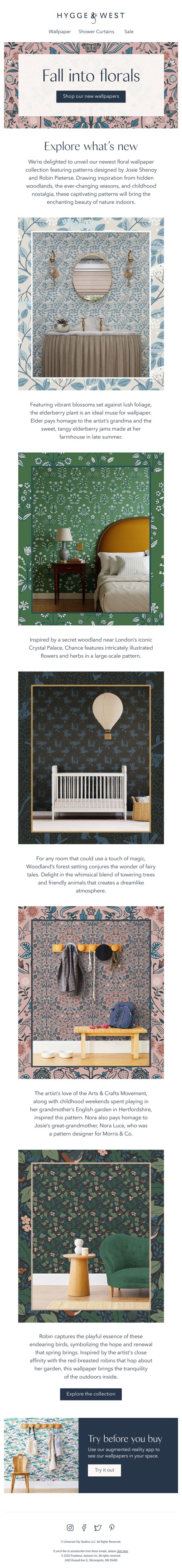
5. NEW: Flowers, and more flowers!
Objective
This email aims to introduce and drive excitement for Hygge & West’s new floral wallpaper collection by showcasing its artistic inspiration and emotional storytelling, encouraging recipients to explore and shop the designs that bring nature’s beauty indoors.
Why this works
The email masterfully ties each wallpaper design to a rich, personal story, whether it’s childhood nostalgia, a grandmother’s jam, or a secret woodland, making the product feel emotionally resonant and deeply human, not just decorative.
How to implement
By placing real-room visuals beneath each pattern description, the campaign helps customers visualize the wallpaper in context, reducing purchase hesitation and transforming abstract designs into tangible lifestyle upgrades they can imagine in their own homes.
Pro Tip
The primary CTA ‘Shop our new wallpapers’ appears only once at the top; adding a sticky or repeated CTA button after each product description would capture attention at every decision point and reduce scroll abandonment. • While each wallpaper has a story, the email lacks a clear visual hierarchy or badge indicating which designs are ‘bestsellers’ or ‘newest arrivals’, adding subtle visual cues would help guide overwhelmed shoppers toward top-performing or trending options.
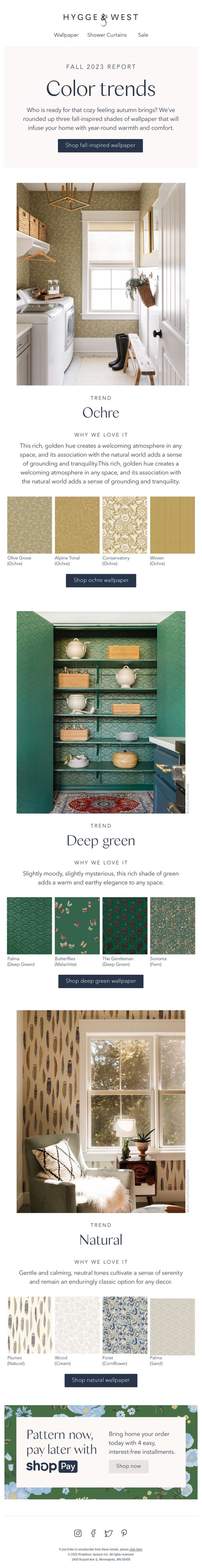
6. Fall into these cozy colors
Objective
This email aims to inspire customers to embrace autumnal home decor by showcasing three curated wallpaper color trends, Ochre, Deep Green, and Natural, that evoke warmth, tranquility, and seasonal comfort, while driving immediate purchases through trend-specific CTAs.
Why this works
The email brilliantly ties seasonal emotion to product selection by framing each color trend with a sensory-rich narrative, like 'cozy feeling autumn brings', which transforms wallpaper from a commodity into an experience that customers can feel before they buy.
How to implement
By pairing each trend with a lifestyle photo and a mini-collection of four coordinating patterns, the campaign creates visual cohesion and reduces decision fatigue, making it easy for customers to imagine and adopt a complete aesthetic rather than just one product.
Pro Tip
Add a subtle countdown timer or 'Limited Stock' indicator beneath each trend’s CTA to create urgency, especially since fall trends are time-sensitive and customers may delay purchase without a nudge. • Include a short testimonial or customer photo beneath one of the trend sections (e.g., Deep Green) to build social proof, showing real homes using the wallpaper would reinforce the 'warm and earthy elegance' claim with tangible validation.
7. We are falling for these wallpapers

Objective
This email aims to inspire customers to begin fall wallpaper projects by showcasing real-life installations, team favorites, and seasonal lifestyle pairings, all while driving traffic to shop best-selling and upcoming collections.
Why this works
The email brilliantly ties seasonal transitions to home transformation, using relatable cues like back-to-school and falling temperatures to position wallpaper as the perfect fall project, making the product feel timely and emotionally resonant.
How to implement
By featuring real team members’ personal stories and favorite wallpapers, the brand builds authentic social proof that feels conversational and trustworthy, turning product promotion into a shared lifestyle experience rather than a sales pitch.
Pro Tip
The CTA 'Shop best-selling wallpaper' appears only once in the hero section, adding secondary CTAs after each testimonial or product highlight would capture momentum and reduce scroll abandonment. • The 'Sneak Peek!' section for the new Harmony wallpaper lacks urgency or exclusivity; adding a countdown timer or 'early access for subscribers' language would better convert anticipation into immediate action.
8. How we pattern all year!

Objective
This email aims to inspire customers to refresh their home decor year-round by showcasing how Hygge & West’s timeless wallpaper patterns can be styled across seasons with complementary accessories. It encourages purchases by demonstrating real-life applications and seasonal versatility through founder stories and product pairings.
Why this works
The email brilliantly uses founder testimonials to humanize product choices, turning wallpaper selections into personal stories that build emotional resonance and trust with the audience while subtly guiding seasonal styling decisions.
How to implement
By dividing content into warm and cool weather sections, the campaign creates a clear, intuitive seasonal roadmap that helps customers visualize how to adapt their spaces throughout the year without feeling overwhelmed by choice.
Pro Tip
The primary CTA 'Shop now' at the bottom lacks urgency and context; adding a time-sensitive incentive like 'Shop before the season shifts' or anchoring it to a specific product section would strengthen conversion intent. • The email lacks visual hierarchy between seasonal sections, using subtle dividers, icons, or color-coded headers for 'Warm Weather' and 'Cool Weather' would improve scannability and help users jump to their current season faster.
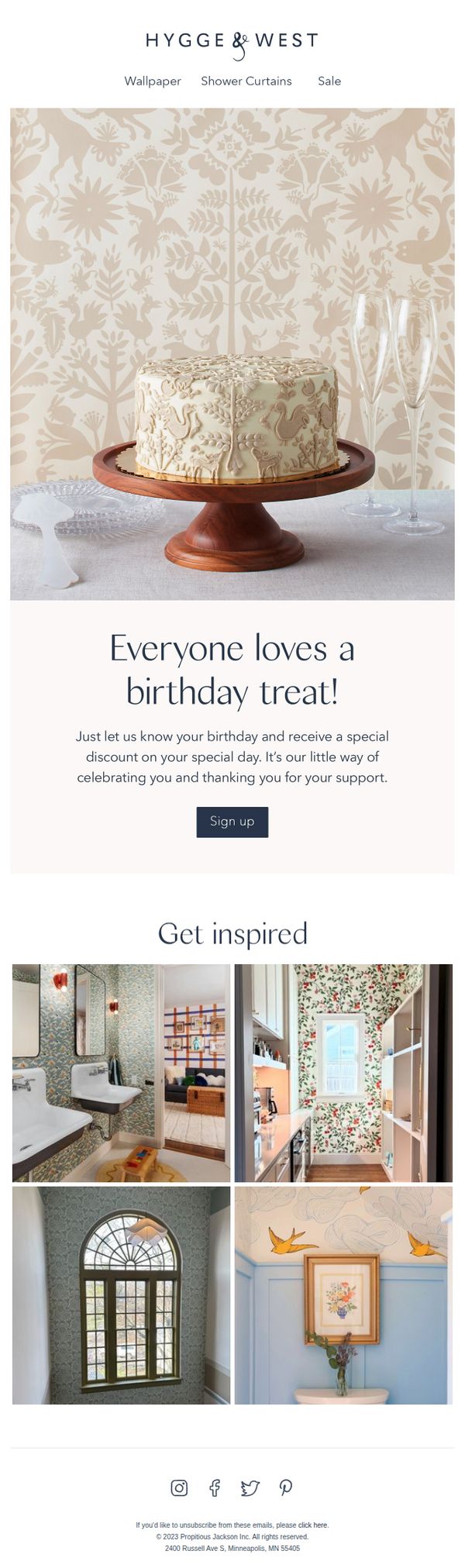
9. 🎉 Celebrate Your Birthday with a Special Discount!
Objective
This email aims to encourage subscribers to share their birthday information in exchange for a personalized discount, fostering customer loyalty while subtly promoting the brand’s decorative home products through aspirational imagery.
Why this works
The email brilliantly ties emotional celebration to commerce by framing the discount as a personal gift, making the customer feel valued rather than targeted, which increases the likelihood of data sharing without resistance.
How to implement
Using a beautifully styled cake against patterned wallpaper visually reinforces the brand’s aesthetic while subtly suggesting that their products belong in life’s special moments, creating an emotional bridge between decor and celebration.
Pro Tip
Add a clear expiration date or urgency cue near the 'Sign up' CTA, such as 'Offer valid for 7 days', to reduce procrastination and increase immediate conversion from birthday-sharing prompts. • Include a micro-testimonial or social proof beneath the offer copy, like 'Over 12,000 customers celebrated their birthday with us last year,' to build trust and normalize the action of sharing personal data.