How leather goods brands build high-performing email campaigns
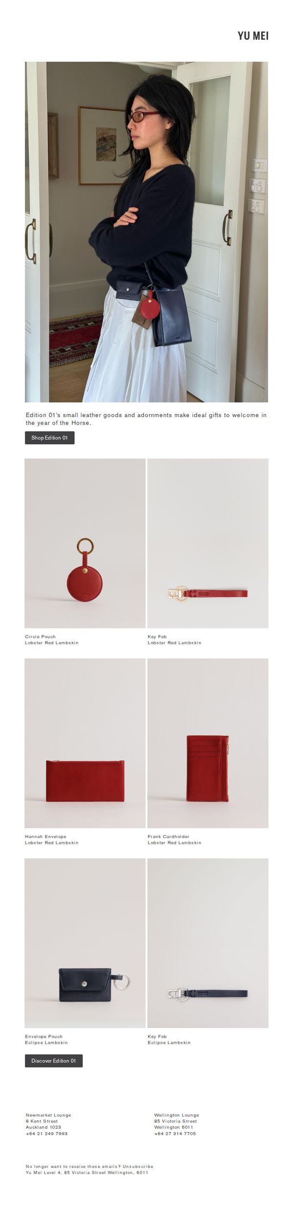
1. Yu Mei Brand - NZ: Small Gifts for the Year of the Horse
Objective
To promote Yu Mei’s Edition 01 collection of small leather goods as thoughtful, culturally resonant gifts for the Year of the Horse, encouraging immediate exploration and purchase through curated product visuals and strategic CTAs.
Why this works
The email leverages cultural timing by framing the collection as ideal gifts for the Year of the Horse, which adds emotional relevance and urgency without being overtly promotional, making the products feel meaningful rather than transactional.
How to implement
By featuring a lifestyle shot of a model wearing the products in a natural home setting, the email subtly communicates how these small leather goods integrate into everyday elegance, helping customers visualize ownership and emotional connection.
Pro Tip
Add a subtle countdown timer or limited-edition badge near the 'Shop Edition 01' CTA to amplify urgency, since the cultural tie-in to the Year of the Horse implies temporal relevance that isn’t currently leveraged visually. • Include a short testimonial or customer quote near the product grid to build social proof, for example, 'Perfect for gifting, my sister loved her Circle Pouch!', which would reinforce the gifting angle and reduce perceived risk.
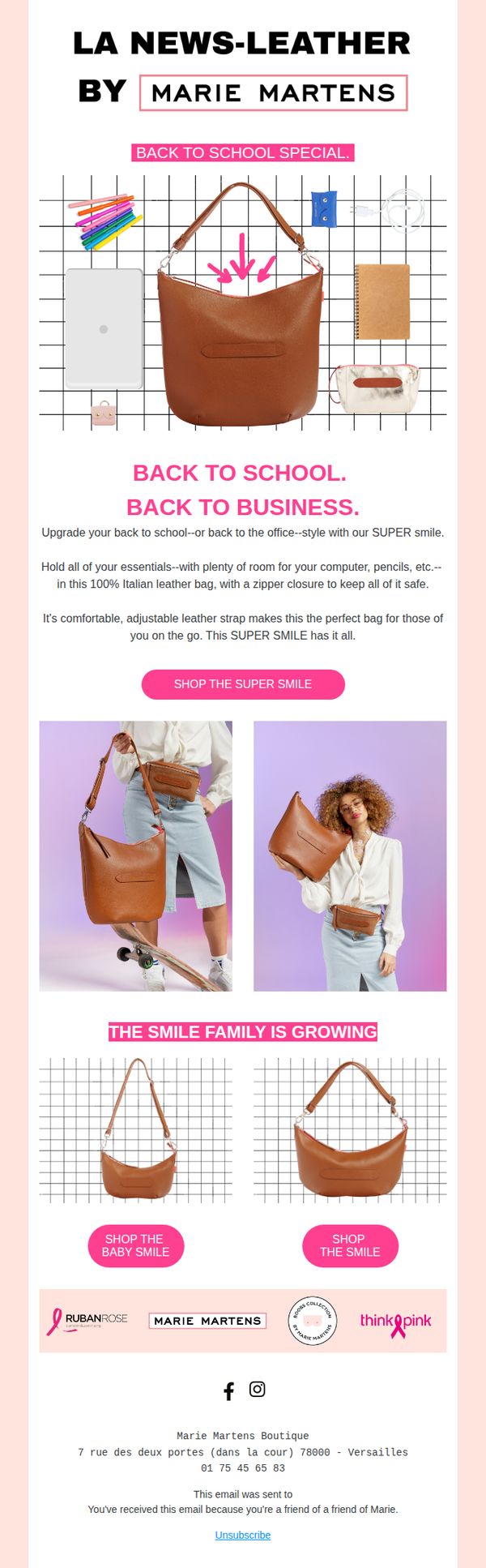
2. Marie Martens: BACK TO SCHOOL. BACK TO BUSINESS.
Objective
This email aims to drive sales of the 'SUPER SMILE' leather bag by positioning it as the ideal versatile accessory for both students and professionals returning to daily routines. It leverages seasonal relevance and lifestyle imagery to connect emotionally while highlighting practical features like capacity and security.
Why this works
The email brilliantly bridges back-to-school and back-to-business audiences by showcasing the same bag in two distinct lifestyle contexts, making it feel universally relevant without diluting its core utility or appeal.
How to implement
By emphasizing the bag’s capacity for tech and essentials alongside its secure zipper closure, the copy speaks directly to the anxieties of modern commuters and students, turning functional specs into emotional reassurance.
Pro Tip
Add a limited-time discount or urgency trigger (e.g., '24-Hour Back-to-School Sale') near the primary CTA to increase conversion by leveraging FOMO, especially since the campaign ties to a seasonal moment. • Include a short testimonial or user review snippet under the hero section to build social proof, especially since the bag is positioned for both students and professionals, real voices would validate its dual-use claim.
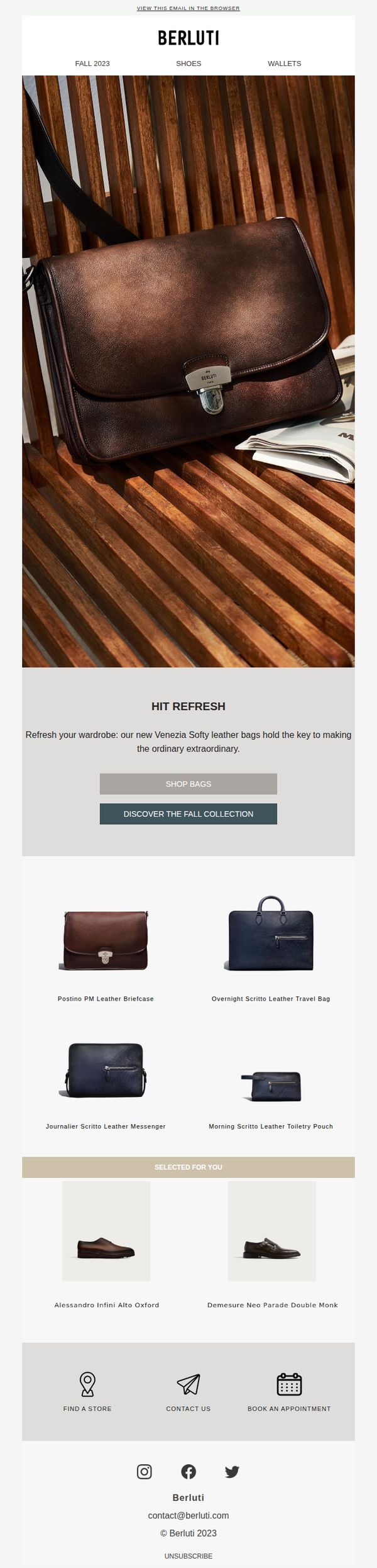
3. Berluti - English: In a back to school state of mind
Objective
To inspire customers to refresh their wardrobe with Berluti’s new Fall 2023 Venezia Softy leather bags, positioning them as essential accessories for a sophisticated back-to-school season. The email aims to drive traffic to the collection and encourage product exploration through curated selections.
Why this works
Berluti masterfully ties seasonal transitions to luxury product launches, using 'back to school' not as a juvenile theme but as a sophisticated lifestyle moment that invites wardrobe renewal with premium leather goods.
How to implement
The email uses minimal copy paired with rich visual storytelling, letting the texture, craftsmanship, and context of the bag on a wooden bench speak louder than words to evoke emotion and desire.
Pro Tip
Add a subtle countdown timer or limited-availability indicator near the 'Shop Bags' CTA to create urgency, especially since the Fall 2023 collection implies seasonality and exclusivity. • Include a short customer testimonial or editorial quote near the hero section to reinforce the 'extraordinary' claim, social proof would elevate perceived value and trust for luxury shoppers.
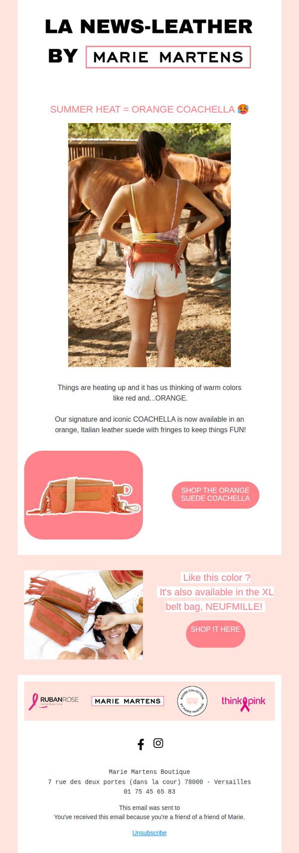
4. Marie Martens: Things are heating up 🔥
Objective
This email aims to drive immediate engagement and sales by highlighting a seasonal product launch, the orange suede Coachella bag, tying it to summer vibes and warm weather, while encouraging recipients to explore related items and feel part of a curated, fashion-forward community.
Why this works
The email brilliantly ties product availability to seasonal emotion, using 'summer heat' and 'orange' to create an instant visual and emotional connection that makes the product feel timely and irresistible rather than just another item in stock.
How to implement
By showcasing the bag in a lifestyle photo with horses and warm sunlight, the brand elevates the product from accessory to experience, subtly suggesting adventure, freedom, and effortless style, key emotional triggers for fashion-conscious buyers.
Pro Tip
Add a subtle countdown timer or limited-quantity indicator near the CTA to create urgency, since the email’s seasonal theme implies fleeting availability, this would nudge hesitant shoppers toward immediate action. • Include a short testimonial or user-generated photo of someone wearing the orange Coachella bag in a real-life setting to build social proof and help customers visualize themselves using the product, increasing conversion confidence.
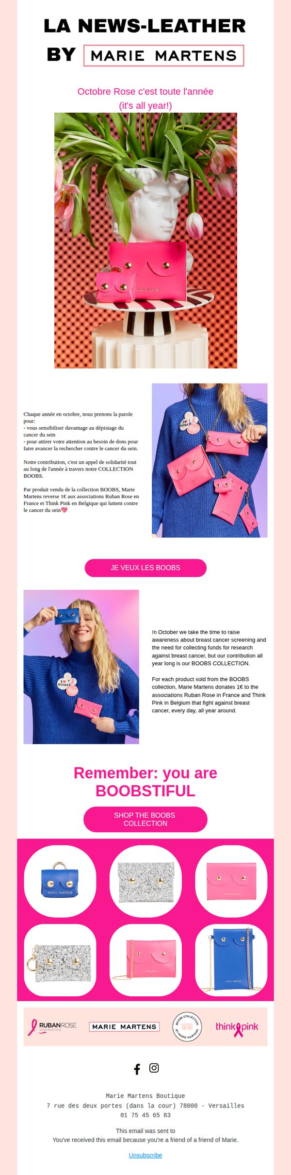
5. Marie Martens: Octobre Rose c'est toute l'année 🎀
Objective
This email aims to promote Marie Martens’ BOOBS collection year-round as part of their ongoing breast cancer awareness initiative, encouraging purchases that directly fund research through donations to Ruban Rose and Think Pink. It seeks to emotionally engage customers by framing shopping as an act of solidarity.
Why this works
The campaign brilliantly reframes a seasonal cause into a year-round mission, making customers feel their support matters beyond October while keeping the emotional resonance of breast cancer awareness alive through consistent visual and messaging cues.
How to implement
By clearly stating that each product sold triggers a €1 donation to trusted local charities, the email transforms a simple purchase into a meaningful act of solidarity, a powerful psychological lever that aligns consumer behavior with social impact.
Pro Tip
Add a small progress bar or counter near the CTA showing total donations raised so far from the BOOBS collection, to create social proof and urgency, this would visually reinforce the impact of each purchase and motivate immediate action. • Include a short customer testimonial or quote from someone who bought the collection to support the cause, placed near the product grid, this would humanize the campaign and strengthen emotional connection beyond the brand’s own messaging.
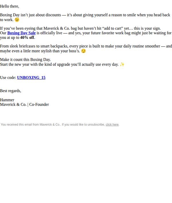
6. Maverick & Co. : It’s on: the last sale of the year 🚀
Objective
The email aims to drive immediate purchases by framing the Boxing Day sale as a final, emotionally resonant opportunity to treat oneself to high-quality, stylish work bags, positioning the purchase as both practical and rewarding.
Why this works
The email brilliantly reframes a discount event as an emotional reward, not just saving money, but giving yourself a reason to smile when returning to work, which elevates the purchase from transactional to self-care.
How to implement
By personalizing the message with a direct nod to the recipient’s hesitation, ‘if you’ve been eyeing that bag but haven’t hit add to cart yet’, it creates urgency while validating the customer’s desire, making the nudge feel supportive, not pushy.
Pro Tip
Add a visual hero section with a high-res image of the featured bag in use, perhaps styled on a desk or being carried into a modern office, to immediately anchor the emotional message with tangible product appeal. • Include a small countdown timer or ‘limited stock’ indicator near the CTA to amplify urgency, since the ‘last sale of the year’ framing is strong but lacks real-time scarcity cues to drive faster action.
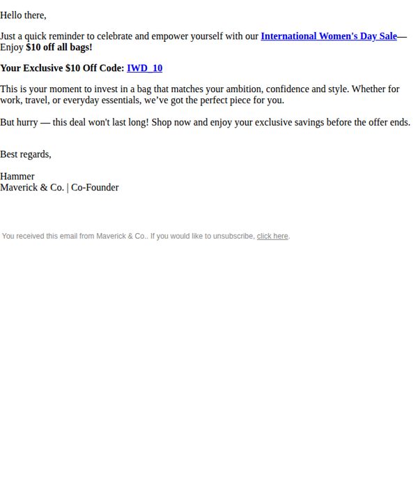
7. Maverick & Co. : Last Chance To Use The Discount
Objective
This email aims to create urgency and drive immediate purchases by reminding recipients of a limited-time discount tied to International Women’s Day, encouraging them to celebrate themselves with a stylish bag before the offer expires.
Why this works
The email frames the discount as a personal empowerment gesture tied to International Women’s Day, transforming a transactional offer into an emotionally resonant moment that aligns with the recipient’s identity and values.
How to implement
By using a personalized tone and a founder’s signature, the message builds trust and authenticity, making the promotion feel less like a sales pitch and more like a thoughtful recommendation from someone who understands the customer’s lifestyle.
Pro Tip
Add a visual hero section with an image of a featured bag or lifestyle shot to anchor the emotional message and give the offer tangible context, increasing conversion potential. • Include a countdown timer or expiration date near the CTA to strengthen urgency visually, since the current text-only urgency may not register as strongly on mobile or distracted readers.
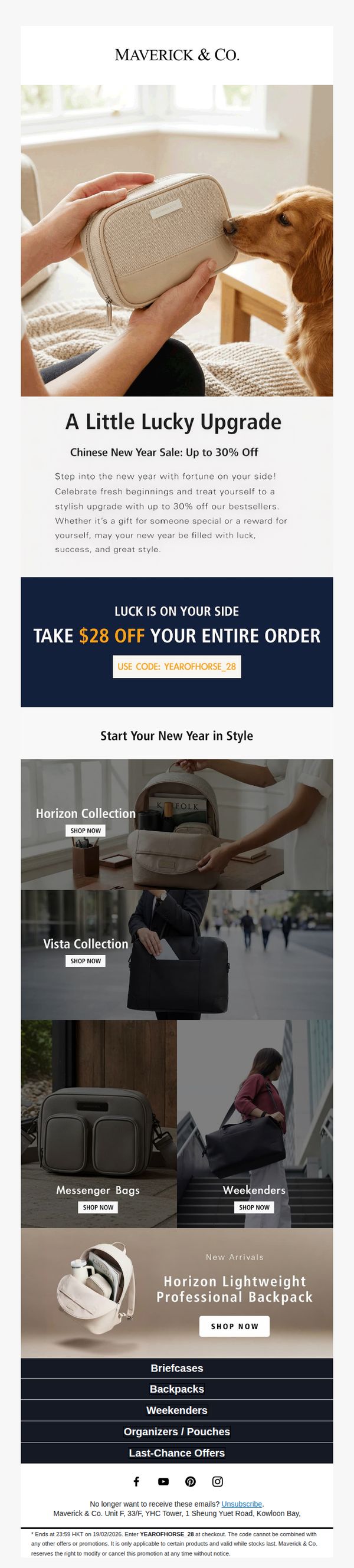
8. Maverick & Co. : Chinese New Year Sale: Up to 30% Off
Objective
This email aims to drive immediate sales during the Chinese New Year by offering a time-sensitive discount and showcasing curated product collections that align with the theme of fresh beginnings and stylish self-rewards. It encourages recipients to treat themselves or gift loved ones while reinforcing brand identity through lifestyle imagery.
Why this works
The email brilliantly ties the Chinese New Year theme to emotional gifting and self-reward, transforming a seasonal sale into a culturally resonant moment that feels personal and meaningful rather than purely transactional.
How to implement
By featuring lifestyle imagery with relatable moments, like a dog sniffing a bag, the brand builds emotional connection and subtly implies product durability and everyday elegance without overtly stating it.
Pro Tip
Add a countdown timer near the CTA to create urgency, since the offer ends at 23:59 HKT, this would visually reinforce the time-sensitive nature of the discount and nudge faster conversions. • Include a short testimonial or social proof snippet under the offer section to build trust, especially since the discount is applied site-wide, a customer quote about quality or value would strengthen perceived legitimacy.
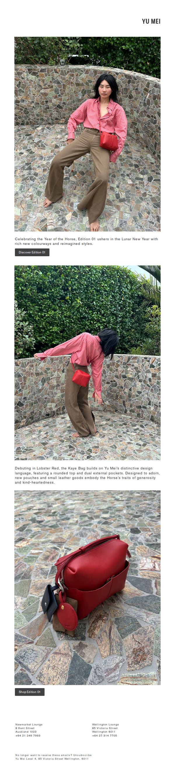
9. Yu Mei Brand - NZ: Edition 01 welcomes the Year of the Horse

Objective
This email aims to introduce Yu Mei’s Lunar New Year Edition 01 collection, celebrating the Year of the Horse with new colorways and reimagined designs, while driving traffic to shop the new release through compelling visuals and storytelling.
Why this works
The email masterfully ties cultural celebration to product storytelling by linking the Horse’s symbolic traits, generosity and kindness, to the design details of the Kaye Bag, making the launch feel meaningful rather than just commercial.
How to implement
Using a single, richly textured outdoor setting across multiple shots creates visual cohesion and elevates the product’s artisanal feel, subtly reinforcing the brand’s connection to nature and craftsmanship without needing explicit copy.
Pro Tip
Add a subtle countdown timer or limited-edition badge near the CTA to create urgency, since the Lunar New Year theme naturally lends itself to time-sensitive appeal and could boost immediate click-through rates. • Include a short testimonial or customer quote near the product close-up to build social proof, especially since the bag is positioned as a statement piece, real-user validation would strengthen perceived value and reduce purchase hesitation.
10. Yu Mei Brand - NZ: Edition 01 welcomes the Year of the Horse
Objective
To introduce Yu Mei’s Lunar New Year Edition 01 collection, highlighting its cultural significance and fresh design direction while driving traffic to shop the new release. The email positions the collection as both a seasonal celebration and a design evolution.
Why this works
The email brilliantly ties product design to cultural symbolism by linking the Kaye Bag’s features, like dual pockets and rounded top, to the Horse’s traits of generosity and kindness, making the product feel emotionally resonant and meaningful beyond aesthetics.
How to implement
Using a single model across multiple dynamic poses in the same outfit creates a cohesive visual story that feels editorial and immersive, subtly encouraging the viewer to imagine themselves wearing and moving in the pieces, which enhances emotional connection and desire.
Pro Tip
Add a subtle countdown timer or limited-edition badge near the CTA to create urgency around Edition 01, since the cultural timing (Year of the Horse) implies exclusivity that’s currently underleveraged in the visual hierarchy. • Include a short testimonial or press quote from a stylist or influencer who’s worn the collection to build social proof, especially since the product is positioned as a design evolution, third-party validation would reinforce its desirability and credibility.