Welcome emails worth copying from real brands

1. Metropolitan Transportation Authority (MTA): Subway and rail service changes: April 11-14
Objective
This email aims to inform riders of upcoming subway and rail service changes over the weekend, helping them plan alternative routes and avoid disruptions. It also encourages ongoing engagement by promoting real-time alerts, apps, and construction updates.
Why this works
The email opens with a friendly, timely hook, mentioning National Pet Day, to humanize a technical update, making riders more receptive to the service alerts that follow without feeling overwhelmed by dry logistics.
How to implement
Each service change is clearly labeled by train line and borough, with bold headers and bullet points that let riders instantly scan for their route, reducing cognitive load and helping them make faster travel decisions during a busy weekend.
Pro Tip
Add a visual map or color-coded route diagram in the hero section to show affected lines at a glance, this would reduce the need to parse dense text and help visual learners quickly identify impacted areas. • Include a countdown timer or bolded 'Effective Until' date near the top to emphasize urgency and time sensitivity, encouraging immediate action rather than passive reading, especially for riders planning weekend trips.
2. Workday : Workday Announces Fiscal 2026 Third Quarter Financial Results
Objective
This email aims to inform investors and stakeholders about Workday’s strong Q3 fiscal 2026 financial performance, highlighting revenue growth, operational efficiency, and strategic initiatives while reinforcing confidence in the company’s future outlook and leadership in enterprise cloud solutions.
Why this works
Workday masterfully anchors its investor message in quantifiable momentum, showcasing double-digit subscription growth and expanding margins, to build credibility while subtly signaling long-term scalability through customer wins like County of San Luis Obispo and Fujitsu Electric Co.
How to implement
The email strategically balances hard financials with forward-looking narrative by pairing GAAP and non-GAAP metrics with executive commentary, allowing both analytical investors and growth-focused stakeholders to find value without overwhelming either audience with jargon or oversimplification.
Pro Tip
Add a visual summary graphic (e.g., bar chart or progress meter) next to key metrics like $2.432B revenue or 12.6% growth to help skimmers grasp performance at a glance without scrolling through dense tables. • Reposition the 'Read the full press release online' CTA higher in the email, ideally beneath the hero section, with a contrasting button design to increase click-through for users who want deeper detail without hunting for links.
3. Alo Yoga: Alo Customer Account Invitation
Objective
This email aims to guide new customers through account activation while immediately introducing them to Alo Yoga’s loyalty program and core brand benefits to encourage engagement and first purchase. It also subtly promotes gender-specific product lines to personalize the onboarding experience.
Why this works
The email smartly pairs account activation with immediate value by highlighting the Alo Access Rewards Shop, turning a functional step into an engaging brand introduction that primes users for future purchases.
How to implement
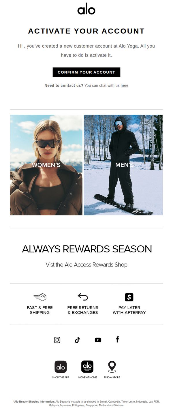
By visually splitting the hero section into Women’s and Men’s categories with lifestyle imagery, Alo Yoga personalizes the onboarding experience without requiring user input, making new customers feel seen from the first click.
Pro Tip
Add a countdown timer or urgency cue near the 'CONFIRM YOUR ACCOUNT' CTA to increase activation rates by creating a subtle sense of time-sensitive value tied to the rewards program. • Include a brief personalized welcome message (e.g., 'Welcome, [First Name]!') above the activation prompt to strengthen emotional connection and increase perceived relevance of the account setup step.
4. Dollar: 🚗 Welcome to Dollar!
Objective
This email aims to welcome new subscribers by introducing Dollar’s value proposition, convenience, ease, and affordability, while immediately prompting them to book a rental through clear CTAs and a friendly brand persona called The Common Sensei.
Why this works
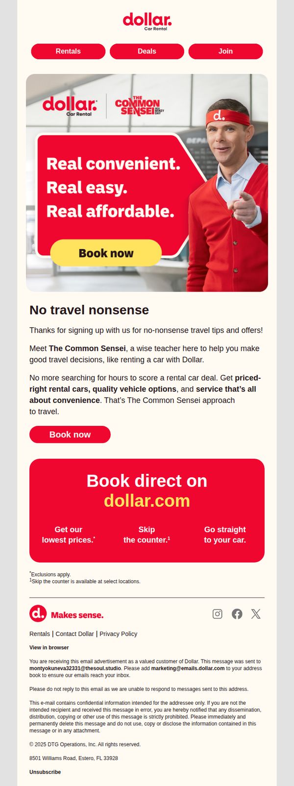
The email brilliantly personifies the brand’s philosophy through 'The Common Sensei,' turning a transactional service into a relatable, trustworthy guide that simplifies decision-making for travelers.
How to implement
By repeating the 'Book now' CTA in both the hero and mid-section, the campaign strategically reinforces urgency and reduces friction, making it effortless for users to convert at multiple touchpoints.
Pro Tip
Add a subtle countdown timer or limited-time offer badge near the primary CTA to create urgency, especially since the email targets new subscribers who may need an extra nudge to act immediately. • Include a short customer testimonial or star rating near the 'No travel nonsense' section to build social proof and reinforce credibility around the 'quality vehicle options' claim.
5. Playa Bowls: Our 200th Playa Bowls location is open! 🍍
Objective
This email celebrates the opening of Playa Bowls’ 200th location in Hackensack, NJ, while driving immediate engagement through product promotion, apparel discounts, and local store visits. It blends milestone excitement with actionable offers to convert readers into customers.
Why this works
The email brilliantly ties a major brand milestone, the 200th location, to a localized, experiential invitation, making customers feel part of a celebration rather than just receiving a promotional blast.
How to implement
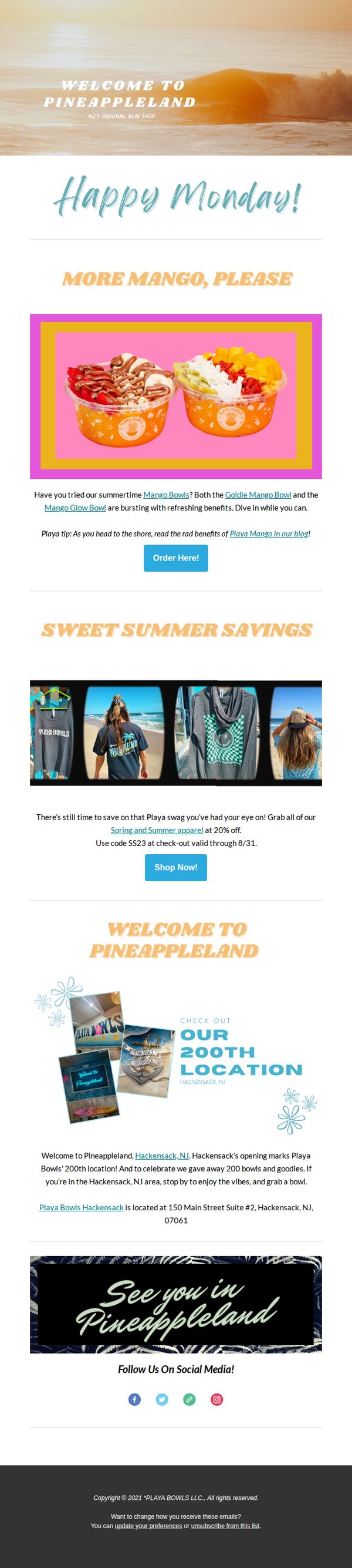
By featuring vibrant, crave-worthy visuals of seasonal bowls alongside a clear CTA and educational blog link, the campaign balances appetite appeal with value-driven content that builds trust and encourages exploration.
Pro Tip
Add a countdown timer or urgency indicator near the apparel discount to amplify FOMO, since the 20% off code expires 8/31, this would strengthen conversion pressure without altering the offer. • Include a clickable map or Google Maps link directly under the Hackensack location address to reduce friction for local customers trying to find the new store, improving in-person visit rates.
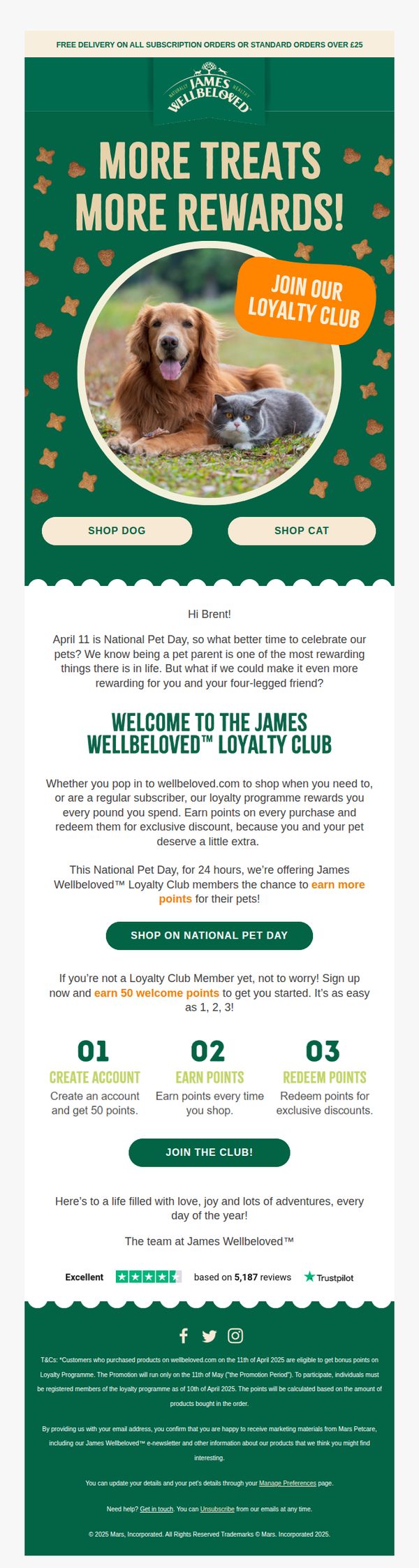
6. James Wellbeloved: Join the club on National Pet Day!
Objective
This email aims to drive immediate sign-ups for the James Wellbeloved Loyalty Club by tying the offer to National Pet Day, encouraging pet owners to join and earn bonus points while reinforcing brand loyalty through emotional connection and exclusive rewards.
Why this works
The email brilliantly leverages National Pet Day as an emotional hook, transforming a calendar event into a compelling reason for pet parents to join the loyalty program, making the offer feel timely, personal, and celebratory rather than purely transactional.
How to implement
By breaking down the loyalty program into three simple, numbered steps, create account, earn points, redeem rewards, the email removes friction and makes joining feel effortless, which is especially effective for time-sensitive promotions where clarity drives conversion.
Pro Tip
Add a countdown timer or urgency indicator near the 'SHOP ON NATIONAL PET DAY' CTA to reinforce the 24-hour window and nudge immediate action, since the current design relies solely on text to convey time sensitivity. • Include a small visual icon or badge next to the '50 welcome points' offer to make the incentive more scannable and emotionally rewarding, such as a star, gift box, or paw print, to increase perceived value and draw the eye.
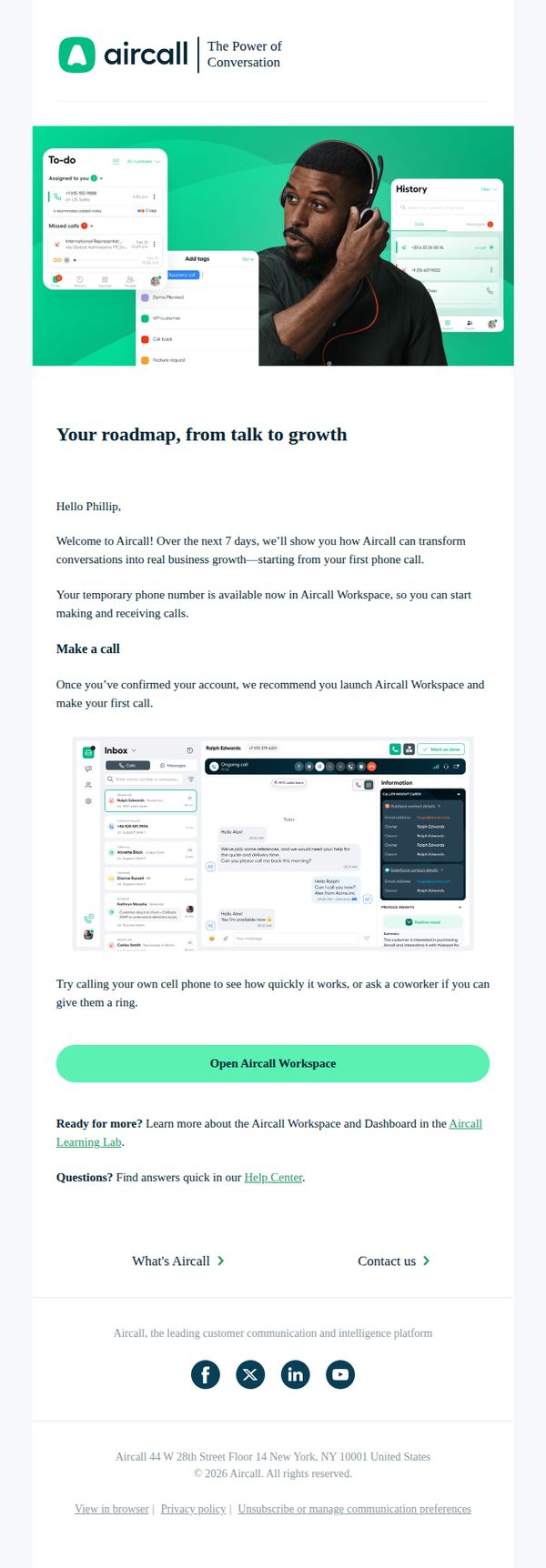
7. Aircall : Welcome to Aircall! Allow us to introduce ourselves
Objective
This email aims to warmly welcome new users to Aircall by guiding them through their first steps, encouraging immediate product engagement, and positioning the platform as a growth-enabling communication tool from day one.
Why this works
The email opens with a personalized greeting and a clear 7-day onboarding promise, which reduces new-user anxiety by setting predictable expectations and framing the platform as a growth partner from the very first interaction.
How to implement
Including a visual mockup of the Aircall interface directly beneath the call-to-action helps users mentally rehearse the next step, bridging the gap between instruction and action by showing exactly what they’ll see when they click.
Pro Tip
Add a subtle progress indicator or checklist (e.g., 'Step 1 of 7: Make Your First Call') to reinforce the 7-day roadmap and motivate users to complete onboarding milestones. • Include a short testimonial or social proof near the CTA, such as '92% of new users make their first call within 24 hours', to reduce hesitation and normalize immediate action.
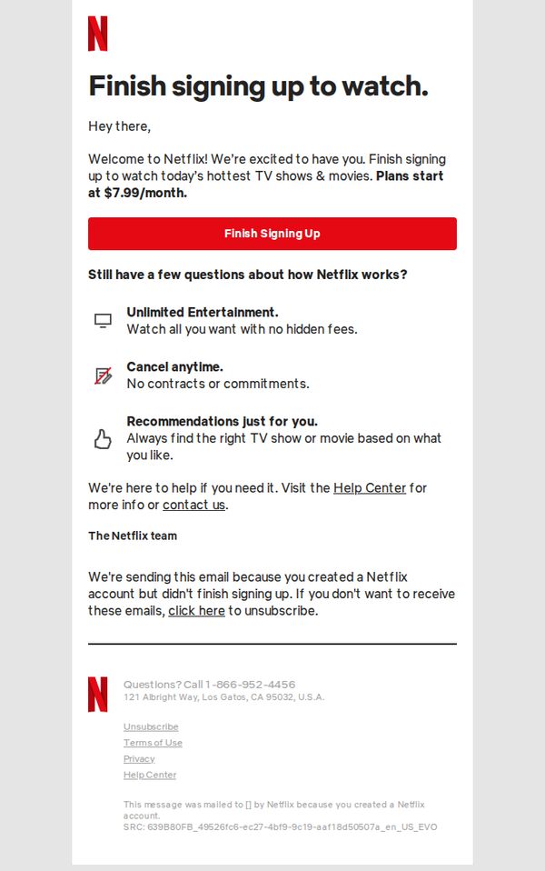
8. Netflix: Start watching today
Objective
This email aims to convert users who started but didn’t complete their Netflix sign-up by reminding them of the value proposition and simplifying the final step with a prominent CTA. It reassures them with key benefits and support options to reduce friction.
Why this works
The email opens with a warm, personalized greeting and immediately reinforces the user’s intent by framing sign-up as the final step, reducing perceived effort and increasing completion likelihood through psychological momentum.
How to implement
It strategically highlights three core value pillars, unlimited content, flexible cancellation, and personalized recommendations, using simple icons and concise copy to build trust and address common objections without overwhelming the reader.
Pro Tip
Add a visual progress indicator (e.g., 'Step 2 of 2') near the CTA to reinforce that the user is nearly done, reducing abandonment by making the final step feel even more effortless and imminent. • Include a micro-testimonial or social proof near the CTA, such as 'Join 200M+ viewers who started watching today', to leverage social validation and nudge hesitant users toward completion.
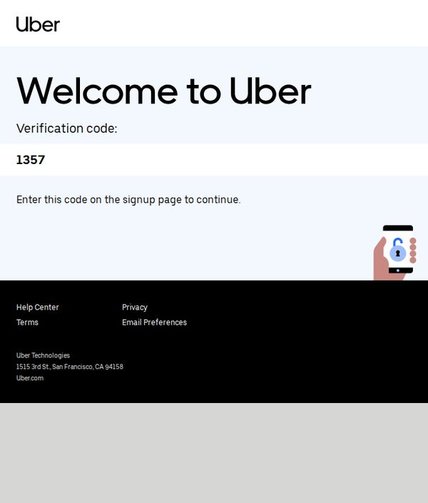
9. Uber: Welcome to Uber
Objective
This email aims to guide new users through account verification by delivering a one-time code, ensuring secure onboarding while reinforcing brand trust through clear instructions and recognizable visual elements.
Why this works
The email immediately establishes trust by displaying a clean, minimalist layout with bold typography that draws attention to the verification code, making the critical action unmistakable for first-time users.
How to implement
Including a simple visual cue, a hand holding a phone with a lock icon, subtly reinforces security without cluttering the message, helping users feel safe while completing a sensitive step in the signup flow.
Pro Tip
Add a subtle countdown timer or expiration notice next to the verification code to create urgency and reduce abandonment, since users may delay entering the code without a time-sensitive cue. • Include a secondary CTA button or link labeled 'Resend Code' beneath the main instruction to accommodate users who may miss or forget the code, reducing friction in the onboarding process.
10. Bobbies: Easter Colors 🐣
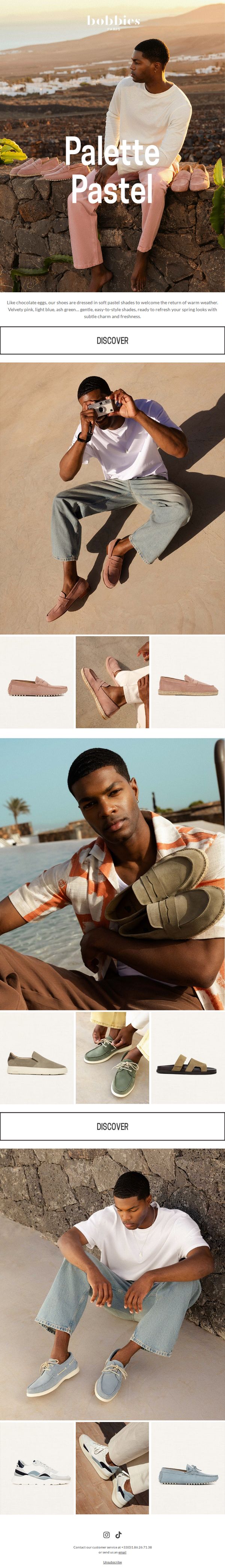
Objective
This email aims to drive engagement and sales by showcasing Bobbies’ spring-ready footwear in soft pastel shades, aligning with the Easter season to evoke freshness and seasonal renewal while encouraging immediate exploration of the collection.
Why this works
The email brilliantly ties seasonal emotion to product color by comparing pastel shoes to chocolate eggs, creating an instant, sensory-rich connection that makes the collection feel timely, indulgent, and emotionally resonant rather than just visually appealing.
How to implement
Each product section uses lifestyle imagery that tells a mini-story, whether it’s a man lounging by the sea or capturing a moment with a camera, which subtly positions the shoes as essential accessories for memorable, relaxed spring experiences, not just footwear.
Pro Tip
Add a subtle urgency element like 'Limited Spring Colors, Shop Before They’re Gone' near the first CTA to nudge immediate action, since the current design lacks any time-sensitive motivation despite the seasonal theme. • Include a short testimonial or social proof snippet under one of the product grids (e.g., 'Loved by 10K+ spring shoppers') to build trust and reduce perceived risk, especially since the email relies heavily on visual appeal without social validation.