How Lucky Brand Does Promotional Emails
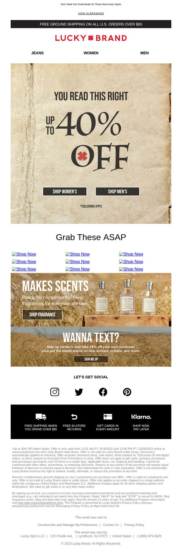
1. Babe, Wake Up 🥰 Everything's Up To 40% Off
Objective
This email aims to drive immediate sales by creating urgency around a limited-time sale of up to 40% off select styles, while also encouraging engagement through fragrance promotions and text sign-ups to build long-term customer relationships.
Why this works
The email opens with a playful, conversational subject line and headline that instantly grabs attention while reinforcing the sale’s urgency, a smart emotional hook that turns a discount into a personal invitation rather than a generic promotion.
How to implement
By placing two clear, contrasting CTAs (Shop Women’s and Shop Men’s) directly under the headline, the email reduces friction and lets users self-segment immediately, which streamlines the path to purchase and respects different audience preferences without clutter.
Pro Tip
Add a countdown timer beneath the 'UP TO 40% OFF' headline to visually reinforce urgency and encourage immediate action, especially since the offer expires within 24 hours, this would leverage FOMO more effectively than text alone. • Reposition the 'WANNA TEXT?' section higher in the email, perhaps right after the hero, to capture attention while users are most engaged, currently, it’s buried below product links, reducing its conversion potential for SMS opt-ins.
2. Psst, Your Fave Styles Are Up To 40% Off 😏
Objective
This email aims to drive immediate sales by highlighting a limited-time discount of up to 40% off select styles, while encouraging recipients to explore both women’s and men’s collections through clear, segmented CTAs.
Why this works
The email uses a conversational, playful tone with phrases like 'Psst' and 'You read this right' to create urgency and emotional connection, making the discount feel like a personal insider tip rather than a generic promotion.
How to implement
By splitting the primary CTA into gender-specific buttons, 'Shop Women’s' and 'Shop Men’s', the campaign reduces decision fatigue and guides users directly to their relevant category, improving conversion likelihood through intuitive segmentation.
Pro Tip
Add a countdown timer beneath the 'Up to 40% Off' headline to visually reinforce urgency and scarcity, which could increase click-through rates by prompting faster decision-making before the offer expires. • Replace the generic 'Shop Now' product grid links with specific product names or categories (e.g., 'Shop Denim Jackets' or 'Shop Summer Dresses') to improve relevance and reduce ambiguity for users scanning the email.
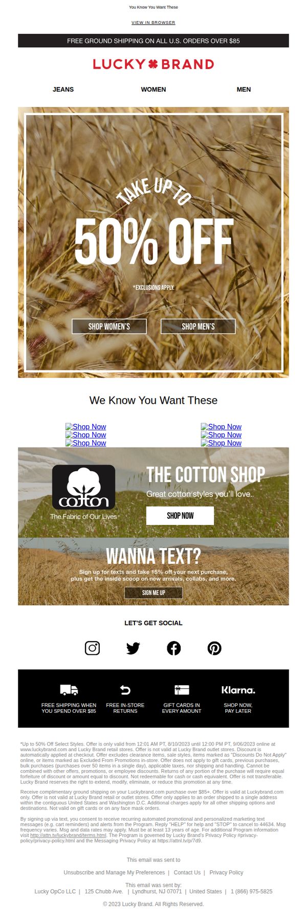
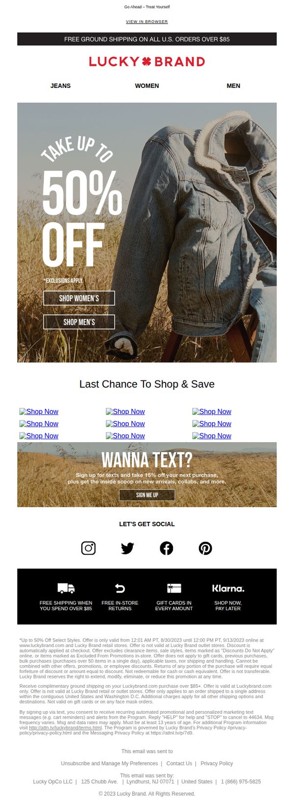
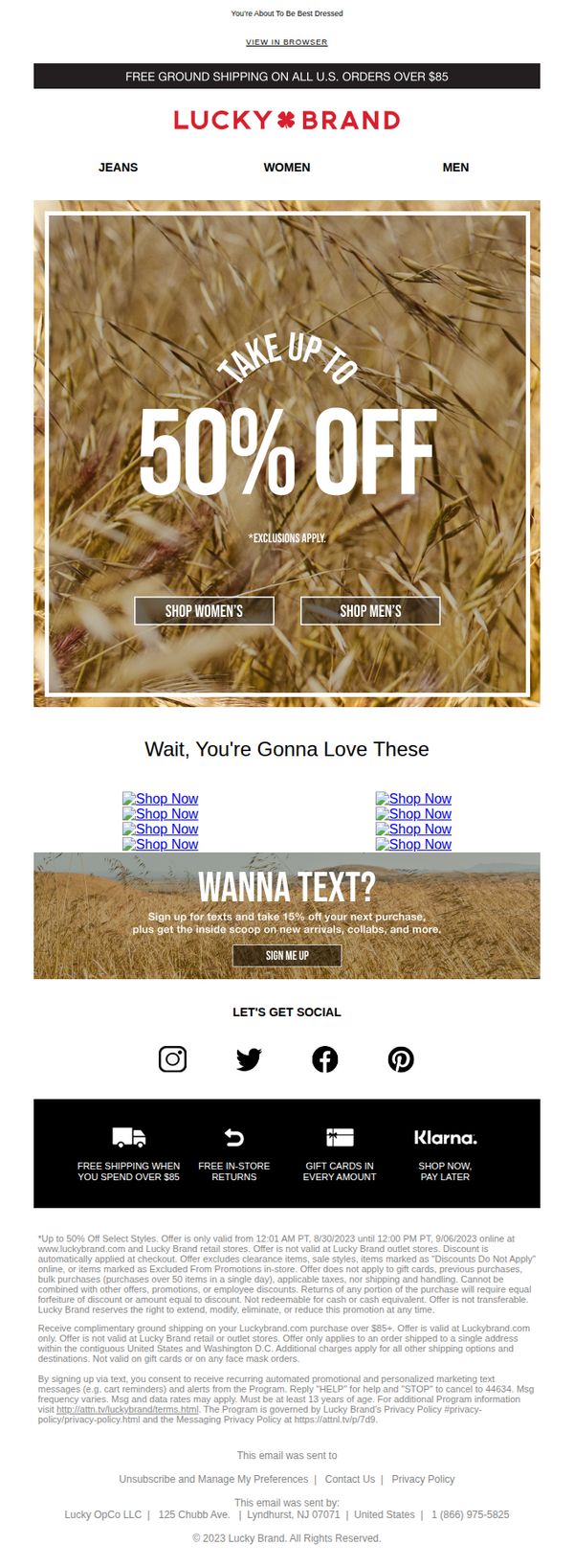
3. ⏰ Time To Shop Up To 50% Off
Objective
This email aims to drive immediate sales by promoting a limited-time sale of up to 50% off select styles, while also encouraging engagement through social media and text message sign-ups to build long-term customer relationships.
Why this works
The hero section uses a warm, natural background with bold, centered typography to instantly communicate the discount while evoking emotional appeal through organic imagery that aligns with the brand’s casual, lifestyle-driven identity.
How to implement
By placing two clear, gender-specific CTAs directly under the main offer, the email reduces decision fatigue and guides users to their preferred shopping path without requiring additional navigation or scrolling.
Pro Tip
The 'We Know You Want These' section lacks personalized product recommendations, replacing generic 'Shop Now' links with dynamically inserted items based on past browsing or purchase history would significantly increase relevance and conversion potential. • The hero section’s urgency is implied but not reinforced visually, adding a countdown timer or 'Ends Soon' badge near the 50% off headline would create stronger psychological pressure to act immediately.
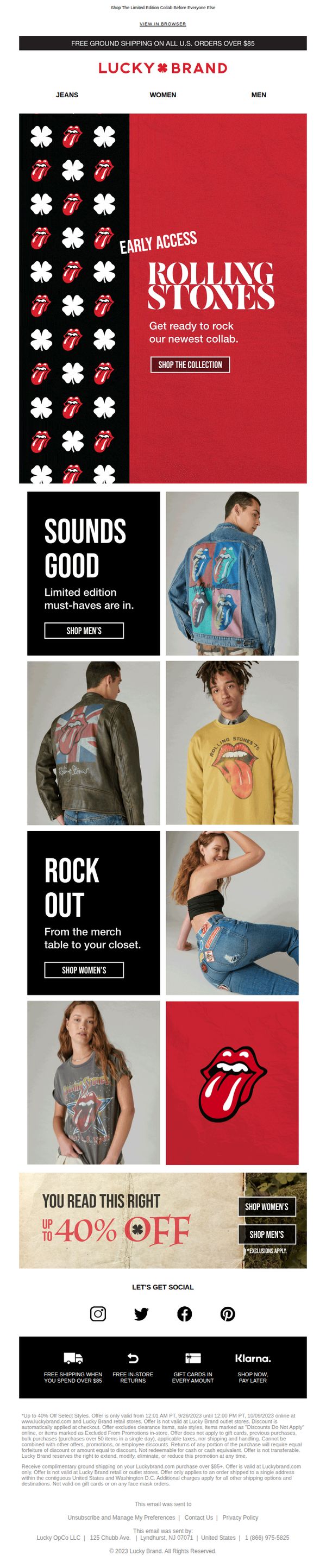
4. EARLY ACCESS! The Rolling Stones x Lucky Brand Is Here 👅
Objective
This email aims to drive immediate engagement and sales by granting early access to a limited-edition Rolling Stones x Lucky Brand collaboration, leveraging urgency and exclusivity to convert fans and fashion shoppers before the general public.
Why this works
The email brilliantly uses cultural nostalgia by spotlighting the Rolling Stones’ iconic tongue logo in bold, repeating patterns to instantly trigger emotional recognition and fan loyalty, making the collaboration feel both exclusive and deeply personal.
How to implement
By segmenting product visuals into gender-specific grids with clear CTAs like 'Shop Men’s' and 'Shop Women’s,' the email reduces decision fatigue and guides users directly to their preferred category, streamlining the path to purchase without overwhelming them.
Pro Tip
Add a countdown timer near the 'Early Access' headline to visually reinforce urgency and encourage faster clicks, since the current text-only time window (9/26–10/9) lacks real-time pressure that drives conversion. • Include a short testimonial or social proof snippet, like '1,200+ fans already grabbed theirs', near the product grid to build trust and FOMO, especially since this is a limited-edition collab where social validation can significantly influence purchase decisions.
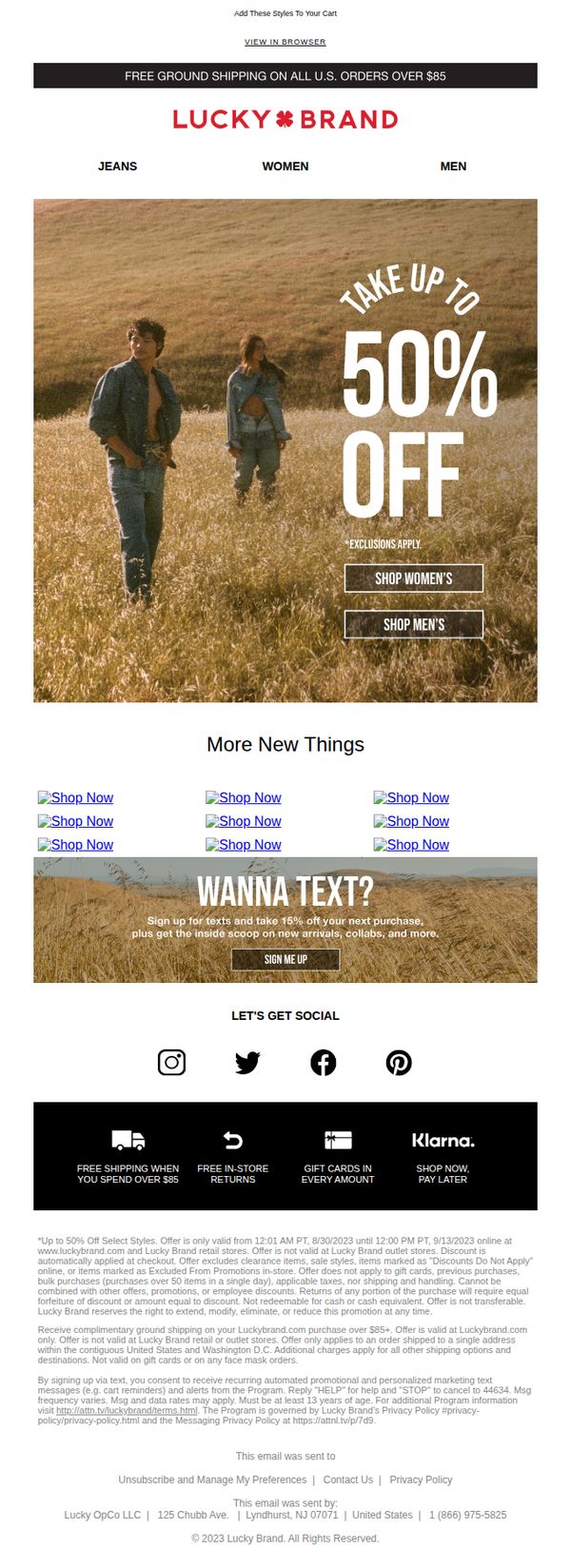
5. Fall For A New Look With Up To 50% Off
Objective
This email aims to drive immediate fall apparel sales by promoting a limited-time sale of up to 50% off, while encouraging customer engagement through social sign-ups and cross-category browsing. It leverages urgency and visual appeal to convert subscribers into shoppers.
Why this works
The hero section uses a lifestyle image paired with bold, oversized discount text to instantly communicate value and emotion, making the offer impossible to ignore while aligning with seasonal fashion trends.
How to implement
Strategically placing dual CTAs for men’s and women’s categories beneath the main offer reduces friction by letting users self-segment, increasing the likelihood of immediate clicks without requiring additional navigation.
Pro Tip
The product grid uses generic 'Shop Now' links without visual product previews or category context, which reduces conversion potential, replacing with thumbnail images and category labels would better guide user decisions. • The footer’s legal disclaimer is overly dense and visually overwhelming; breaking it into collapsible sections or icons with tooltips would improve readability while maintaining compliance.
6. Best Of Fall: Up To 50% Off
Objective
This email aims to drive immediate sales by promoting a time-sensitive fall sale with up to 50% off, while encouraging category exploration through gender-specific CTAs and reinforcing brand loyalty with free shipping and social proof elements.
Why this works
The hero section uses a warm, seasonal outdoor photo with bold, curved typography to instantly communicate the sale’s value while evoking emotional connection through lifestyle imagery that aligns with fall fashion trends.
How to implement
By placing gender-specific CTAs directly over the hero image, the email reduces friction for shoppers, allowing them to self-segment and dive into relevant categories without scrolling or decision fatigue.
Pro Tip
Add a countdown timer near the hero section to create urgency around the 8/30/2023 deadline, which is currently buried in fine print and fails to motivate immediate action. • Replace the generic 'More New Things' product grid with curated fall collections (e.g., 'Cozy Knits' or 'Denim Essentials') to guide shoppers with intent rather than overwhelming them with undifferentiated options.
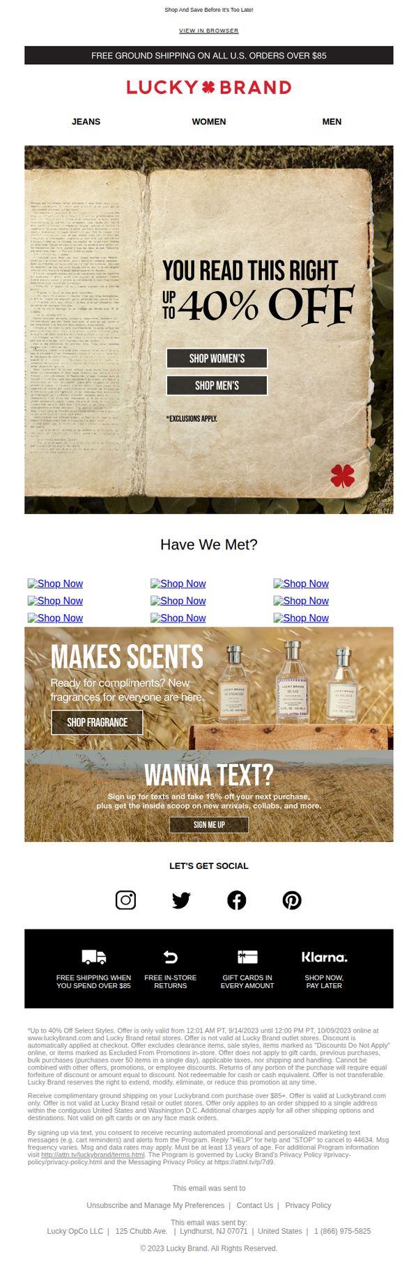
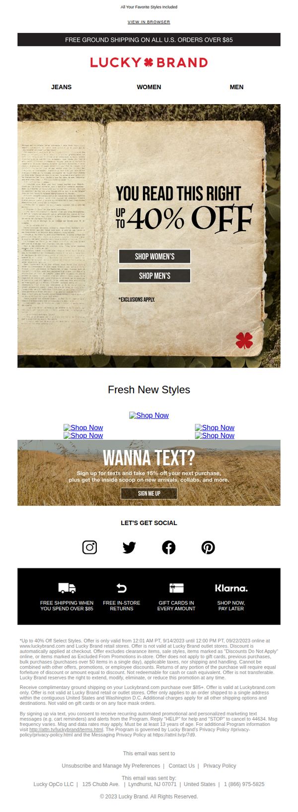
7. Great Styles For Less! Up To 40% Off
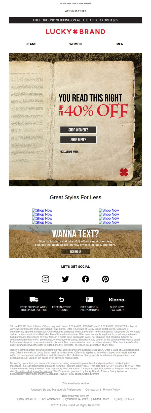
Objective
This email aims to drive immediate sales by promoting a limited-time discount of up to 40% off select styles, while encouraging category-specific browsing for both women’s and men’s apparel. It also seeks to grow SMS engagement for future promotions.
Why this works
The email uses a vintage book visual as a hero image to create emotional resonance and curiosity, turning a simple discount into a storytelling moment that feels personal and intentional rather than purely transactional.
How to implement
By placing two distinct CTAs, 'Shop Women’s' and 'Shop Men’s', directly under the headline, the email reduces decision fatigue and guides users immediately toward their preferred category, increasing the likelihood of conversion.
Pro Tip
The product grid section uses identical 'Shop Now' links with no visual differentiation or product imagery, which reduces perceived value and urgency, adding thumbnail images or unique descriptors for each link would strengthen click-through intent. • The hero section’s discount message lacks a visible countdown timer or end date within the main visual, which diminishes urgency, adding a dynamic timer or bold deadline text would reinforce scarcity and drive faster action.
8. SALE ALERT: Up To 50% Off Sitewide
Objective
This email aims to drive immediate sales by promoting a limited-time sitewide sale of up to 50% off, while encouraging recipients to explore gender-specific collections and opt into SMS for additional discounts and updates.
Why this works
The hero section uses a warm, textured background with bold, centered typography to immediately communicate the sale’s magnitude, creating visual urgency without cluttering the message or distracting from the core offer.
How to implement
By separating gender-specific CTAs beneath the main offer, the email respects user intent and reduces decision fatigue, guiding shoppers directly to their preferred category while reinforcing the scale of the discount with consistent visual hierarchy.
Pro Tip
The cross-sell section displays generic 'Shop Now' links without product imagery or descriptions, which reduces conversion potential, replacing these with actual product thumbnails and brief benefit-driven copy would better entice clicks. • The hero CTA buttons lack visual differentiation or hover states, which may reduce perceived interactivity, adding subtle shadows, color shifts, or iconography would enhance clickability and reinforce the urgency of the limited-time offer.
9. Up To 40% Off Your Fall Haul
Objective
This email aims to drive immediate sales by promoting a time-sensitive fall sale with up to 40% off, encouraging recipients to shop women’s and men’s collections while highlighting added value through free shipping and social engagement.
Why this works
The email leverages urgency and exclusivity by anchoring the offer to a specific date range and using bold, oversized typography to make the 40% discount impossible to miss, instantly capturing attention and prompting action.
How to implement
By splitting the hero CTA into gender-specific buttons, 'Shop Women’s' and 'Shop Men’s', the campaign reduces friction for shoppers, allowing them to self-segment and dive directly into relevant categories without extra clicks or decisions.
Pro Tip
Add a countdown timer beneath the hero headline to visually reinforce urgency and encourage immediate clicks before the 9/14/2023 deadline, increasing perceived scarcity and conversion pressure. • Include a small testimonial or social proof snippet near the 'Fresh New Styles' section, such as 'Over 10,000 customers loved this season’s denim', to build trust and reduce hesitation for first-time buyers.
10. Three Words: Liquid. Denim. Luxe. 🌊
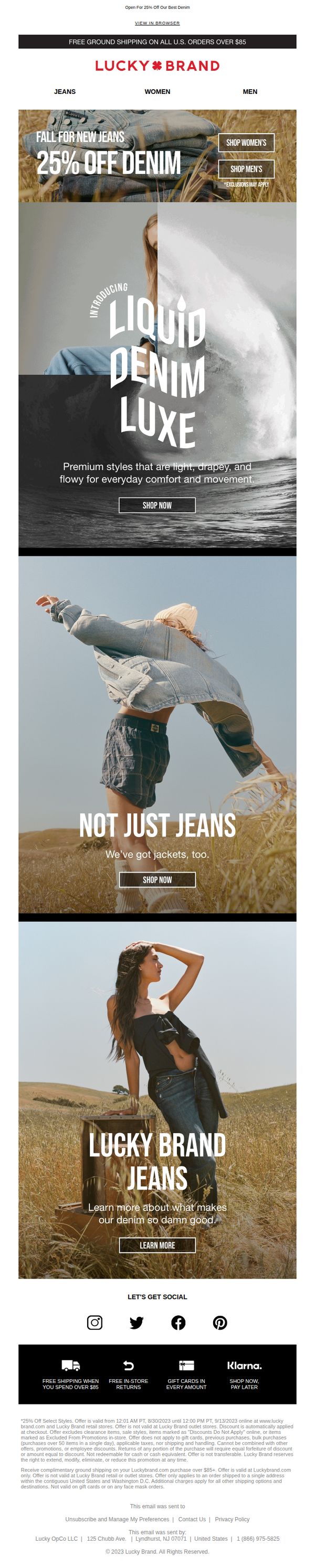
Objective
This email aims to drive immediate sales by promoting a limited-time 25% discount on denim while introducing the new 'Liquid Denim Luxe' collection as a premium, comfort-focused product line. It also seeks to expand category engagement by showcasing denim jackets and educating customers on the brand’s denim craftsmanship.
Why this works
The email masterfully uses sensory language like 'Liquid Denim Luxe' to transform a commodity product into an experience, making customers feel they’re not just buying jeans but upgrading their everyday comfort and movement with premium, drapey fabric.
How to implement
By placing the 25% off offer front and center with clear category buttons for women’s and men’s denim, the campaign removes friction and speaks directly to both audiences without forcing them to navigate away from the promotional hook.
Pro Tip
Add a countdown timer beneath the 25% off headline to create urgency and reinforce the limited-time nature of the offer, which is currently only implied by the fine print at the bottom. • Include a small visual indicator or icon next to the 'SHOP NOW' buttons in the Liquid Denim Luxe and jackets sections to differentiate which CTA leads to new arrivals versus existing styles, reducing customer confusion.