The Complete Mask Email Collection

1. Oui In France: ❗Read this BEFORE advocating for yourself at the doctor in France (plus it SNOWED!) ❄️
Objective
This email aims to engage readers with personal, culturally rich storytelling while subtly promoting upcoming events and blog content relevant to expats in France. It builds community by sharing relatable experiences and offering practical resources for navigating life abroad.
Why this works
The email opens with a warm, personal anecdote about snow in France, a relatable, sensory hook that instantly creates emotional resonance and positions the sender as a fellow expat, not just a brand, which builds trust before any promotion begins.
How to implement
Instead of hard-selling, the campaign weaves educational value into lifestyle storytelling, like explaining French New Year customs or doctor advocacy tips, making the content feel like a thoughtful gift rather than a pitch, which increases reader retention and loyalty.
Pro Tip
The primary CTA 'REGISTER TODAY' is visually buried within a webinar section that lacks urgency or benefit-driven copy; reposition it above the fold with a stronger value proposition like 'Join 500+ Expats Learning How to Work Remotely in France, Free Webinar' to boost conversions. • The blog section uses inconsistent color blocks and image sizes, creating visual clutter; standardizing card dimensions and using a unified background tone would improve scannability and guide the eye toward the most valuable content, like the 'Why I wouldn’t retire in France' post.
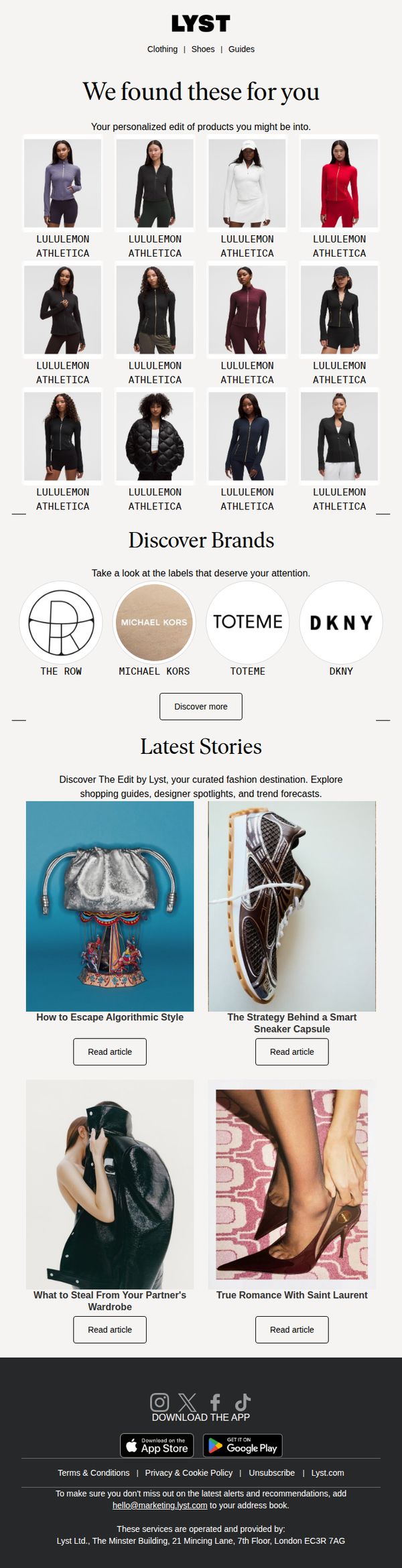
2. Lyst - US: Dive back in to lululemon athletica jackets
Objective
This email aims to re-engage users by surfacing personalized lululemon athletica jackets based on past behavior or preferences, while also introducing them to new brands and editorial content to deepen platform exploration and encourage repeat visits.
Why this works
The email leverages behavioral personalization by curating a grid of lululemon jackets tailored to the recipient, making the content feel relevant and reducing decision fatigue while subtly reinforcing brand affinity through repeated visual exposure.
How to implement
By embedding a 'Discover Brands' section with minimalist circular logos and a clear CTA, the email strategically introduces complementary labels without overwhelming the user, turning a product-focused message into a broader discovery experience that encourages category exploration.
Pro Tip
Add a time-sensitive incentive or personalized discount code in the hero section to create urgency and increase conversion likelihood, since the current layout lacks any motivational trigger beyond product discovery. • Reposition the 'Discover more' CTA under the brand grid to be more visually prominent and aligned with user intent, currently, it’s buried beneath logos and risks being overlooked despite its strategic importance.