Money Transfer email designs from top brands
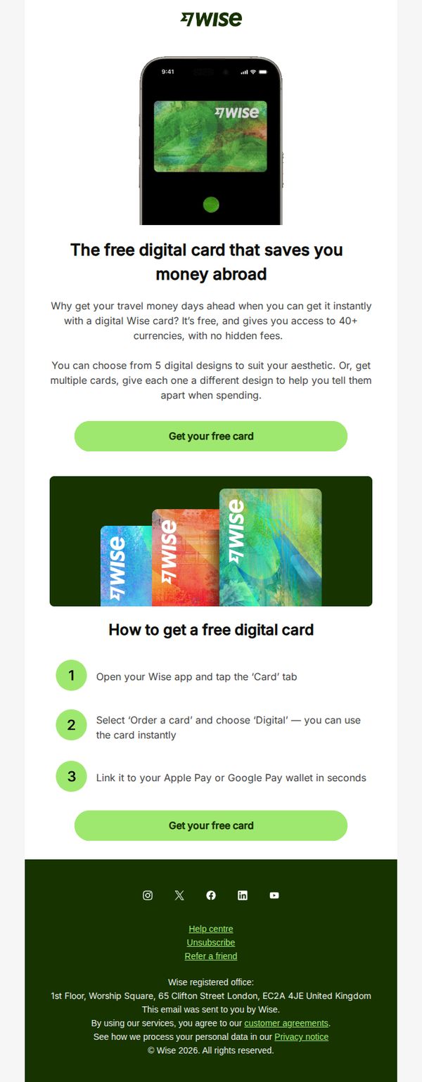
1. Wise - UK: Need a free travel card that’s ready to use instantly?
Objective
To drive immediate sign-ups for Wise’s free digital travel card by highlighting its instant availability, multi-currency support, and no hidden fees, positioning it as the smarter, faster alternative to traditional travel money solutions.
Why this works
The email brilliantly reframes the digital card not as a financial tool but as a travel convenience, emphasizing instant access and aesthetic customization to emotionally resonate with globetrotters who value both function and personal style.
How to implement
By breaking down the activation process into three simple, numbered steps with visual cues, the email reduces perceived friction and builds confidence that users can get started in seconds, a powerful conversion tactic for time-sensitive travelers.
Pro Tip
Add a subtle urgency element, like a countdown timer or limited-edition card design, near the CTA to nudge procrastinators into immediate action, especially since the offer is framed as instant and time-sensitive. • Include a micro-testimonial or trust badge (e.g., 'Used by 10M+ travelers') near the hero section to reinforce credibility and reduce skepticism around digital-only financial products.
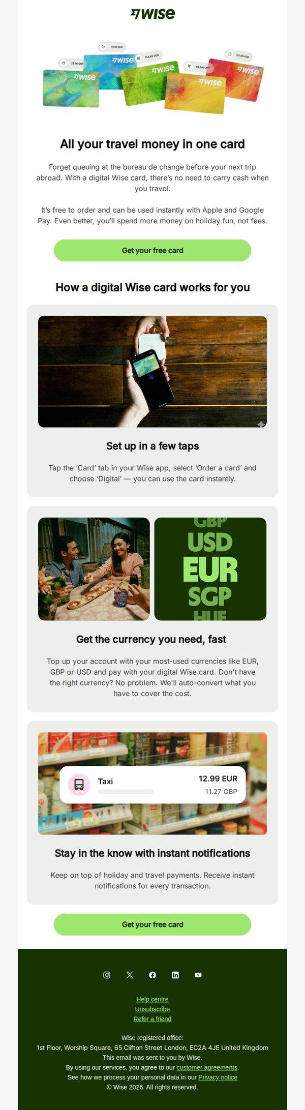
2. Wise - UK: Get your free digital card for easy travel spending
Objective
To encourage UK users to sign up for a free digital Wise card by highlighting its convenience for international travel, seamless setup, and real-time spending features, ultimately driving app adoption and reducing friction around foreign currency payments.
Why this works
The email positions the digital card not just as a financial tool but as a travel companion that eliminates the hassle of carrying cash or visiting currency exchange booths, making it emotionally resonant with wanderlust-driven users.
How to implement
By visually demonstrating the setup process with a real hand holding a phone and card, the email reduces perceived complexity and builds trust through relatable, tactile imagery that mirrors actual user behavior.
Pro Tip
Add a subtle countdown timer or limited-time badge near the CTA to create urgency, since the offer is free and time-sensitive framing could increase conversion without altering the core message. • Include a short testimonial or social proof snippet, such as 'Used by 1M+ travelers', near the hero section to reinforce credibility and reduce perceived risk for first-time users.
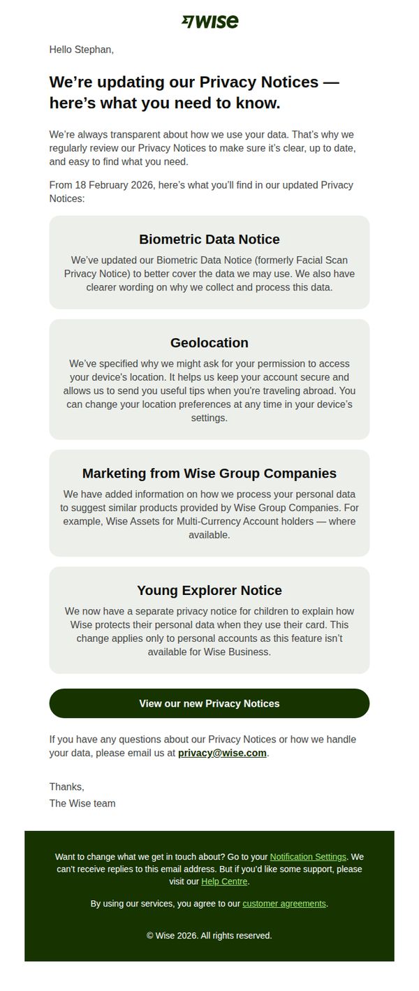
3. Wise - UK: We’re updating our Privacy Notices
Objective
To inform users transparently about updates to Wise’s Privacy Notices, ensuring compliance and trust by clearly explaining changes to data handling practices, while directing users to review the full notice and contact support if needed.
Why this works
Wise builds trust by proactively explaining privacy updates in plain language, avoiding legalese and instead focusing on user benefits like security and clarity, which makes compliance feel like customer care rather than obligation.
How to implement
The email strategically groups updates into clearly labeled sections with descriptive headers, helping users quickly scan and understand what’s changing without feeling overwhelmed, a smart way to handle complex policy updates.
Pro Tip
Add a brief summary bullet list above the detailed sections to highlight key changes at a glance, helping users who skim quickly understand the impact without scrolling through all four notice blocks. • Include a small icon or visual cue next to each section header (e.g., a fingerprint for Biometric, a map pin for Geolocation) to enhance visual scanning and reinforce the topic without increasing text density.
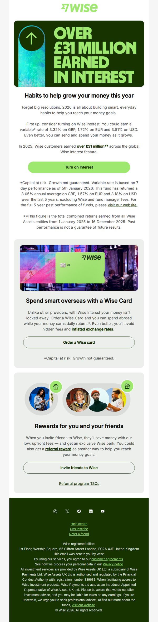
4. Wise - UK: Want to make smarter money moves in 2026?
Objective
This email aims to encourage Wise users to adopt smarter financial habits in 2026 by activating Wise Interest and using the Wise Card for overseas spending, while also incentivizing referrals through exclusive rewards. It positions Wise as a tool for everyday financial growth rather than one-time resolutions.
Why this works
The email smartly reframes New Year’s resolutions as sustainable daily habits, making financial growth feel achievable and less intimidating by tying it to existing behaviors like using Wise for spending and saving.
How to implement
By highlighting £31 million earned in interest as a collective customer achievement, the campaign builds social proof and trust, subtly implying that users are missing out if they haven’t activated Wise Interest yet.
Pro Tip
Add a visual progress bar or countdown timer near the 'Turn on Interest' CTA to create urgency, since the email references 2026 but lacks a tangible deadline to motivate immediate action. • Include a brief testimonial quote or user stat under the Wise Card section to reinforce trust, currently, the benefit of avoiding inflated exchange rates is stated but not emotionally validated by real user experience.
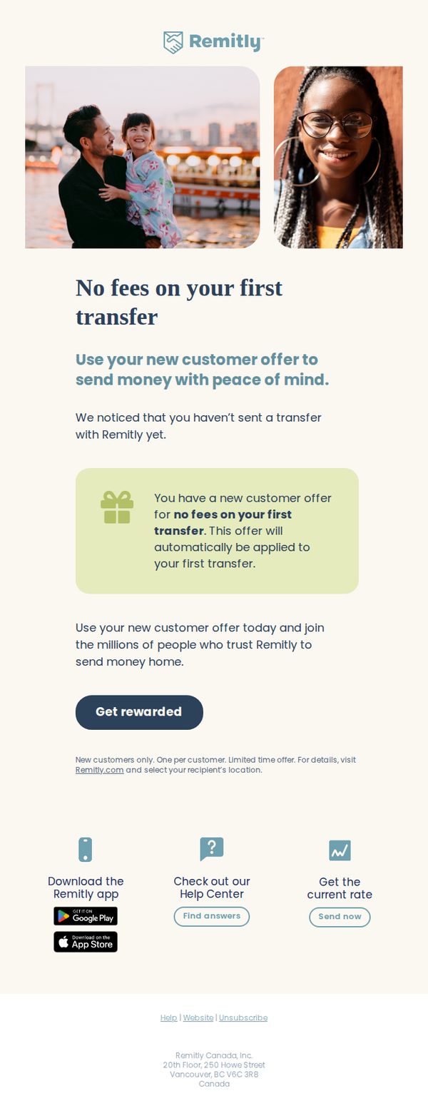
5. Remitly - CA: 💙 For your first transfer 💙
Objective
This email aims to convert new Canadian customers by highlighting a fee-free first transfer offer, encouraging immediate action through emotional connection and social proof while reducing perceived risk for first-time users.
Why this works
The email opens with warm, human-centered imagery that visually reinforces emotional connection and trust, a powerful technique for financial services targeting personal remittance needs.
How to implement
By explicitly stating 'We noticed that you haven’t sent a transfer with Remitly yet,' the message personalizes the offer and reduces friction by acknowledging the user’s inactivity without sounding accusatory.
Pro Tip
Add a subtle countdown timer or 'limited-time offer' badge near the CTA to create urgency, since the email mentions it’s a limited-time offer but doesn’t visually reinforce time sensitivity. • Include a micro-testimonial or trust badge near the 'Get rewarded' button, such as 'Rated 4.8/5 by 100K+ users', to further reduce hesitation for first-time senders.