Outdoor campaign ideas that work
1. Ikon Pass: Your Ikon Pass Account
Objective
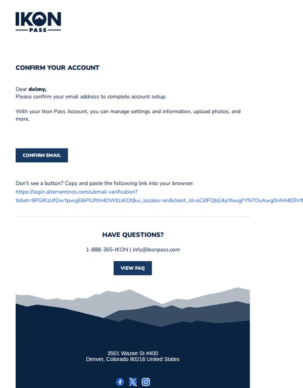
This email aims to guide the recipient through the final step of account setup by confirming their email address, ensuring they can fully access and manage their Ikon Pass account features such as settings, uploads, and personal information.
Why this works
The email immediately personalizes the experience by addressing the recipient by name, which builds trust and signals that this is a tailored, secure step in their account journey rather than a generic broadcast.
How to implement
It clearly explains the value of completing the action, managing settings, uploading photos, and more, which transforms a mundane verification step into a meaningful gateway to full account functionality and user control.
Pro Tip
Add a subtle visual indicator or progress bar near the top to show this is Step 2 of 3 in account setup, helping users understand context and reducing abandonment by reinforcing forward momentum. • Reposition the 'VIEW FAQ' button closer to the CTA or include a micro-copy line like 'Still unsure? Check our top 3 FAQs' to preemptively reduce support inquiries without adding friction to the primary goal.
2. Exodus Adventure Travels : Discover Peru Through Local Eyes
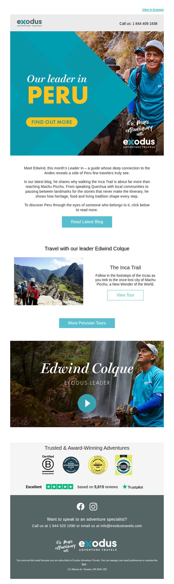
Objective
This email aims to inspire travelers to explore Peru by showcasing a local guide’s authentic perspective, while driving engagement through blog content and tour bookings. It positions Exodus as a trusted, experience-led travel brand rooted in cultural immersion.
Why this works
By spotlighting a local guide as the face of the campaign, the email builds emotional trust and positions the brand as a curator of authentic, culturally rich experiences rather than just a tour operator.
How to implement
The strategic use of storytelling through the blog preview invites readers to discover deeper meaning in travel, transforming a simple itinerary into a narrative of heritage, language, and living tradition that resonates with experiential travelers.
Pro Tip
The primary CTA 'FIND OUT MORE' lacks urgency or specificity, consider testing a benefit-driven alternative like 'Join Edwind’s Inca Trail Tour, Limited Spots Available' to better align with conversion goals. • The video section featuring Edwind feels disconnected from the rest of the flow, adding a short headline or caption like 'Watch Edwind Share Why the Inca Trail Changed His Life' would strengthen narrative continuity and encourage play.
3. Cowboy - EN: Free insurance on any Performance model
Objective
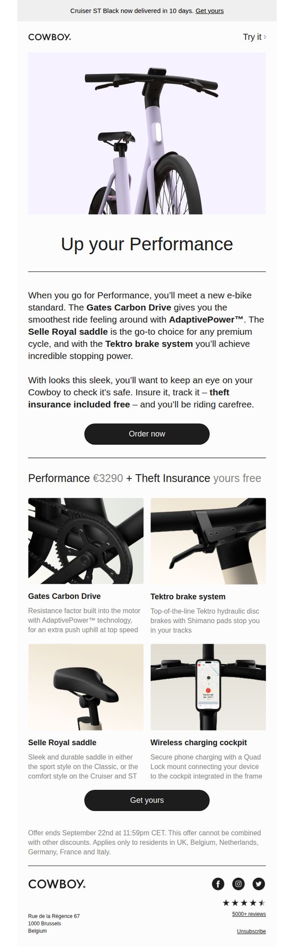
This email aims to drive immediate purchases of Cowboy’s Performance e-bike models by highlighting premium features and sweetening the deal with free theft insurance, creating urgency through a time-limited offer.
Why this works
The email brilliantly ties product superiority to emotional reassurance by pairing high-end specs like the Gates Carbon Drive with the practical benefit of free theft insurance, making the upgrade feel both luxurious and secure.
How to implement
By isolating four key features in a clean grid with crisp visuals and benefit-driven captions, the email transforms technical specs into compelling reasons to buy without overwhelming the reader with jargon.
Pro Tip
Add a countdown timer near the CTA to visually reinforce the September 22nd deadline, increasing urgency and reducing decision latency for hesitant buyers. • Include a short testimonial or user quote near the product grid to build social proof around the Performance model’s ride quality or insurance peace of mind, enhancing trust before the final CTA.
4. Ikon Pass: Final Hours: Ikon Pass goes off sale tonight
Objective
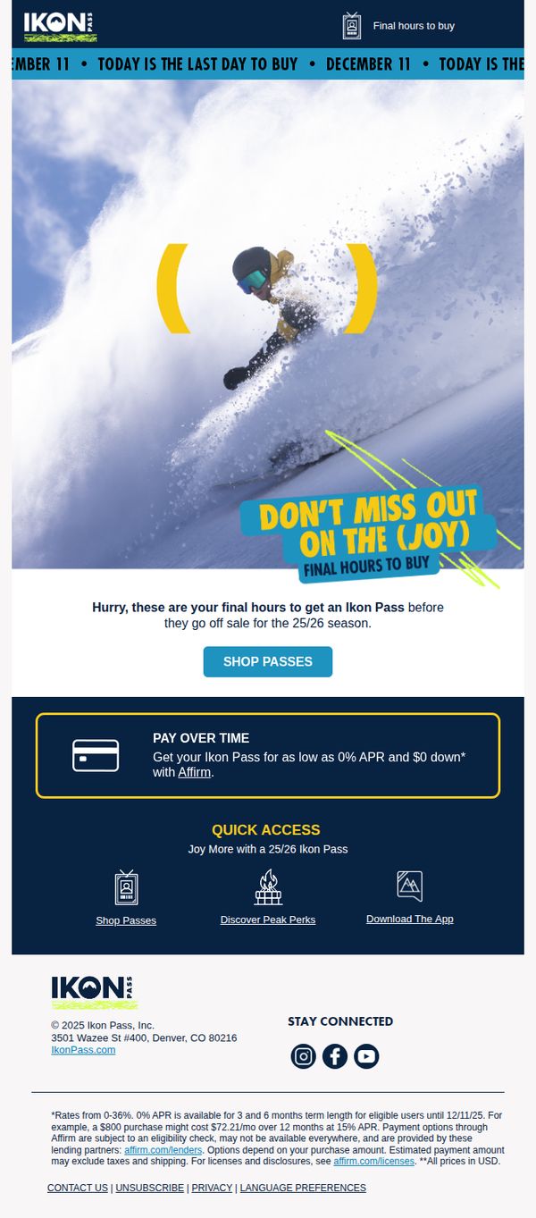
This email aims to create urgency and drive last-minute purchases of the Ikon Pass before it goes off sale for the 25/26 season, leveraging FOMO and flexible payment options to convert hesitant buyers.
Why this works
The email masterfully uses time-sensitive language like 'Final Hours' and 'Today is the Last Day to Buy' to trigger immediate action without sounding overly aggressive, making urgency feel like a privilege rather than pressure.
How to implement
By featuring a dynamic hero image of a snowboarder mid-action paired with bold, playful text like 'Don’t Miss Out on the (Joy),' the campaign emotionally connects adventure seekers to the experience, not just the product.
Pro Tip
Add a visible countdown timer in the hero section to reinforce urgency visually, as the current text-only urgency may not resonate with mobile users who scan quickly and respond better to dynamic elements. • Include a short testimonial or social proof near the CTA, such as 'Join 500,000+ riders who skied more this season', to build trust and reduce hesitation among first-time buyers considering a big investment.
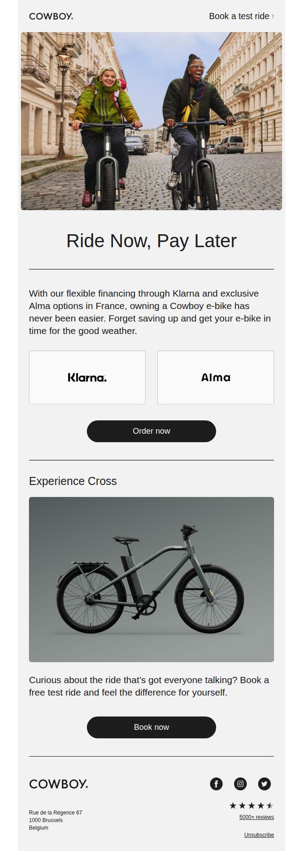
5. Cowboy - EN: Flexible finance for your ride
Objective
The email aims to encourage immediate e-bike ownership by highlighting flexible financing options through Klarna and Alma, removing financial barriers so customers can ride now and pay later. It also promotes test rides to build confidence in the product experience.
Why this works
The email brilliantly reframes ownership as an immediate experience rather than a financial hurdle, using 'Ride Now, Pay Later' to emotionally align with the joy of riding instead of the stress of payment.
How to implement
By featuring Klarna and Alma as trusted payment partners front and center, the campaign leverages third-party credibility to reduce perceived risk and increase conversion confidence among hesitant buyers.
Pro Tip
Add a subtle countdown or urgency indicator near the 'Order now' CTA to nudge decision-making, especially since financing offers often benefit from perceived time sensitivity. • Include a short testimonial quote or star rating directly under the 'Experience Cross' product image to reinforce social proof before the user scrolls to the footer.
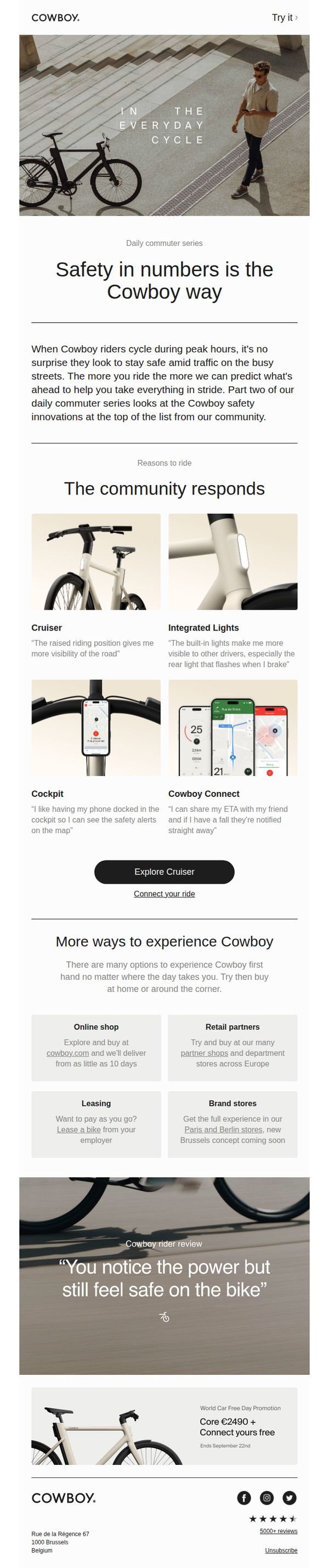
6. Cowboy - EN: Staying safe on the daily commute
Objective
This email aims to position Cowboy bikes as the safest choice for daily urban commuting by highlighting community-driven safety features and real rider experiences. It encourages readers to explore the Cruiser model and consider purchasing or leasing through multiple accessible channels.
Why this works
The email smartly anchors its value proposition in real-world commuter pain points, safety during peak hours, then immediately validates it with community testimonials, making the product feel both necessary and trusted by riders just like the reader.
How to implement
By breaking down safety into tangible, named features like 'Integrated Lights' and 'Cockpit,' the email transforms abstract benefits into concrete, memorable innovations that riders can visualize themselves using during their daily commute.
Pro Tip
Add a subtle countdown timer or urgency indicator near the 'World Car Free Day Promotion' to nudge immediate action, since the offer ends September 22nd and currently lacks visual urgency cues. • Reposition the 'Explore Cruiser' CTA to appear after each feature tile in the 'The community responds' section, allowing users to convert at the moment of highest interest rather than forcing them to scroll to a single button.
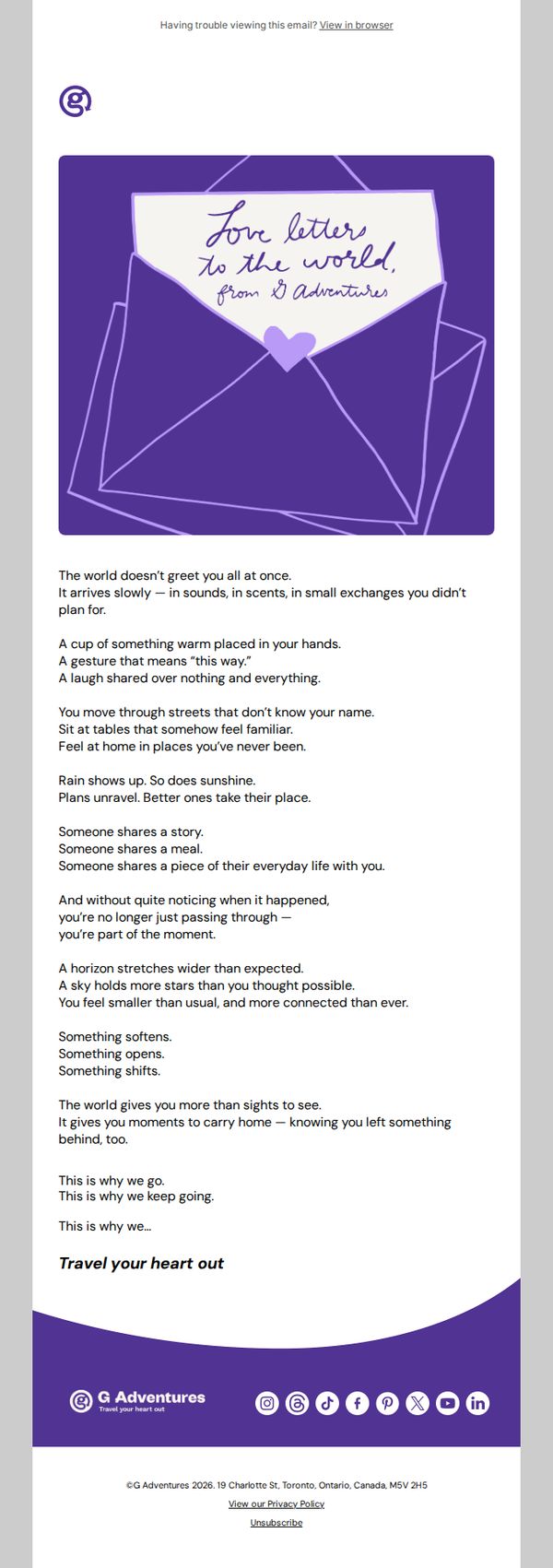
7. G Adventures: A love letter to the world
Objective
To emotionally reconnect subscribers with the transformative, human-centered essence of travel through poetic storytelling, reinforcing G Adventures’ brand ethos of meaningful connection and encouraging readers to reignite their wanderlust.
Why this works
The email masterfully uses lyrical prose to evoke the quiet, unexpected moments of connection that define authentic travel, turning abstract emotions into tangible reasons to book a trip.
How to implement
By framing the message as a 'love letter to the world,' G Adventures positions itself not just as a tour operator but as a curator of emotional experiences, deepening brand affinity through narrative intimacy.
Pro Tip
Add a secondary CTA button or link near the bottom that says 'Explore Trips That Connect You' to bridge the emotional message with actionable next steps without disrupting the tone. • Include a small testimonial snippet or traveler quote beneath the main body to ground the poetic message in real-world proof, enhancing credibility while preserving the romantic tone.
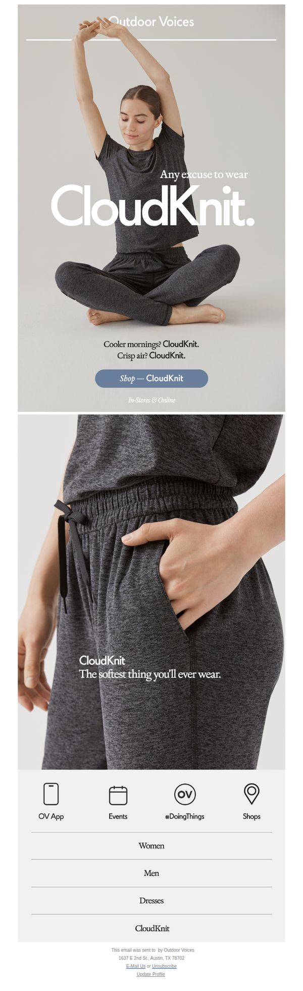
8. Outdoor Voices: CloudKnit, always.
Objective
To drive sales and awareness for Outdoor Voices’ CloudKnit apparel line by positioning it as the ideal everyday wear for comfort and versatility, encouraging customers to shop both online and in-store.
Why this works
The email brilliantly frames CloudKnit as an emotional comfort product rather than just activewear, using phrases like 'The softest thing you’ll ever wear' to tap into tactile desire and daily ritual.
How to implement
By tying the product to everyday moments, 'Cooler mornings? CloudKnit. Crisp air? CloudKnit.', the campaign makes the apparel feel indispensable rather than optional, increasing perceived relevance and urgency.
Pro Tip
Add a subtle countdown timer or limited-quantity indicator near the CTA to create urgency, since the current design lacks any temporal or scarcity cue that could nudge immediate action. • Include a customer testimonial or social proof snippet under the hero image to validate the 'softest thing you’ll ever wear' claim, which currently relies solely on brand assertion without third-party reinforcement.
9. Grady-White Boats : Docklines, Your Grady-White Newsletter
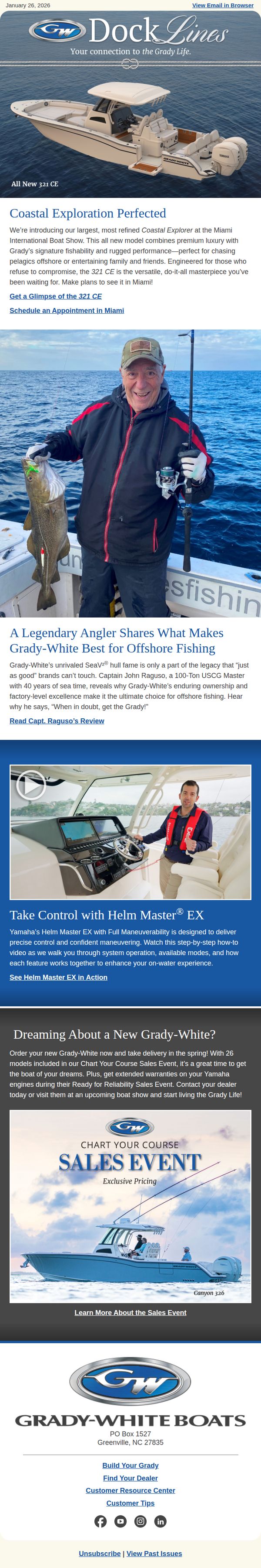
Objective
This email aims to engage Grady-White boat enthusiasts by showcasing the new 321 CE model, leveraging expert testimonials and product features to drive interest and appointments, while promoting the Chart Your Course Sales Event to encourage immediate purchasing decisions.
Why this works
The email masterfully blends aspirational lifestyle imagery with concrete product specs, making the 321 CE feel both luxurious and ruggedly capable, perfect for buyers who want performance without sacrificing comfort or style.
How to implement
By featuring a legendary angler’s endorsement, the campaign taps into social proof and authority, transforming technical boat features into emotionally resonant reasons to choose Grady-White over competitors who lack such authentic, sea-tested validation.
Pro Tip
Add a countdown timer or urgency indicator to the 'Chart Your Course Sales Event' section to reinforce limited-time value and nudge readers toward immediate action instead of passive browsing. • Include a small map or clickable 'Find a Dealer Near You' button beneath the sales event CTA to reduce friction for users ready to act, especially since the email mentions visiting dealers at boat shows.
10. Cowboy - EN: Intuitive Assistance in action
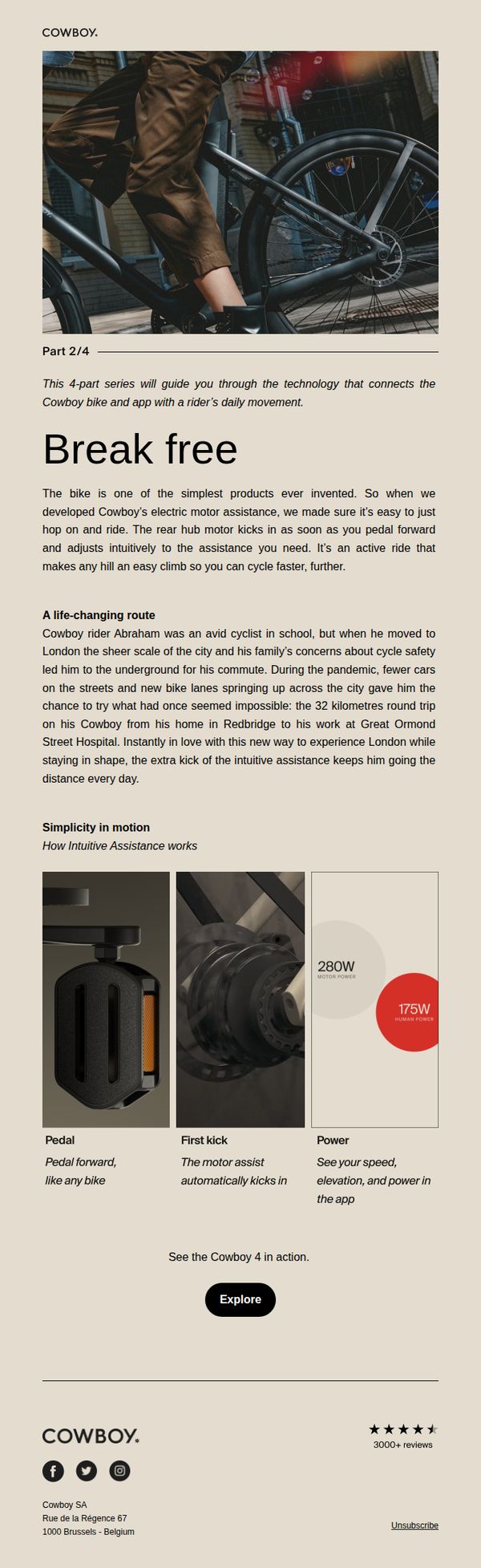
Objective
This email aims to educate potential buyers on the intuitive motor assistance technology of the Cowboy bike, using real-life storytelling and technical visuals to build trust and demonstrate effortless usability for urban commuters.
Why this works
By spotlighting a real rider’s transformation from hesitant commuter to confident daily cyclist, the email humanizes the tech and proves its real-world impact on lifestyle and safety in dense urban environments.
How to implement
The breakdown of ‘Simplicity in motion’ into three digestible visual components, Pedal, First kick, Power, turns complex engineering into intuitive, bite-sized benefits that even non-tech-savvy readers can grasp instantly.
Pro Tip
Add a time-sensitive incentive like ‘Limited availability’ or ‘Early access for subscribers’ near the CTA to create urgency and nudge immediate exploration, especially since the email focuses on education rather than promotion. • Include a short video or animated GIF beneath the ‘See the Cowboy 4 in action’ line to visually demonstrate the intuitive assistance in motion, enhancing comprehension and emotional engagement beyond static images.