Transport email examples & ideas from real campaigns
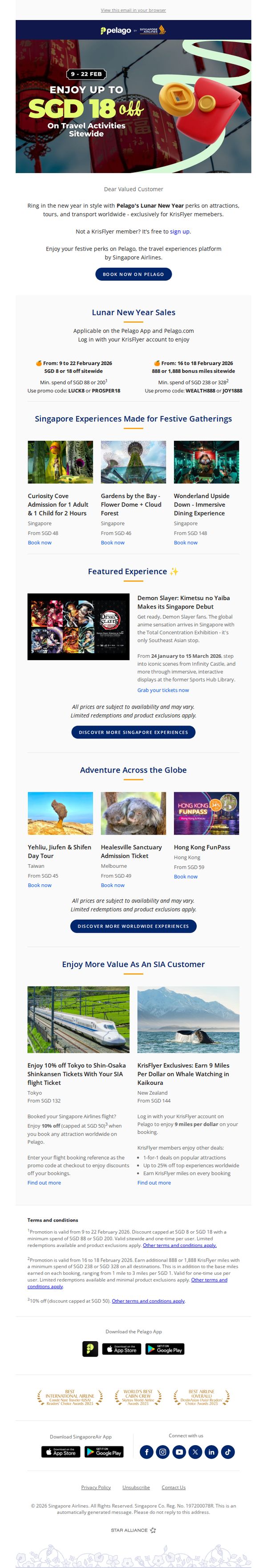
1. Singapore Airlines: Lunar New Year is Coming - And So Are Pelago’s Best Travel Deals!
Objective
To drive bookings for travel activities and experiences during the Lunar New Year period by offering exclusive discounts and bonus miles to KrisFlyer members, while promoting Pelago as Singapore Airlines’ preferred travel experiences platform.
Why this works
The email brilliantly ties the Lunar New Year cultural moment to travel experiences, creating emotional resonance while offering tangible savings, a powerful combo that turns seasonal celebration into immediate purchasing motivation.
How to implement
By clearly segmenting offers for KrisFlyer members and non-members, the campaign personalizes value without alienating either group, subtly nudging non-members to join while rewarding loyal customers with tiered perks and bonus miles.
Pro Tip
Add a countdown timer near the top of the email to create urgency for the Lunar New Year promotion, especially since the offer expires on 22 Feb 2026, this would visually reinforce the limited-time nature of the deal. • Include a small visual icon or badge next to each experience that indicates ‘KrisFlyer Exclusive’ or ‘Bonus Miles Eligible’ to help members quickly identify which offers maximize their loyalty benefits without scanning fine print.
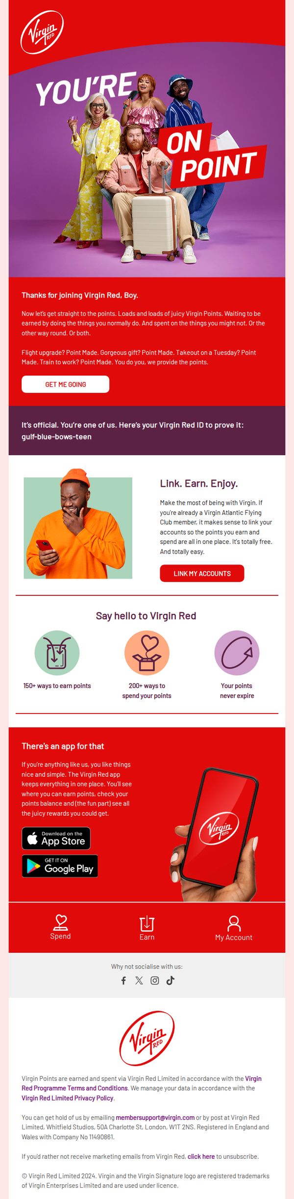
2. Virgin Atlantic: Come on in, Boy
Objective
This email welcomes new Virgin Red members with a playful, personalized tone to encourage immediate engagement with the loyalty program, highlighting how points can be earned and spent through everyday activities while prompting account linking and app download.
Why this works
The email brilliantly uses conversational, gendered language like 'Come on in, Boy' to create instant familiarity and emotional resonance, making the loyalty program feel less transactional and more like joining a fun, exclusive club.
How to implement
By visually breaking down the program into three digestible pillars, earn, spend, never expire, the email transforms a complex loyalty system into an intuitive, benefit-driven experience that reduces cognitive friction for new users.
Pro Tip
Add a visual progress bar or milestone tracker under the 'Link. Earn. Enjoy.' section to show users how close they are to their first reward, creating urgency and reinforcing the value of linking accounts immediately. • Include a short testimonial or user quote near the app download section, e.g., 'I earned my first flight upgrade in 3 days!', to build social proof and reduce skepticism about point earning speed.
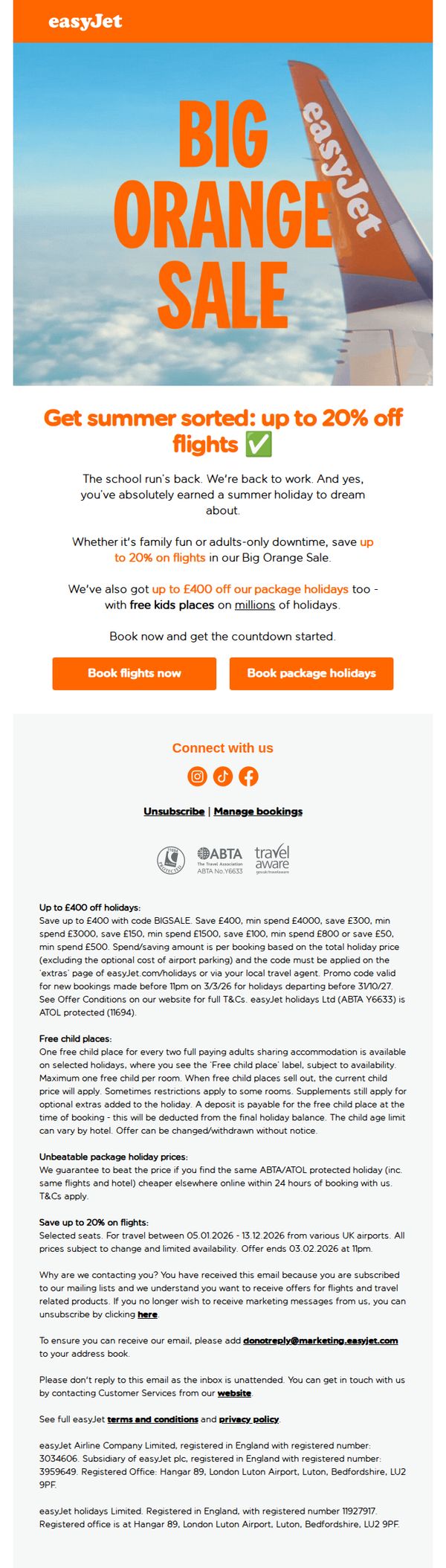
3. easyJet: Back to work? Let’s get your summer sorted ☀️
Objective
To re-engage subscribers returning to work after the school holidays by encouraging immediate booking of summer flights and package holidays through time-sensitive discounts and emotional appeals to earned leisure time.
Why this works
The email opens with a relatable, emotionally resonant hook, 'Back to work? Let’s get your summer sorted', which instantly validates the recipient’s fatigue and positions the offer as a well-deserved reward, not just a transaction.
How to implement
By clearly separating flight discounts from package holiday savings and using distinct CTAs for each, the campaign respects user intent and reduces decision paralysis, making it easier for travelers to act based on their preferred vacation style.
Pro Tip
Add a countdown timer near the CTA buttons to visually reinforce urgency, especially since the offer ends on 03.02.2026, this would convert passive readers into active bookers by highlighting the time-sensitive nature of the discount. • Include a small testimonial or customer quote near the offer section, even one sentence like 'We booked our family holiday in 10 minutes and saved £300!', to humanize the savings and increase emotional persuasion before the CTA.
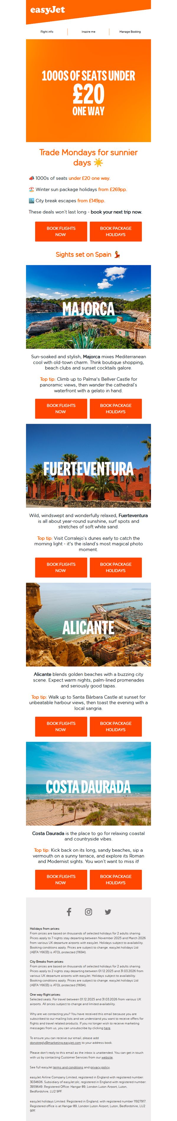
4. easyJet: 1000s of seats under £20 one way✈️
Objective
The email aims to drive immediate flight and holiday bookings by highlighting limited-time, ultra-low fares under £20 one way, while inspiring travel through curated destination content focused on sunny Spanish getaways.
Why this works
The email brilliantly leverages urgency and affordability by leading with '1000s of seats under £20 one way', a bold, benefit-driven hook that instantly captures budget-conscious travelers and primes them for immediate action.
How to implement
Each destination is presented as a mini travel guide with vivid imagery, personality-driven descriptions, and a practical 'Top tip', transforming a promotional email into an inspirational travel planner that builds emotional connection before prompting a click.
Pro Tip
Add a subtle countdown timer or 'limited seats remaining' indicator near the hero section to amplify urgency beyond the static 'won’t last long' text, making scarcity feel real and immediate. • Include a small map or visual icon next to each destination name to help users quickly orient themselves geographically, especially for less familiar locations like Fuerteventura or Costa Daurada.
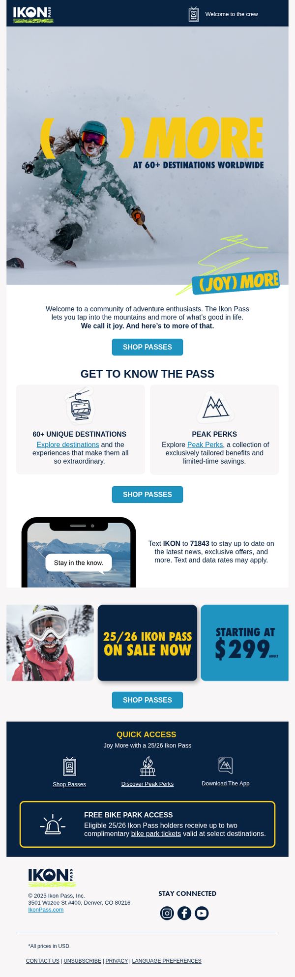
5. Ikon Pass: Find out what joy is all about
Objective
The email aims to convert adventure seekers into Ikon Pass holders by highlighting the emotional reward of mountain experiences and the tangible value of access to 60+ global destinations, while driving immediate action through a limited-time offer starting at $299.
Why this works
The email brilliantly ties emotional payoff, 'joy', to the product by showing a skier mid-action, making the pass feel less like a transaction and more like an invitation to live a fuller, more exhilarating life.
How to implement
By breaking down the pass’s value into digestible, icon-driven sections like '60+ Unique Destinations' and 'Peak Perks,' the email reduces cognitive load and helps prospects quickly grasp the breadth of benefits without feeling overwhelmed.
Pro Tip
Add a countdown timer near the '25/26 Ikon Pass on Sale Now' section to create urgency and reduce decision latency, especially since the price point is a key conversion lever. • Reposition the 'FREE BIKE PARK ACCESS' benefit higher in the flow, perhaps right after the hero, to immediately showcase cross-season value, which could appeal to non-winter sports enthusiasts and broaden the target audience.
6. Ukprefulfillment: Signup Success! 👍
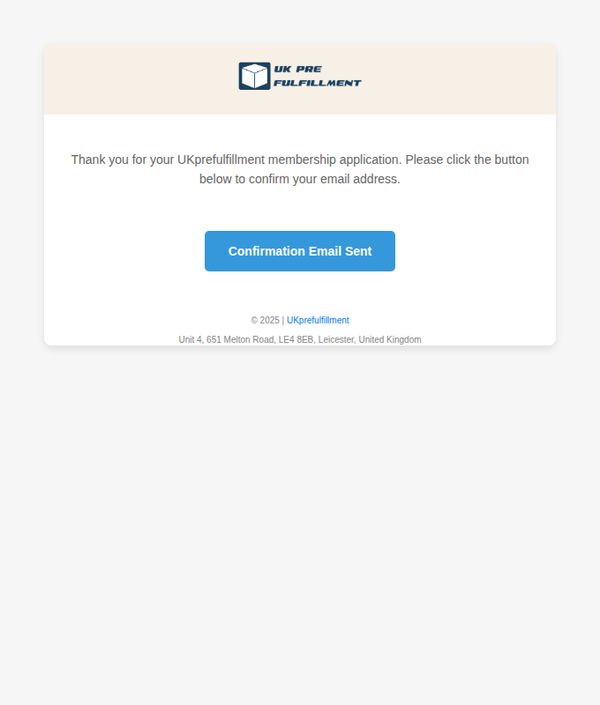
Objective
To confirm the user’s membership application and prompt them to verify their email address, ensuring account legitimacy and enabling future communication. This step builds trust and sets the foundation for onboarding.
Why this works
The email immediately acknowledges the user’s action with gratitude, creating a warm, personal tone that reassures them their application was received and is being processed.
How to implement
By using a clear, action-oriented button labeled 'Confirmation Email Sent,' the design guides users intuitively toward the next step without confusion or unnecessary text.
Pro Tip
Add a visual indicator or brief animation near the CTA button to show the email has been sent, reducing uncertainty and preventing users from repeatedly clicking. • Include a short line below the CTA explaining what to expect next, e.g., 'Check your inbox (and spam folder) within 5 minutes', to manage expectations and reduce support queries.
7. Gebrüder Weiss - AT: Press Release: Securing the Future: One Hundred Young Professionals Begin Their Apprenticeships at Gebrüder Weiss
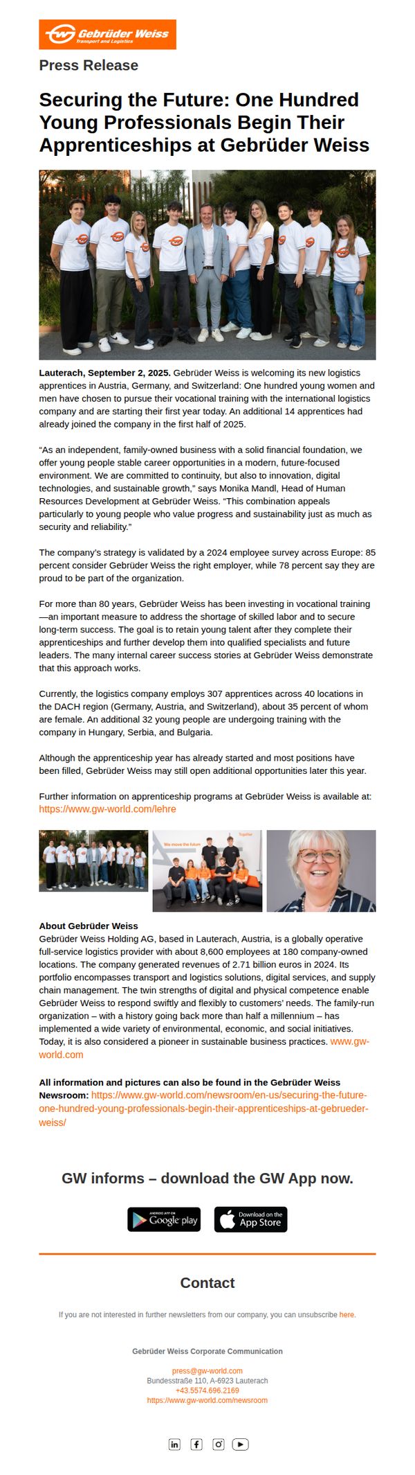
Objective
To announce and celebrate the onboarding of 100 new apprentices across Austria, Germany, and Switzerland, reinforcing Gebrüder Weiss’s commitment to youth development, sustainability, and long-term workforce stability while enhancing employer branding.
Why this works
Gebrüder Weiss effectively ties its apprenticeship program to broader corporate values like sustainability and innovation, making the initiative feel mission-driven rather than transactional, which resonates deeply with purpose-oriented young talent.
How to implement
By citing specific survey data, 85% of employees consider it the right employer, the brand builds third-party credibility into its recruitment messaging, subtly reassuring prospects that joining is a smart, validated career move.
Pro Tip
Add a dedicated CTA button or link directly beneath the apprenticeship statistics (e.g., 'Apply Now' or 'Learn About Open Positions') to convert reader interest into immediate action, rather than relying solely on the generic app download CTA at the bottom. • Include a short video testimonial or quote carousel from current apprentices to humanize the program further, visual storytelling would strengthen emotional appeal and provide social proof that complements the survey data already cited.
8. AutoTrader : New number plates, free car valuations and how to part exchange your vehicle
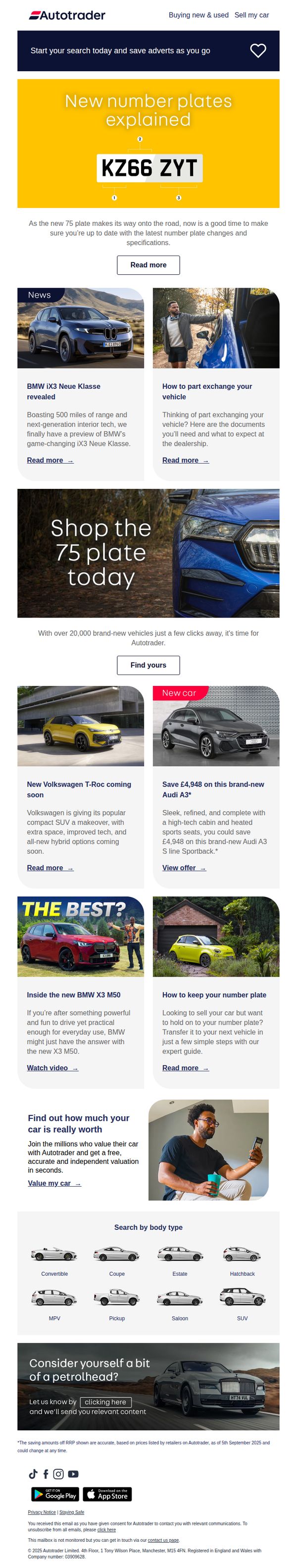
Objective
This email aims to educate car buyers and sellers on the new 75 plate system while driving engagement through vehicle valuations, part-exchange guidance, and new car inventory discovery. It positions AutoTrader as a trusted resource for both transactional and informational needs.
Why this works
The email brilliantly blends educational content about the new 75 plate with actionable product listings, turning informational curiosity into immediate shopping intent without feeling salesy or overwhelming.
How to implement
By featuring both new car savings and valuation tools side by side, the campaign creates a dual-path conversion funnel, appealing to buyers looking for deals and sellers curious about their car’s worth, maximizing audience coverage.
Pro Tip
Add a countdown timer or urgency indicator near the Audi A3 offer to amplify the perceived value of the £4,948 saving, especially since the offer is tied to a specific plate release cycle that implies time sensitivity. • Reposition the 'Value my car' CTA higher in the flow, perhaps directly under the hero section, to capitalize on initial curiosity about the 75 plate and immediately convert it into valuation engagement before users scroll past.
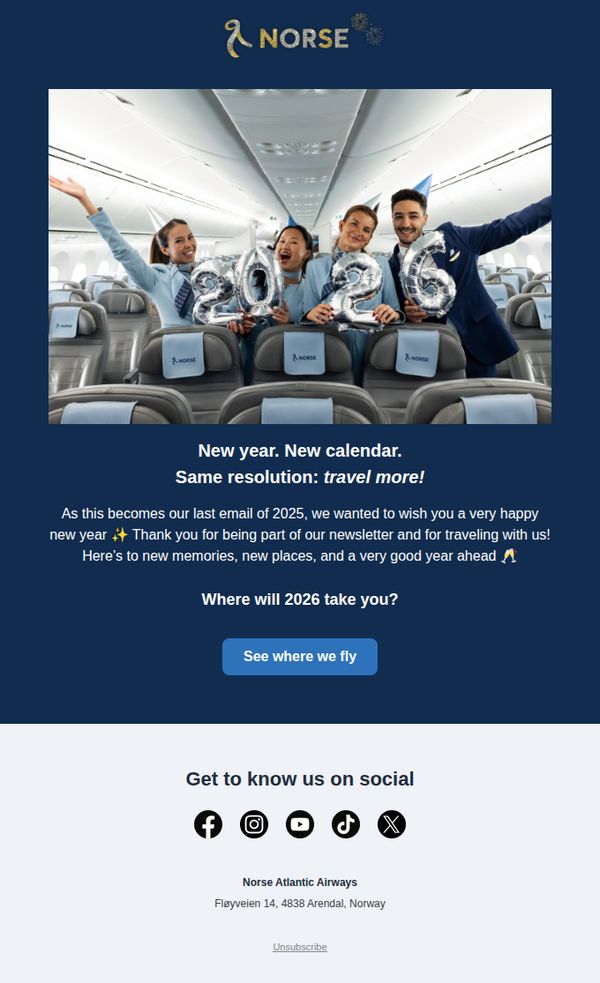
9. Norse Atlantic Airways - FR : Our last email of 2025 ✨
Objective
This email aims to bid farewell to subscribers at the end of 2025 while inspiring them to plan new travels in 2026, reinforcing brand loyalty through warm holiday wishes and a forward-looking call to action.
Why this works
The email brilliantly ties emotional nostalgia to future aspiration by framing 2025’s end as a moment to reflect on past journeys while igniting excitement for 2026’s possibilities, making the CTA feel like a natural next step rather than a sales pitch.
How to implement
Using real crew members holding '2026' balloons inside the aircraft creates an authentic, joyful visual that humanizes the brand and subtly reinforces safety, comfort, and celebration, all while anchoring the message in the airline’s core product: the flying experience itself.
Pro Tip
Add a subtle countdown or urgency cue near the CTA, such as 'Flights to 2026 destinations fill fast', to nudge immediate action without undermining the celebratory tone, since the current CTA lacks motivational friction. • Include a micro-testimonial or quote from a real traveler beneath the hero image, e.g., 'My 2025 trip to Oslo changed everything!', to add social proof and emotional validation that supports the 'travel more' resolution.
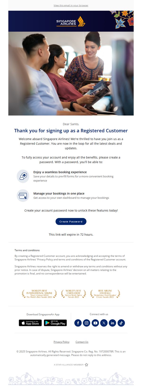
10. Singapore Airlines: You have successfully enrolled as a Registered Customer
Objective
This email confirms successful enrollment as a Registered Customer with Singapore Airlines and encourages immediate password creation to unlock account benefits like seamless booking and centralized trip management. It aims to convert new sign-ups into active, engaged users within 72 hours.
Why this works
The email immediately validates the user’s action with a warm, personalized welcome, reinforcing emotional connection while clearly stating the next critical step, creating a password, to transform passive sign-ups into active account holders.
How to implement
By listing tangible benefits like ‘seamless booking experience’ and ‘manage bookings in one place’ right after the welcome, the email frames password creation not as a chore but as a gateway to real, valuable convenience, increasing conversion motivation.
Pro Tip
Add a secondary CTA or reminder link near the bottom of the email, for users who scroll past the primary button, to reduce drop-off and reinforce the 72-hour deadline visually, especially since the footer contains only legal and social links. • Include a brief, one-sentence value reinforcement above the CTA, such as ‘Your next trip is just one password away’, to re-anchor the user’s motivation at the point of decision, reducing hesitation and boosting click-through rates.