How Randox Health does healthcare marketing emails
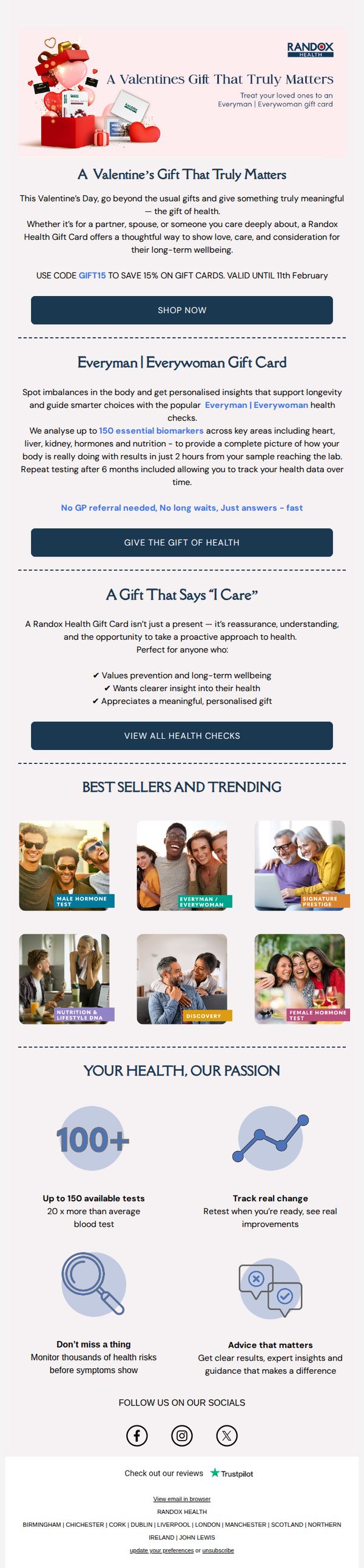


1. A Valentine’s Gift That Truly Matters
Objective
This email aims to position Randox Health’s gift cards as emotionally resonant Valentine’s Day presents by framing health as a meaningful, caring gesture. It encourages immediate purchase by highlighting time-sensitive savings and the personal, proactive value of gifting health insights.
Why this works
By reframing health testing as a Valentine’s gift, the campaign taps into emotional gifting psychology, transforming a clinical service into a heartfelt expression of care, which makes the offer feel both timely and deeply personal.
How to implement
The email smartly uses social proof and aspirational imagery in the product grid, showing diverse, happy people enjoying life after their health checks, subtly implying that gifting this service leads to better, more connected relationships.
Pro Tip
Add a countdown timer near the CTA to visually reinforce the urgency of the 11th February deadline, increasing conversion by making the time sensitivity more visceral and immediate. • Include a short customer testimonial or quote under the ‘A Gift That Says “I Care”’ section to strengthen emotional credibility, showing real people who’ve gifted or received the card and felt its impact.
2. Your monthly update with Randox Health🗓️
Objective
This email aims to keep subscribers informed and engaged by delivering a curated monthly wellness update, while subtly encouraging bookings and product purchases through timely health insights, clinic expansions, and promotional offers.
Why this works
The email masterfully blends timely health news with branded service offerings, turning public health trends into personalized reasons for the reader to act, making the content feel both urgent and relevant to their personal wellness journey.
How to implement
By anchoring promotions to cultural moments like Mother’s Day and World Cancer Day, the campaign leverages emotional resonance and social relevance to elevate gift-giving and preventive care from transactional to meaningful, increasing conversion potential without sounding salesy.
Pro Tip
The 'Save 10% on Your In-Clinic Test' offer at the bottom lacks urgency or exclusivity, adding a countdown timer or limiting the discount to newsletter subscribers would create scarcity and drive immediate action. • The CTA buttons are visually consistent but lack hierarchy, the 'BOOK NOW' and 'BUY NOW' CTAs should vary in size or color to guide users toward the highest-value action based on their segment or past behavior.
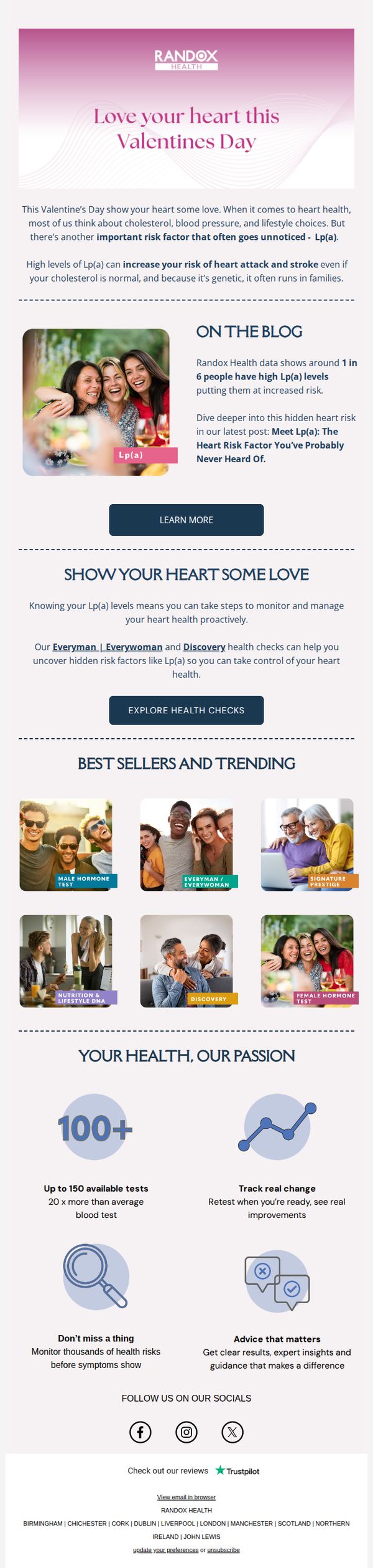
3. This Valentine’s Day, Love Your Heart
Objective
This email aims to educate recipients about the lesser-known heart health risk factor Lp(a) during Valentine’s Day, while encouraging them to take proactive steps through Randox Health’s testing services. It blends emotional appeal with medical insight to drive engagement and conversions.
Why this works
By tying heart health awareness to Valentine’s Day, the campaign emotionally resonates while introducing a clinically significant but under-discussed biomarker, Lp(a), making complex science feel personal and timely for the audience.
How to implement
The inclusion of real-world blog data (‘1 in 6 people have high Lp(a)’) builds credibility without overwhelming readers, turning abstract risk into relatable statistics that motivate action rather than fear.
Pro Tip
Add a countdown timer or urgency cue near the CTA to leverage Valentine’s Day’s time-sensitive nature, nudging procrastinators to act before the emotional window closes. • Include a short testimonial or quote from a real user who discovered their Lp(a) levels through Randox, adding social proof that bridges education with emotional validation and trust-building.
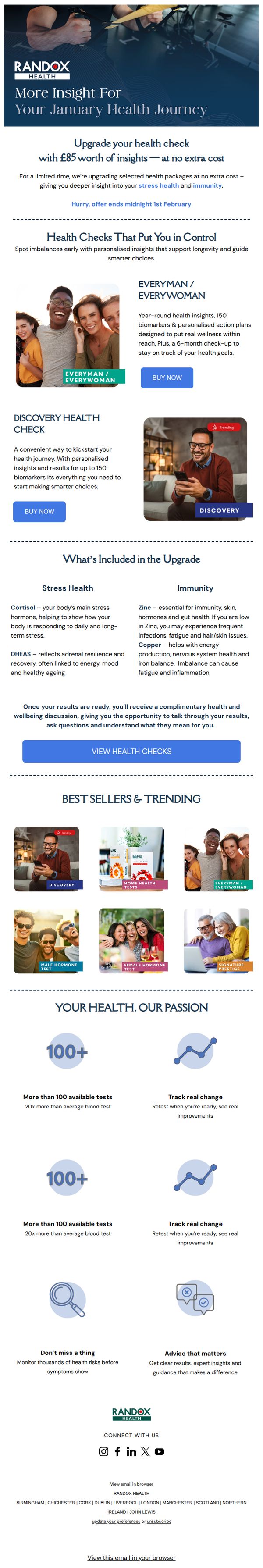
4. Upgrade your health check with £85 worth of insights - at no extra cost
Objective
This email aims to drive immediate upgrades to Randox Health’s premium health check packages by highlighting a limited-time offer of £85 worth of added insights at no extra cost, encouraging users to act before the deadline to gain deeper control over their stress and immunity health.
Why this works
The email brilliantly frames the upgrade as a time-sensitive gift, not a purchase, making the £85 value feel like a personal bonus rather than a sales tactic, which reduces perceived friction and increases perceived generosity.
How to implement
By visually pairing each health package with relatable, smiling customers and clear benefit-driven copy, the email builds emotional trust while simultaneously educating the reader on complex biomarkers like cortisol and zinc in an accessible, non-intimidating way.
Pro Tip
Add a countdown timer near the CTA to visually reinforce urgency, the current ‘Hurry, offer ends midnight 1st February’ text is buried and lacks visual impact, reducing its persuasive power. • Reposition the ‘VIEW HEALTH CHECKS’ CTA higher in the email, ideally after the offer section, to reduce scroll friction, users may miss it after reading detailed biomarker explanations.
5. Your monthly update with Randox Health🗓️
Objective
This email aims to keep subscribers informed and engaged by delivering curated, evidence-based health insights while gently guiding them toward booking personalized health tests. It blends educational content with strategic service promotion to reinforce Randox Health’s authority and drive conversions.
Why this works
By anchoring each health topic to real-world research and media coverage, the email builds credibility while making complex medical concepts feel accessible and urgent, encouraging readers to trust Randox Health’s guidance over generic online advice.
How to implement
The consistent use of dual CTAs, 'Read Article' for education and 'Book Now' for conversion, creates a frictionless journey that respects the reader’s intent while strategically nudging them toward action without feeling pushy or salesy.
Pro Tip
Add a visual progress bar or countdown timer near the 10% discount CTA to create urgency and reduce decision fatigue, especially since the offer is time-sensitive and buried near the footer. • Reposition the Trustpilot review section higher in the email, perhaps after the first article, to leverage social proof earlier in the journey, increasing trust before readers encounter conversion prompts.