How Sintra AI does email campaigns that convert
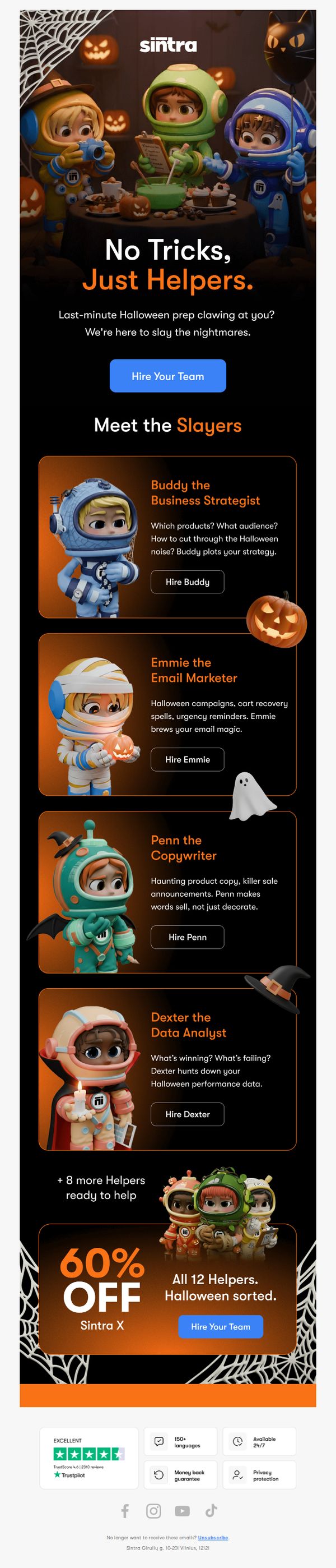
1. Halloween prep stress? Yikes.
Objective
This email aims to alleviate Halloween marketing stress by positioning Sintra AI’s team of specialized AI helpers as the solution for last-minute campaign needs, encouraging immediate hiring through a limited-time discount.
Why this works
The email brilliantly reframes seasonal stress as a solvable problem by personifying AI services as quirky, themed ‘helpers’, making complex tools feel approachable and emotionally resonant during high-pressure moments.
How to implement
By introducing each helper with a distinct personality, role, and Halloween pun, the campaign transforms feature listings into memorable character-driven storytelling that boosts engagement and recall without sacrificing clarity or conversion intent.
Pro Tip
Add a visible countdown timer near the CTA to reinforce urgency around the 60% offer, leveraging psychological scarcity to nudge hesitant users toward immediate action before the Halloween deadline passes. • Include a short testimonial or case study snippet under the 'Meet the Slayers' section showing how one of these helpers solved a real Halloween marketing crisis, adding social proof that validates their effectiveness beyond cute branding.
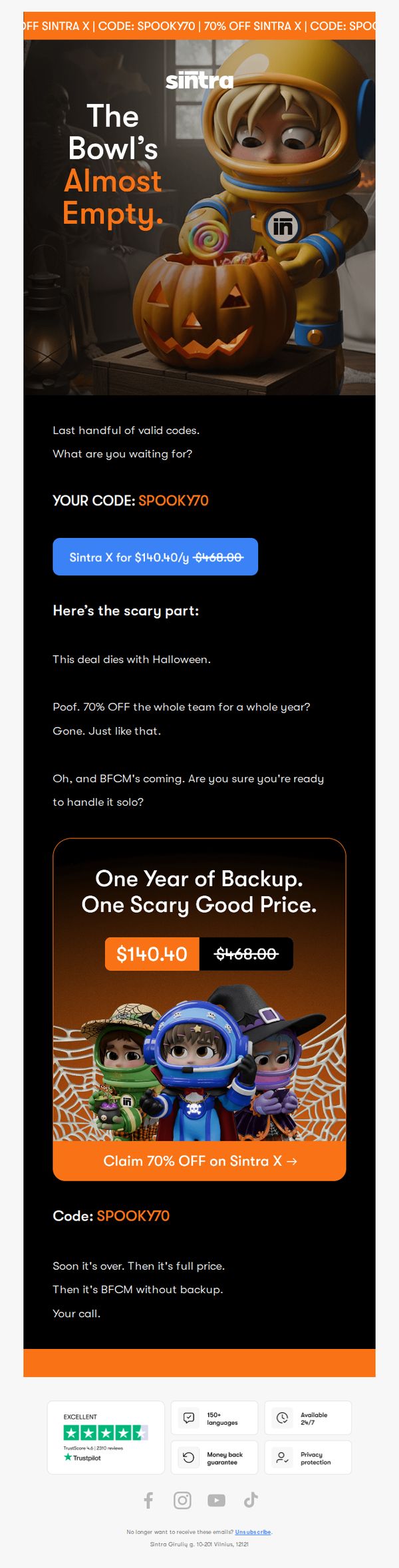
2. Trick's on you if you miss it.
Objective
This email aims to create urgency and drive immediate conversions by offering a limited-time 70% discount on Sintra X before Halloween ends, leveraging seasonal FOMO and playful scare tactics to compel users to act before the deal vanishes.
Why this works
The email brilliantly uses Halloween-themed visuals and playful scare language like 'The Bowl’s Almost Empty' to transform a discount offer into a memorable, emotionally resonant experience that feels urgent without being pushy.
How to implement
By framing the 70% discount as a fleeting, seasonal event that 'dies with Halloween,' the campaign taps into psychological scarcity in a way that feels authentic and timely, making users feel they’re missing out on a unique, once-a-year opportunity.
Pro Tip
Add a visible countdown timer near the CTA to visually reinforce the urgency of the Halloween deadline, making the time-sensitive nature of the offer more immediate and compelling for users who skim. • Include a brief bullet-point list under the offer section highlighting key features or benefits of Sintra X to help users quickly understand what they’re getting beyond the price, reducing hesitation for first-time buyers.
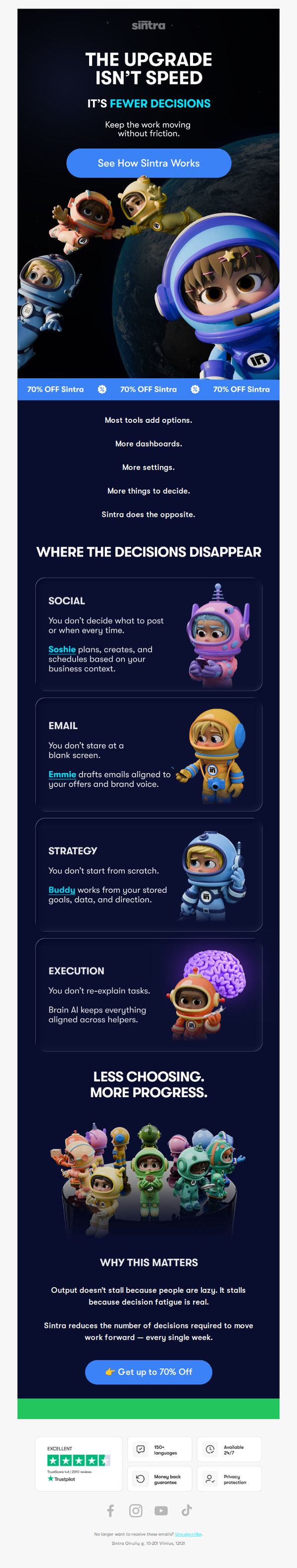
3. Fewer Decisions Is The Real Upgrade
Objective
The email aims to reframe the value of Sintra AI not as a speed tool but as a decision-reduction engine that removes friction from daily workflows, encouraging prospects to try the platform by highlighting its AI helpers and offering a limited-time discount.
Why this works
Instead of leading with speed or efficiency, this campaign brilliantly flips the script by positioning decision fatigue as the real bottleneck, making the product feel like a relief rather than another tool to manage.
How to implement
The use of named AI helpers like Soshie, Emmie, and Buddy turns abstract automation into relatable teammates, giving users emotional ownership and reducing the intimidation factor of adopting new AI workflows.
Pro Tip
The hero CTA ‘See How Sintra Works’ is too generic, it should be more benefit-driven like ‘Reduce Your Weekly Decisions by 70%’ to align with the core message and increase conversion intent. • The repeated ‘70% OFF Sintra’ banners above the fold create visual noise and dilute the emotional narrative, consider replacing them with a single, sticky discount bar or moving the offer lower to preserve storytelling flow.
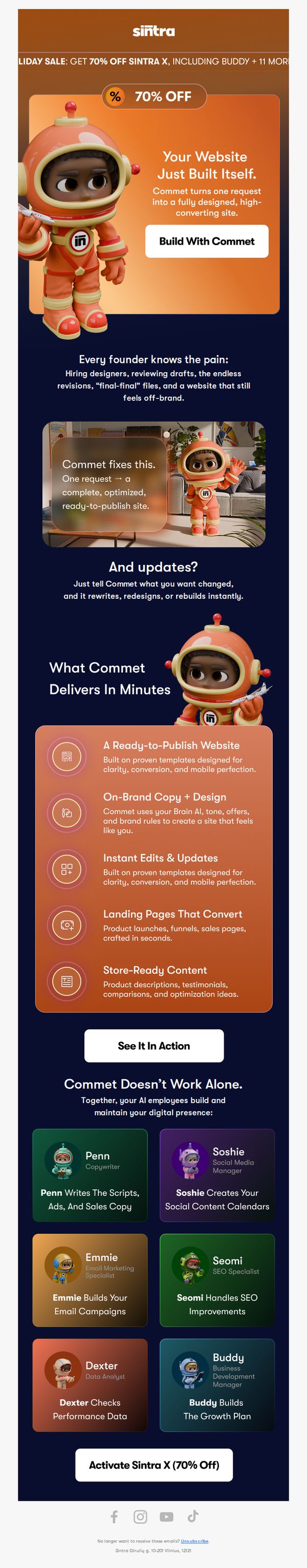
4. Did Your Website Just Build Itself?
Objective
This email aims to convert founders frustrated with traditional website building into users of Sintra AI’s Commet tool by highlighting its speed, brand alignment, and all-in-one digital team, while leveraging a limited-time 70% discount to drive immediate sign-ups.
Why this works
The email brilliantly reframes website creation as a pain point founders already feel, then positions Commet not as software but as a solution that eliminates hiring, revisions, and brand drift, making the value emotional before it’s technical.
How to implement
By introducing AI team members like Penn, Soshie, and Buddy with clear roles and personality, the campaign transforms a faceless tool into a relatable, collaborative workforce, building trust and reducing the intimidation factor of AI for non-technical founders.
Pro Tip
Add a micro-testimonial or social proof badge near the ‘Build With Commet’ CTA, such as ‘Used by 2,300+ founders’, to reduce friction for first-time visitors who may hesitate without peer validation. • Include a subtle countdown timer above the final CTA to reinforce the urgency of the 70% off sale, especially since the discount is mentioned in the header but not visually reinforced later in the email’s flow.
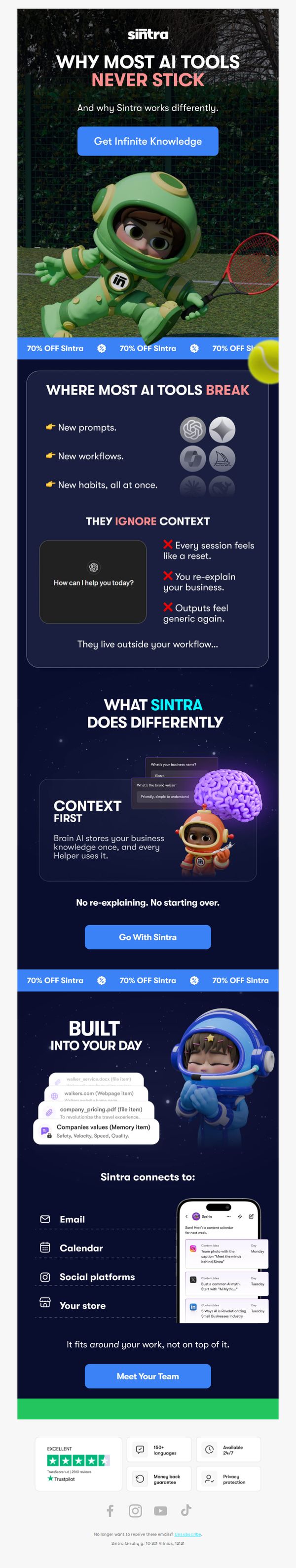
5. Why Do Most AI Tools Not Stick?
Objective
This email aims to position Sintra AI as a uniquely sticky, context-aware solution by contrasting it with generic AI tools that fail to integrate into users’ workflows. It seeks to convert readers by highlighting Sintra’s ability to retain business knowledge and adapt to daily routines.
Why this works
Sintra brilliantly frames its value by first diagnosing the universal pain point, AI tools that feel disconnected and forgetful, then positions itself as the antidote with context-aware, memory-driven assistance that evolves with your business, not against it.
How to implement
The email leverages playful, memorable visuals, like the astronaut character and brain icon, to humanize complex AI concepts, making the message feel approachable and sticky without sacrificing technical credibility or professional tone.
Pro Tip
The repeated '70% OFF Sintra' banners are visually disruptive and dilute the core message; replace them with a single, strategically placed discount badge near the final CTA to maintain focus on value before prompting action. • The 'Meet Your Team' CTA lacks urgency or specificity, rephrase it to 'Meet Your AI Team in 60 Seconds' or add a micro-testimonial to clarify what users gain by clicking, reducing friction and increasing conversion intent.
6. By Sunday, Your AI Should’ve Done This
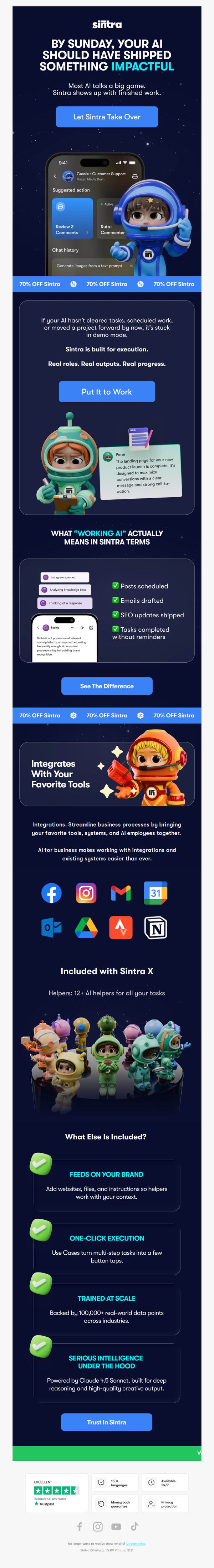
Objective
This email aims to convert hesitant AI users by positioning Sintra as the execution-focused alternative to talkative, underperforming AI tools, urging immediate adoption with urgency and social proof before Sunday. It leverages a bold deadline and tangible outcomes to drive sign-ups.
Why this works
The email opens with a bold, time-bound challenge, 'By Sunday, Your AI Should’ve Shipped Something Impactful', which instantly reframes AI from a novelty to an accountability tool, creating urgency without sounding salesy.
How to implement
Instead of vague claims, it defines 'working AI' through concrete, checkable outputs like scheduled posts and drafted emails, making the value proposition instantly tangible and reducing the cognitive load for skeptical buyers.
Pro Tip
The '70% OFF Sintra' banner repeats three times visually but lacks a countdown timer or urgency indicator, adding a live clock near the CTA would reinforce the Sunday deadline and reduce hesitation. • The 'See The Difference' CTA is buried after a dense feature list; moving it higher or making it sticky would improve conversion by letting users compare Sintra vs. generic AI before scrolling into integrations.
7. Vizzy Makes Chaos Look Easy
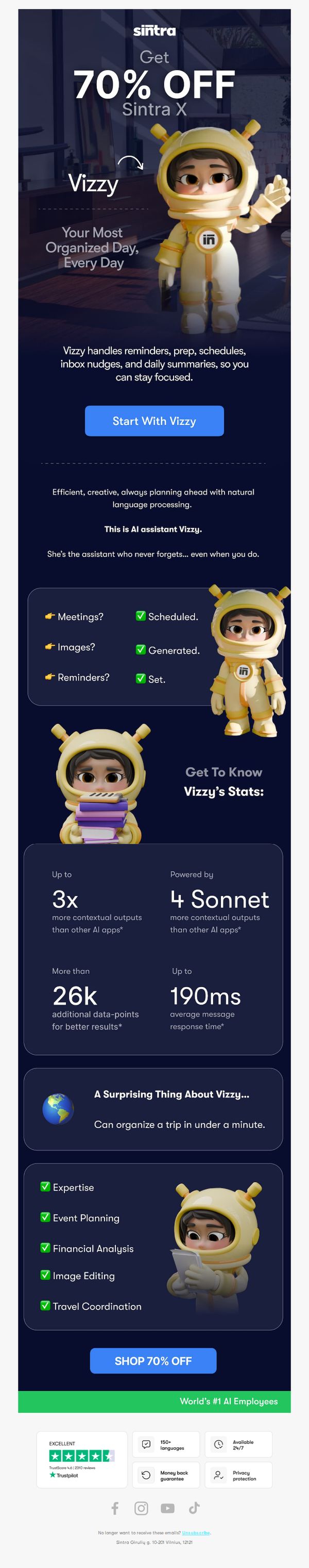
Objective
This email aims to convert subscribers into users of Sintra X by showcasing Vizzy, the AI assistant, as the ultimate productivity partner that simplifies daily chaos through automation and intelligent organization. It leverages a limited-time 70% discount to create urgency and drive immediate sign-ups.
Why this works
The email brilliantly personifies the AI assistant as 'Vizzy', a friendly, memorable character that humanizes complex tech, making the product feel approachable and emotionally engaging rather than cold or intimidating.
How to implement
By spotlighting specific, measurable outcomes like '3x more contextual outputs' and '190ms response time,' the campaign transforms abstract AI capabilities into tangible performance metrics that build credibility and justify the premium positioning.
Pro Tip
The primary CTA 'Start With Vizzy' appears early but lacks visual hierarchy against the large '70% OFF' headline; repositioning or enlarging the button and adding a subtle animation could better guide the eye toward conversion. • While stats are compelling, they’re buried mid-email; adding a sticky or floating 'Top Stats' bar near the CTA would reinforce value during the decision moment and reduce scroll abandonment.
8. So many wasted Fridays…
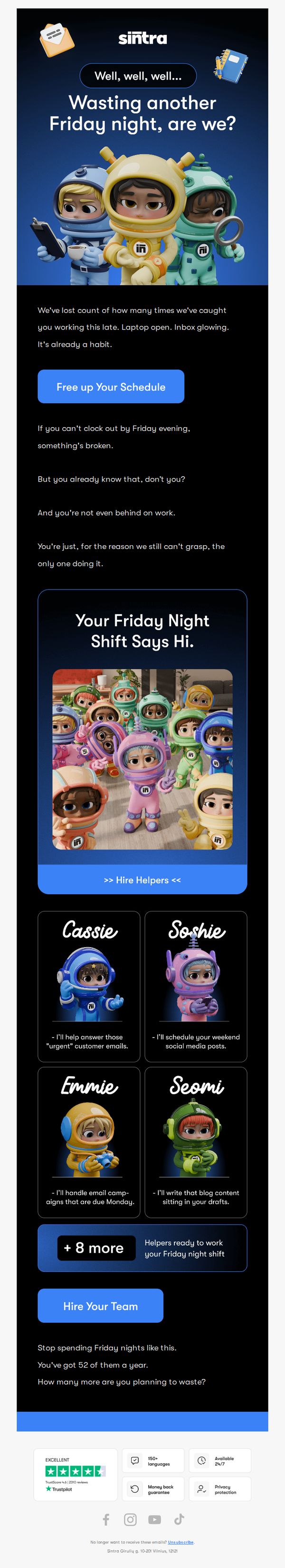
Objective
The email aims to resonate emotionally with overworked professionals by highlighting the pain of wasted Friday nights, then positions Sintra AI’s virtual helpers as the solution to reclaim personal time and reduce work-related stress. It encourages immediate action by framing hiring help as a way to protect weekends and restore work-life balance.
Why this works
The email opens with a relatable, emotionally charged hook, 'Wasting another Friday night, are we?', that instantly connects with the audience’s lived experience, making the solution feel personal rather than promotional.
How to implement
By personifying AI helpers with names and specific tasks, like Cassie handling urgent emails or Seomi writing blog drafts, the campaign transforms abstract tech into tangible, trustworthy teammates, reducing skepticism and increasing perceived value.
Pro Tip
Add a micro-copy line under the 'Hire Your Team' CTA that clarifies the next step, e.g., 'Get matched with your perfect helper in 60 seconds', to reduce friction and set clear expectations for the user journey. • Include a small visual indicator (like a progress bar or badge) next to '+8 more' to subtly communicate that these are real, available helpers, not placeholders, thereby increasing perceived legitimacy and reducing hesitation.
9. Most Founders Guess...
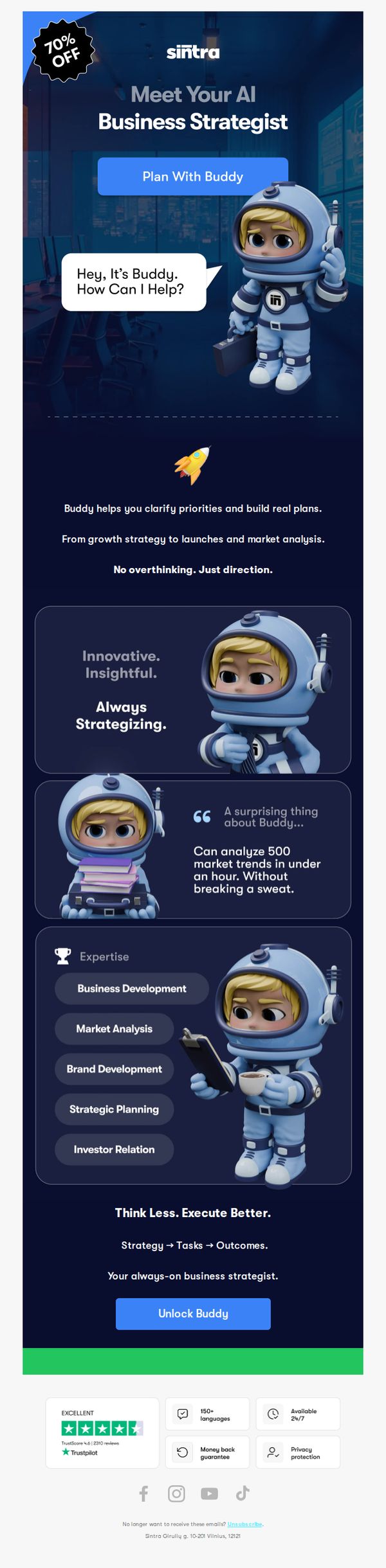
Objective
This email aims to convert curious founders into users of Sintra AI’s ‘Buddy’ by positioning it as an indispensable AI business strategist that simplifies complex planning. It leverages urgency with a 70% discount and social proof to reduce friction and drive immediate sign-ups.
Why this works
The email brilliantly personifies the AI as 'Buddy', a friendly, approachable strategist, which transforms a technical tool into a relatable partner, making complex business planning feel less intimidating and more collaborative for overwhelmed founders.
How to implement
By leading with a bold 70% discount and anchoring it to a pain point ('Most Founders Guess...'), the campaign immediately creates urgency and positions the product as a solution to a widespread, emotionally resonant problem, making the offer feel essential, not optional.
Pro Tip
Add a short video or animated GIF near the hero section showing Buddy in action, this would visually demonstrate the 'Plan With Buddy' experience and reduce cognitive load for users who skim, increasing conversion potential. • Include a mini-case study or founder quote in the 'Expertise' section to humanize the capabilities, e.g., 'Used by 2,000+ founders to launch 3x faster', to strengthen social proof and connect features to real-world outcomes.
10. We all know you’re here again.
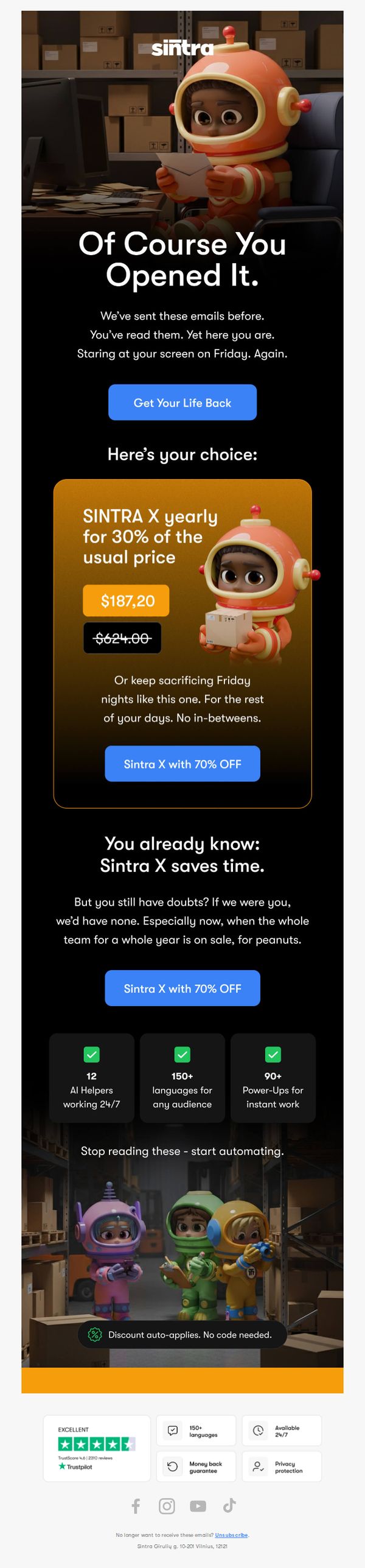
Objective
This email aims to re-engage users who have opened previous emails but haven’t converted, using humor and urgency to push them toward purchasing Sintra X at a steep discount before the offer expires.
Why this works
The email opens with a cheeky, personalized tone that acknowledges the recipient’s repeated engagement, turning potential guilt into a playful nudge that disarms resistance and invites action.
How to implement
By framing the discount as a binary choice, either reclaim your life or keep sacrificing Friday nights, the campaign creates emotional stakes that make the offer feel urgent and personally relevant.
Pro Tip
Add a countdown timer near the CTA to visually reinforce urgency, since the current copy implies scarcity but doesn’t quantify the deadline, which could reduce conversion pressure. • Place the 'Discount auto-applies. No code needed.' message closer to the CTA button, currently buried at the bottom, to eliminate friction and reassure users they won’t miss out due to technical confusion.