Proven Texas Monthly email designs you can use
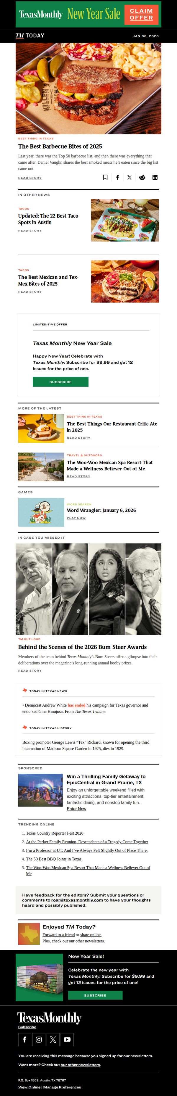
1. What our food critics ate last year
Objective
To drive new subscriptions by leveraging Texas Monthly’s food authority and timely New Year momentum, positioning the magazine as the essential guide to Texas culture through curated culinary experiences and exclusive critic insights.
Why this works
By anchoring the campaign in the credibility of their food critics’ year-end picks, Texas Monthly transforms editorial authority into a persuasive subscription driver that feels less like an ad and more like a curated cultural experience.
How to implement
The email strategically layers multiple food-related stories around the central offer, creating a rich context that makes the subscription feel like access to an insider’s guide rather than just a magazine purchase.
Pro Tip
Add a countdown timer next to the New Year Sale offer to heighten urgency and create a visual trigger that encourages immediate action before the limited-time pricing expires. • Include a short testimonial or quote from a subscriber who discovered a favorite restaurant through Texas Monthly’s critics, to add social proof and emotionally connect the subscription to real-life discovery and enjoyment.
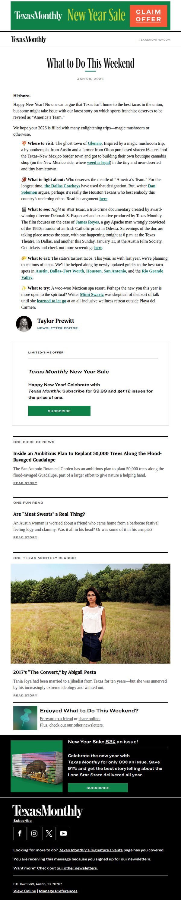
2. A new contender for “America’s Team”? Plus, the state’s tastiest tacos
Objective
This email aims to engage Texas Monthly subscribers with curated weekend content while promoting a limited-time New Year subscription offer. It blends editorial storytelling with promotional urgency to drive conversions without sacrificing brand voice.
Why this works
The email masterfully balances editorial value with promotional intent by leading with culturally relevant, curiosity-driven content that feels native to the brand, making the subscription offer feel like a natural next step rather than a sales pitch.
How to implement
By anchoring the offer in a New Year celebration theme and using specific, tangible savings, '12 issues for the price of one', the campaign creates emotional resonance and perceived value that motivates immediate action without overwhelming the reader.
Pro Tip
Add a countdown timer to the New Year Sale section to heighten urgency and encourage immediate action, especially since the offer is time-sensitive and the current design lacks visual cues for scarcity. • Include a short testimonial or subscriber quote near the CTA to build social proof, readers are more likely to convert when they see others have already benefited from the same offer.
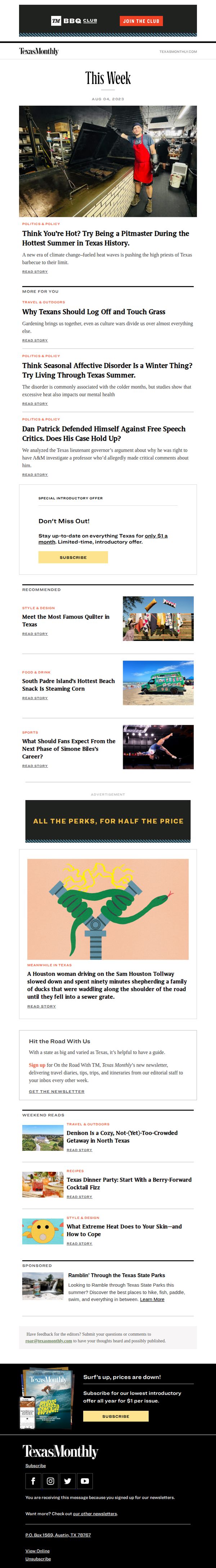
3. Weekly Roundup: Think You’re Hot? Try Being a Pitmaster During the Hottest Summer in Texas History.
Objective
This email aims to engage readers with timely, culturally relevant Texas stories while driving subscriptions through a limited-time offer. It positions Texas Monthly as an essential source for understanding life in the state, especially during extreme conditions.
Why this works
The email opens with a bold, relatable hook, comparing reader discomfort to a pitmaster’s suffering in extreme heat, which instantly creates emotional resonance and frames Texas Monthly as the voice of authentic local experience.
How to implement
Strategically placing the subscription CTA twice, once mid-email after high-engagement content and again in the footer, capitalizes on reader momentum while reinforcing urgency with a time-sensitive price point that feels like a local insider deal.
Pro Tip
The hero image of the pitmaster is strong, but adding a subtle overlay text or caption like 'The Real Heat of Texas' would reinforce the theme and improve scannability for mobile readers who may not read the full headline immediately. • The 'Recommended' section lacks visual hierarchy, adding category tags or small icons next to each story type (e.g., a fork for Food & Drink, a suitcase for Travel) would help readers quickly identify content aligned with their interests.
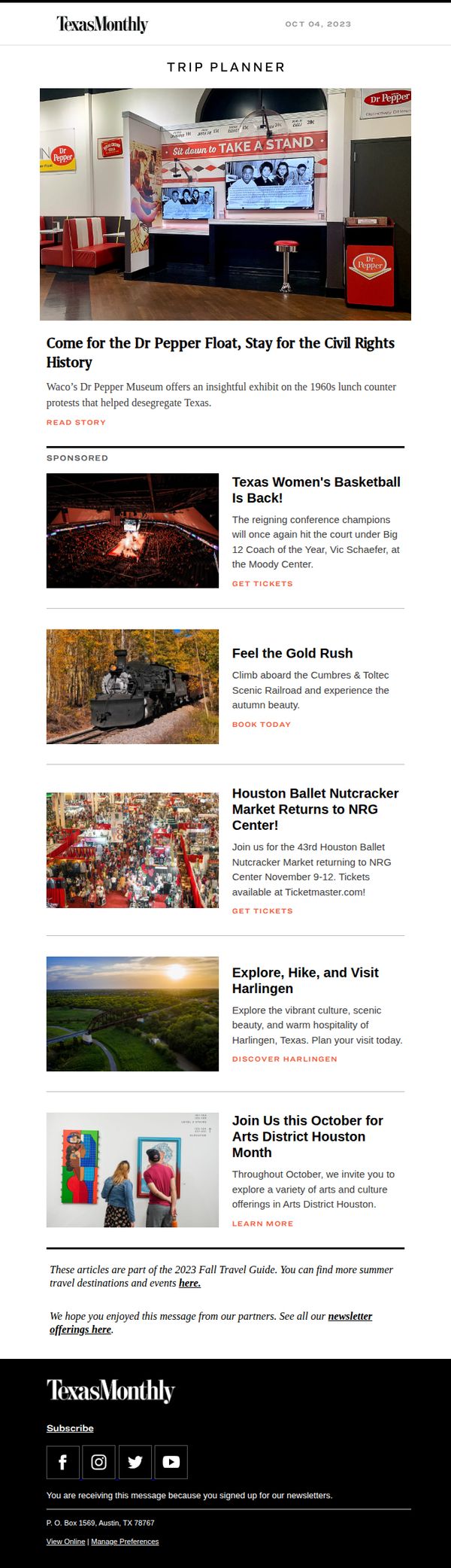
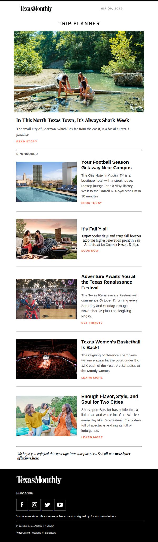
4. In Texas, There's Always More to Explore
Objective
This email aims to inspire Texas residents and travelers to explore culturally rich, locally significant experiences across the state by highlighting unique events, historical exhibits, and seasonal attractions. It positions Texas Monthly as a trusted curator of authentic Texas adventures.
Why this works
The email masterfully blends history and modern culture by leading with a powerful civil rights exhibit at the Dr Pepper Museum, immediately establishing emotional resonance and intellectual curiosity while anchoring the brand in Texas’s complex identity.
How to implement
Each event is framed with vivid sensory language, like 'Feel the Gold Rush' or 'Explore, Hike, and Visit Harlingen', which transforms passive listings into immersive invitations, making readers feel the experience before they even click through.
Pro Tip
Add a visual countdown or seasonal badge (e.g., 'Only 3 Weeks Left for Fall Adventures!') near the top to reinforce urgency and align with the 'Fall Travel Guide' theme, increasing click-through on time-sensitive events. • Reposition the 'READ STORY' CTA under the hero section to be more visually prominent, perhaps as a button with contrasting color, to ensure the primary action doesn’t get lost among multiple secondary CTAs like 'GET TICKETS' and 'BOOK TODAY'.
5. Summer at Your Speed
Objective
This email aims to inspire summer travel within Texas by highlighting unique local destinations and experiences, while subtly promoting partner offerings to drive engagement and exploration. It blends editorial storytelling with sponsored content to maintain brand authority while monetizing reader interest.
Why this works
The email opens with a visually rich, editorial-style hero image that immediately evokes curiosity and wanderlust, making the reader feel like they’re discovering a hidden gem rather than being sold to.
How to implement
By blending authentic editorial content with clearly labeled sponsored sections, the campaign maintains trust while monetizing naturally, readers don’t feel interrupted, they feel guided toward relevant experiences.
Pro Tip
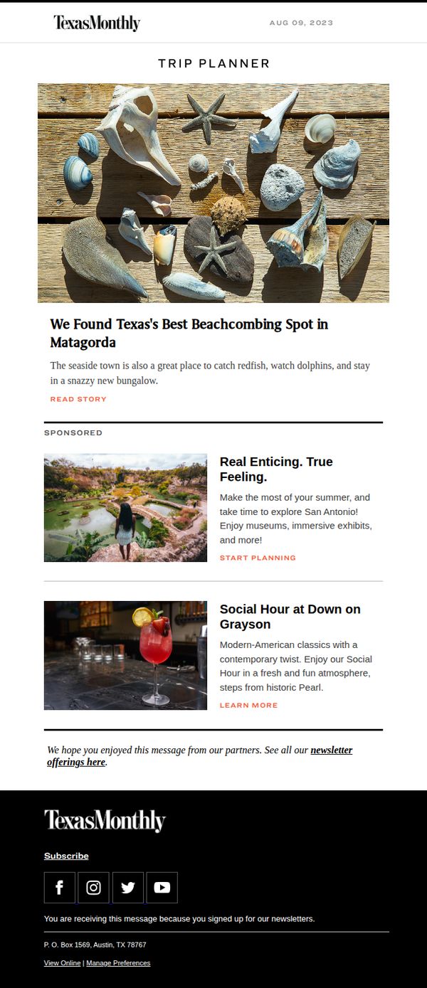
Add a secondary CTA beneath the sponsored sections, such as 'Explore More Texas Getaways', to guide readers who engage with partner content toward more editorial value, reducing drop-off after the first scroll. • Include a small map pin or location tag next to each destination (Matagorda, San Antonio, Grayson) to visually anchor the geographic relevance and help readers mentally map their potential trips.
6. Can Cohousing Work in Texas? These Houstonians Think So.
Objective
This email aims to engage Texas Monthly readers by highlighting compelling local stories that reflect Texan identity and innovation, while subtly encouraging subscription through a limited-time offer and a strong closing CTA that ties community pride to readership.
Why this works
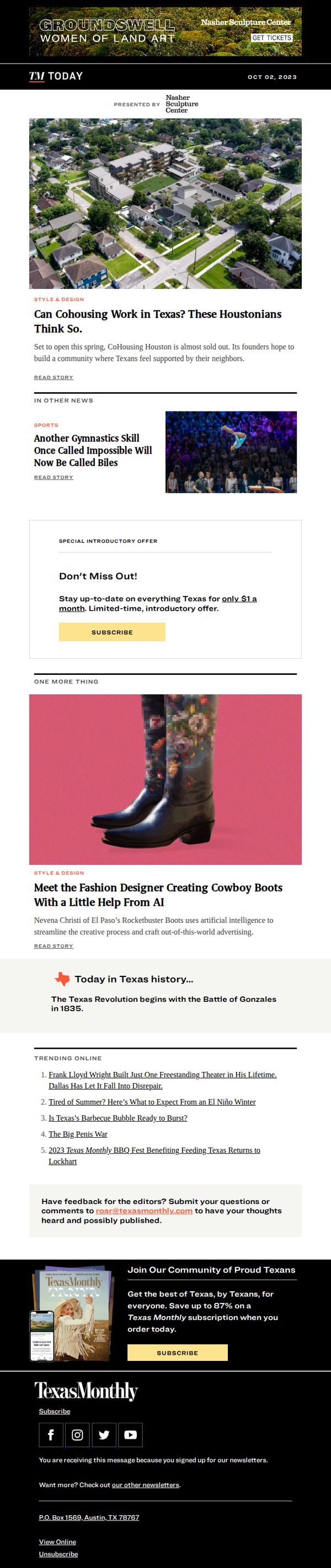
The email opens with a visually rich, locally relevant story that immediately taps into Texan curiosity and pride, making the reader feel like they’re being let in on an insider trend shaping their own communities.
How to implement
By embedding a time-sensitive, low-friction subscription offer mid-email, Texas Monthly turns passive readers into potential subscribers without interrupting the narrative flow, making the CTA feel like a natural next step rather than a sales pitch.
Pro Tip
The hero image and headline about cohousing are strong, but adding a brief sub-headline or pull quote from a founder would increase emotional pull and give readers a reason to click beyond curiosity. • The ‘Special Introductory Offer’ section uses generic phrasing, adding social proof like ‘Join 12,000+ Texans already subscribed’ or a small badge like ‘Limited to first 500’ would boost urgency and credibility.
7. Greg Abbott Failed to Persuade Lawmakers on School Vouchers. Now He’s Threatening Them.
Objective
To inform subscribers about Governor Greg Abbott’s political maneuvering around school vouchers while driving engagement through a limited-time subscription offer that positions Texas Monthly as the essential source for in-depth Texas news and culture.
Why this works
The email leads with a high-stakes political headline that immediately taps into reader urgency and regional identity, making it impossible to scroll past without feeling the weight of Texas-specific governance drama.
How to implement
By embedding a time-sensitive, low-cost subscription offer directly beneath the main story, the campaign smartly converts reader curiosity into immediate action without disrupting the editorial flow or compromising journalistic tone.
Pro Tip
The primary CTA ‘SUBSCRIBE’ appears twice but lacks visual hierarchy, the second CTA in the footer is visually identical to the first, diluting urgency; consider using a contrasting color or animation on the first CTA to guide the eye and prioritize conversion. • The ‘Special Introductory Offer’ section feels disconnected from the editorial tone, adding a brief sentence like ‘Join thousands of Texans who trust us to break down the stories that matter’ would bridge the gap between journalism and subscription appeal.
8. Think Seasonal Affective Disorder Is a Winter Thing? Try Living Through Texas Summer.
Objective
This email aims to drive subscriptions to Texas Monthly by leveraging seasonal relevance, highlighting the mental toll of Texas summers, to create emotional resonance and urgency around their 50th-anniversary offer. It positions the magazine as both a cultural companion and a practical escape from summer stress.
Why this works
The email brilliantly reframes seasonal affective disorder not as a winter malady but as a Texas summer survival challenge, making the content instantly relatable and emotionally compelling to local readers who feel the heat’s psychological weight.
How to implement
By anchoring the subscription offer to the magazine’s 50th anniversary, the campaign transforms a routine promotion into a cultural milestone, giving subscribers the sense they’re joining a legacy rather than just buying a product, which elevates perceived value and exclusivity.
Pro Tip
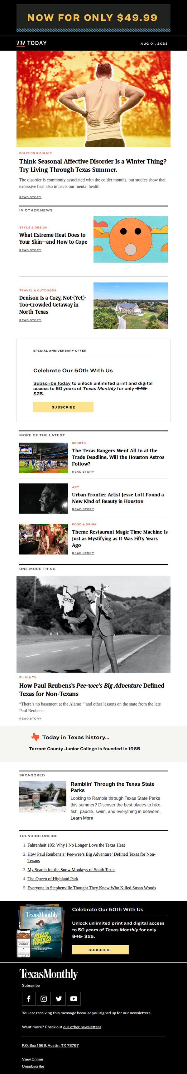
The CTA button appears twice but lacks visual hierarchy; the second instance in the footer should be more prominent or include a time-sensitive element like a countdown to reinforce urgency and reduce scroll abandonment. • The hero image of a man holding his back in heat-induced discomfort is powerful but could be paired with a short testimonial or stat overlay (e.g., '78% of Texans report summer anxiety') to strengthen social proof and validate the emotional hook.
9. Find Adventure This Fall
Objective
This email aims to inspire readers to plan fall adventures across Texas by showcasing unique local experiences, events, and getaways, blending editorial storytelling with sponsored travel offers to drive engagement and bookings.
Why this works
The email masterfully blends editorial charm with commercial intent by leading with a quirky, locally rooted story, turning curiosity into clicks while subtly priming readers for sponsored travel offers that feel like natural extensions of the narrative.
How to implement
Each sponsored section is visually anchored by a high-res lifestyle photo and paired with a concise, benefit-driven headline that answers ‘Why go?’, making even promotional content feel editorially authentic and emotionally resonant with the Texas Monthly brand voice.
Pro Tip
Add a subtle countdown or date badge next to time-sensitive offers (like the Texas Renaissance Festival) to create urgency, currently, the October 7 start date is buried in body text and doesn’t visually compel immediate action. • Reposition the ‘SPONSORED’ label closer to the headline or integrate it into the image overlay to reduce visual disconnect, as it stands, the label feels tacked on and may cause readers to mentally dismiss the section before absorbing its value.
10. Innocence Lost and Found
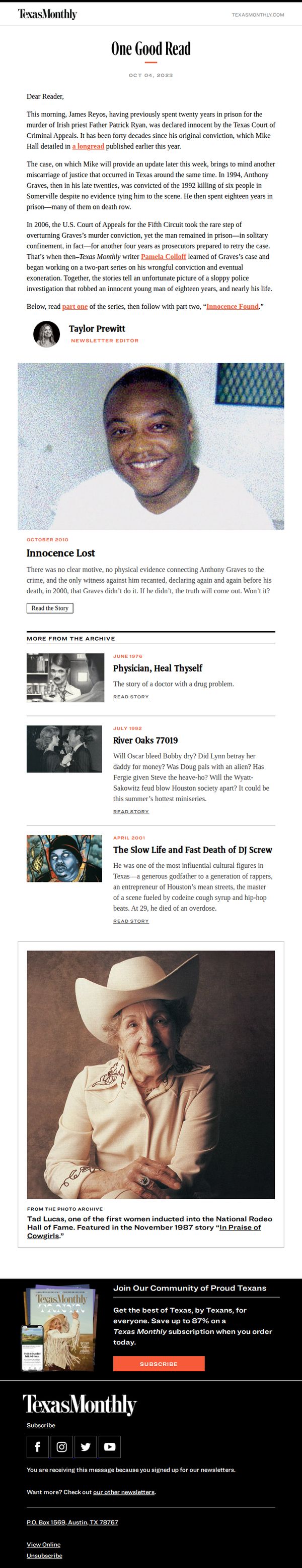
Objective
This email aims to engage readers with a compelling true crime narrative centered on wrongful convictions in Texas, while subtly encouraging subscription by showcasing the depth and historical value of Texas Monthly’s journalism.
Why this works
The email masterfully opens with a timely, emotionally resonant legal update to hook readers, then immediately ties it to a deeper, archived investigative series, creating narrative continuity that rewards long-time subscribers and intrigues newcomers.
How to implement
By featuring a powerful archival photo of Anthony Graves alongside the headline 'Innocence Lost,' the email visually anchors the story’s emotional weight, making the human cost of injustice impossible to ignore and driving readers to click through for context.
Pro Tip
The primary CTA 'SUBSCRIBE' appears only in the footer, buried after multiple content sections, repositioning a secondary CTA above the archive section or as a sticky button would capture interest while readers are most engaged. • The email lacks personalization cues (e.g., reader’s name, past reading behavior) that could deepen relevance; adding a line like 'As someone who reads our justice coverage, you’ll appreciate this update' would strengthen connection and conversion intent.