Proven The RealReal email designs you can use
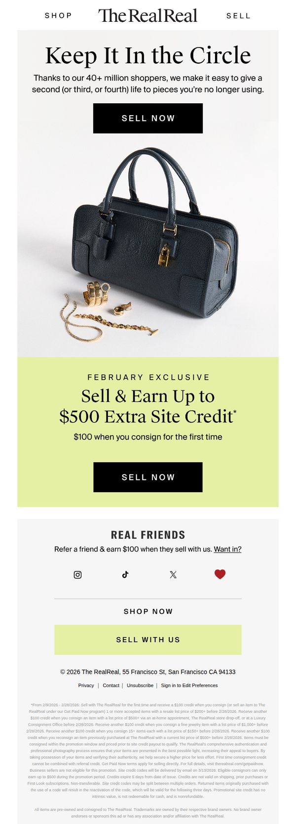
1. Keep it in the circle
Objective
The email aims to encourage users to consign their luxury items by highlighting the environmental and financial benefits of recycling fashion through The RealReal’s platform, while promoting a limited-time bonus credit offer to drive immediate action.
Why this works
The campaign brilliantly frames consignment as a sustainable lifestyle choice by using the phrase 'Keep It In the Circle,' which emotionally connects with eco-conscious shoppers while subtly positioning the brand as a steward of circular fashion.
How to implement
By anchoring the promotion to a specific month and offering tiered credit rewards based on item value, the email creates urgency and perceived exclusivity, making the offer feel personalized and attainable rather than generic or mass-market.
Pro Tip
Add a visual countdown timer in the Offer Section to reinforce the February exclusivity and create real-time urgency, which could increase conversion by making the deadline feel more immediate and tangible. • Include a micro-testimonial or customer quote near the CTA button, such as 'I earned $320 in credit last month!', to humanize the offer and reduce perceived risk for first-time consignors.
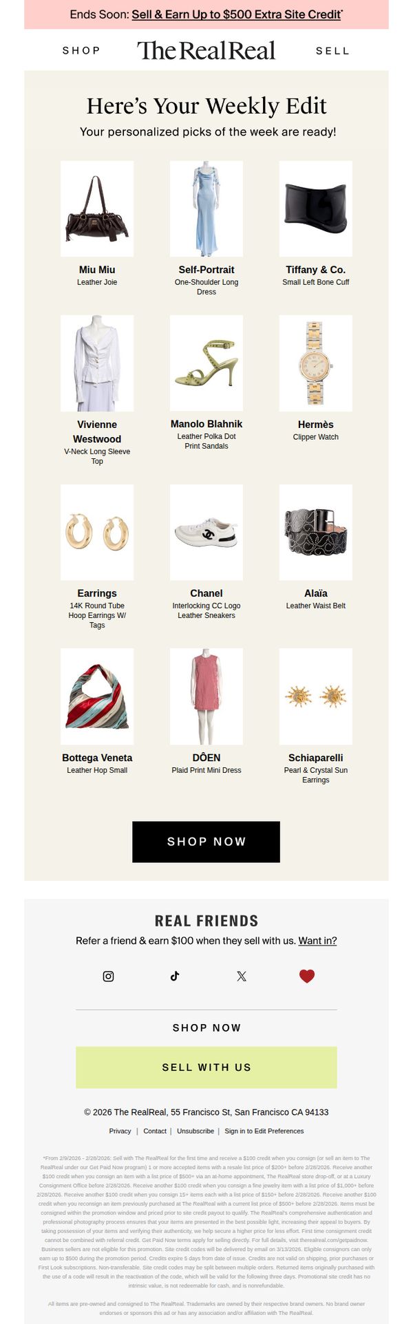
2. We found what you've been looking for...
Objective
This email aims to re-engage users by showcasing personalized luxury item recommendations while simultaneously promoting a limited-time incentive to sell with The RealReal, encouraging both browsing and consignment behavior.
Why this works
The email leverages personalization by curating a 'Weekly Edit' that feels uniquely tailored to the recipient, which increases relevance and emotional connection without requiring explicit user input.
How to implement
By placing a high-impact, time-sensitive promotion at the top, 'Sell & Earn Up to $500 Extra Site Credit', the email immediately creates urgency and dual motivation: to shop and to sell, expanding conversion pathways.
Pro Tip
The 'REAL FRIENDS' referral section feels disconnected from the main shopping intent; relocating it below the product grid or integrating it as a post-purchase suggestion would better align with user flow and reduce cognitive friction. • The primary CTA 'SHOP NOW' appears only once and is visually buried beneath 12 product tiles; adding a sticky or secondary CTA button after the first 4-6 items would capture attention earlier and reduce scroll abandonment.
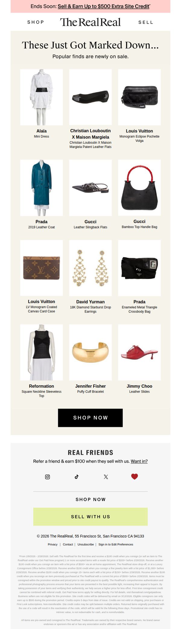
3. New sale items just added
Objective
The email aims to drive immediate purchases by highlighting newly discounted luxury items while incentivizing users to sell their own items for extra site credit, creating a dual-path conversion strategy that boosts both buy and sell activity.
Why this works
The email brilliantly leverages urgency and exclusivity by announcing 'newly marked down' luxury items, tapping into FOMO while positioning the sale as a curated, insider opportunity rather than a generic clearance event.
How to implement
By prominently featuring high-end designer names like Louis Vuitton and Gucci alongside clear product titles, the email instantly communicates value and authenticity, reassuring luxury shoppers that discounted doesn’t mean compromised.
Pro Tip
Add a countdown timer beneath the 'Ends Soon' banner to visually reinforce urgency and encourage immediate action, especially since the promotion has a clear expiration date mentioned in the fine print. • Include a brief testimonial or social proof near the product grid, such as '92% of buyers say our authentication gives them peace of mind', to reduce perceived risk and increase trust in the discounted luxury items.
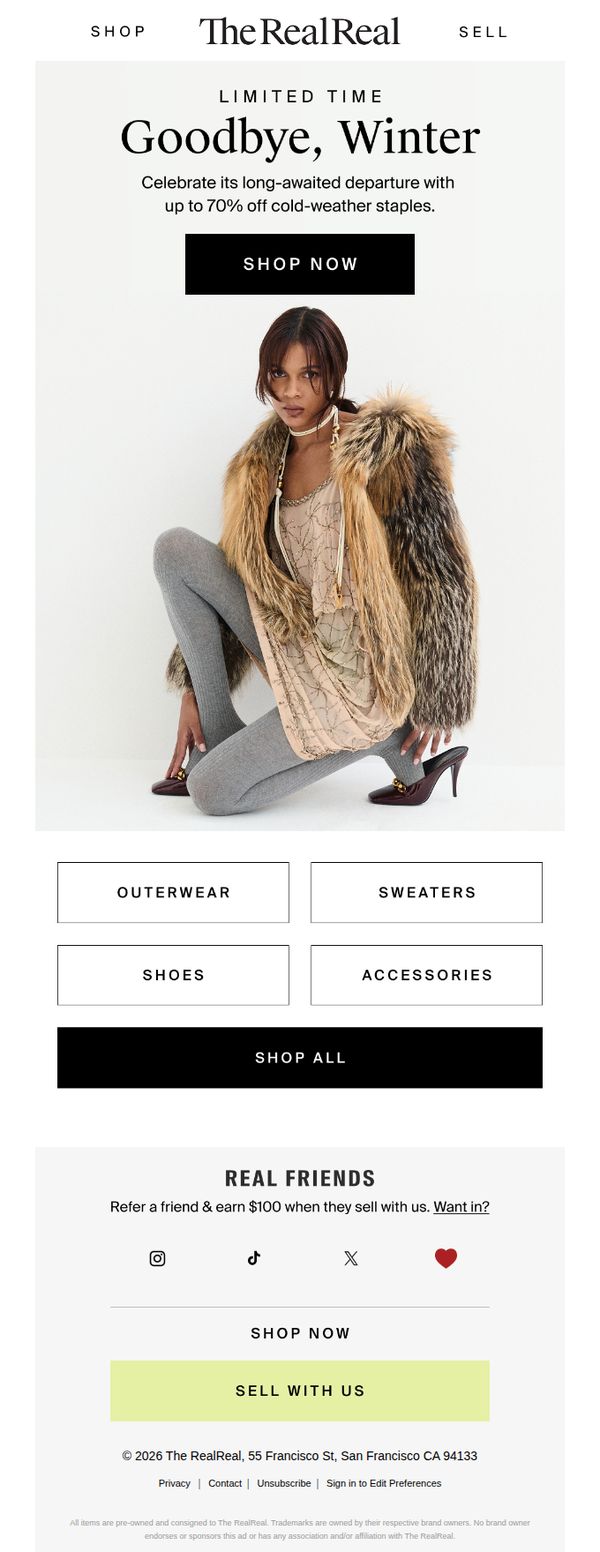
4. Up to 70% off (bye, winter!)
Objective
The email aims to drive immediate sales by promoting a limited-time seasonal sale with up to 70% off winter apparel, encouraging users to shop before the collection is gone. It also seeks to grow its seller base by incentivizing referrals with a $100 reward.
Why this works
The email leverages seasonal urgency with 'Goodbye, Winter' to emotionally connect with shoppers ready to transition wardrobes, making the discount feel timely and relevant rather than generic.
How to implement
By featuring a single, stylish model in a transitional outfit, the campaign visually communicates the sale’s focus on cold-weather staples while subtly suggesting versatility and modern wearability.
Pro Tip
Add a countdown timer beneath the 'LIMITED TIME' headline to amplify urgency and encourage immediate clicks, especially since the offer lacks a visible end date. • Reposition the 'SELL WITH US' CTA higher in the email or duplicate it near the hero section to balance buyer and seller acquisition goals, since the current placement risks being overlooked.
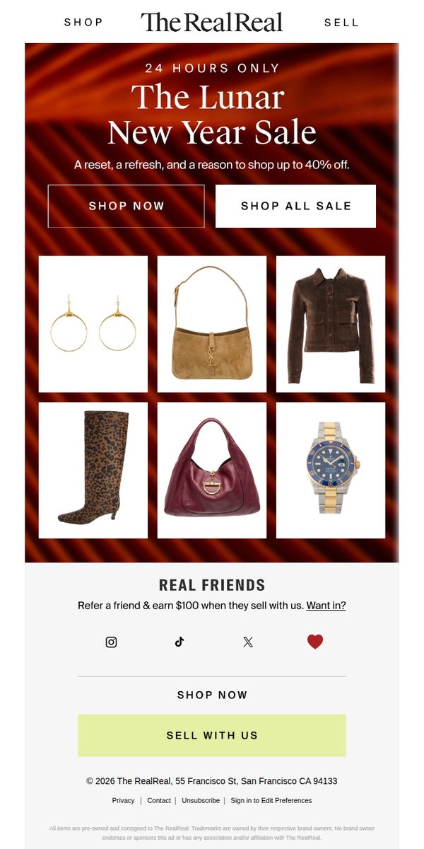
5. The Lunar New Year Sale is on
Objective
This email aims to drive immediate sales by promoting a limited-time Lunar New Year event offering up to 40% off, while also encouraging user acquisition through a referral program that rewards existing customers with $100 when a friend sells with the brand.
Why this works
The email leverages urgency with a '24 Hours Only' headline paired with a rich, festive background that visually signals exclusivity and celebration, making the sale feel like a cultural moment rather than just a discount.
How to implement
By featuring a tightly curated grid of six high-appeal luxury items, from jewelry to watches, the email showcases variety without overwhelming, subtly guiding the shopper toward aspirational yet attainable purchases during the sale window.
Pro Tip
Add a countdown timer beneath the '24 HOURS ONLY' headline to visually reinforce urgency and reduce the cognitive load of calculating time remaining, which could increase conversion rates during the limited window. • Reposition the 'SELL WITH US' CTA above the footer and below the referral section to create a clearer dual-path flow, one for buying, one for selling, aligning with The RealReal’s core business model and increasing seller conversions.
6. You’re ready for spring (almost)
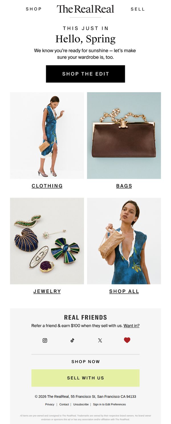
Objective
The email aims to inspire customers to refresh their wardrobes for spring by showcasing curated seasonal items across key categories, while subtly encouraging user acquisition through a referral program and driving immediate sales with a clear call to action.
Why this works
The email opens with a warm, seasonal greeting that aligns emotionally with the customer’s mindset, positioning the brand as a trusted partner in preparing for spring rather than just pushing products, which builds subtle urgency without pressure.
How to implement
By organizing products into clearly labeled categories like Clothing, Bags, and Jewelry with high-quality visuals, the email reduces decision fatigue and guides the shopper intuitively through the edit, making browsing feel effortless and personalized even without dynamic content.
Pro Tip
Add a subtle countdown timer or seasonal urgency cue (e.g., 'Spring Edit Ends Soon') near the CTA to nudge procrastinators, the current design lacks time-sensitive motivation despite the seasonal theme. • Reposition the 'Sell With Us' CTA to appear earlier in the flow, perhaps beneath the hero section, to better balance acquisition and conversion goals, currently, it’s buried in the footer where it competes with legal links and social icons.