VEJA - EN email gallery from real brands
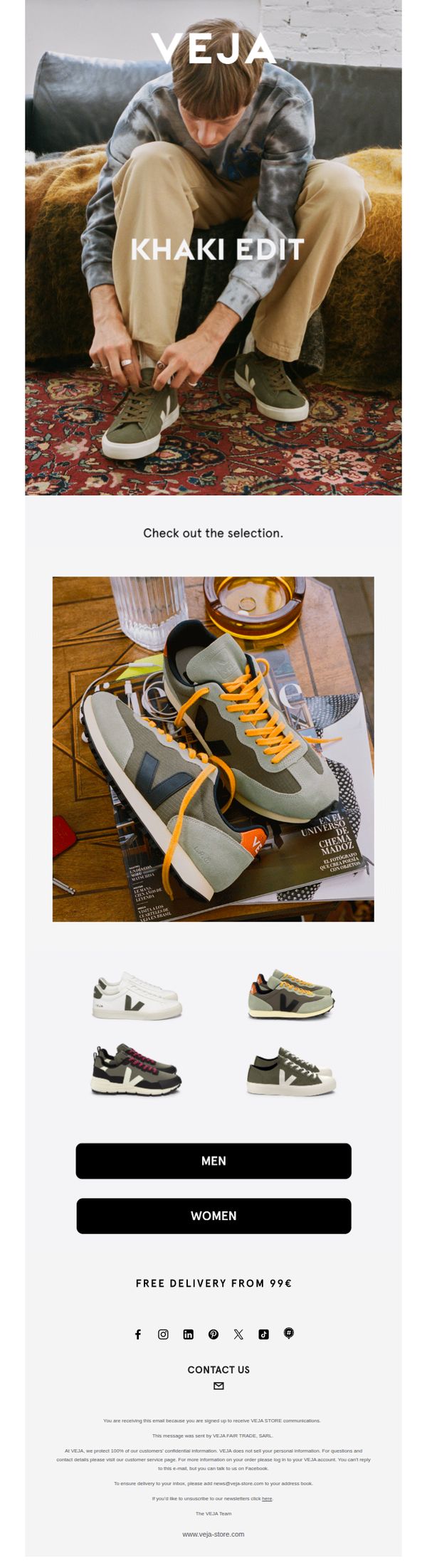

1. Khaki edit
Objective
This email aims to showcase VEJA’s new Khaki Edit collection by highlighting curated sneaker styles in a lifestyle context, encouraging recipients to explore gender-specific selections and ultimately drive traffic to the product pages for purchase.
Why this works
The email opens with a strong visual narrative, a model tying khaki sneakers in a cozy, textured environment, which instantly communicates lifestyle relevance and emotional connection without needing excessive copy.
How to implement
By using a clean product grid with only four hero SKUs, the email reduces decision fatigue while still offering enough variety to appeal to different tastes, making it easy for shoppers to click through with confidence.
Pro Tip
Add a subtle countdown timer or limited-edition badge near the hero section to create urgency around the Khaki Edit, encouraging faster clicks and reducing bounce rates from passive scrollers. • Include a short testimonial or social proof snippet under the product grid, such as 'Worn by 10K+ customers this season', to reinforce trust and reduce hesitation before users click through to product pages.
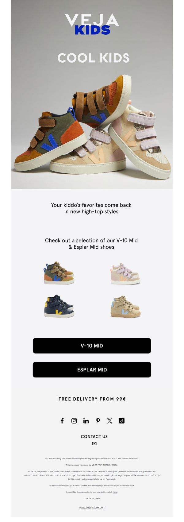
2. New-in: Kids
Objective
To announce and drive interest in VEJA’s newly released high-top kids’ sneaker styles, specifically the V-10 Mid and Esplar Mid models, encouraging parents to explore and purchase through clear product visuals and direct CTAs.
Why this works
The email leverages nostalgic appeal by positioning the new styles as returning favorites, subtly tapping into parental memory while introducing updated designs that feel both familiar and fresh for today’s kids.
How to implement
By featuring only four clean, well-lit product images with consistent styling, the campaign avoids visual clutter and lets each shoe’s unique colorway and design speak for itself without overwhelming the viewer.
Pro Tip
Add a brief benefit-driven headline above the product grid (e.g., 'Built for Play, Designed for Style') to reinforce emotional value before showcasing options, strengthening the connection between product and parent needs. • Include a small visual indicator like a ‘Bestseller’ badge or ‘New Arrival’ tag on one of the featured shoes to create subtle urgency and guide attention toward top-performing or most relevant items.
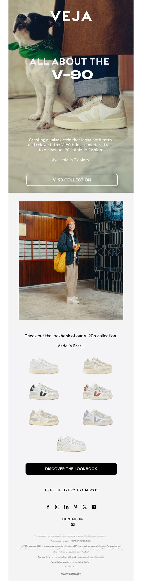
3. Meet the V-90
Objective
This email aims to introduce and promote the V-90 sneaker collection by highlighting its unisex, retro-modern design and Brazilian craftsmanship, encouraging recipients to explore the full range and ultimately drive traffic to the product page or lookbook.
Why this works
The email brilliantly frames the V-90 as a cultural bridge between 90s nostalgia and modern streetwear, making it feel both timeless and fresh, a powerful emotional hook for style-conscious shoppers.
How to implement
By featuring a real person wearing the sneakers in a warm, everyday setting, complete with a dog and casual accessories, the brand humanizes the product and invites customers to imagine themselves in the scene.
Pro Tip
Add a subtle countdown timer or limited-edition badge near the CTA to create urgency, especially since the collection is available in only 7 colors, this could nudge hesitant buyers to act faster. • Include a short testimonial or customer review snippet under the product grid to build social proof, since the email currently lacks third-party validation despite promoting a lifestyle-driven product.
4. VEJA x REFORMATION
Objective
This email aims to introduce and drive excitement around the VEJA x Reformation collaboration, encouraging recipients to explore and purchase the limited-edition Venturi sneakers by highlighting the fusion of sustainable design and vintage-inspired fashion.
Why this works
The email brilliantly leverages brand synergy by positioning the collaboration as a fusion of innovation and vintage style, making the product feel both exclusive and emotionally resonant with eco-conscious fashion lovers.
How to implement
By featuring a lifestyle-focused hero image with a relaxed, confident model, the campaign visually communicates comfort and style without needing excessive text, letting the product and aesthetic speak for themselves.
Pro Tip
Add a subtle countdown timer or 'Limited Stock' indicator near the CTA to create urgency, since the collaboration is exclusive and likely to sell out quickly, which would motivate faster action. • Include a short testimonial or influencer quote near the product grid to build social proof, especially since sustainability-focused shoppers often rely on peer validation before purchasing.
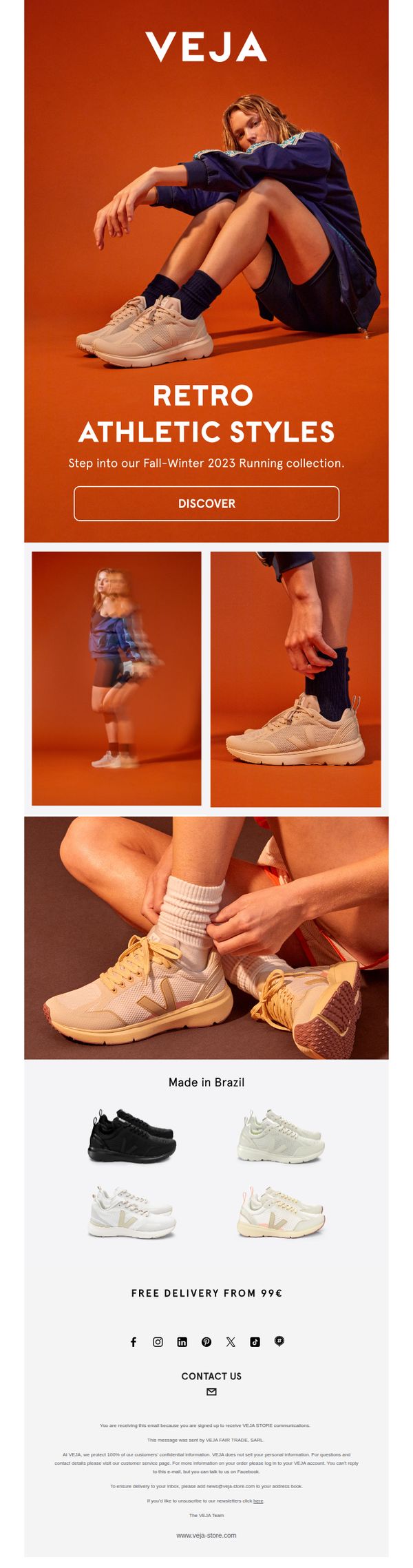
5. VEJA Running
Objective
This email aims to introduce and drive engagement with VEJA’s Fall-Winter 2023 Running collection by highlighting retro athletic styles and encouraging immediate exploration through a clear CTA. It also reinforces brand values like Brazilian craftsmanship and ethical delivery thresholds.
Why this works
The email masterfully blends lifestyle imagery with product focus, using motion blur and close-up shots to convey energy and comfort while keeping the shoes as the undeniable hero of every frame.
How to implement
By anchoring the campaign in a seasonal narrative, 'Fall-Winter 2023 Running collection', the email creates urgency and relevance, positioning the shoes not just as products but as timely wardrobe essentials for active lifestyles.
Pro Tip
Add a subtle countdown timer or limited-availability tag near the 'DISCOVER' CTA to create urgency, especially since the collection is seasonally themed and benefits from perceived scarcity. • Include a short testimonial or user review snippet near the product grid to build social proof, as the current layout lacks third-party validation that could boost conversion for new customers.
6. Classics | Fall 2023
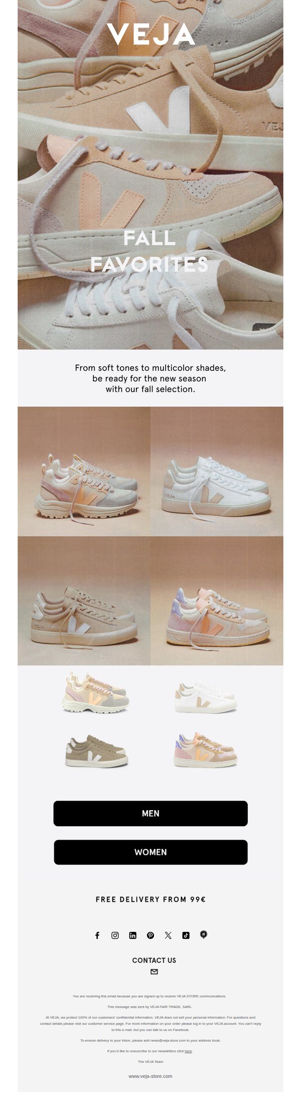
Objective
This email aims to introduce VEJA’s Fall 2023 sneaker collection by highlighting seasonal color palettes and driving traffic to gender-specific product pages. It seeks to convert subscribers by emphasizing aesthetic appeal and offering a clear delivery incentive.
Why this works
The email leverages soft, seasonal color storytelling to emotionally connect with shoppers, framing the collection not just as footwear but as a curated fall wardrobe essential that aligns with evolving personal style.
How to implement
By splitting the CTA into gender-specific buttons beneath the product grid, VEJA streamlines the user journey, reducing decision fatigue and guiding customers directly to relevant inventory without overwhelming them with choices.
Pro Tip
Add a subtle countdown timer or limited-edition badge near the hero section to create urgency around the Fall 2023 collection, encouraging faster clicks before potential restocks or seasonal rotation. • Include a short testimonial or social proof snippet beneath the product grid, such as 'Worn by 10K+ customers this season', to build trust and reduce hesitation for first-time buyers unfamiliar with VEJA’s fit or quality.
7. New collection
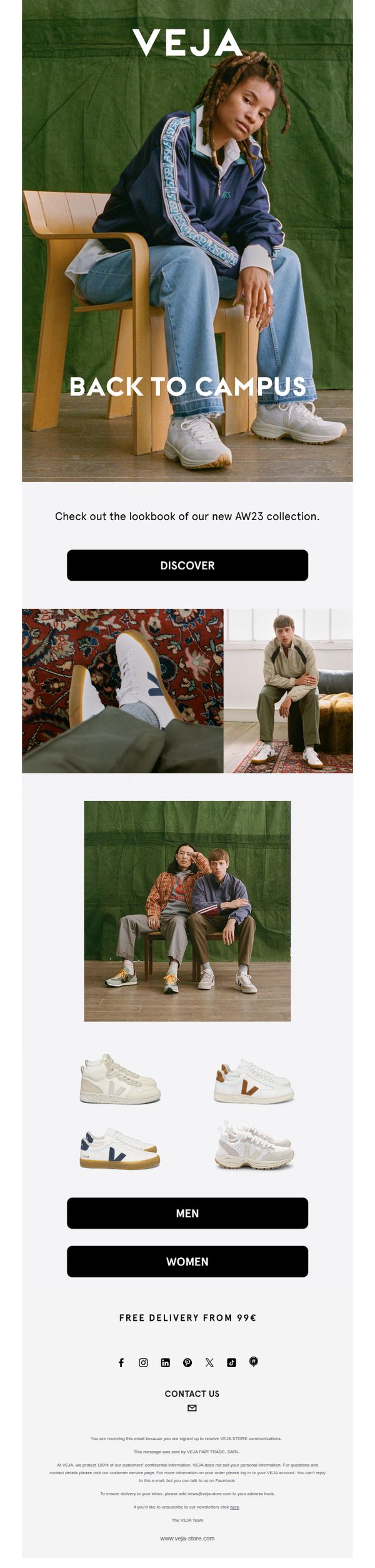
Objective
This email aims to drive engagement with VEJA’s new AW23 'Back to Campus' collection by showcasing lifestyle imagery and directing subscribers to explore the full lookbook, while subtly encouraging gender-specific browsing and highlighting a delivery threshold incentive.
Why this works
The email leverages a strong seasonal theme, 'Back to Campus', to emotionally resonate with students and young professionals, positioning the sneakers as both stylish and contextually relevant for everyday academic life.
How to implement
By featuring lifestyle photography with diverse models in natural, relatable settings, the campaign builds aspirational yet authentic connections, making the product feel integrated into the customer’s daily identity rather than just a purchase.
Pro Tip
Add a subtle countdown timer or 'Limited Stock' indicator near the CTA to create urgency, especially since the collection is new and may benefit from perceived scarcity to boost immediate clicks. • Include a short testimonial or social proof snippet under the hero image, such as 'Worn by 10K+ students this season', to reinforce credibility and reduce hesitation for first-time buyers.
8. Venturi Edit
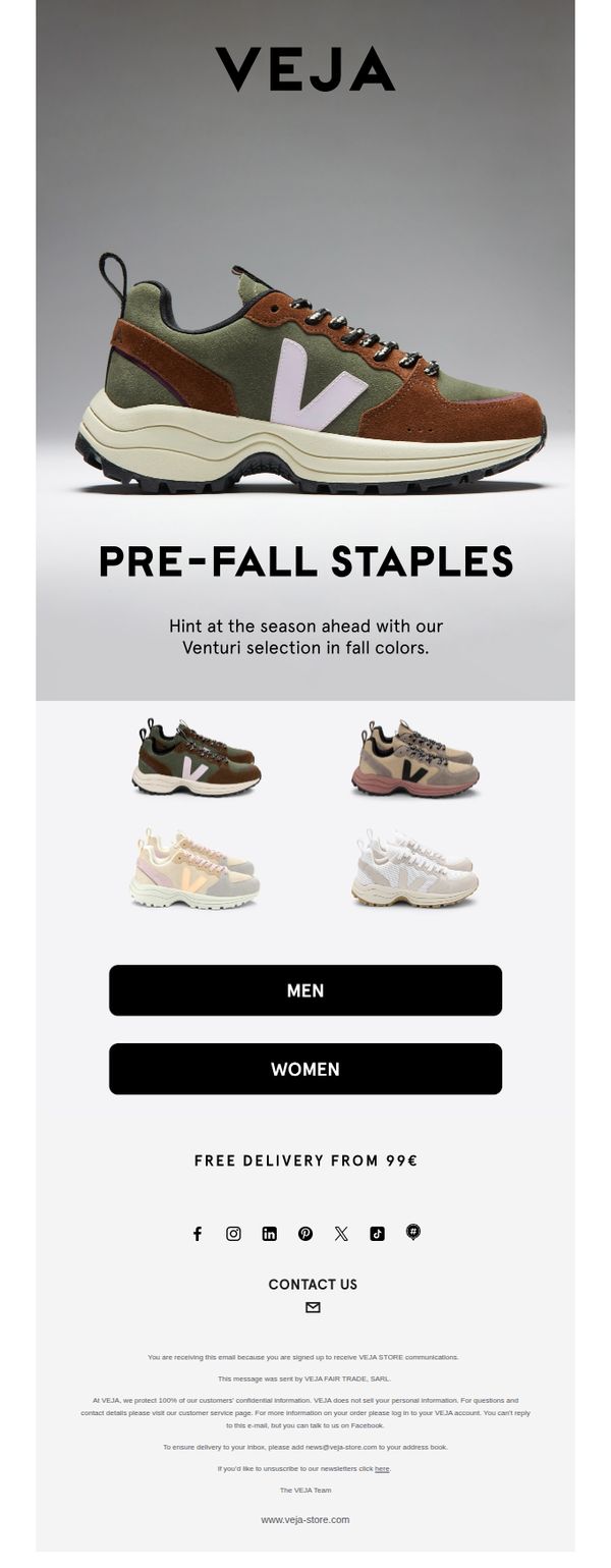
Objective
This email aims to introduce VEJA’s Pre-Fall Staples collection, specifically highlighting the Venturi sneaker in seasonal colorways to drive early engagement and purchases ahead of the fall season. It encourages users to explore gender-specific collections and leverages free delivery as an incentive to convert.
Why this works
The email smartly positions the Venturi sneaker as a 'Pre-Fall Staple,' creating urgency and seasonal relevance while subtly educating customers on upcoming trends without overwhelming them with too many product options.
How to implement
By using a clean, minimalist layout with high-contrast product imagery and bold typography, the email ensures the shoes remain the visual hero, allowing the design to support, not compete with, the product storytelling.
Pro Tip
Add a subtle countdown timer or 'Limited Stock' indicator near the CTA to amplify urgency, especially since the email promotes a pre-season collection that benefits from early adopter psychology. • Include a short testimonial or social proof snippet under the hero section, such as 'Worn by 10K+ customers this season', to build trust and validate the Venturi’s appeal before users scroll to product options.
9. VEJA Masterclass
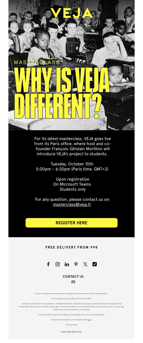
Objective
The email aims to drive student registrations for a live VEJA masterclass hosted by co-founder François-Ghislain Morillion, positioning the brand as transparent and mission-driven while deepening audience connection through educational storytelling.
Why this works
By framing the masterclass as a behind-the-scenes look led by the co-founder, VEJA transforms a simple event into an exclusive, credibility-building experience that appeals to students seeking authentic brand narratives.
How to implement
The bold, high-contrast yellow-on-black design immediately signals urgency and importance, ensuring the core message, 'Why is VEJA different?', dominates attention without visual clutter or competing elements.
Pro Tip
Add a brief testimonial or quote from a past student attendee to build social proof and reduce perceived risk for first-time registrants, especially since the event is exclusive to students. • Include a countdown timer or 'seats filling fast' indicator near the CTA to create urgency, since the event is time-bound and the current design lacks any scarcity signal.
10. Back to school
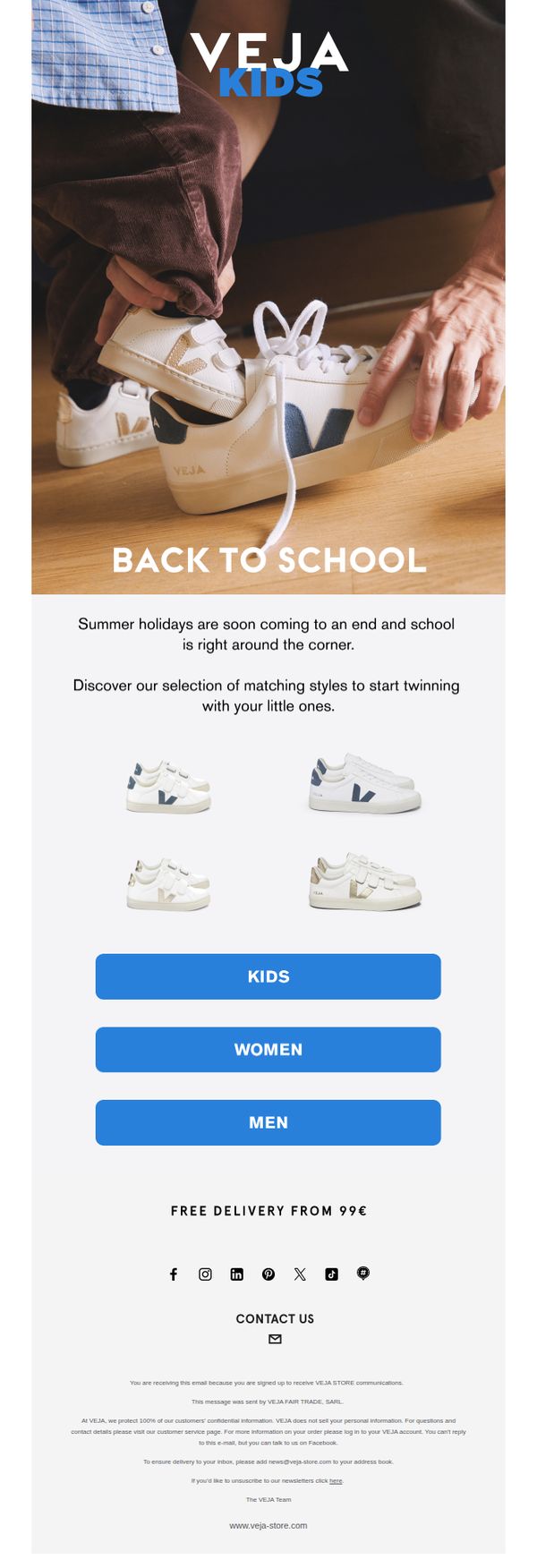
Objective
This email aims to drive back-to-school sneaker purchases by encouraging parents to shop matching styles for themselves and their children, leveraging emotional connection and seasonal timing to boost family-oriented sales.
Why this works
The email brilliantly taps into the emotional rhythm of the back-to-school season by positioning sneakers not just as footwear, but as a shared family ritual that strengthens parent-child bonds through matching styles.
How to implement
By featuring a warm, tactile image of an adult helping a child put on shoes, the campaign creates instant relatability and subtly implies care, comfort, and trust, values that resonate deeply with parents making purchase decisions.
Pro Tip
Add a subtle countdown timer or urgency cue near the CTA buttons (e.g., 'Shop matching styles before school starts, only 7 days left!') to nudge procrastinating parents toward immediate action. • Include a short testimonial or social proof snippet under the product grid, such as '92% of parents say their kids love VEJA’s comfort for long school days,' to reinforce trust and reduce purchase hesitation.