How Zara does fashion marketing emails

1. Discover what's new this week at #zarawoman
Objective
This email aims to drive engagement and traffic by showcasing Zara’s latest women’s fashion arrivals, encouraging subscribers to explore new styles and ultimately shop the collection. It also promotes brand loyalty through lifestyle content and app downloads.
Why this works
Zara masterfully blends editorial photography with product presentation, turning a promotional email into a fashion editorial that feels aspirational rather than salesy, which elevates brand perception while still driving discovery.
How to implement
The strategic use of monochrome and minimalist styling across product images creates a cohesive visual rhythm that guides the eye naturally through the collection, making browsing feel intuitive and luxurious without overwhelming the viewer.
Pro Tip
Add a clear, prominent CTA button above the fold, such as 'Shop New Arrivals', to reduce friction for users ready to buy, since the current 'Download Our App' CTA is buried and doesn’t align with immediate shopping intent. • Include brief product context or styling tips under key images (e.g., 'Pair this bralette with wide-leg trousers for a modern office look') to help customers visualize usage and increase conversion by reducing decision fatigue.
2. DENIM capsule #zaraman
Objective
This email aims to introduce and drive engagement with Zara Man’s new Denim Capsule collection by showcasing its aesthetic and versatility through editorial-style imagery, while encouraging recipients to explore the full range online.
Why this works
The email masterfully blends editorial fashion photography with product presentation, creating an aspirational mood that positions the denim capsule not just as clothing, but as a curated lifestyle statement for the modern man.
How to implement
By using a consistent raw indigo color palette across all garments and maintaining a minimalist layout, the campaign reinforces brand cohesion and allows the collection’s design details to stand out without visual clutter or distraction.
Pro Tip
Add a brief value proposition or styling tip beneath the 'DENIM CAPSULE' headline to clarify why this collection matters, for example, 'Built for movement, designed for impact', to strengthen immediate emotional resonance before the scroll. • Place a secondary CTA like 'SHOP THE LOOK' directly under the hero model image to capture impulse interest early, rather than forcing users to scroll to the product grid where attention may have already drifted.
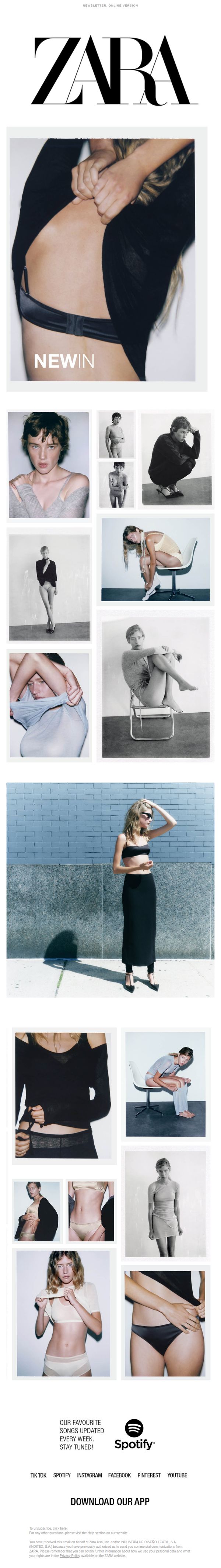
3. Discover what's new this week at #zarawoman
Objective
To showcase Zara’s latest women’s fashion arrivals for Autumn/Winter 2023 and drive engagement through visual storytelling, while encouraging app downloads and social media follow-through. The email positions Zara as a trendsetter by blending editorial-style imagery with curated product highlights.
Why this works
Zara masterfully uses monochromatic editorial photography to elevate everyday pieces into aspirational fashion moments, making the collection feel like a curated runway rather than a retail catalog.
How to implement
By integrating Spotify and TikTok into the email’s closing, Zara creates a lifestyle ecosystem around its brand, not just selling clothes, but inviting subscribers into a cultural moment they can stream, wear, and share.
Pro Tip
Add a clear, visually distinct CTA button above the fold, perhaps labeled 'Shop New Arrivals', to reduce scroll friction and align with the email’s primary goal of driving immediate product engagement. • Include a short, punchy tagline or benefit-driven copy beneath each product image in the grid (e.g., 'Effortless Elegance, Just Dropped') to reinforce emotional appeal and reduce decision fatigue for shoppers.
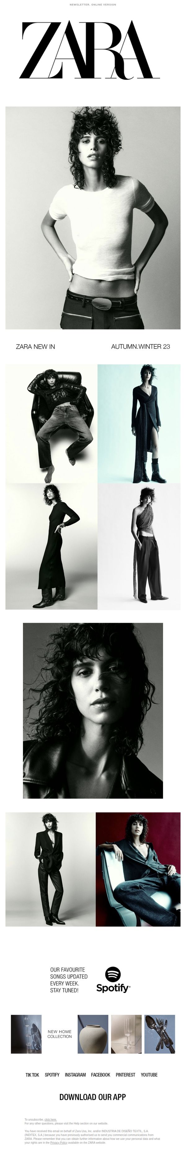
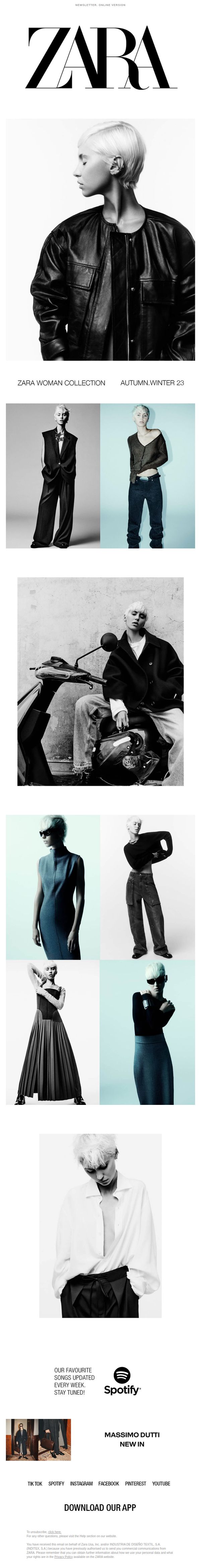
4. Discover what's new this week at #zarawoman
Objective
To drive engagement and traffic to Zara’s AW23 Woman Collection by showcasing high-impact editorial imagery that highlights key looks, while encouraging app downloads and social media follow-through to deepen brand connection.
Why this works
The email leverages monochromatic editorial photography to create a luxury fashion magazine feel, instantly elevating perceived value and drawing the viewer into the collection’s narrative without relying on text-heavy descriptions.
How to implement
By integrating Spotify and social media icons with a lifestyle hook, 'Our favourite songs updated every week', Zara subtly ties fashion to cultural moments, making the brand feel current and emotionally resonant beyond just product promotion.
Pro Tip
Add a clear secondary CTA like 'Shop the Collection' or 'See New Arrivals' near the product grid to reduce friction for users ready to browse, since the current single CTA ('Download Our App') may not align with immediate purchase intent. • Include a brief editorial tagline or styling tip under each product image to guide customers on how to wear or pair items, enhancing perceived value and reducing decision fatigue for shoppers unfamiliar with the collection’s styling direction.
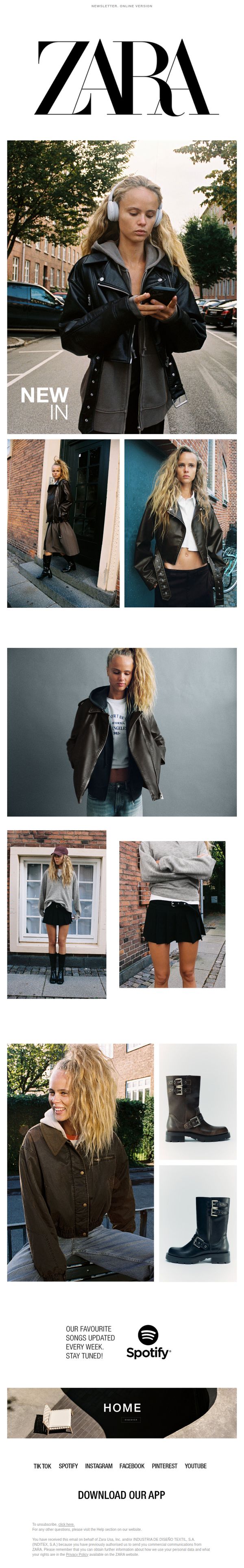
5. The biker trend #zarawoman
Objective
This email aims to drive engagement and sales by showcasing Zara’s new biker-inspired fashion collection, positioning it as a must-have trend for modern, style-conscious women while reinforcing brand identity through curated visuals and lifestyle storytelling.
Why this works
Zara masterfully blends editorial storytelling with e-commerce by using candid, street-style photography that feels authentic and aspirational, making the biker trend feel accessible rather than intimidating to the everyday shopper.
How to implement
The email strategically layers product shots with lifestyle context, showing the same model in multiple settings, to subtly demonstrate versatility and styling potential, which reduces purchase hesitation and encourages cart additions across categories.
Pro Tip
Add a clear, time-sensitive offer or discount code in the hero section to create urgency and incentivize immediate clicks, since the current design relies solely on visual appeal without a tangible conversion trigger. • Include a mini 'How to Style' section or icon-based styling tips beneath key product images to guide less confident shoppers, reducing friction and increasing the likelihood of cross-category purchases.
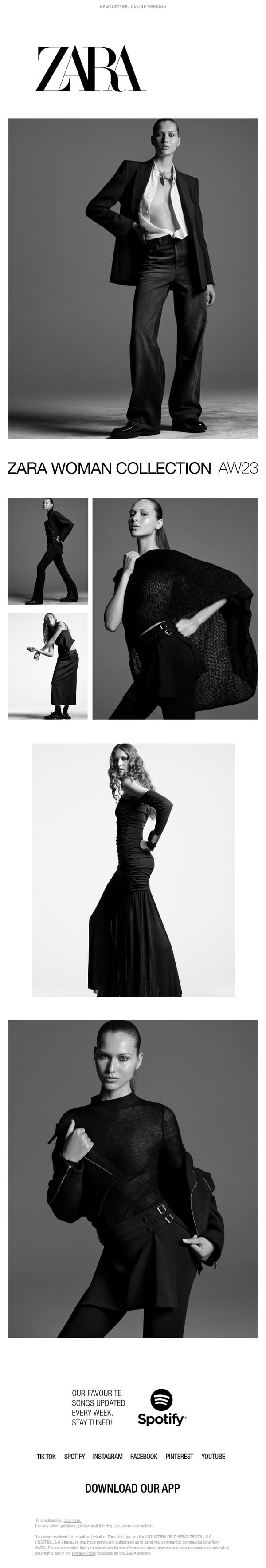
6. Discover what's new this week at #zarawoman
Objective
This email aims to drive engagement and traffic to Zara’s latest Autumn/Winter 23 collection by showcasing high-impact editorial imagery and teasing new arrivals, while subtly encouraging app downloads and social media follows to deepen brand loyalty.
Why this works
Zara masterfully uses monochrome editorial photography with selective color accents to create a high-fashion, gallery-like experience that elevates the perceived value of everyday apparel while maintaining visual cohesion across the entire email.
How to implement
By featuring a single, consistent model across multiple looks, the campaign builds a narrative of versatility and personal style, subtly encouraging customers to imagine themselves wearing the collection rather than just viewing isolated products.
Pro Tip
Add a clear, visually distinct CTA button above the fold, such as 'Shop the Collection', to reduce friction and guide users toward immediate conversion, rather than relying solely on the app download CTA at the bottom. • Include a brief, benefit-driven headline or tagline beneath the hero image (e.g., 'Effortless Elegance for Every Occasion') to reinforce the collection’s emotional appeal and help users quickly understand the value proposition.
7. Trick or treat? Discover the Halloween Collection #zarakids

Objective
This email aims to drive excitement and engagement around Zara Kids’ Halloween-themed Autumn Winter .23 collection by showcasing playful, imaginative costumes through high-impact visuals, encouraging parents to explore and shop the new line for their children.
Why this works
Zara masterfully uses high-contrast black backgrounds to make each costume pop visually, turning every child into a spotlighted character that instantly captures attention and evokes emotional connection through playful storytelling.
How to implement
The campaign leans into whimsy without sacrificing brand elegance, each costume is styled with editorial precision, blending Halloween fun with Zara’s signature minimalist aesthetic to appeal to fashion-conscious parents seeking both style and substance.
Pro Tip
Add a subtle countdown timer or limited-time offer badge near the CTA to create urgency, since Halloween is date-sensitive and parents often shop last-minute, this would nudge immediate action without disrupting the visual flow. • Include a small 'Shop by Age' or 'Top 5 Best Sellers' tag beneath the product grid to reduce decision fatigue for parents, helping them quickly identify age-appropriate or popular costumes without scrolling further.
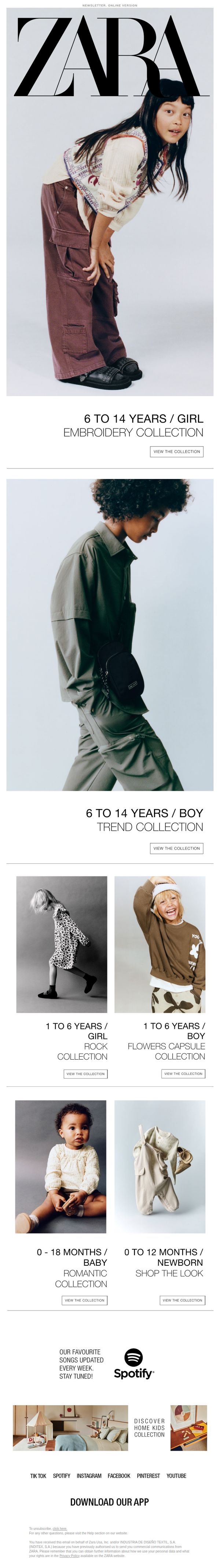
8. Discover what's new this week at #zarakids
Objective
This email aims to drive engagement and traffic to Zara Kids’ latest collections by showcasing age- and gender-specific fashion drops, encouraging parents to explore curated styles for their children while reinforcing brand loyalty through lifestyle content and app promotion.
Why this works
Zara brilliantly segments its kids’ collections by age and gender, making it effortless for parents to find relevant styles without scrolling through irrelevant categories, a smart UX win that reduces decision fatigue and increases conversion likelihood.
How to implement
The use of high-fashion editorial imagery for children’s wear elevates perceived value and aspirational appeal, subtly positioning Zara Kids as a trendsetter rather than just a retailer, a powerful emotional lever for fashion-conscious parents.
Pro Tip
Add a subtle countdown timer or ‘New Arrivals’ badge near each collection header to create urgency and signal freshness, especially since the subject line promises ‘what’s new this week’, reinforcing the timeliness of the offer. • Include a short testimonial or social proof snippet (e.g., ‘Loved by 10K+ parents’) under one or two key collections to build trust and reduce hesitation, particularly for first-time shoppers or those unfamiliar with Zara Kids’ sizing or quality.
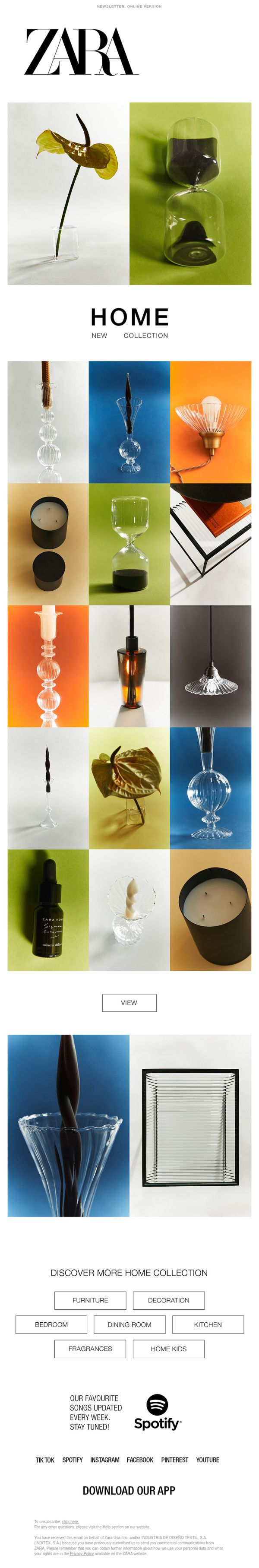
9. HOME – NEW COLLECTION
Objective
To introduce and drive engagement with Zara’s new Home Collection by showcasing curated, aesthetically pleasing products that inspire home styling, encouraging recipients to explore and shop the full range online.
Why this works
Zara masterfully uses a minimalist grid layout to let each home product shine individually while maintaining visual harmony, making the collection feel curated and aspirational rather than overwhelming or cluttered.
How to implement
The strategic use of bold, saturated background colors behind each product creates instant visual contrast that draws the eye and elevates everyday home items into statement pieces worth exploring further.
Pro Tip
Add a subtle hover or tap animation to the 'VIEW' CTA to increase perceived interactivity and urgency, especially since the button is visually understated against the white background and may be overlooked on mobile. • Include a short, benefit-driven tagline under the 'HOME NEW COLLECTION' header, such as 'Elevate Every Room with Modern Essentials', to immediately communicate value and emotional appeal before users scroll.
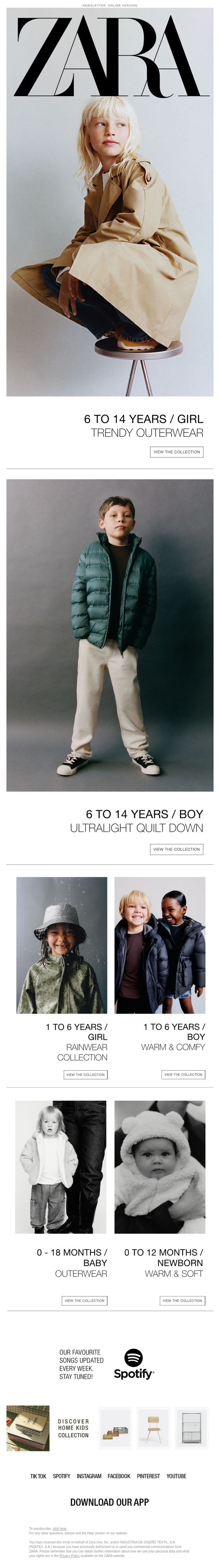
10. Discover the new outerwear collection for #Zarakids
Objective
This email aims to drive engagement and sales by showcasing Zara’s new outerwear collection for kids across multiple age groups and styles, encouraging parents to explore and shop the latest seasonal offerings tailored to their child’s needs.
Why this works
Zara effectively segments its kids’ outerwear by age and function, like rainwear for toddlers or quilted jackets for preteens, making it effortless for parents to find exactly what they need without scrolling through irrelevant items.
How to implement
The use of lifestyle imagery featuring real children in natural poses builds emotional resonance, subtly communicating comfort and practicality while reinforcing the brand’s modern, minimalist aesthetic that appeals to fashion-conscious parents.
Pro Tip
Add a subtle countdown timer or seasonal urgency tag (e.g., 'Limited Stock for Fall') near the CTA buttons to nudge immediate action, especially since outerwear is time-sensitive and weather-driven. • Include a short testimonial or parent review snippet under one of the product grids (e.g., '9/10 parents say this jacket lasts all season') to build social proof and reduce purchase hesitation for new customers.