Proven Aged Care Decisions email designs you can use

1. Choosing the right residential aged care home
Objective
This email aims to guide families through the emotionally complex process of selecting residential aged care by positioning Aged Care Decisions as a trusted, free support service that helps balance clinical needs with quality of life. It encourages readers to engage with educational content and take action to find suitable care providers.
Why this works
The email masterfully reframes a stressful decision into a balanced, informed choice by emphasizing that clinical care and quality of life aren’t mutually exclusive, a powerful emotional reassurance for anxious families navigating aged care options.
How to implement
By anchoring the CTA in emotional language, 'Find an Aged Care Provider that you will love!', the campaign transforms a transactional search into a personal, values-driven journey, making support feel less like a service and more like a compassionate partnership.
Pro Tip
Add a brief, scannable checklist or bullet-point summary under the hero section to visually reinforce key decision-making criteria (e.g., 'What to look for: Staff ratios, activity programs, medical response times'), this reduces cognitive load and increases perceived value before the CTA. • Reposition the 'READ MORE' button as a secondary CTA beneath the article preview, while making 'GET FREE ASSISTANCE' the dominant, centrally aligned primary CTA, this clarifies the email’s conversion hierarchy and reduces decision fatigue for time-poor readers.
2. Your Support at Home care plan, decoded
Objective
This email aims to educate recipients about their Support at Home care plan by demystifying how services, budgets, and priorities are determined and adjusted over time, while encouraging them to engage with a free support service to find trusted aged care providers.
Why this works
The email opens with a clear, empathetic hook that acknowledges common confusion around care plans, immediately positioning the brand as a trusted guide rather than a sales entity, which builds rapport before any call to action.
How to implement
By embedding a strong value proposition, 'FREE support service' and '100% FREE for families', directly beneath the educational content, the email seamlessly transitions from information to action without feeling pushy or transactional.
Pro Tip
Add a brief visual timeline or icon-based flowchart in the Hero Section to illustrate how care plans are reviewed and adjusted over time, this would make the abstract concept more digestible and reinforce the educational goal. • Place the 'CLICK HERE TO FIND PROVIDERS' CTA above the CEO signature, not below it, to reduce friction and capitalize on momentum after the reader has absorbed the value proposition and social proof.
3. Choosing the right residential aged care home
Objective
This email aims to guide families through the emotionally complex process of selecting a residential aged care home by reframing it as a balanced choice between clinical support and quality of life, while positioning Aged Care Decisions as a trusted, free support service to simplify the journey.
Why this works
The email masterfully reframes a stressful decision into a balanced, empowering choice by emphasizing that clinical care and quality of life aren’t mutually exclusive, a subtle but powerful psychological shift that reduces anxiety and builds trust with overwhelmed families.
How to implement
By anchoring the message in real-world guidance, such as knowing what questions to ask and which quality indicators matter, the email positions the brand not as a sales entity but as a compassionate, educational ally, which significantly increases perceived credibility and emotional resonance.
Pro Tip
The primary CTA 'READ MORE' is too generic and doesn’t reflect the emotional urgency or value proposition; replacing it with 'Get Your Free Aged Care Guide' or 'Start Your Care Provider Search' would better align with the user’s intent and increase conversion. • The email lacks a visual hierarchy that guides the eye from problem → solution → action; adding subtle dividers, icons, or a progress bar (e.g., 'Step 1: Understand Your Options') would improve flow and reduce cognitive load for anxious readers.
4. , confused about Support at Home?
Objective
This email aims to reduce confusion for families navigating the Support at Home application process by offering a clear, step-by-step guide and positioning Aged Care Decisions as a trusted, free support service to help them find and compare aged care providers with confidence.
Why this works
The email opens with empathy, acknowledging the emotional overwhelm families feel when applying for Support at Home, which immediately builds trust and positions the brand as a compassionate guide rather than a sales entity.
How to implement
By framing their service as 'obligation-free & 100% FREE for families,' the brand removes financial hesitation and leverages social proof with 785+ Google reviews to reinforce credibility without sounding promotional.
Pro Tip
Add a brief visual timeline or numbered steps under the hero section to visually reinforce the 'step-by-step guide' promise, helping readers instantly grasp the process structure before clicking through. • Include a short testimonial quote from a real family near the first CTA to strengthen emotional resonance and social proof at the point where readers are deciding whether to engage further.
5. , confused about Support at Home?
Objective
This email aims to reduce confusion for families navigating the Support at Home application process by offering a clear, step-by-step guide and positioning Aged Care Decisions as a trusted, free support service to help them find suitable aged care providers with confidence.
Why this works
The email opens by validating the reader’s emotional state, acknowledging that applying for Support at Home feels confusing, which immediately builds trust and positions the brand as empathetic and solution-oriented rather than sales-driven.
How to implement
By clearly outlining the end-to-end process from contacting My Aged Care to choosing a provider, the email transforms an overwhelming bureaucratic journey into a manageable, predictable experience, which significantly reduces decision paralysis for anxious caregivers.
Pro Tip
Add a brief visual timeline or numbered steps under the 'How to apply' headline to reinforce the 'simple step-by-step' promise and improve scannability for time-poor caregivers. • Include a short testimonial quote directly under the 'Find an Aged Care Provider' banner to strengthen social proof at the point of highest conversion intent, rather than relegating all reviews to the footer.
6. CHSP vs Support at Home: What’s the difference?
Objective
This email aims to educate families on the key differences between CHSP and Support at Home programs, helping them make informed decisions about aged care options while positioning Aged Care Decisions as a trusted, free guidance resource to assist with provider selection.
Why this works
The email opens with a clear, empathetic hook that acknowledges family uncertainty around aged care programs, immediately establishing relevance and trust by addressing a real emotional pain point before diving into educational content.
How to implement
By framing the comparison as a practical guide rather than a sales pitch, the email positions the brand as a helpful advisor, subtly building authority while encouraging engagement through a low-barrier CTA that promises clarity, not commitment.
Pro Tip
Add a brief visual comparison table or icon-based breakdown between CHSP and Support at Home directly in the email body to reduce cognitive load and help readers quickly grasp key differences without clicking through. • Reposition the 'GET FREE ASSISTANCE' CTA higher in the flow, perhaps immediately after the hero section, to capture interest while readers are still emotionally engaged, rather than waiting until after the educational content.
7. Understanding Support at Home fees
Objective
This email aims to educate families navigating aged care by clarifying Support at Home fees and out-of-pocket costs, while guiding them toward informed provider selection through a free, obligation-free support service.
Why this works
The email opens with a clear, empathetic hook that acknowledges the complexity of aged care pricing, immediately validating the reader’s confusion and positioning the brand as a trustworthy guide through an emotionally charged decision-making process.
How to implement
By embedding a strong, benefit-driven CTA within a visually distinct hero section, the email creates a seamless transition from education to action, encouraging readers to engage without feeling pressured or overwhelmed by financial jargon.
Pro Tip
Add a brief FAQ or cost breakdown snippet under the 'READ MORE' CTA to reduce friction, many readers may hesitate to click if they’re unsure whether the article addresses their specific financial concern. • Reposition the 'CLICK HERE TO FIND PROVIDERS' button higher in the flow, after the educational section but before the CEO signature, to capitalize on momentum while the reader is still engaged and primed to act.
8. , When is it time to move into residential aged care?
Objective
This email aims to guide families through the emotionally complex decision of transitioning a loved one into residential aged care by offering a clear, compassionate resource that identifies key signs and practical next steps. It also positions Aged Care Decisions as a trusted, free support service to reduce anxiety and encourage immediate engagement.
Why this works
The email opens with empathy, acknowledging the emotional weight of the decision, which immediately builds trust and positions the brand as a compassionate guide rather than a sales-driven entity, making families more receptive to the message.
How to implement
By framing the article as a tool to identify 'signs' and 'practical steps,' the campaign transforms an overwhelming topic into a manageable, actionable journey, reducing decision paralysis and encouraging readers to click through for clarity.
Pro Tip
The primary CTA 'READ MORE' is generic and doesn’t convey urgency or benefit; replacing it with action-oriented text like 'Discover the 5 Signs It’s Time for Residential Care' would better align with the emotional and informational intent of the email. • The email lacks a visual hierarchy that guides the eye from problem → solution → action; adding subtle dividers, icons, or directional cues between sections would improve flow and reduce cognitive load for overwhelmed readers.
9. , noticing changes in your loved one's mobility?
Objective
This email aims to gently alert caregivers to early signs of declining mobility in loved ones and position Aged Care Decisions as a trusted, no-obligation resource for finding tailored home care support. It seeks to convert concern into action by offering free, personalized assistance with provider matching.
Why this works
The email opens with empathetic, observational language that validates the reader’s concerns, framing mobility changes as common, early signs rather than alarming red flags, which reduces defensiveness and builds trust before introducing solutions.
How to implement
It strategically separates educational value from the sales offer: first explaining how support at home improves safety and independence, then introducing the free service as a natural next step, making the CTA feel helpful, not pushy.
Pro Tip
Add a brief, bulleted list under the 'READ MORE' CTA highlighting 2–3 specific mobility aids or home modifications mentioned in the article to give immediate value and reduce friction for readers unsure whether to click. • Reposition the 'CLICK HERE TO FIND PROVIDERS' button higher, ideally directly under the hero section, to reduce scroll depth for users already primed to act, since the current layout buries the primary conversion point.
10. Navigating Aged Care Choices with Confidence
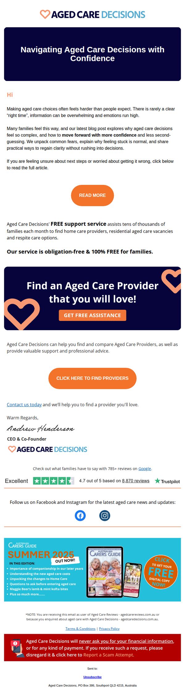
Objective
This email aims to reduce anxiety around aged care decisions by offering empathetic guidance and a free, no-obligation support service to help families confidently find suitable care providers. It positions the brand as a trusted, compassionate advisor during an emotionally charged decision-making process.
Why this works
The email opens with emotional validation, acknowledging the overwhelm and uncertainty families feel, this builds immediate trust and positions the brand as a compassionate ally rather than a sales-driven entity.
How to implement
By framing the service as 'obligation-free & 100% FREE for families,' the campaign removes financial hesitation and leverages psychological safety to encourage engagement without perceived risk or pressure.
Pro Tip
Add a subtle countdown timer or urgency indicator near the 'GET FREE ASSISTANCE' CTA to gently nudge action without compromising the empathetic tone, for example, 'Helping 12 families this week, limited slots available.' • Include a short, bulleted list of 'What You’ll Get' under the offer section, such as 'Personalized provider matches,' 'Cost comparison tools,' and 'Family decision checklist', to clarify value and reduce perceived ambiguity.