Alo Yoga emails worth copying from real campaigns


1. Alo Customer Account Invitation
Objective
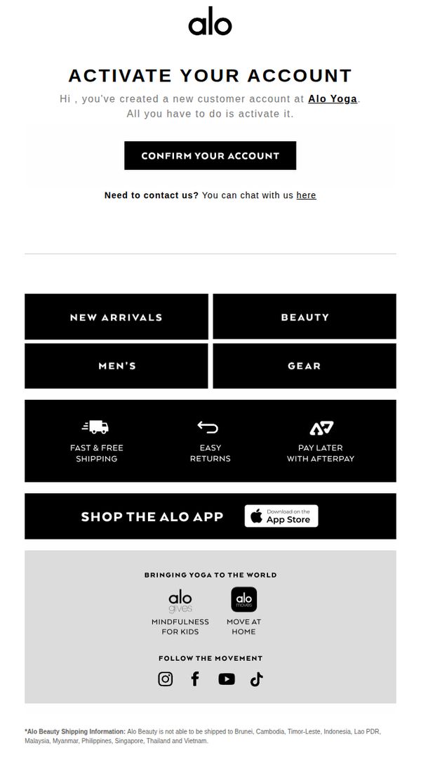
This email aims to guide new customers through account activation to unlock personalized shopping experiences and encourage immediate engagement with Alo Yoga’s product categories and brand ecosystem.
Why this works
The email immediately clarifies the user’s next step with a bold, centered CTA that reduces friction and leverages urgency without being pushy, making activation feel like a natural progression rather than a chore.
How to implement
By organizing product categories into clean, high-contrast blocks, the email visually simplifies navigation for new users, helping them quickly discover relevant sections without overwhelming them with too many options at once.
Pro Tip
Add a subtle countdown timer or expiration notice near the CTA to create gentle urgency, encouraging immediate account activation before the user loses momentum or forgets the email. • Include a personalized product recommendation or curated starter bundle beneath the CTA based on the user’s sign-up source or inferred interests to bridge activation with immediate product discovery.
2. NYFW, Supermodel Style
Objective
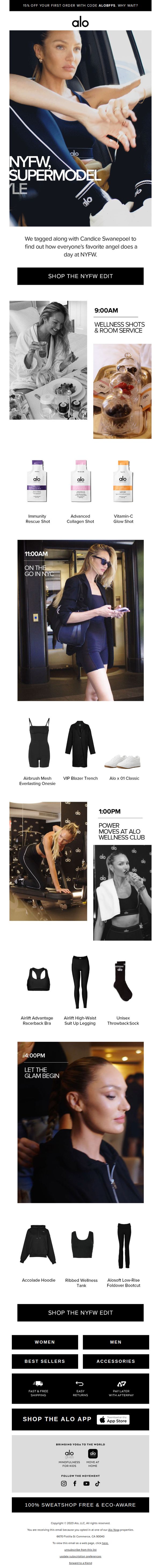
This email aims to drive sales by showcasing Alo Yoga’s NYFW-inspired collection through the lens of supermodel Candice Swanepoel’s daily routine, blending lifestyle storytelling with shoppable product moments to inspire urgency and aspiration.
Why this works
The email brilliantly merges editorial storytelling with commerce by mapping Candice Swanepoel’s NYFW day to specific product moments, making each outfit and wellness item feel like a natural, aspirational choice rather than a forced sale.
How to implement
By structuring the day into time-stamped vignettes, from morning wellness shots to evening glam, the email creates a narrative rhythm that keeps readers scrolling while subtly reinforcing product relevance at every stage of the day.
Pro Tip
Add a subtle countdown timer near the top or beside the CTA to amplify urgency around the 15% discount, especially since the offer is time-sensitive and tied to a high-energy event like NYFW. • Include a short testimonial or quote from Candice Swanepoel about her favorite Alo piece in the day’s timeline to deepen authenticity and personal connection, making the product endorsements feel more organic and less promotional.
3. Alo Customer Account Invitation
Objective
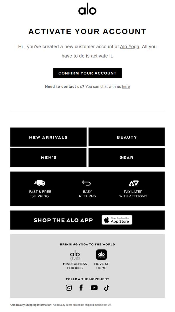
This email aims to guide new customers through account activation by clearly instructing them to confirm their account, while also introducing them to key brand offerings and navigation paths to encourage immediate engagement and exploration of the Alo Yoga ecosystem.
Why this works
The email immediately validates the user’s action by acknowledging their new account creation, which builds trust and reduces friction by framing activation as a simple, expected next step rather than an obstacle.
How to implement
By placing the primary CTA front and center with high contrast and minimal surrounding text, the design eliminates decision fatigue and funnels attention exactly where the brand wants it, toward account confirmation.
Pro Tip
Add a brief, benefit-driven sentence under the CTA explaining why account activation matters, such as 'Unlock saved carts, order history, and exclusive member perks', to increase conversion by clarifying the user’s personal gain. • Include a subtle visual cue or icon next to the 'CONFIRM YOUR ACCOUNT' button, like a checkmark or lock, to reinforce security and completion, reducing hesitation for users unfamiliar with the brand.
4. Alo Customer Account Invitation
Objective
This email aims to guide new customers through account activation while subtly reinforcing brand engagement by highlighting key shopping categories and value-added services. It seeks to convert a newly created account into an active, loyal shopper by reducing friction in the onboarding process.
Why this works
The email immediately validates the user’s action by acknowledging their new account creation, which builds trust and reduces uncertainty, this psychological reinforcement encourages immediate engagement with the CTA.
How to implement
By organizing product categories and customer benefits like free shipping and Afterpay into clean, bold blocks, the email visually prioritizes decision-making without overwhelming the reader, making it easier to transition from activation to browsing.
Pro Tip
Add a brief personalized welcome message or first-name placeholder above the CTA to increase perceived relevance and warmth, helping reduce abandonment during the activation step. • Include a small visual cue or icon next to 'CONFIRM YOUR ACCOUNT', such as a checkmark or lock, to reinforce security and completion, which can boost conversion by reducing cognitive friction.
5. Alo Customer Account Invitation
Objective
This email aims to guide new customers through account activation by clearly instructing them to confirm their account, while simultaneously introducing key brand offerings and navigation paths to encourage immediate engagement and exploration of the Alo Yoga ecosystem.
Why this works
The email opens with a direct, action-oriented subject line and headline that immediately clarifies the user’s next step, reducing friction and increasing the likelihood of account activation by framing it as a simple, necessary task rather than an optional formality.
How to implement
By embedding category tiles like 'New Arrivals,' 'Beauty,' and 'Men’s' directly beneath the CTA, the email transforms a functional confirmation message into a discovery engine, subtly guiding users toward browsing and purchasing without overwhelming them with choices.
Pro Tip
Add a brief personalized welcome message or first-name merge tag in the hero section to increase emotional connection and make the activation feel more tailored, rather than transactional. • Include a small visual cue or icon next to the 'CONFIRM YOUR ACCOUNT' button, such as a checkmark or envelope, to reinforce the action’s purpose and improve visual scanning for mobile users.
6. NEW! Set off the season in style

Objective
This email aims to drive first-time purchases by showcasing Alo Yoga’s new movement-ready apparel and accessories while incentivizing immediate action with a 15% discount code. It also introduces a new eco-friendly hair care product to expand customer interest beyond activewear.
Why this works
The email masterfully blends aspirational lifestyle imagery with practical product breakdowns, making each outfit feel both achievable and covetable for the modern wellness enthusiast who values form and function equally.
How to implement
By anchoring the campaign around a time-sensitive 15% discount for first-time buyers, the brand lowers the barrier to entry while subtly reinforcing exclusivity, a psychological trigger that converts curiosity into committed purchases.
Pro Tip
Add a subtle countdown timer near the CTA to amplify urgency around the 15% discount, especially since the offer is targeted at new customers who may need extra motivation to convert immediately. • Include a short testimonial or social proof element beneath the first product grid to reinforce trust, for example, a quote like 'Over 10K customers loved this set' could reduce hesitation for first-time buyers.
7. Alo Customer Account Invitation
Objective
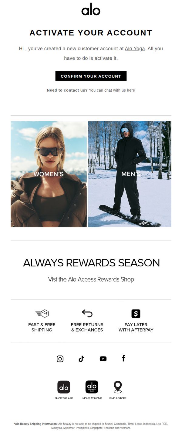
This email aims to guide new customers through account activation while immediately introducing them to Alo Yoga’s loyalty program and core brand benefits to encourage engagement and first purchase. It also subtly promotes gender-specific product lines to personalize the onboarding experience.
Why this works
The email smartly pairs account activation with immediate value by highlighting the Alo Access Rewards Shop, turning a functional step into an engaging brand introduction that primes users for future purchases.
How to implement
By visually splitting the hero section into Women’s and Men’s categories with lifestyle imagery, Alo Yoga personalizes the onboarding experience without requiring user input, making new customers feel seen from the first click.
Pro Tip
Add a countdown timer or urgency cue near the 'CONFIRM YOUR ACCOUNT' CTA to increase activation rates by creating a subtle sense of time-sensitive value tied to the rewards program. • Include a brief personalized welcome message (e.g., 'Welcome, [First Name]!') above the activation prompt to strengthen emotional connection and increase perceived relevance of the account setup step.
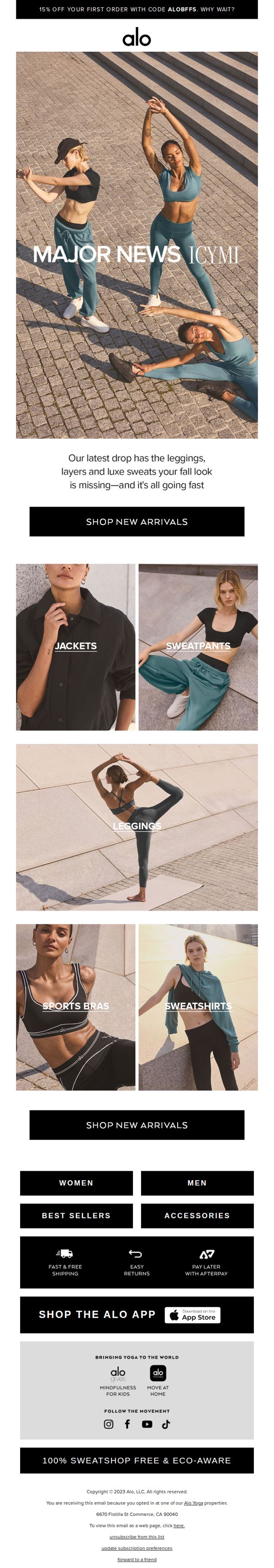
8. All-new everything
Objective
This email aims to drive immediate traffic to Alo Yoga’s new fall collection by highlighting fresh arrivals across key categories and incentivizing first-time buyers with a 15% discount. It positions the brand as essential for seasonal wardrobe updates while reinforcing lifestyle values like mindfulness and sustainability.
Why this works
The email opens with a bold, benefit-driven headline, 'MAJOR NEWS ICYMI', that creates urgency while immediately tying the new drop to the customer’s seasonal needs, making the message feel personal and timely rather than just promotional.
How to implement
By visually grouping products into clear, labeled categories like 'Jackets,' 'Leggings,' and 'Sweatpants,' the email reduces decision fatigue and guides the shopper intuitively through the collection, turning browsing into a purposeful journey rather than a random scroll.
Pro Tip
Add a subtle countdown timer near the CTA to reinforce urgency around the new arrivals, especially since the email mentions items are 'going fast', this would convert passive interest into immediate action. • Include a short testimonial or social proof snippet under the hero section (e.g., 'Loved by 10K+ yogis this week') to build trust and validate the 'major news' claim, making the new drop feel socially endorsed rather than just internally promoted.
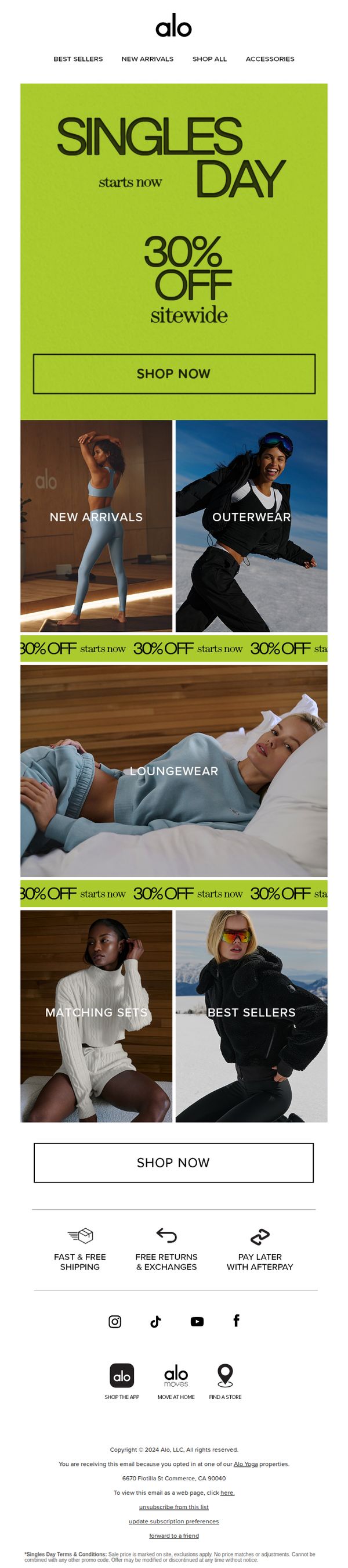
9. 30% OFF EVERYTHING. GO!
Objective
This email aims to drive immediate site-wide sales by announcing a limited-time 30% discount across all products, leveraging urgency and category-specific visuals to encourage browsing and conversion. It targets existing subscribers with a bold, action-oriented message to capitalize on Singles Day momentum.
Why this works
The email opens with a high-impact, full-width hero banner that immediately communicates the 30% discount and Singles Day timing, creating instant clarity and urgency without visual clutter or competing messages.
How to implement
By organizing products into visually distinct category tiles, like New Arrivals, Outerwear, and Loungewear, the email guides shoppers intuitively through different use cases, making it easier for users to self-segment and find relevant items quickly.
Pro Tip
Add a countdown timer in the hero section to amplify urgency, since the offer is tied to Singles Day, showing hours or days left would increase FOMO and drive faster conversions. • Include a short customer testimonial or social proof near the top or alongside the CTA to build trust and reduce perceived risk, especially since the discount applies sitewide and shoppers may question product value.
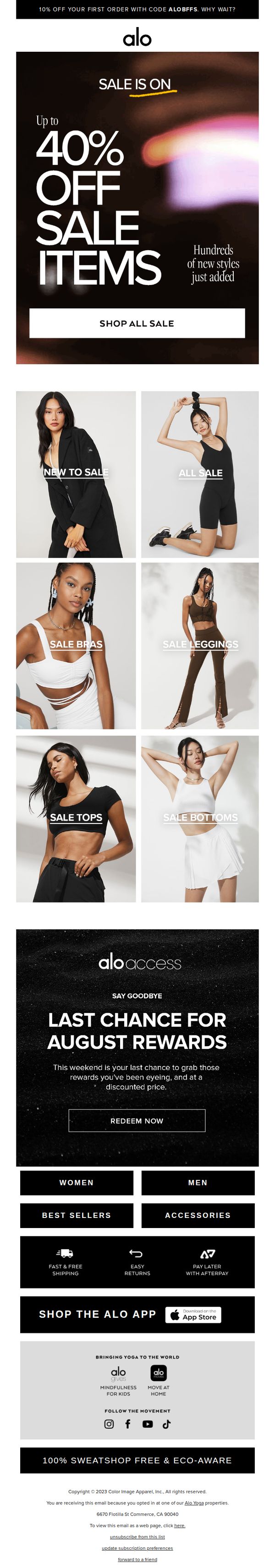
10. Labor Day Sale starts now!
Objective
This email aims to drive immediate sales by promoting Alo Yoga’s Labor Day Sale with up to 40% off select items, while also encouraging redemption of expiring Alo Access rewards to boost urgency and conversion.
Why this works
The email masterfully combines urgency and exclusivity by pairing a time-sensitive Labor Day discount with a last-chance reminder for Alo Access rewards, creating dual motivations for immediate action without overwhelming the reader.
How to implement
By organizing sale items into clearly labeled product categories like 'Sale Bras' and 'Sale Leggings,' the email reduces decision fatigue and guides shoppers intuitively to their desired items, increasing the likelihood of conversion through smart visual segmentation.
Pro Tip
Add a countdown timer beneath the 'LAST CHANCE FOR AUGUST REWARDS' section to visually reinforce urgency and encourage immediate redemption before the window closes. • Include a small testimonial or social proof snippet near the hero section, such as 'Over 10,000 customers shopped the sale in the first 24 hours', to build credibility and FOMO around the promotion.