The complete beehiiv email collection


1. 🔴 Every creator has an expiration date
Objective
This email aims to position Lia Haberman as a trusted authority on creator longevity and platform strategy while subtly promoting beehiiv’s email growth course by framing creator relevance as time-sensitive and actionable. It blends editorial insight with soft product placement to nurture high-intent subscribers.
Why this works
The email brilliantly reframes creator burnout as a strategic business challenge, not just a personal one, making it urgent for marketers and founders to act before platform algorithms leave them behind, which deepens emotional resonance and positions the content as indispensable.
How to implement
By embedding Google AdSense as a seamless, low-friction monetization solution within a high-value editorial narrative, the campaign avoids overt sales pressure while still driving conversions, a masterclass in native advertising that feels like helpful advice rather than a pitch.
Pro Tip
The primary CTA 'Start earning the easy way with AdSense' is buried mid-email and visually underwhelming, relocate it to the top or bottom with a bold, contrasting button to align with the urgency of the subject line and increase conversion likelihood. • The email lacks a clear next step after the 7-step guide, add a micro-CTA like 'Want this framework as a downloadable checklist? Grab it here' to capture leads and funnel readers toward the beehiiv course without breaking the editorial flow.
2. someone left you a review
Objective
This email aims to inform existing beehiiv users about the launch of Digital Products v2, highlighting new features like native reviews, global payments, and discount codes to encourage product creation and monetization. It seeks to drive users toward launching their first digital product by showcasing platform advantages and social proof.
Why this works
The email brilliantly leverages social proof by embedding real product reviews and star ratings directly into the product grid, which builds immediate trust and reduces perceived risk for new creators considering launching their first digital product.
How to implement
By visually comparing beehiiv’s 0% platform fee against competitors’ 5–10% cuts, the campaign turns a financial advantage into an emotional win, framing revenue retention as empowerment, which resonates deeply with indie creators and solopreneurs.
Pro Tip
The CTA 'Launch Your First Product' appears repeatedly but lacks urgency or personalization; adding a dynamic element like 'Your First Product Awaits, Start in 3 Minutes' or tying it to the user’s name or past behavior would increase conversion intent. • While the email showcases product reviews, it doesn’t highlight how reviews impact conversion rates or revenue, adding a stat like 'Products with 5+ reviews convert 3x faster' would strengthen the persuasive power of the testimonial section.
3. 🐝 The biggest thing we’ve ever shipped
Objective
To generate excitement and drive attendance for beehiiv’s Winter Release Event by positioning it as a historic, transformative update that redefines audience-building online. The email aims to convert curiosity into RSVPs through personalization and urgency.
Why this works
By framing the update as a 'complete redefinition' rather than just another feature drop, the email elevates perceived value and positions the brand as an industry innovator driving meaningful change for creators.
How to implement
Personalizing the message with the recipient’s name and using the CEO’s direct voice builds trust and intimacy, making the announcement feel less like a corporate blast and more like a personal invitation to witness a milestone.
Pro Tip
Add a visual teaser or animated GIF in the hero section to hint at the new features, this would increase engagement and give users a tangible reason to RSVP beyond text alone. • Include a brief bullet point or stat under 'Four years of innovation' to quantify the impact (e.g., 'Used by 50,000+ creators') to reinforce credibility and justify the 'massive reveal' claim.
4. 🔴 The science of short-form video
Objective
This email aims to educate creators on the strategic, data-driven evolution of short-form video content by analyzing the growth trajectory of Kane Kallaway, while subtly promoting Taplio as a tool to systematize LinkedIn growth. It positions Creator Spotlight as a research-backed resource for monetizing creator-first businesses.
Why this works
The email brilliantly uses a real creator’s growth arc as a case study, turning abstract content strategy into a tangible, data-rich narrative that readers can reverse-engineer for their own channels, making the advice feel both authoritative and actionable.
How to implement
By contrasting early low-performing thumbnails with later high-performing ones, the email visually demonstrates the power of iterative design, a subtle but powerful lesson that encourages creators to treat their content as a living, evolving system rather than a static output.
Pro Tip
The Taplio CTA is buried mid-email and visually underwhelming; it should be repeated in a sticky banner or floating button near the top and bottom to increase conversion without disrupting the educational flow. • The 'Creator Jobs' section at the bottom feels disconnected from the main content; it should be repositioned as a sidebar or footer module with a clearer value proposition (e.g., 'Find your next creator role') to avoid diluting the core message.
5. 🔴 Total addressable audience
Objective
This email aims to educate creator-entrepreneurs on how to think strategically about audience size using business frameworks like TAM, SAM, and SOM, reframing audience growth as a revenue and scalability challenge rather than just a vanity metric.
Why this works
The email brilliantly reframes audience growth as a business problem by introducing startup-style market sizing frameworks, helping creators move beyond vanity metrics and think like entrepreneurs when evaluating their true monetizable potential.
How to implement
By using real creator case studies like Nicolas Cole and Nastja Mohren, the email grounds abstract business concepts in tangible, relatable examples, making complex frameworks feel actionable and immediately applicable to the reader’s own business model.
Pro Tip
Add a short, bold summary box at the top that distills the core takeaway, e.g., 'Your audience isn’t just followers, it’s your addressable market. Here’s how to size it like a startup', to immediately anchor readers and reduce cognitive load. • Include a micro-CTA after the framework explanation, such as 'Download our free TAM/SAM/SOM worksheet for creators', to convert educational value into an immediate, low-friction action that reinforces learning and builds lead capture.
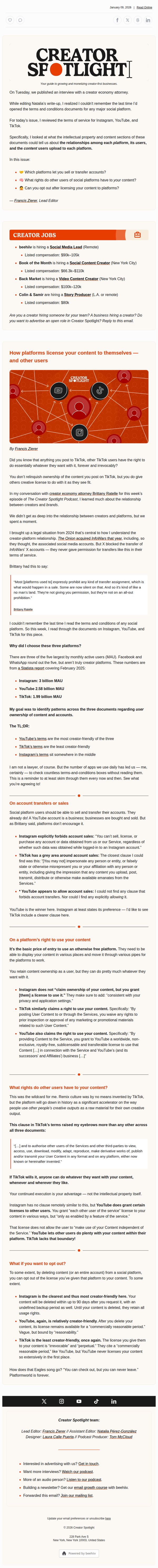
6. 🔴 What rights do platforms have to your content?
Objective
This email aims to educate creators on the legal rights platforms hold over their content, empowering them to make informed decisions about where and how they publish. It positions Creator Spotlight as a trusted resource for navigating the creator economy’s legal complexities.
Why this works
The email brilliantly frames a dry legal topic as a high-stakes creator empowerment issue, using real-world examples like The Onion’s InfoWars account to ground abstract terms in tangible consequences that creators care about.
How to implement
By comparing Instagram, YouTube, and TikTok side-by-side using clear bullet points and a TL;DR summary, the email transforms complex legal jargon into digestible, actionable insights that creators can immediately apply to their own platform strategies.
Pro Tip
Add a visual comparison table or infographic summarizing platform rights side-by-side to reduce cognitive load and make key differences instantly scannable for time-poor creators. • Include a micro-CTA after each major section (e.g., 'Want to protect your content? Download our platform rights checklist') to capture interest at peak engagement moments rather than only at the footer.
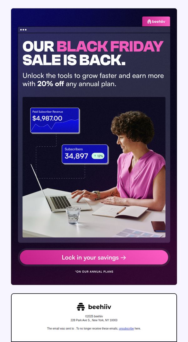
7. Black Friday deals just landed 🤑
Objective
This email aims to drive immediate sign-ups or plan upgrades by highlighting a limited-time 20% discount on annual plans during Black Friday, positioning beehiiv as the essential tool for accelerating growth and revenue for newsletter creators.
Why this works
The email immediately anchors the offer in tangible outcomes, showing real revenue and subscriber growth numbers, to make the discount feel like an investment, not just a price cut, which builds credibility and urgency for creators focused on ROI.
How to implement
Using a bold, contrasting pink CTA button against a dark navy background ensures the primary action stands out visually without competing with the hero message, guiding the reader’s eye naturally from value proposition to conversion point.
Pro Tip
Add a small countdown timer near the CTA to reinforce urgency, since Black Friday is time-sensitive and a visible timer can increase conversion by creating psychological pressure to act now. • Include a brief testimonial or social proof snippet under the offer section, such as 'Join 10,000+ creators who grew 2x faster', to reduce perceived risk and strengthen trust before the user clicks through.
8. 🔴 The best of Creator Spotlight 2025

Objective
This email aims to recap and celebrate the top content from Creator Spotlight’s 2025 season while reinforcing the brand’s value as a guide for creators seeking to grow and monetize their businesses. It also encourages reader engagement and feedback for future content planning.
Why this works
By curating top-performing content based on reader behavior and editorial judgment, this email transforms a year-end recap into a powerful social proof engine that validates the newsletter’s authority and relevance in the creator economy.
How to implement
The strategic use of data-driven highlights, like unique opens and ranking metrics, lends credibility to editorial picks, subtly teaching readers how to evaluate content performance while reinforcing the newsletter’s role as a trusted curator of creator insights.
Pro Tip
The primary CTA for Google AdSense is visually dominant but contextually disconnected from the newsletter’s core theme of creator storytelling; consider placing a secondary CTA tied to content engagement (e.g., 'Download the 2025 Highlights PDF') to better align with the email’s editorial purpose. • While the podcast episode highlights are compelling, they lack embedded audio players or direct streaming links, adding clickable play buttons or platform-specific links (Spotify, Apple Podcasts) would reduce friction and increase conversion for audio content.
9. 🔴 Feeling burnt out?

Objective
This email aims to resonate emotionally with creators by addressing burnout and mental health struggles, while subtly promoting beehiiv’s platform as a supportive tool for sustainable creator growth. It also encourages engagement through a monetization survey and a limited-time discount offer.
Why this works
The email opens with raw, relatable creator pain points, not sales pitches, which instantly builds trust by validating the reader’s emotional reality before introducing any product or offer.
How to implement
It strategically embeds the beehiiv discount within a narrative about creator burnout, making the promotion feel like a supportive solution rather than a pushy sales tactic, which increases conversion likelihood through emotional alignment.
Pro Tip
The CTA ‘Use code WRE2025 before time runs out’ is buried mid-email; move it to a sticky banner or floating button near the top to ensure visibility without disrupting the narrative flow. • Add a countdown timer next to the discount offer to create urgency and reinforce the ‘final chance’ message, which would increase conversion rates by leveraging psychological scarcity.
10. 🔴 Brand deal red flags

Objective
This email aims to educate creators on legal pitfalls in brand deals by highlighting red flags in contracts, using expert insights from attorney Brittany Ratelle to empower creators with negotiation tactics and legal awareness. It also promotes beehiiv’s broader resources for creator growth.
Why this works
The email brilliantly uses a real-world legal case involving Molly Sims to ground abstract contract risks in tangible consequences, making legal jargon feel urgent and personally relevant to creators who might otherwise skip over fine print.
How to implement
By structuring the content around Brittany Ratelle’s ‘big three’ contract red flags, payment terms, usage rights, and exclusivity, the email delivers complex legal advice in a digestible, memorable framework that creators can immediately apply to their own negotiations.
Pro Tip
The CTA 'Get in touch' is too vague for the educational context; it should be more action-oriented like 'Download Your Creator Contract Checklist' or 'Book a Free Legal Audit' to align with the email’s goal of empowering creators with tools. • The podcast interview section lacks a clear visual hierarchy, adding a play button overlay or timestamped chapter links directly on the video thumbnail would improve usability and encourage more listens, especially for time-constrained creators.