Clare email examples & ideas from real campaigns
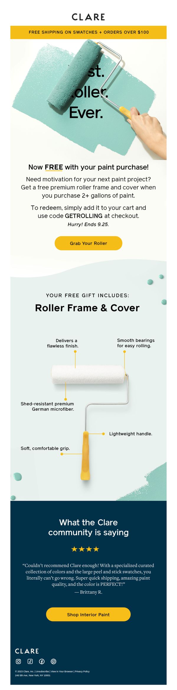

1. A FREE gift to get rolling!
Objective
This email aims to drive immediate paint purchases by offering a time-sensitive free roller frame and cover with the purchase of two or more gallons, leveraging urgency and perceived value to convert hesitant shoppers. It also reinforces brand trust through social proof and product quality highlights.
Why this works
The email brilliantly ties a free, high-perceived-value tool to a minimum purchase threshold, turning a simple discount into a compelling project starter kit that feels like a personal upgrade rather than just a sale.
How to implement
By visually annotating the roller’s premium features, like German microfiber and smooth bearings, the email transforms a freebie into a desirable product, subtly elevating the perceived quality of the entire brand experience.
Pro Tip
Add a countdown timer next to the 'Hurry! Ends 9.25' text to visually reinforce urgency and reduce decision latency, especially since the offer is time-bound and tied to a specific action. • Include a small visual cue or icon near the CTA button indicating that the roller is free, this reduces cognitive load and prevents users from second-guessing whether the offer is truly no-cost.
2. Want to save $20?
Objective
This email aims to drive immediate paint and supply purchases by offering tiered discounts based on order volume, encouraging customers to tackle multiple home projects while capitalizing on a limited-time savings opportunity.
Why this works
The campaign brilliantly ties emotional motivation, finally tackling those long-delayed home projects, to a tangible financial incentive, making the discount feel like permission to act rather than just a price cut.
How to implement
By structuring discounts around volume tiers (2+ or 4+ gallons), Clare transforms a simple promotion into a strategic nudge toward higher average order values without appearing pushy or salesy.
Pro Tip
Add a subtle countdown timer near the offer details to visually reinforce urgency and encourage faster decision-making before the October 1 deadline. • Include a small visual example, like a thumbnail image of a freshly painted room or a paint can with a checkmark, to help customers mentally connect the discount with real-life outcomes and boost conversion.
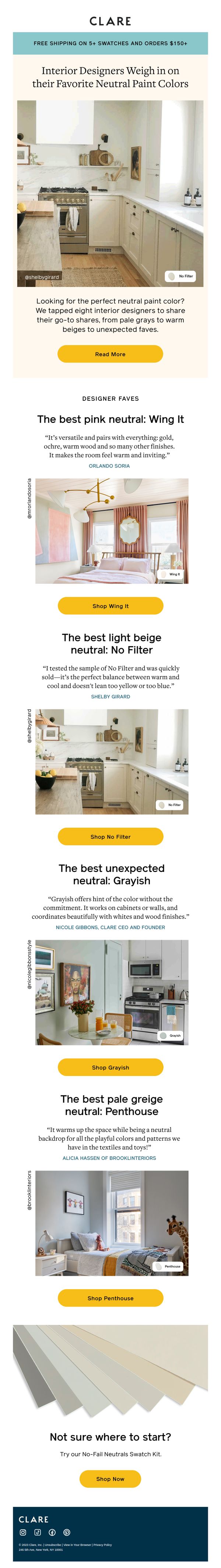
3. Love neutrals? Try these designer-approved faves
Objective
This email aims to guide customers who love neutral paint colors toward designer-recommended shades by showcasing real interior design applications and expert testimonials, ultimately driving product purchases through targeted CTAs.
Why this works
The email brilliantly leverages designer credibility by pairing each paint shade with a real interior photo and a direct quote, transforming color selection from a guesswork chore into a trusted, expert-guided experience that builds confidence in the buyer.
How to implement
Each product section is structured identically, name, quote, visual, and CTA, creating a predictable, scannable rhythm that reduces cognitive load and makes it effortless for readers to compare options and act without hesitation.
Pro Tip
Add a subtle countdown timer or limited-availability tag near the 'Shop Now' CTA to create urgency, especially since the email promotes curated designer picks that could imply exclusivity or seasonal relevance. • Include a small 'Compare Shades' toggle or side-by-side visual tool beneath the product grid to help users evaluate how the neutrals look together, a feature that would reduce friction for those overwhelmed by choice.
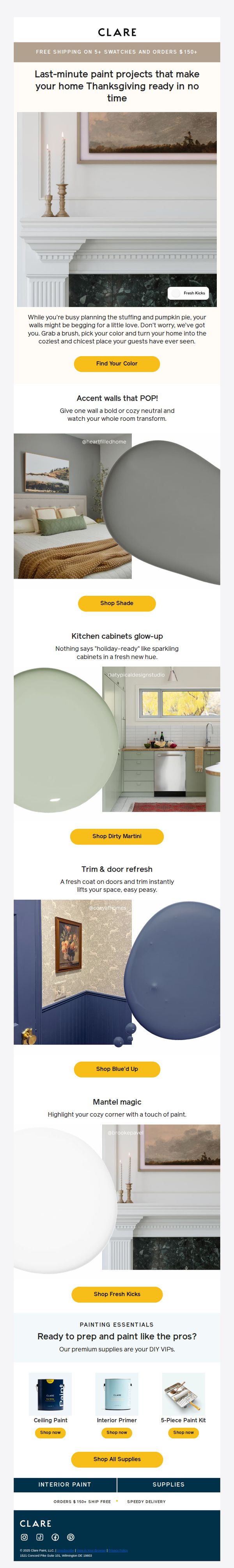
4. Quick paint fixes before Thanksgiving 🦃🌽
Objective
This email aims to inspire last-minute home painting projects before Thanksgiving by showcasing quick, high-impact updates that make spaces feel festive and welcoming for guests. It drives immediate action by linking each idea to a specific paint shade and supply kit.
Why this works
The email brilliantly ties seasonal urgency to home improvement by framing paint projects as quick fixes for Thanksgiving hosting, making the offer feel timely, relevant, and emotionally resonant with busy homeowners.
How to implement
Each project idea is paired with a named paint shade and a visual example, creating a shoppable inspiration experience that reduces decision fatigue and turns browsing into immediate purchasing intent.
Pro Tip
Add a subtle countdown timer near the CTA to reinforce the 'last-minute' urgency and encourage immediate clicks before Thanksgiving. • Include a short customer testimonial or social proof under one of the project sections to build trust and validate the transformative impact of the paint shades shown.
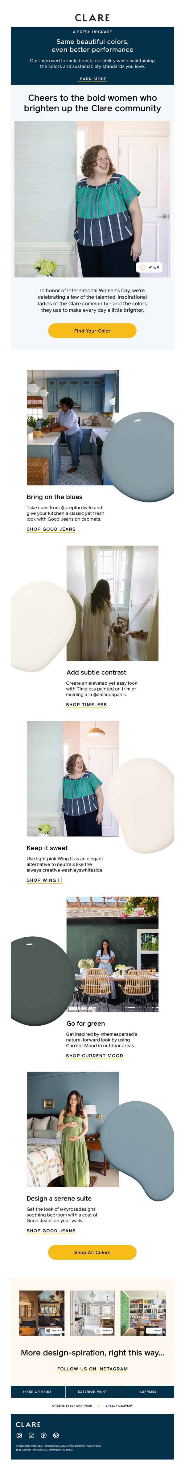
5. Cheers to women who think bold and live colorfully!
Objective
This email campaign celebrates International Women’s Day by honoring bold, inspirational women in the Clare community while showcasing how their favorite paint colors can elevate home spaces. It aims to drive engagement and sales by connecting emotional storytelling with product inspiration.
Why this works
The email brilliantly ties emotional celebration to product utility by spotlighting real women who use Clare paint to express their boldness, turning inspiration into a tangible design solution that feels personal and aspirational.
How to implement
Each color story is anchored to a specific room and lifestyle moment, making the paint feel less like a commodity and more like a curated design tool that solves real aesthetic challenges while honoring individual taste.
Pro Tip
Add a subtle countdown timer near the CTA to create urgency around the International Women’s Day celebration, encouraging immediate action before the moment passes. • Include a small 'before & after' visual cue or icon next to each color story to visually reinforce transformation, helping users quickly grasp the impact of each paint choice without reading the full text.
6. Clean, green and so serene 💚🍀
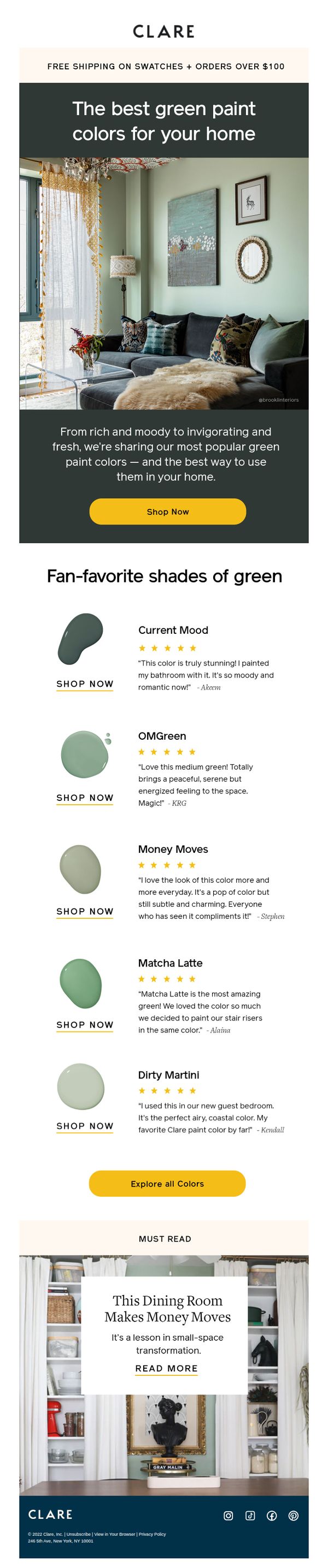
Objective
This email aims to inspire homeowners to explore and purchase Clare’s curated green paint colors by showcasing real-life applications, customer testimonials, and emotional benefits like serenity and romance. It positions green as a versatile, mood-enhancing choice for modern interiors.
Why this works
By pairing each green paint shade with a customer testimonial and real-world application, the email transforms color selection from a technical decision into an emotionally resonant storytelling experience that builds trust and aspiration.
How to implement
The hero section’s lifestyle photo paired with evocative copy like 'rich and moody to invigorating and fresh' immediately communicates the emotional payoff of using green paint, making the product feel less like paint and more like a mood enhancer for the home.
Pro Tip
Add a subtle countdown timer or limited-availability note near the CTA to create urgency, especially since the email promotes specific fan-favorite shades that could be perceived as trending or in-demand. • Include a small icon or tag next to each paint swatch indicating room suitability (e.g., 'Best for Bathrooms' or 'Perfect for Bedrooms') to help customers visualize application and reduce decision fatigue.
7. Tired of your home office setup?
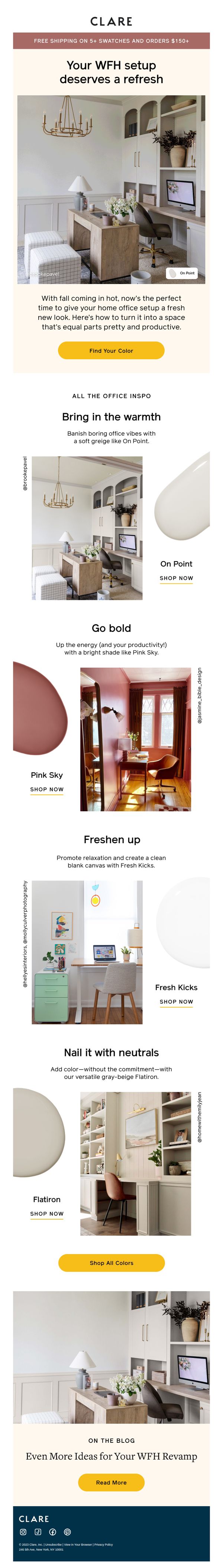
Objective
This email aims to inspire homeowners to refresh their work-from-home spaces by showcasing curated paint color palettes that enhance both aesthetics and productivity, ultimately driving clicks to shop specific shades and explore more design ideas.
Why this works
Clare brilliantly ties seasonal timing, fall, with emotional motivation, positioning a home office refresh not as a chore but as a timely, uplifting ritual that blends beauty and function to support modern work-life balance.
How to implement
By pairing each paint color with a lifestyle benefit, like ‘banish boring vibes’ or ‘promote relaxation’, the campaign transforms paint from a commodity into a mood-altering, productivity-boosting tool that speaks directly to the emotional needs of remote workers.
Pro Tip
Add a subtle countdown timer or limited-time offer tag near the 'Find Your Color' CTA to create urgency, since the email’s seasonal framing (fall) already implies a window of relevance that could be leveraged more actively. • Include a quick 2-question interactive quiz (e.g., 'What’s your WFH vibe? Calm or Bold?') above the color grid to personalize the experience and guide users toward the most relevant shade before they scroll, increasing engagement and conversion likelihood.
8. Tips + inspo to make your whole home look like a Pinterest board 👉
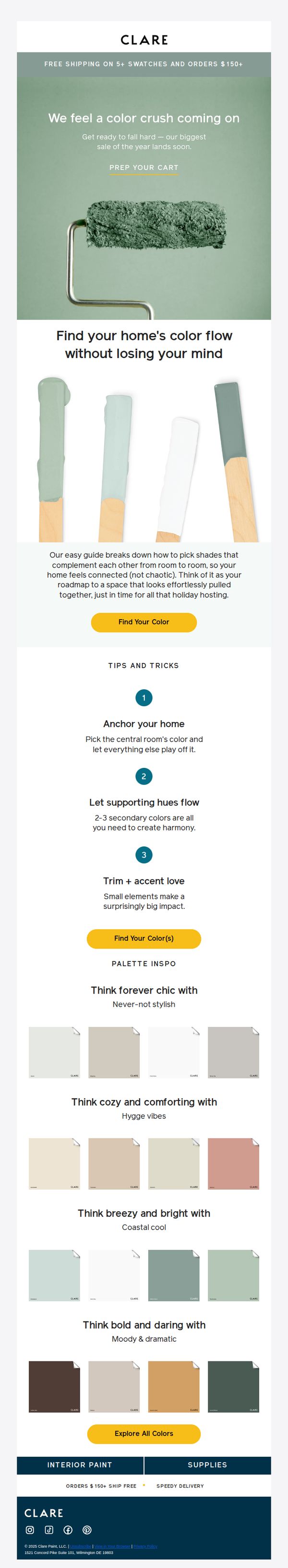
Objective
This email aims to inspire homeowners to embrace seasonal color trends by offering practical guidance on creating cohesive, Pinterest-worthy interiors, while subtly driving traffic to explore and purchase Clare’s curated paint palettes ahead of their biggest annual sale.
Why this works
The email brilliantly frames paint selection as a stress-free, strategic design journey, not just a product purchase, by offering a clear, three-step system that empowers users to build confidence in their color choices without feeling overwhelmed.
How to implement
By organizing color palettes around emotional and lifestyle-driven themes like 'Hygge vibes' and 'Coastal cool,' Clare transforms paint swatches into storytelling tools that resonate with personal aspirations, making the decision feel intuitive and emotionally rewarding.
Pro Tip
Add a subtle countdown timer beneath the 'PREP YOUR CART' CTA in the hero section to create urgency around the upcoming sale, leveraging FOMO without disrupting the inspirational tone of the email. • Include a mini testimonial or user-generated photo next to one of the palette categories (e.g., 'Hygge vibes') to add social proof and help readers visualize how these colors look in real homes, increasing perceived credibility and relatability.
9. $10 off every gallon of exterior paint 🙌
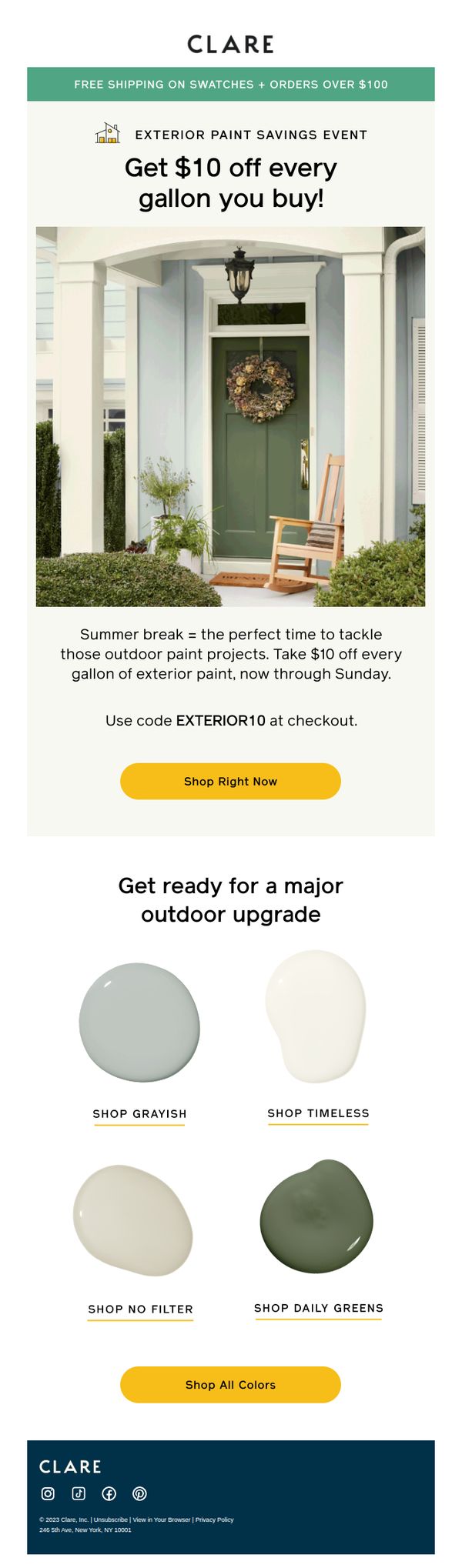
Objective
This email aims to drive immediate sales of exterior paint by promoting a limited-time $10 discount per gallon, encouraging customers to start summer home improvement projects before the offer expires on Sunday.
Why this works
The email brilliantly ties the discount to a seasonal moment, summer break, making the offer feel timely and emotionally resonant for homeowners ready to tackle outdoor projects.
How to implement
By showcasing four curated exterior paint colors with intuitive names like 'Grayish' and 'Daily Greens,' the brand reduces decision fatigue while subtly guiding customers toward popular, project-ready palettes.
Pro Tip
Add a countdown timer near the CTA to reinforce urgency, since the offer ends Sunday, this visual cue would increase perceived scarcity and drive faster conversions. • Include a short testimonial or customer photo showing a real home painted with one of the featured colors to build social proof and help customers visualize the outcome.
10. Color Pairings to Elevate Your Holiday Décor
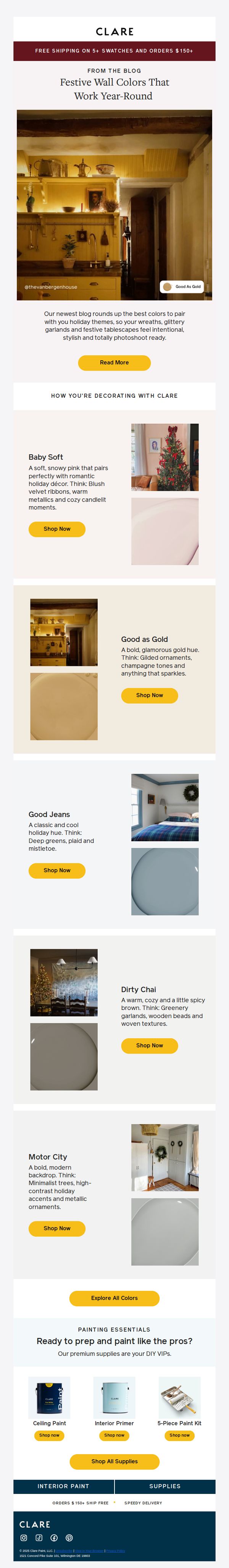
Objective
This email aims to inspire holiday decorating through curated paint color pairings while driving sales of Clare’s paint and supplies by showcasing real-life applications and seasonal styling tips.
Why this works
Clare brilliantly ties seasonal emotion to paint colors by pairing each hue with specific holiday decor elements, like velvet ribbons or gilded ornaments, making the choice feel personal and instantly actionable for the reader.
How to implement
The email leverages real customer spaces as visual proof, transforming abstract color names into tangible, aspirational environments that help shoppers envision the paint in their own homes during the holidays.
Pro Tip
Add a subtle countdown timer near the 'Shop Now' buttons to create urgency around holiday prep, especially since the email targets time-sensitive seasonal decorating decisions. • Include a short testimonial or social proof snippet under each color pairing (e.g., 'Loved by 2,300+ holiday decorators') to reinforce trust and social validation without cluttering the layout.