Co-operators emails worth copying from real campaigns


1. 2025 in review: Investment Update (December 15, 2025)
Objective
This email aims to inform Co-operators clients about key financial market trends from 2025 and encourage them to engage with a detailed investment report, reinforcing the brand’s role as a trusted advisor in financial planning.
Why this works
The email opens with a concise, data-driven summary of market performance that immediately establishes credibility and relevance, helping busy investors quickly grasp the year’s financial narrative without overwhelming them with jargon.
How to implement
By anchoring the CTA around a single, high-value asset, the full report, the campaign avoids decision fatigue and funnels readers toward deeper engagement, turning passive recipients into active seekers of financial insight.
Pro Tip
Add a brief testimonial or client insight near the CTA to humanize the data and build trust, for example, a quote from a financial advisor or satisfied client reflecting on how the year’s trends impacted real portfolios. • Include a visual element like a mini chart or icon set in the hero section to break up text and visually reinforce the key market drivers (e.g., interest rates, tech stocks) mentioned in the summary.
2. The Bank of Canada lowered interest rates: Investment Update (October 27 to 31, 2025)
Objective
This email aims to inform subscribers about recent interest rate cuts by the Bank of Canada and U.S. Federal Reserve, while positioning Co-operators as a trusted source for timely financial market insights. It encourages readers to engage deeper by reading the full report and exploring additional resources.
Why this works
The email opens with a timely, data-driven hook, citing actual policy moves by central banks, which immediately signals relevance and authority to financially aware readers who track macroeconomic shifts.
How to implement
Instead of overwhelming the reader, the message distills complex market events into a single digestible paragraph, then funnels attention toward a clear next step: reading the full report, which balances education with engagement.
Pro Tip
Add a brief visual element, such as a mini chart or icon, next to the interest rate mention to make the macroeconomic update more scannable and emotionally resonant for time-pressed investors. • Include a secondary CTA below the main button, such as 'Explore our Market View Section,' to guide users who may not want to read the full report but are interested in related content, increasing internal navigation.
3. Thanks for signing up!
Objective
This email aims to confirm the recipient’s subscription to Co-operators’ weekly Investment Update and prompt them to verify their email address to ensure continued delivery of financial market insights and updates.
Why this works
The email opens with a personalized greeting that immediately builds rapport, making the recipient feel recognized and valued rather than just another subscriber in a database.
How to implement
It clearly explains why the recipient is receiving the message and what action is required, reducing confusion and increasing the likelihood of email confirmation through straightforward, user-centered language.
Pro Tip
Add a brief value reminder above the CTA, such as 'Get weekly market insights to help grow your portfolio', to reinforce why confirming is worth the user’s time and increase conversion. • Include a secondary CTA or visual cue (like a small icon or arrow) pointing to the confirmation button, especially since the button is the only interactive element and may be overlooked in plain layouts.
4. Stock markets climbed: Investment Update (October 20 to 24, 2025)
Objective
This email aims to inform subscribers about recent positive movements in equity markets and encourage them to engage further by reading the full investment report, while reinforcing Co-operators’ role as a trusted source for financial insights and advice.
Why this works
The email opens with a clear, time-bound headline that immediately signals relevance and urgency, making subscribers feel informed and in-the-know about market movements without overwhelming them with jargon.
How to implement
By anchoring the CTA around accessing a 'full report,' the campaign positions itself as a value-driven resource rather than a sales pitch, which builds trust and encourages deeper engagement from financially literate audiences.
Pro Tip
Add a brief bullet-point summary of key market takeaways above the CTA to reduce friction for readers who may not click through, increasing perceived value and reinforcing the email’s educational intent. • Integrate a subtle visual cue, like an icon or micro-illustration, next to the CTA button to draw attention and improve click-through rates without disrupting the clean, professional tone of the design.
5. Canada’s TSX scaled to new heights: Investment Update (January 12 to 16, 2026)
Objective
This email aims to inform subscribers about recent positive movements in Canada’s TSX index and position Co-operators as a trusted source for timely, insightful financial market updates that support informed investment decisions.
Why this works
The email opens with a clear, data-driven hook, highlighting the TSX surpassing 33,000 points, to immediately capture attention and establish credibility through timely, relevant market milestones.
How to implement
It strategically links performance to real-world catalysts like the Prime Minister’s visit to China, helping readers connect macroeconomic events to market outcomes without overwhelming them with jargon.
Pro Tip
Add a brief, visually distinct summary bullet list beneath the headline to highlight 2–3 key takeaways from the report, helping skimmers grasp value before deciding to click through. • Include a subtle social proof element, such as 'Join 15,000+ investors who read our weekly updates', near the CTA to boost perceived authority and encourage conversion.
6. Markets ended higher: Investment Update (October 13 to 17, 2025)
Objective
This email aims to inform subscribers about recent financial market movements and encourage them to engage with deeper analysis by reading the full investment report. It also reinforces Co-operators as a trusted source for timely, professional market insights.
Why this works
The email opens with a concise, data-driven summary of market activity, immediately establishing credibility and giving readers a clear reason to keep reading without overwhelming them with jargon or unnecessary detail.
How to implement
By anchoring the CTA around a specific, time-bound report, the email creates a sense of urgency and relevance, positioning the content as essential reading for anyone tracking market trends during that week’s key economic events.
Pro Tip
Add a brief bullet-point summary of key market takeaways above the CTA to reduce friction for time-pressed readers and increase the likelihood they’ll click through after scanning the highlights. • Include a small visual element, like a mini chart or icon, next to the market summary to break up text and reinforce the financial theme, making the email more scannable and visually engaging without adding clutter.
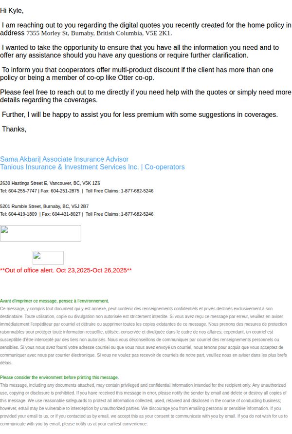
7. Cooperators - Inquiry for Online Condominium Quote
Objective
This email aims to follow up with a client who recently requested a digital quote for home insurance, offering personalized assistance and highlighting potential discounts for multi-product policies or co-op membership. It seeks to build trust and encourage further engagement by positioning the advisor as a helpful resource.
Why this works
The email personalizes the outreach by referencing the exact property address and policy type, which immediately signals attention to detail and builds credibility with the recipient.
How to implement
By mentioning specific eligibility for multi-product discounts and co-op membership benefits, the message creates urgency and value without sounding pushy, encouraging the reader to explore savings opportunities.
Pro Tip
Add a clear primary CTA button (e.g., 'Schedule a 10-Minute Consultation') near the top to guide users toward immediate action instead of relying solely on passive text links. • Include a brief bullet-point summary of key coverage highlights or discount eligibility under the offer section to reduce cognitive load and reinforce value before the recipient scrolls to contact info.
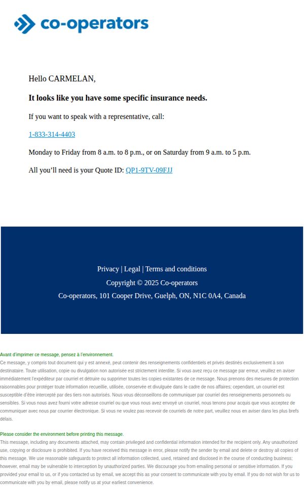
8. Your quote’s not going anywhere.
Objective
The email aims to reassure the recipient that their insurance quote is preserved and encourages them to follow up with a representative to discuss their specific needs, thereby converting interest into a sales conversation.
Why this works
By personalizing the greeting and referencing the user’s unique quote ID, the email creates a sense of ownership and urgency, making the recipient feel their inquiry is valued and actively held for them.
How to implement
The inclusion of precise business hours alongside the phone number reduces friction by eliminating guesswork, which increases the likelihood of immediate action from time-sensitive or hesitant prospects.
Pro Tip
Add a secondary CTA button labeled 'Schedule a Call' next to the phone number to accommodate users who prefer booking over calling, improving conversion paths for different customer preferences. • Include a brief testimonial or trust badge near the call-to-action to reinforce credibility and reduce hesitation, especially since insurance decisions often involve high perceived risk.
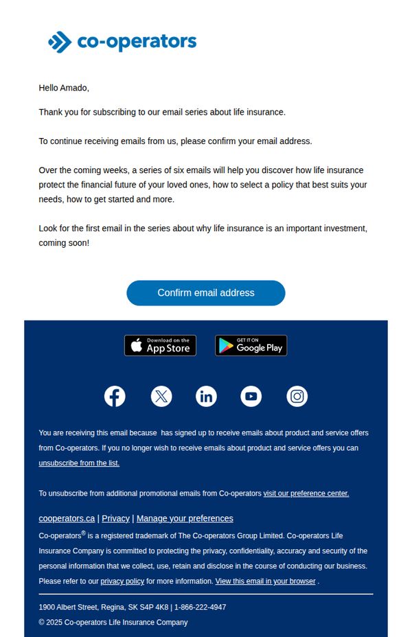
9. Thanks for signing up!
Objective
This email aims to confirm the recipient’s subscription to a life insurance educational email series while setting expectations for upcoming content. It also encourages immediate action by prompting email verification to ensure continued delivery of valuable, personalized guidance.
Why this works
The email immediately personalizes the experience by addressing the recipient by name and clearly stating the value of the upcoming email series, which builds trust and anticipation for future content without overwhelming the reader.
How to implement
By framing the email series as a six-part educational journey focused on protecting loved ones and selecting the right policy, the brand positions itself as a helpful guide rather than a sales-driven entity, which reduces subscriber resistance.
Pro Tip
Add a brief preview or teaser of the first email’s topic (e.g., 'Why Life Insurance Is an Important Investment') directly under the CTA to increase curiosity and reinforce the value of confirming the subscription. • Include a subtle visual cue or icon next to the 'Confirm email address' button, such as a checkmark or envelope, to visually reinforce the action’s purpose and reduce cognitive friction for users unfamiliar with double opt-in processes.
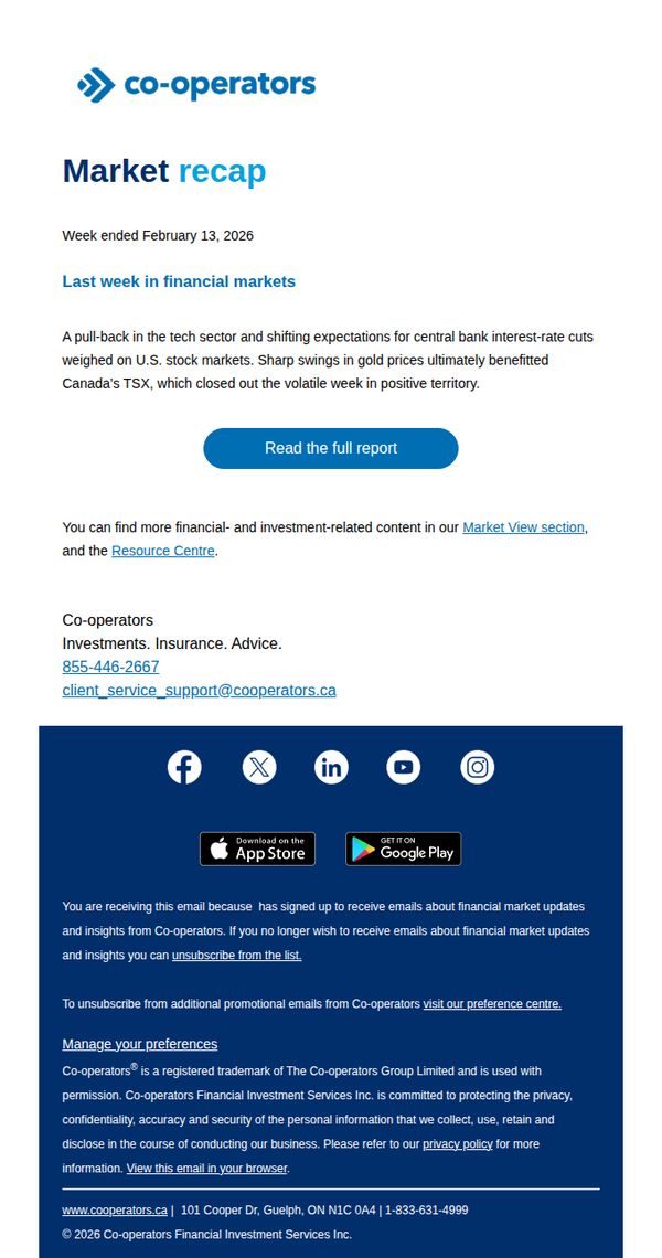
10. Tech losses hit stock markets: Weekly recap (February 9 to 13, 2026)
Objective
To inform subscribers about key financial market movements from the previous week, specifically highlighting tech sector declines and their impact on U.S. and Canadian markets, while encouraging deeper engagement through a detailed report.
Why this works
The email opens with a clear, data-driven summary that immediately frames market volatility around tech losses and central bank expectations, giving readers a strong context before diving deeper into the report.
How to implement
By positioning Canada’s TSX as having closed positively despite global turbulence, the message subtly reinforces regional resilience, a smart emotional hook for Canadian investors seeking stability amid uncertainty.
Pro Tip
Add a visual element like a mini chart or icon next to the CTA to visually reinforce the 'market recap' theme and increase click-through by appealing to data-oriented investors. • Include a brief teaser sentence under the CTA hinting at one surprising insight from the full report, such as 'Discover why gold surged 4% despite Fed signals', to boost curiosity and conversion.