The complete DentalPlans.com email collection
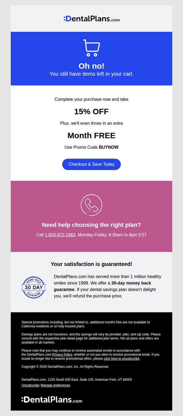
1. Update: Price drop on the savings plan you have in cart!
Objective
This email aims to recover an abandoned cart by alerting the recipient to a limited-time price drop and added bonus, 15% off plus an extra free month, to incentivize immediate checkout before the offer expires.
Why this works
The email opens with a playful yet urgent tone, 'Oh no!', to immediately grab attention and create emotional resonance, making the recipient feel personally addressed rather than targeted by a generic sales pitch.
How to implement
By bundling a percentage discount with a time-based bonus (an extra free month), the offer feels more valuable and less transactional, which reduces perceived risk and increases the psychological urgency to act now.
Pro Tip
Add a countdown timer or expiration notice near the CTA to visually reinforce urgency, since the current offer lacks a time-bound element that could motivate faster action. • Include a small visual of the plan in the cart or a brief bullet list of what’s included to jog the recipient’s memory and rekindle interest in the specific product they abandoned.
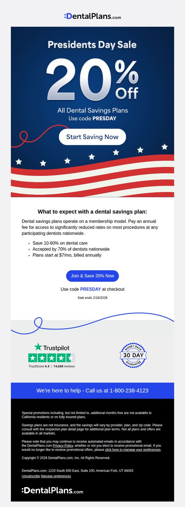
2. Enjoy 20% off this Presidents Day 🇺🇸
Objective
This email aims to drive immediate sign-ups for dental savings plans by leveraging the Presidents Day holiday with a time-sensitive 20% discount, while also educating recipients on the value and structure of membership-based dental savings.
Why this works
The email brilliantly ties a patriotic holiday to a financial benefit, making the discount feel timely and culturally relevant while positioning dental savings as an act of self-care worth celebrating.
How to implement
It clearly explains how dental savings plans work in simple terms, emphasizing membership models, nationwide acceptance, and cost reductions, so prospects understand the value before clicking, reducing friction in conversion.
Pro Tip
Add a countdown timer beneath the CTA to reinforce urgency since the sale ends on 2/18/2026, this visual cue can nudge procrastinators toward immediate action without adding clutter. • Include a short customer testimonial or quote near the education section to humanize the benefits; real stories about saving on cleanings or crowns would strengthen emotional appeal beyond stats.
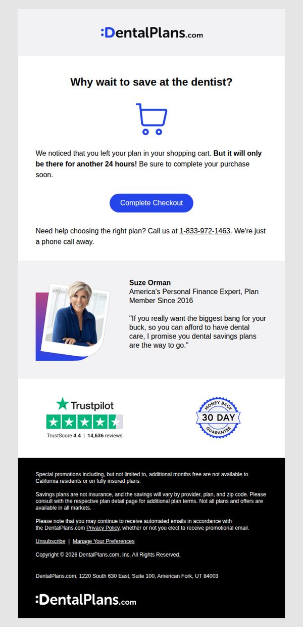
3. Just a quick reminder: Finalize your order now
Objective
This email aims to recover abandoned carts by creating urgency around a limited-time offer, encouraging users to complete their dental plan purchase within 24 hours to avoid losing their selected plan. It also reassures prospects with social proof and expert endorsement to reduce hesitation.
Why this works
The email leverages urgency effectively by stating the cart will expire in 24 hours, which taps into loss aversion and motivates immediate action without sounding pushy or aggressive.
How to implement
Including a named expert with credentials and a relatable quote adds authority and emotional resonance, helping prospects feel confident that they’re making a smart, financially savvy decision.
Pro Tip
Add a visual countdown timer next to the 'Complete Checkout' button to reinforce the 24-hour urgency in real time, increasing perceived scarcity and reducing decision fatigue. • Include a brief bullet list of key benefits or savings from the selected plan directly under the hero text to remind users why they added it to cart, reducing friction in the final decision.
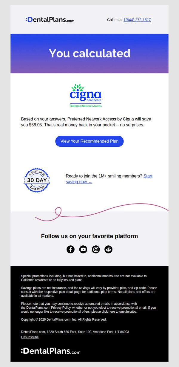
4. Don't forget your $58.05 in savings!
Objective
This email aims to re-engage users who previously calculated potential savings with DentalPlans.com by reminding them of their personalized $58.05 savings and encouraging immediate action to view and enroll in their recommended Cigna plan.
Why this works
The email leverages personalized savings data as a powerful psychological trigger, making the value proposition feel real and urgent rather than generic, which significantly increases conversion potential for cost-conscious consumers.
How to implement
By prominently featuring the Cigna logo and 'Preferred Network Access,' the campaign builds instant credibility and taps into brand recognition, reducing friction for users unfamiliar with DentalPlans.com’s third-party partnerships.
Pro Tip
Add a subtle countdown timer next to the CTA to create urgency around the personalized savings, since the current design lacks time-sensitive pressure that could boost immediate clicks. • Reposition the 'Start saving now' link closer to the CTA button or integrate it as a secondary button to reduce decision fatigue and provide a clearer alternative path for users hesitant to view the full plan details.
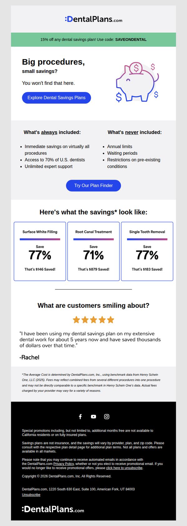
5. Smaller dental bills immediately
Objective
The email aims to drive immediate sign-ups for DentalPlans.com’s savings plans by highlighting substantial cost reductions on common dental procedures and building trust through customer testimonials and transparent plan details.
Why this works
The email immediately grabs attention by contrasting 'big procedures' with 'small savings', a clever twist that flips expectations and positions the service as uniquely valuable for high-cost dental work.
How to implement
By showcasing specific savings percentages and dollar amounts for real procedures like root canals and tooth removal, the email transforms abstract discounts into tangible, emotionally resonant financial relief for the reader.
Pro Tip
Add a countdown timer or urgency indicator near the 15% promo code to encourage faster action, since the current design lacks time-sensitive pressure despite offering a limited discount. • Reposition the 'Try Our Plan Finder' CTA to appear immediately after the savings grid, where users are most primed to act, rather than burying it between two informational sections.
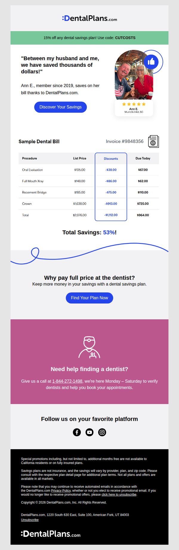
6. You may be overpaying at the dentist!
Objective
This email aims to convince recipients they’re overpaying for dental care by showcasing real savings through a member testimonial and a sample bill breakdown, ultimately driving them to enroll in a discounted dental savings plan.
Why this works
The email opens with a bold, relatable pain point, 'You may be overpaying at the dentist!', which immediately grabs attention by speaking directly to financial anxiety around healthcare costs.
How to implement
Including a real customer testimonial with photo, name, location, and star rating builds instant credibility and emotional resonance, making abstract savings feel tangible and trustworthy to skeptical readers.
Pro Tip
Add a countdown timer or urgency cue near the CTA to encourage immediate action, since the current offer lacks time-sensitive pressure despite promoting limited-time savings. • Include a brief FAQ or tooltip near the sample bill explaining how savings are calculated or why prices vary by provider, reducing friction for users who may hesitate due to perceived complexity or distrust.
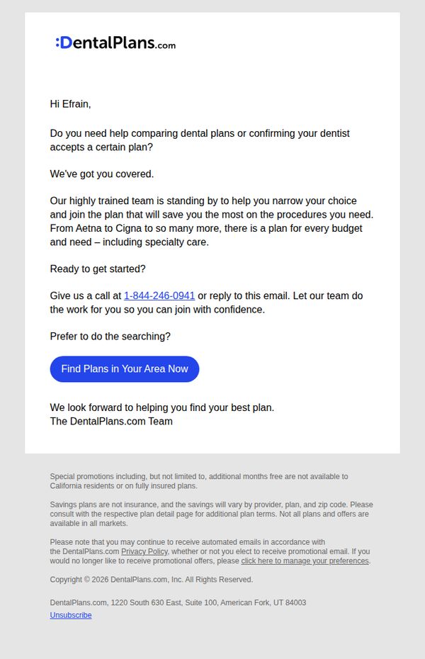
7. Hi, Efrain. Your dental plan questions, answered.
Objective
This email aims to reassure the recipient, Efrain, that expert help is available to simplify dental plan selection and confirm dentist network compatibility, ultimately guiding him toward confident enrollment through personalized support.
Why this works
The email opens with a personal greeting and immediately addresses a common pain point, comparing plans and verifying dentist acceptance, which builds instant relevance and trust by speaking directly to the reader’s uncertainty.
How to implement
By positioning their team as ‘highly trained’ and ready to do the work for the customer, the message shifts the burden from the overwhelmed consumer to a supportive, knowledgeable guide, making the decision feel safer and more manageable.
Pro Tip
Add a brief testimonial or stat (e.g., '92% of customers find their ideal plan within 15 minutes') near the CTA to boost social proof and reduce perceived effort in taking the next step. • Include a subtle visual cue like a small icon or badge next to the phone number to highlight it as a preferred contact method, helping users quickly identify the fastest path to assistance.
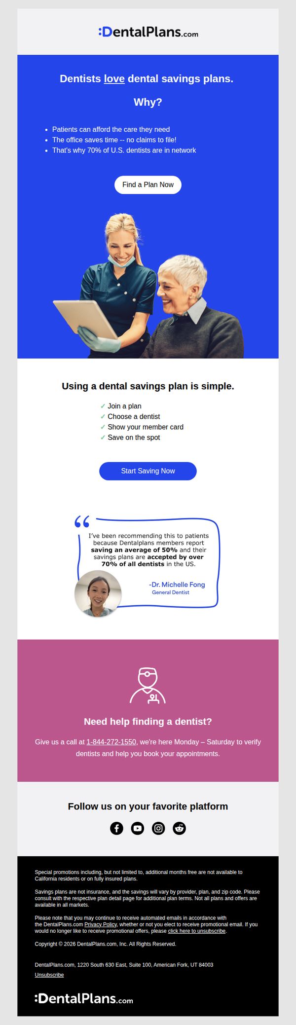
8. Your dentist loves us! 💙
Objective
This email aims to build trust and drive sign-ups by highlighting that dentists endorse dental savings plans, emphasizing convenience and savings for patients while positioning the service as widely accepted and dentist-approved.
Why this works
The email smartly flips the script by leading with dentist approval instead of patient savings, which builds instant credibility and reassures skeptical consumers that this isn’t just another discount gimmick but a clinically endorsed solution.
How to implement
By breaking down the user journey into four simple, check-marked steps, the campaign removes friction and mental overload, making the process feel effortless and approachable even for those intimidated by dental costs or insurance complexity.
Pro Tip
The primary CTA 'Find a Plan Now' appears above the value explanation, consider moving it below the dentist testimonial or after the 4-step process to ensure users understand the benefit before being asked to act. • The purple help section feels visually disconnected; integrate the phone number and support offer into the main flow or add a secondary CTA like 'Call Us for Help Finding a Dentist' to maintain momentum and reduce drop-off for users needing guidance.
9. Hello new friend. Goodbye stressful dental bills.
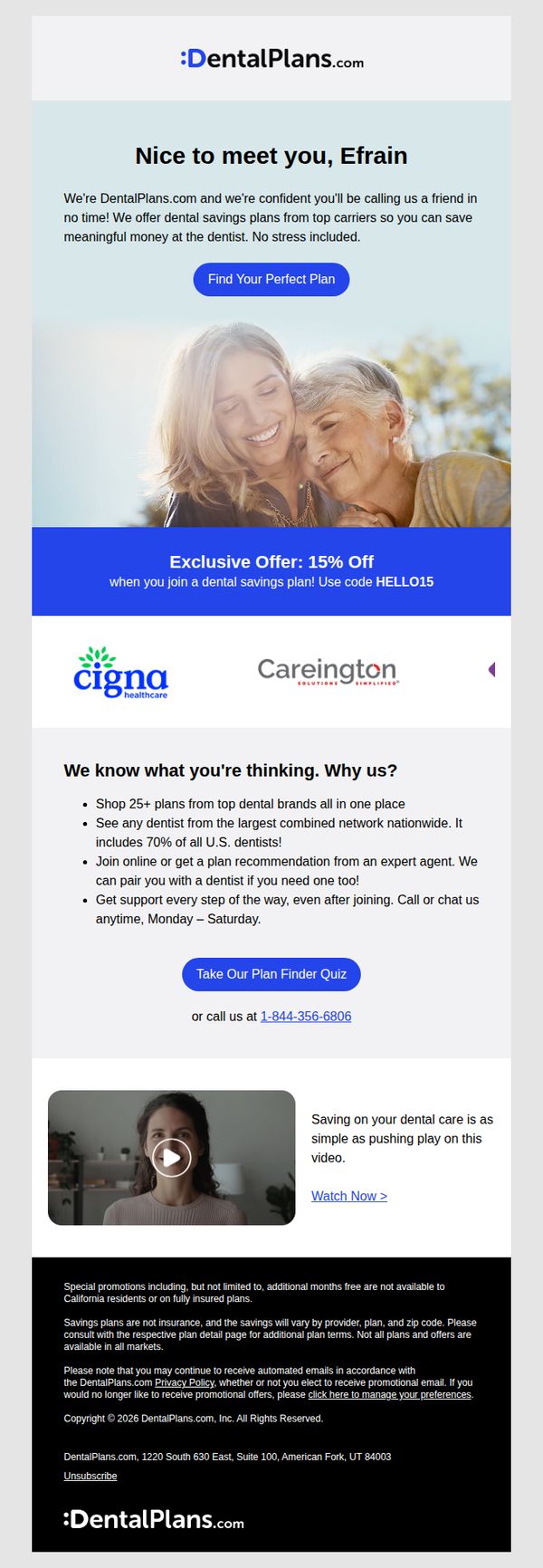
Objective
This email aims to welcome new subscribers by positioning DentalPlans.com as a trusted, stress-free solution for reducing dental costs, while encouraging immediate engagement through a personalized plan finder and a limited-time discount offer.
Why this works
The email opens with a warm, personalized greeting that instantly builds rapport, making the recipient feel seen and valued rather than just another lead in a database.
How to implement
By anchoring the offer around a specific discount code and pairing it with a strong visual banner, the campaign creates urgency and makes redemption feel effortless and exclusive.
Pro Tip
Add a subtle countdown timer next to the 15% off offer to visually reinforce urgency and encourage faster decision-making without overwhelming the layout. • Reposition the phone number directly beneath the primary CTA button instead of after the quiz link, ensuring users who prefer human interaction can act immediately without scrolling.
10. Plan match complete: See your savings
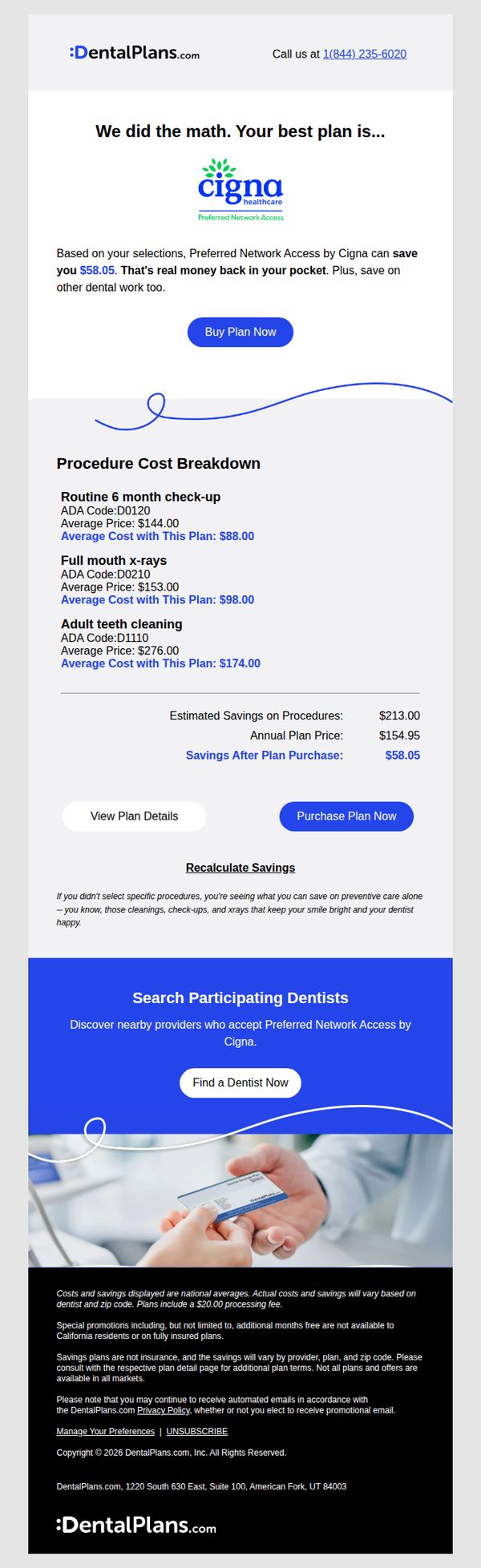
Objective
This email aims to convert users by showcasing personalized savings from a matched dental plan, emphasizing tangible cost reductions and encouraging immediate purchase through clear CTAs and procedure-specific breakdowns.
Why this works
The email builds instant credibility by quantifying exact dollar savings per common dental procedure, making abstract benefits feel concrete and personally relevant to the recipient’s budget and health needs.
How to implement
By anchoring the message around 'We did the math,' the brand positions itself as a helpful advisor rather than a sales entity, reducing buyer resistance and increasing perceived value through data-driven personalization.
Pro Tip
Add a subtle countdown timer near the CTA to create urgency, since dental plans are often purchased during open enrollment windows or after diagnostic appointments, timing can significantly impact conversion rates. • Include a short testimonial or star rating from a real user who saved money using this exact plan to reinforce social proof, especially since trust is critical when purchasing healthcare-related services online.