Digital Services campaign ideas that work
1. OVME : Time to Lighten Things Up
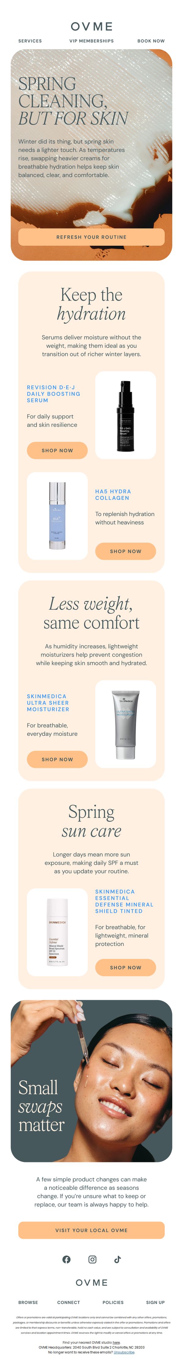
Objective
This email aims to guide customers through seasonal skincare transitions by encouraging them to refresh their routines with lighter, hydrating products suited for spring weather. It positions OVME as a trusted advisor while driving product engagement and store visits.
Why this works
The email brilliantly ties seasonal change to skincare behavior, making the transition feel natural and necessary rather than sales-driven, which builds trust while nudging action.
How to implement
Each product is framed not just by its name but by its functional benefit, like 'breathable hydration' or 'lightweight protection', helping shoppers visualize how it solves their specific springtime skin concerns.
Pro Tip
Add a countdown timer or urgency cue near the 'Refresh Your Routine' CTA to encourage immediate action, since seasonal transitions are time-sensitive and motivation fades without timely prompts. • Include a mini-quiz or personalized recommendation engine link (e.g., 'Not sure what to swap? Take our 30-second skin quiz') to reduce decision fatigue and increase conversion from hesitant shoppers.
2. DentalPlans.com : Hello new friend. Goodbye stressful dental bills.
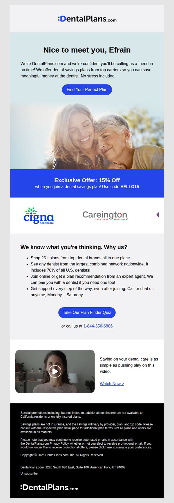
Objective
This email aims to welcome new subscribers by positioning DentalPlans.com as a trusted, stress-free solution for reducing dental costs, while encouraging immediate engagement through a personalized plan finder and a limited-time discount offer.
Why this works
The email opens with a warm, personalized greeting that instantly builds rapport, making the recipient feel seen and valued rather than just another lead in a database.
How to implement
By anchoring the offer around a specific discount code and pairing it with a strong visual banner, the campaign creates urgency and makes redemption feel effortless and exclusive.
Pro Tip
Add a subtle countdown timer next to the 15% off offer to visually reinforce urgency and encourage faster decision-making without overwhelming the layout. • Reposition the phone number directly beneath the primary CTA button instead of after the quiz link, ensuring users who prefer human interaction can act immediately without scrolling.
3. Connecticut Magazine: Brainard Airport should stay open, consultants say
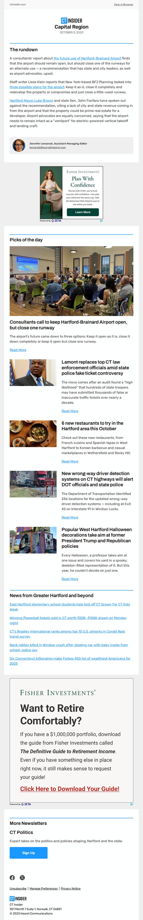
Objective
To inform readers about the consultants’ recommendation to keep Brainard Airport open while closing one runway, and to drive engagement with local news and sponsored financial content through curated articles and a retirement guide CTA.
Why this works
The email opens with a strong, localized news hook that immediately captures attention by framing the airport debate as a high-stakes civic issue, making readers feel informed and invested in the outcome.
How to implement
By embedding a sponsored financial offer within a trusted editorial context, the campaign subtly positions the advertiser as a solution to a reader’s potential life-stage concern, retirement planning, without disrupting the news experience.
Pro Tip
The primary CTA for the retirement guide is buried below multiple news stories; repositioning it immediately after the lead story would capitalize on reader momentum and increase conversion rates. • The email lacks visual hierarchy between editorial content and sponsored ads, adding subtle dividers or background shading to distinguish ad blocks would improve user experience and reduce accidental clicks.
4. OVME : You Asked for Results 👀
Objective
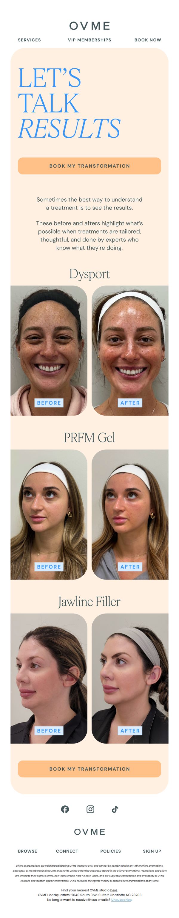
This email aims to convert curious prospects into booked clients by showcasing real, expert-led treatment results that build trust and demonstrate tangible outcomes. It leverages social proof through before-and-after visuals to reduce hesitation and encourage immediate action.
Why this works
The email opens with a bold, benefit-driven headline that speaks directly to the customer’s desire for visible results, immediately aligning the message with the emotional driver behind cosmetic treatment decisions.
How to implement
Each before-and-after pair is labeled clearly and paired with the specific treatment name, making it easy for readers to mentally map their own goals to a proven solution without needing to guess or research further.
Pro Tip
Add a short testimonial quote or star rating beneath each before-and-after set to reinforce credibility and humanize the results, making the transformation feel more relatable and trustworthy. • Include a subtle urgency element, like a limited-time offer or a note about high demand, near the CTA to nudge hesitant readers toward booking now rather than saving it for later.
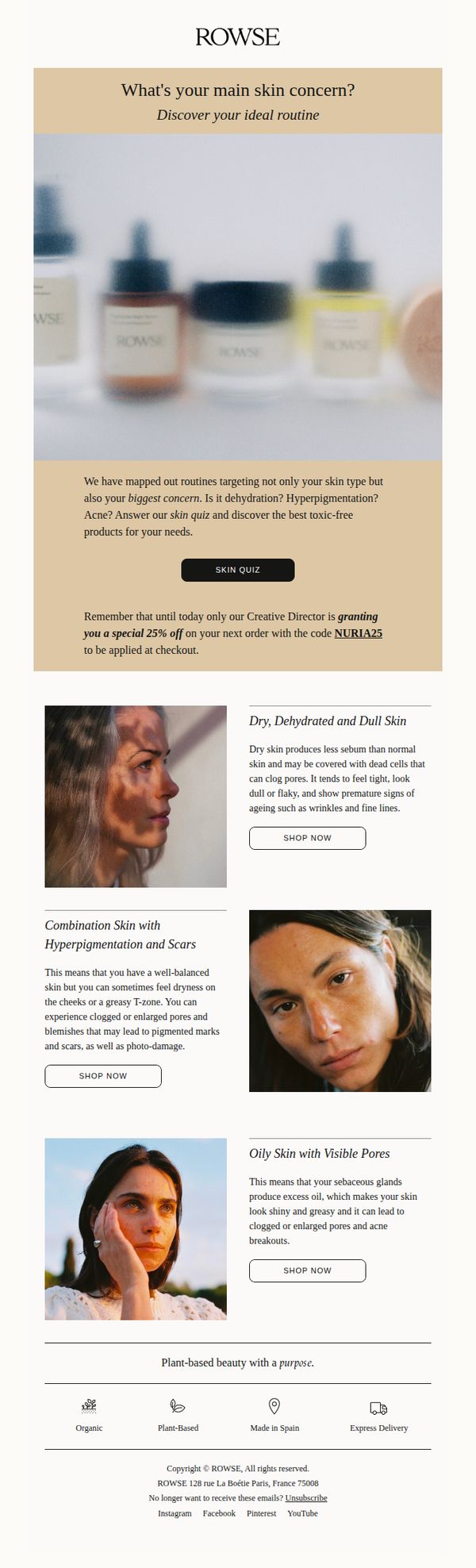
5. Rowse: What's your main skin concern? 🌿
Objective
The email aims to engage subscribers by prompting them to identify their primary skin concern through a personalized quiz, while simultaneously incentivizing immediate purchase with a time-sensitive discount code.
Why this works
By opening with a direct, empathetic question about skin concerns, the email instantly personalizes the experience and positions the brand as a thoughtful guide rather than a pushy seller, which builds trust before any product is shown.
How to implement
The inclusion of a time-bound, authority-backed discount, granted by the Creative Director, creates urgency and perceived exclusivity, making the offer feel more valuable and less like a generic promotion that could be ignored.
Pro Tip
Add a visual progress indicator or mini-quiz preview after the main CTA to reduce friction, readers may hesitate to click if they don’t know how long or involved the quiz will be. • Reposition the 25% discount offer closer to the top or integrate it into the hero section’s CTA button to increase visibility, since the current placement risks it being overlooked by users who don’t scroll fully.
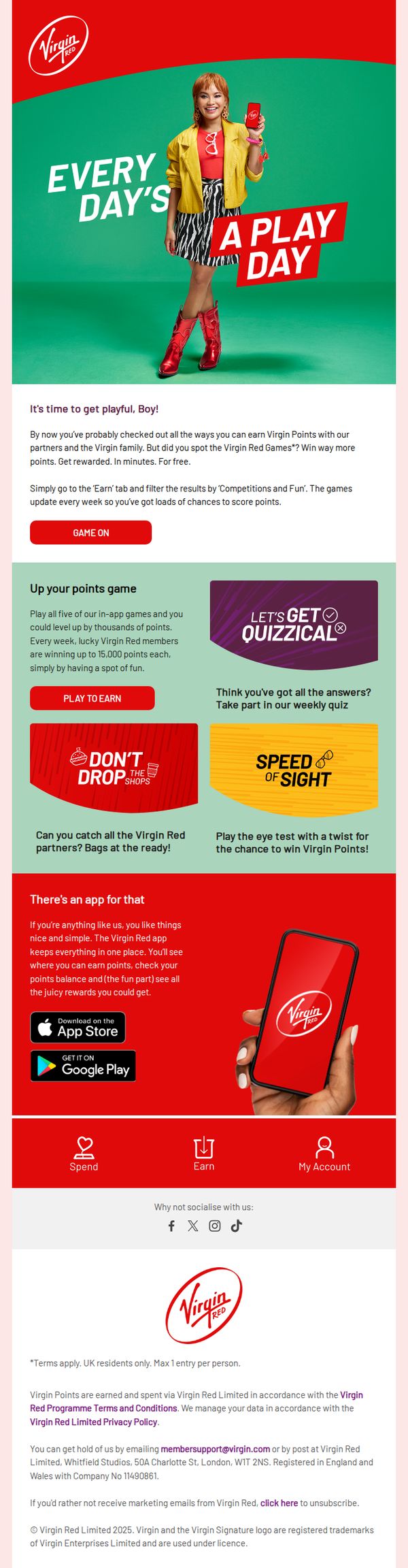
6. Virgin Atlantic: Play to win - points that is!
Objective
This email aims to drive engagement with Virgin Red’s gamified loyalty program by encouraging members to play weekly games for a chance to earn thousands of points, positioning rewards as fun, accessible, and instantly redeemable through the app.
Why this works
Virgin Atlantic brilliantly reframes loyalty rewards as playful, bite-sized games that feel less like chores and more like entertainment, making point accumulation emotionally rewarding and socially shareable through vibrant visuals and casual tone.
How to implement
By spotlighting specific in-app games with catchy names and clear stakes, like winning up to 15,000 points weekly, the email transforms abstract rewards into tangible, exciting opportunities that trigger FOMO and immediate action.
Pro Tip
Add a visual countdown or weekly game refresh indicator near the 'GAME ON' CTA to reinforce urgency and encourage immediate participation before the next set of games expires. • Include a short testimonial or user-generated photo from a member who recently won points through a game, this social proof would strengthen credibility and motivate skeptics to try the games.
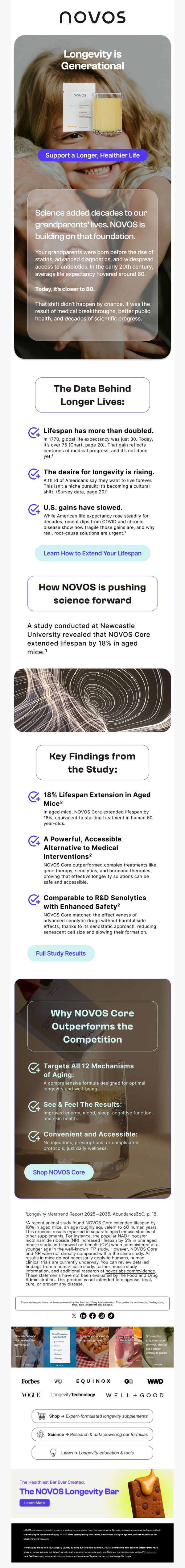
7. NOVOS: We’re Living Longer Than Our Grandparents Ever Imagined.
Objective
This email aims to position NOVOS as a science-backed longevity solution by highlighting generational life expectancy gains and anchoring its product in peer-reviewed research, ultimately driving conversions through education and credibility.
Why this works
By framing longevity as a generational achievement rooted in medical progress, the email taps into emotional nostalgia while positioning NOVOS as the next logical step in a trusted scientific legacy, making the product feel inevitable rather than optional.
How to implement
The email masterfully translates complex scientific data into digestible, benefit-driven bullet points that emphasize safety, accessibility, and efficacy, turning clinical findings into compelling consumer motivations without oversimplifying the science.
Pro Tip
Add a subtle countdown timer or urgency indicator near the 'Shop NOVOS Core' CTA to nudge immediate action, especially since the email’s educational tone may delay conversion without a behavioral trigger. • Include a short customer testimonial or real-user quote near the 'Why NOVOS Core Outperforms the Competition' section to humanize the science and reinforce social proof alongside clinical data.
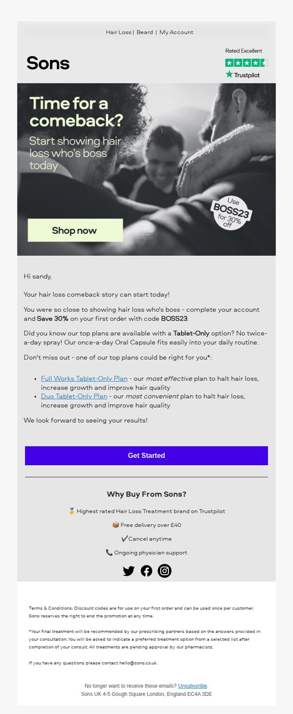
8. Sons: Time for a comeback?
Objective
The email aims to re-engage a past customer by offering a personalized 30% discount to restart their hair loss treatment journey, while highlighting convenient, effective tablet-only plans that fit into daily routines.
Why this works
The email opens with a bold, emotionally resonant question, 'Time for a comeback?', that immediately taps into the recipient’s personal journey, making the message feel less like a pitch and more like a supportive nudge toward self-improvement.
How to implement
By emphasizing the convenience of tablet-only plans over sprays, the email smartly addresses a common pain point, daily routine friction, and positions the product as not just effective, but effortlessly integrated into real life, which boosts perceived value and reduces hesitation.
Pro Tip
The hero section’s CTA button ('Shop now') conflicts with the email’s primary goal, restarting treatment, and should be changed to 'Restart Your Plan' or 'Claim Your 30% Off' to align with the campaign’s re-engagement intent and reduce cognitive friction. • The email lacks a visual hierarchy that guides the eye from the personalized offer to the product benefits; adding a subtle arrow, icon, or color accent near the 'Get Started' button would improve conversion flow and reinforce the next step visually.
9. Clinique La Prairie : How your Body Keeps Time
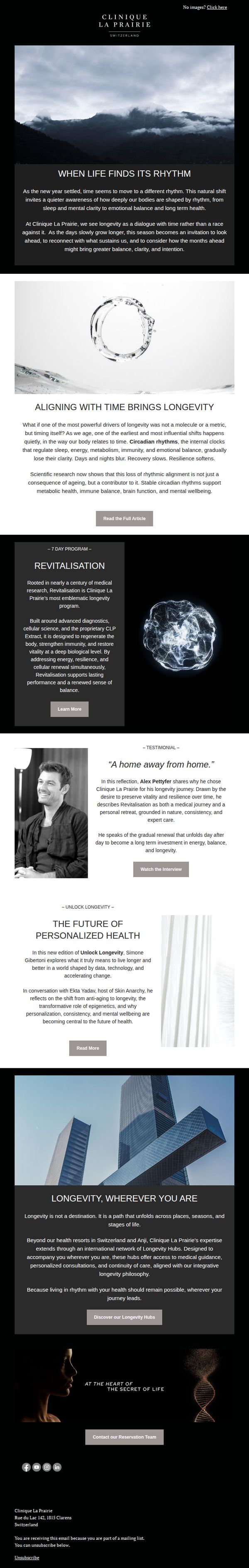
Objective
This email aims to educate subscribers on the science of circadian rhythms and their role in longevity, while positioning Clinique La Prairie as a thought leader in holistic, time-aligned wellness. It gently guides readers toward deeper engagement with their programs and global hubs.
Why this works
The email masterfully reframes aging not as a battle to win but as a rhythm to align with, inviting readers into a contemplative, science-backed narrative that positions longevity as a holistic, intentional journey rather than a cosmetic fix.
How to implement
By weaving in a personal testimonial from a recognizable figure, the campaign builds emotional credibility while subtly validating the program’s transformative impact, turning abstract science into relatable human experience without overt sales pressure.
Pro Tip
Add a subtle countdown timer or urgency cue near the 'Discover our Longevity Hubs' CTA to nudge high-intent readers toward immediate action, especially since the email’s tone is contemplative and may benefit from a gentle behavioral nudge. • Include a brief visual icon or tagline next to each CTA (e.g., 'Read More → Science Explained' or 'Watch Interview → Real Results') to clarify the value of each next step and reduce cognitive load for skimmers.
10. Triple Whale: 📊 Quantify your confidence
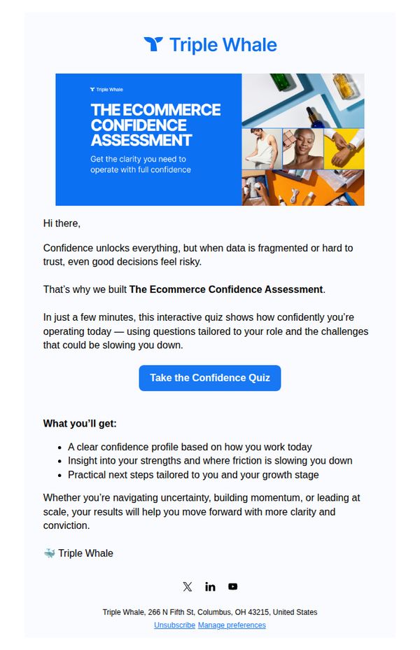
Objective
This email aims to drive engagement with Triple Whale’s Ecommerce Confidence Assessment by positioning it as a quick, role-tailored tool that helps users diagnose operational friction and gain clarity for confident decision-making in their ecommerce growth journey.
Why this works
The email frames data fragmentation as a confidence killer, a smart emotional hook that positions the quiz not as another assessment, but as a clarity tool for leaders who feel stuck despite having good instincts.
How to implement
By promising a 'clear confidence profile' and 'practical next steps tailored to your growth stage,' the copy speaks directly to the reader’s identity and pain points, making the value feel personalized and immediately actionable.
Pro Tip
Add a brief testimonial or social proof near the CTA, even one sentence from a founder or marketer who used the quiz and gained clarity, to reduce perceived risk and increase conversion by validating the tool’s impact. • Include a visual progress indicator or time estimate (e.g., 'Takes 3 minutes') near the CTA to lower friction and reassure busy readers that the quiz is lightweight and worth their time.