Doctor On Demand email designs from top brands
1. Time for your heart health check-in
Objective
This email aims to encourage recipients to prioritize heart health by connecting daily habits to long-term cardiac wellness and prompting them to schedule a virtual check-in with a provider through Doctor On Demand. It positions routine care as proactive, accessible, and personalized.
Why this works
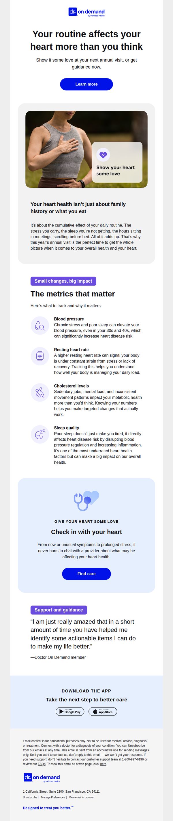
The email reframes heart health not as a genetic inevitability but as a daily practice influenced by stress, sleep, and movement, making it feel actionable and within the reader’s control rather than intimidating or abstract.
How to implement
By listing specific, trackable metrics like resting heart rate and sleep quality with clear explanations of their impact, the email transforms vague wellness advice into tangible, science-backed steps that build credibility and motivate behavior change.
Pro Tip
Add a subtle countdown timer or urgency cue near the 'Find care' CTA to nudge procrastinators, since heart health is often deferred, a gentle time-sensitive prompt could increase conversion without compromising the calm, educational tone. • Include a brief FAQ or 'What to expect' snippet under the testimonial to reduce friction for first-time users, many may hesitate due to uncertainty about virtual visits, and addressing this directly would strengthen the path to action.
2. Don’t need care right now? We’re here whenever you do.
Objective
This email aims to gently re-engage users who haven’t yet booked a virtual care visit by reassuring them that support is available whenever needed, while subtly encouraging immediate action through clear CTAs and educational content. It positions Doctor On Demand as a reliable, on-demand healthcare partner rather than pushing urgency.
Why this works
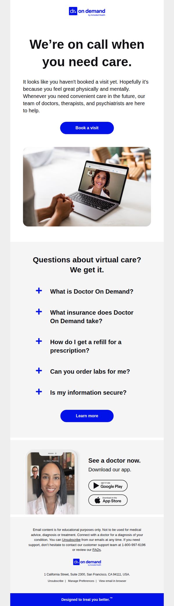
The email opens with empathetic, non-pushy language that assumes the recipient is healthy, turning a potential point of friction into a moment of trust and emotional alignment, which makes the CTA feel supportive rather than salesy.
How to implement
By structuring FAQs as expandable accordions with bold, benefit-driven questions, the email reduces cognitive load while proactively addressing common barriers to virtual care adoption, making the service feel more accessible and trustworthy.
Pro Tip
Add a subtle social proof element, such as a short testimonial or stat like '95% of users feel better after their first visit', near the CTA to reduce hesitation and reinforce credibility without overwhelming the clean layout. • Include a secondary CTA like 'See how it works in 60 seconds' linked to a short explainer video or animated walkthrough, placed just below the FAQ section, to engage users who need more context before booking.
3. Save $15 off urgent care visits
Objective
This email aims to drive immediate bookings for virtual urgent care visits by highlighting a limited-time $15 discount, emphasizing convenience and 24/7 availability to reduce friction for users seeking fast medical help.
Why this works
The email strategically anchors urgency with a clear deadline and price drop, making the offer feel exclusive and time-sensitive without overwhelming the reader with complex terms or fine print.
How to implement
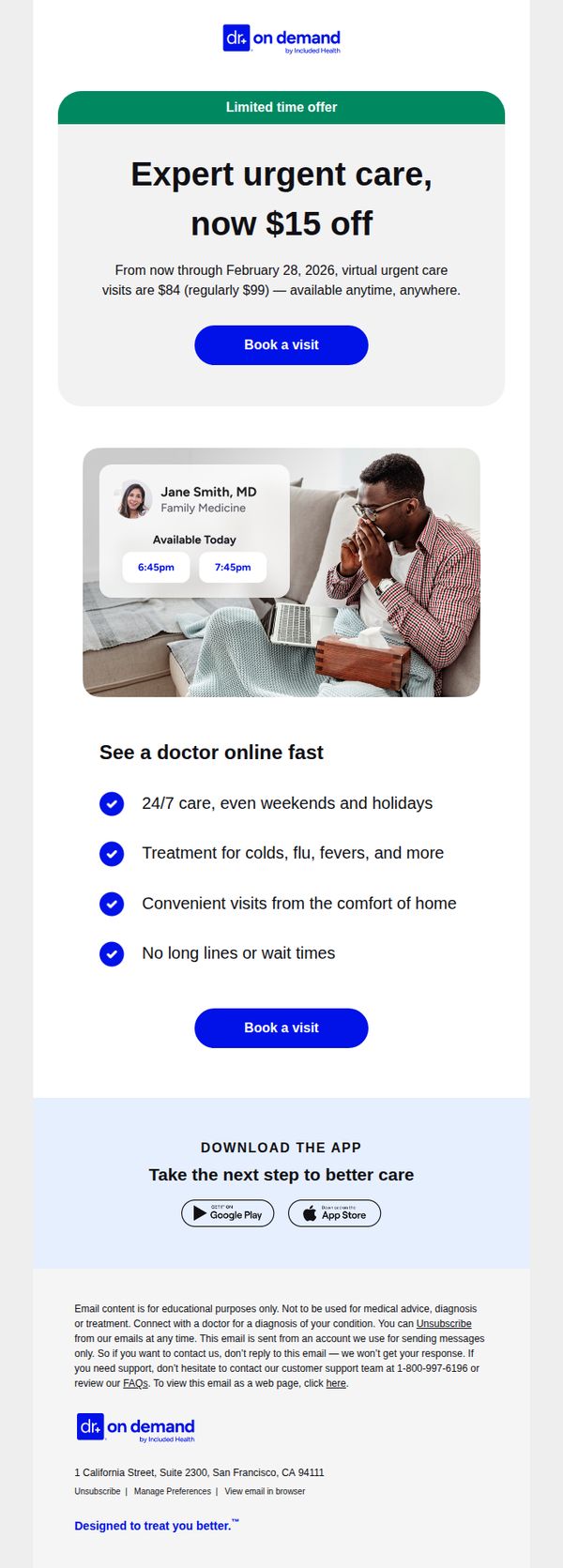
By featuring a real doctor’s name, specialty, and available appointment times alongside a relatable patient image, the email builds instant trust and reduces perceived risk for first-time users.
Pro Tip
Add a countdown timer beneath the offer headline to visually reinforce urgency and encourage faster decision-making, especially since the deadline is over a month away and may feel distant to users. • Include a short patient testimonial or satisfaction rating near the CTA to strengthen social proof, currently, the doctor’s availability is shown, but real user validation could boost conversion confidence.
4. Last reminder: Get $15 off urgent care
Objective
This email aims to drive immediate action by reminding recipients of a time-sensitive $15 discount on urgent care visits, encouraging them to book before the offer expires on February 28, 2026, while reinforcing the convenience of virtual care during cold and flu season.
Why this works
The email smartly ties the discount to seasonal urgency, cold and flu season, making the offer feel timely and personally relevant rather than just a generic promotion, which increases perceived value and motivates faster action.
How to implement
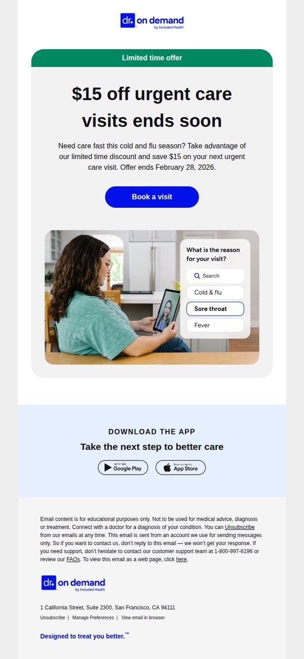
By placing the primary CTA button directly beneath the offer headline and expiration date, the design creates a clear visual path to conversion, reducing friction and guiding users instinctively toward booking without needing to scroll or search.
Pro Tip
Add a countdown timer beneath the offer expiration date to visually reinforce urgency and create psychological pressure to act before the discount disappears, which can significantly boost last-minute conversions. • Include a short testimonial or patient success story near the CTA to build social proof, especially for users unfamiliar with telehealth, by showing real people who benefited from urgent care visits, increasing trust and reducing perceived risk.