Expert Recommends emails worth copying from real brands
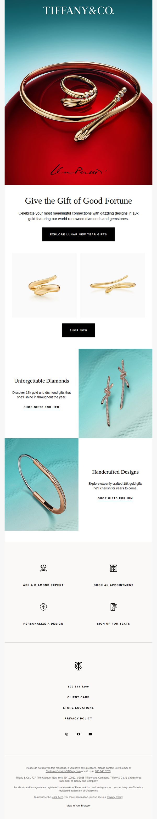
1. Tiffany & Co. - US: Celebrate Lunar New Year with Tiffany & Co.
Objective
This email aims to drive Lunar New Year gifting sales by positioning Tiffany & Co. jewelry as meaningful, lucky gifts made in 18k gold and diamonds, while subtly reinforcing brand prestige and emotional connection through curated product storytelling.
Why this works
Tiffany brilliantly ties cultural celebration to luxury gifting by framing its 18k gold and diamond pieces as symbols of good fortune, making high-end jewelry feel emotionally resonant and timely rather than purely transactional.
How to implement
The email strategically segments gift recommendations by gender with distinct visual backdrops and copy tones, soft teal for her, sleek metallic for him, creating a personalized experience that respects traditional gifting norms while elevating them with craftsmanship storytelling.
Pro Tip
Add a subtle countdown timer or 'Limited Edition' badge near the hero CTA to create urgency around Lunar New Year gifting, since the current design lacks temporal pressure despite the seasonal theme. • Include a short testimonial or gifting quote from a real customer near the 'Unforgettable Diamonds' section to build social proof, luxury buyers often seek validation before committing, and emotional peer endorsement would strengthen persuasion.
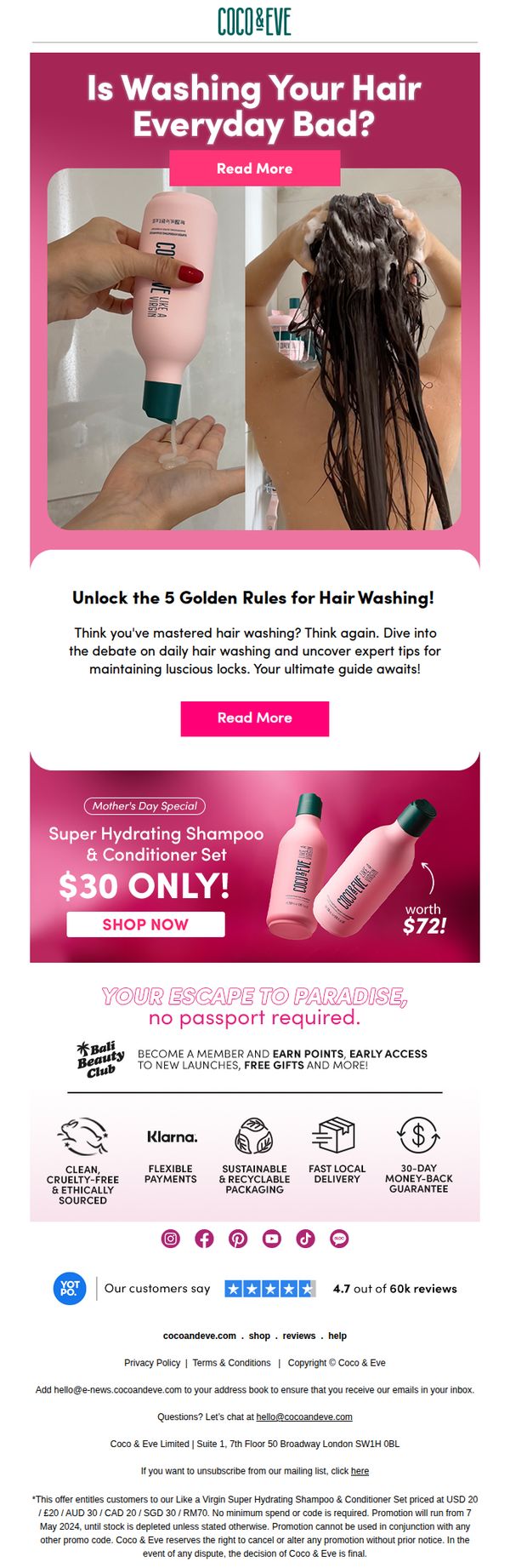
2. Coco & Eve: Is Washing Your Hair Everyday Bad for you?
Objective
This email aims to educate subscribers on hair washing best practices while subtly promoting a Mother’s Day special on their Super Hydrating Shampoo & Conditioner Set, encouraging immediate purchase through urgency and value framing.
Why this works
The email opens with a provocative, relatable question that immediately hooks the reader by tapping into a common hair care myth, making the content feel personally relevant and worth exploring further.
How to implement
By positioning the product as a solution to a debated hair care habit, rather than just pushing a sale, the brand builds trust and positions itself as an authority, which increases conversion likelihood without sounding pushy.
Pro Tip
The CTA 'SHOP NOW' appears only once and is buried below educational content; adding a sticky or repeated CTA button after the hero section and before the footer would capture attention from skimmers and reduce drop-off. • The email lacks social proof near the offer, adding a short testimonial or star rating directly under the '$30 ONLY!' headline would reinforce trust and reduce hesitation for first-time buyers considering the discount.
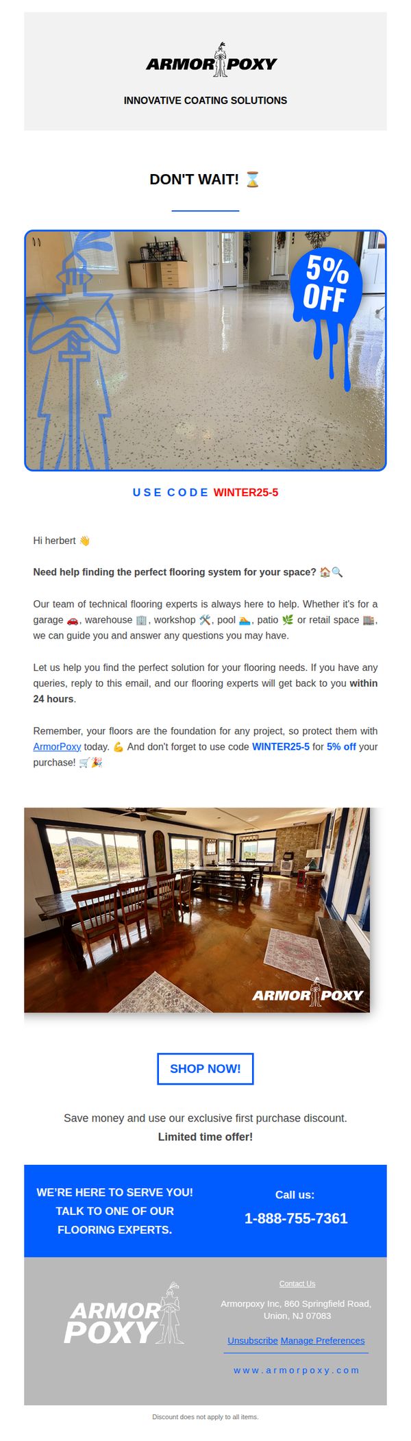
3. Armorpoxy: Need Help Deciding on your Flooring System?
Objective
This email aims to assist potential customers in selecting the right flooring system by offering expert guidance and incentivizing immediate action with a limited-time 5% discount. It positions ArmorPoxy as a trusted advisor while driving conversions through personalized support and urgency.
Why this works
The email brilliantly combines urgency with personalization by addressing the recipient by name and offering a time-sensitive discount, making the offer feel exclusive and tailored to their immediate decision-making needs.
How to implement
By positioning their team as 'technical flooring experts' available to answer questions within 24 hours, ArmorPoxy builds trust and reduces buyer hesitation, turning a simple promotional email into a consultative sales tool.
Pro Tip
Add a visual countdown timer near the 'DON’T WAIT!' header to reinforce urgency and encourage immediate action before the discount expires. • Include a brief customer testimonial or star rating near the 'SHOP NOW!' CTA to build social proof and reduce perceived risk for first-time buyers.
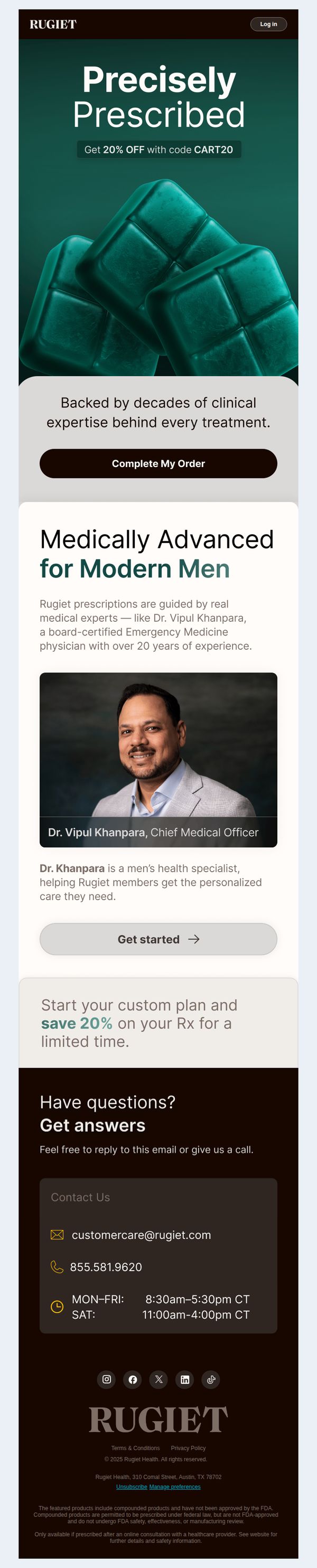
4. Rugiet : Your Doctor Is Waiting with 20% Off
Objective
This email aims to convert recipients into customers by positioning Rugiet as a clinically credible, doctor-guided solution for men’s health, while incentivizing immediate action with a time-sensitive 20% discount. It leverages medical authority and personalized care to reduce hesitation and drive prescription completions.
Why this works
The email brilliantly frames the product as a medical prescription rather than a supplement, using clinical language and a real doctor’s photo to build instant trust and position the brand as a legitimate healthcare partner for men seeking personalized solutions.
How to implement
By anchoring the discount to a limited-time Rx savings offer instead of a generic sale, the campaign creates urgency while reinforcing the medical legitimacy of the service, making the discount feel like a professional benefit rather than a marketing gimmick.
Pro Tip
Add a subtle countdown timer or 'limited spots available' indicator near the 'Complete My Order' CTA to amplify urgency without disrupting the clinical tone, since the current 'limited time' mention lacks visual reinforcement to drive faster decisions. • Reposition the 'Get started' button under Dr. Khanpara’s bio to appear as a secondary CTA that funnels users into learning more, while keeping 'Complete My Order' as the primary CTA, this clarifies the user journey and reduces decision fatigue.
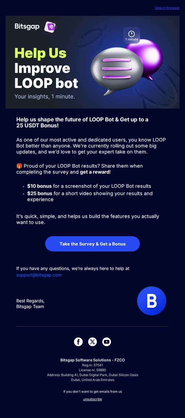
5. Bitsgap: Share your thoughts on LOOP Bot for a reward 🚀
Objective
The email aims to gather user feedback on the LOOP Bot through a quick survey while incentivizing participation with monetary rewards, strengthening user engagement and product development alignment.
Why this works
The email brilliantly frames user feedback as a co-creation opportunity, making recipients feel like valued partners in shaping the product’s future rather than just survey takers.
How to implement
By offering tiered rewards based on content type, screenshot vs. video, it encourages richer, more actionable feedback while appealing to different user comfort levels and engagement styles.
Pro Tip
Add a brief testimonial or social proof near the CTA, like 'Over 1,200 users already shared their results', to reduce friction and reinforce credibility for hesitant respondents. • Include a micro-preview of the survey questions or a progress bar to set expectations and reduce abandonment, especially since users may fear hidden time commitments despite the '1 minute' claim.
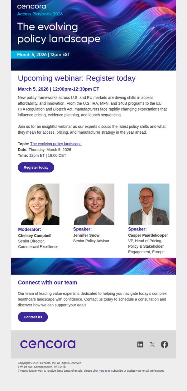
6. PharmaLex: Register Now: Decoding 2025–2026 Policy Shifts Across U.S. and EU Markets
Objective
This email aims to drive registrations for a webinar that unpacks emerging policy changes in U.S. and EU healthcare markets, positioning PharmaLex as a trusted advisor for manufacturers navigating regulatory complexity and strategic planning in 2025–2026.
Why this works
The email effectively anchors urgency and relevance by naming specific, high-impact regulations like the U.S. IRA and EU HTA Act, giving readers immediate context for why this webinar matters to their strategic planning and compliance workflows.
How to implement
By featuring headshots and clear titles of the moderator and speakers, the campaign builds instant credibility and personalizes the experience, subtly signaling that attendees will hear from seasoned industry insiders rather than generic corporate presenters.
Pro Tip
Add a subtle countdown timer near the CTA to visually reinforce urgency, especially since the webinar is scheduled for a specific date and time, which can nudge procrastinators to act immediately. • Include a short bullet list of key takeaways or learning outcomes under the topic description to clarify value proposition and help readers quickly assess relevance before committing to register.
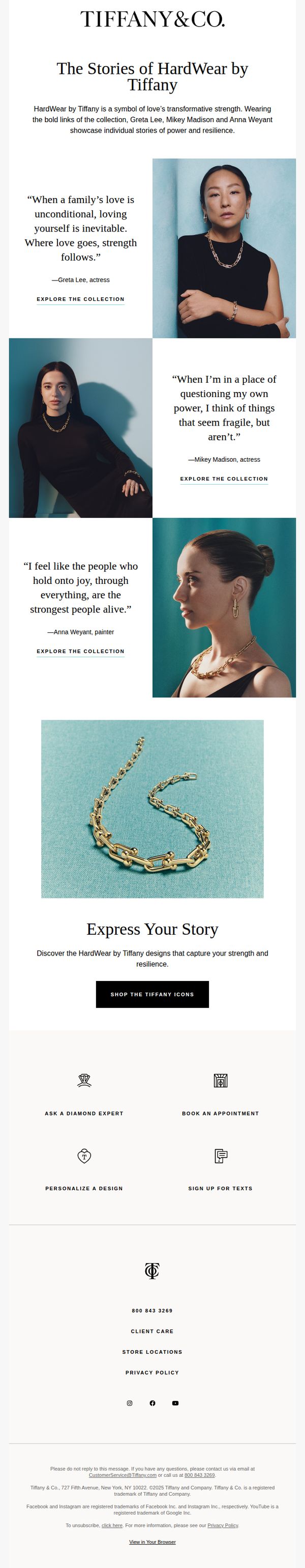
7. Tiffany & Co. - US: Fernan, Embrace the Strength of HardWear by Tiffany
Objective
This email aims to emotionally connect the recipient with the HardWear by Tiffany collection by highlighting personal stories of strength and resilience from real women, encouraging them to see the jewelry as a symbol of their own power and to explore or purchase the collection.
Why this works
Tiffany brilliantly humanizes luxury by anchoring the HardWear collection to authentic, emotionally resonant stories from real women, transforming jewelry from an accessory into a personal emblem of resilience and self-worth.
How to implement
The email strategically uses minimal, high-contrast visuals and clean typography to let the emotional weight of each testimonial shine, proving that luxury marketing doesn’t need clutter, it needs clarity and conviction.
Pro Tip
Add a subtle countdown timer or limited-edition badge near the CTA to create urgency, since the current design lacks any time-sensitive incentive that could nudge hesitant shoppers toward immediate action. • Include a small visual cue or icon next to each 'Explore the Collection' link to indicate it’s clickable, currently, the text blends into the body copy, reducing perceived interactivity and potentially lowering engagement rates.
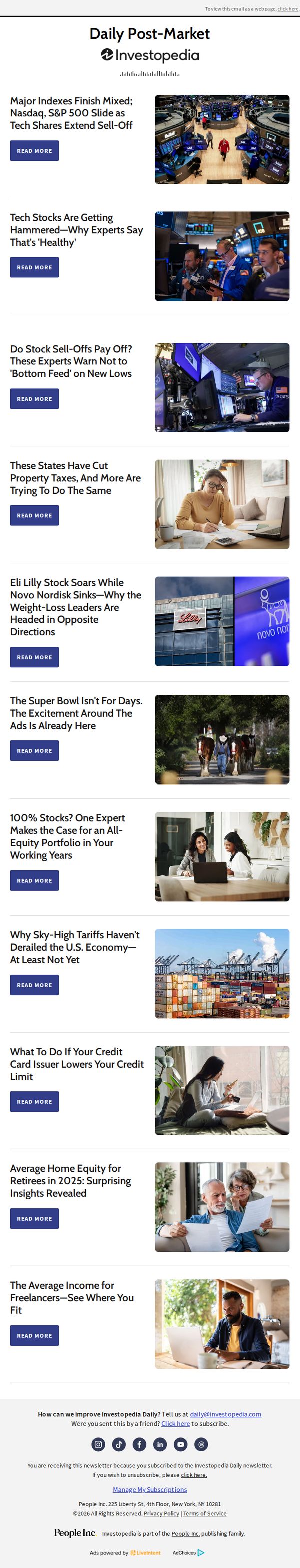
8. Investopedia: Major Indexes Finish Mixed; Nasdaq, S&P 500 Slide as Tech Shares Extend Sell-Off
Objective
This email aims to inform subscribers of the day’s key financial market movements and expert analysis, while driving engagement through article clicks that reinforce Investopedia’s authority as a trusted source for timely, actionable investment insights.
Why this works
The email leads with a high-impact, data-driven headline that immediately signals market relevance, anchoring the reader’s attention with a clear, timely reason to keep reading and reinforcing Investopedia’s role as a market pulse-checker.
How to implement
Each article teaser pairs a provocative, question-driven or expert-quoted headline with a relevant image and a consistent CTA, creating a scannable, trustworthy rhythm that encourages multiple clicks without overwhelming the reader’s decision-making process.
Pro Tip
Add a visual hierarchy to the hero section by increasing the font size of the main headline and using a subtle background tint behind the first article to draw the eye downward, reducing scroll hesitation and boosting first-click conversion. • Include a short, bolded 'Why This Matters' sub-headline under the top article to quickly connect market data to reader impact, e.g., 'This tech pullback could create buying opportunities for long-term investors', to increase perceived relevance and urgency.
9. Children's Hospital of Philadelphia: Cardiac Connections: Heart Month Edition
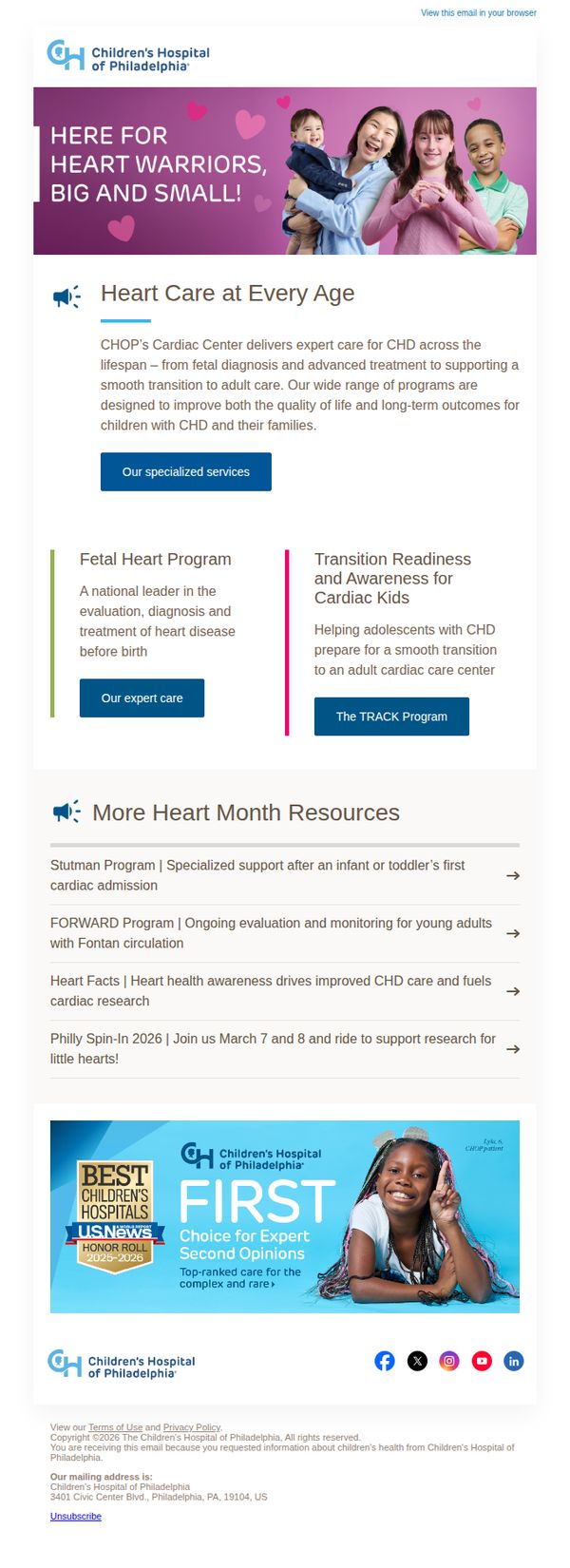
Objective
This email aims to educate families and caregivers about CHOP’s comprehensive cardiac care services across all life stages while promoting Heart Month engagement through awareness resources and community events. It also reinforces CHOP’s authority in pediatric cardiology to build trust and drive service inquiries.
Why this works
The email powerfully humanizes clinical expertise by featuring joyful, diverse families in the hero image, this emotional resonance makes complex medical services feel approachable and deeply personal for anxious parents seeking trustworthy care.
How to implement
By segmenting cardiac care into distinct life-stage programs like Fetal Heart and Transition Readiness, the email strategically reduces overwhelm for caregivers while showcasing CHOP’s end-to-end support system from diagnosis through adulthood with clear, actionable CTAs for each phase.
Pro Tip
Add a countdown timer or urgency indicator near the Philly Spin-In 2026 CTA to increase event registration conversion, since dates are already specified and social proof (‘ride to support research’) is strong but lacks temporal pressure. • Reposition the ‘Our specialized services’ CTA higher in the email or duplicate it after the ‘More Heart Month Resources’ section, as users may scroll past the first CTA without realizing it’s the primary action point for service inquiries.
10. Real Simple: Skincare products to avoid using while you're pregnant
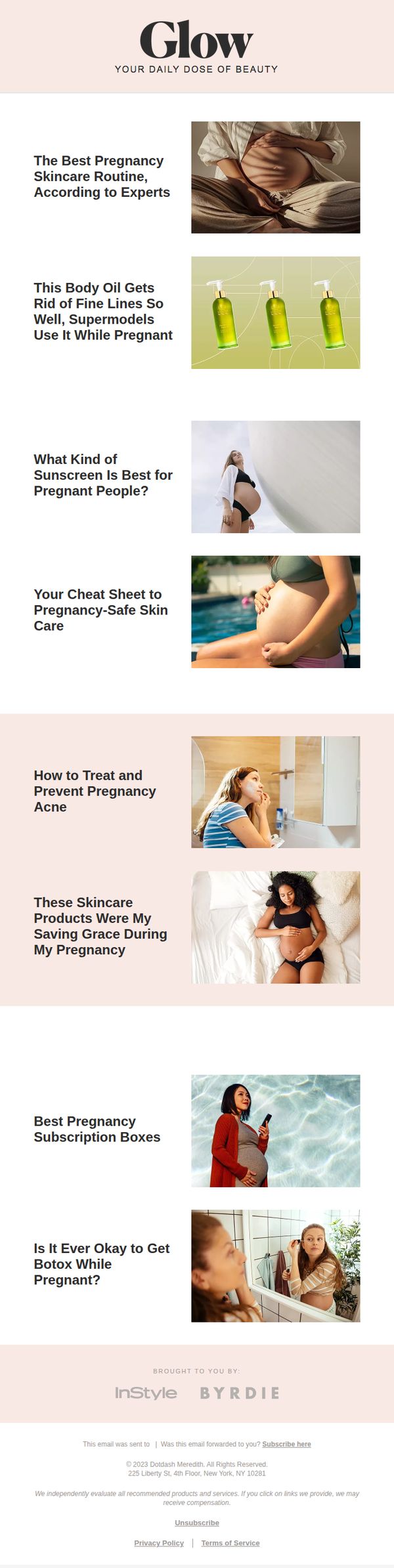
Objective
To educate pregnant readers on safe skincare practices and product choices while positioning the brand as a trusted authority on pregnancy beauty. The email aims to drive engagement through curated, expert-backed content that addresses real concerns during pregnancy.
Why this works
The email strategically frames skincare not as vanity but as maternal wellness, using empathetic headlines like 'Your Cheat Sheet to Pregnancy-Safe Skin Care' to position itself as a compassionate, expert guide rather than a sales pitch.
How to implement
By featuring real-life scenarios, such as supermodels using body oil or women treating pregnancy acne, the email builds emotional resonance and trust, making clinical advice feel personal, relatable, and immediately actionable for expectant mothers.
Pro Tip
Add a primary CTA button after the first article section (e.g., 'Download Your Pregnancy Skincare Checklist') to capture attention early and convert engaged readers before they scroll past the educational content. • Introduce a visual hierarchy using bold subheadings or icons to distinguish between product recommendations, expert advice, and personal stories, helping readers quickly identify content type and increasing scanability for time-constrained pregnant audiences.