Electronics email examples & ideas from real campaigns
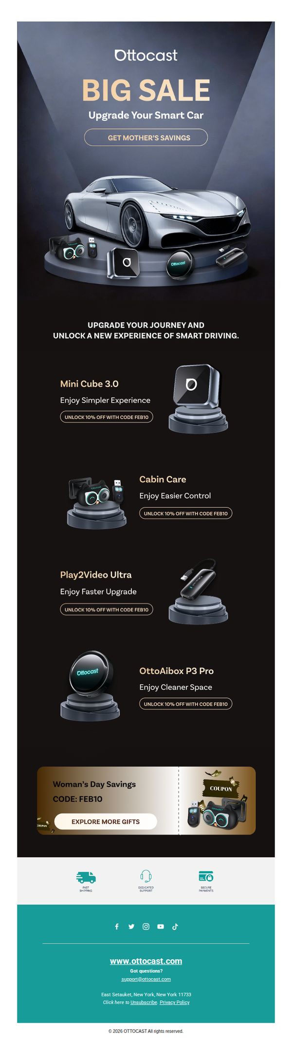
1. Ottocast: Crafted for a More Fluid Driving Experience — Now 10% Off.
Objective
This email aims to drive immediate sales by promoting a limited-time 10% discount on Ottocast’s smart car accessories, while positioning the brand as a premium solution for enhancing the driving experience. It leverages seasonal themes like Mother’s Day to create urgency and emotional resonance.
Why this works
The email brilliantly ties a tech product to an emotional occasion, Mother’s Day, making the discount feel like a thoughtful gift rather than just a sale, which increases perceived value and purchase intent.
How to implement
Each product is paired with a benefit-driven headline like 'Enjoy Simpler Experience' or 'Enjoy Cleaner Space,' which instantly communicates value without requiring the reader to decode technical specs or features.
Pro Tip
Add a countdown timer near the CTA to reinforce urgency, since the current design relies solely on the 'Mother’s Day' theme without a visible deadline, which may reduce conversion pressure. • Include a short testimonial or star rating next to each product to build social proof, as the current layout presents products in isolation without any validation from existing users.
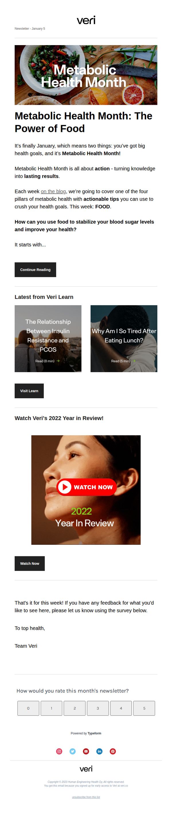
2. veri: Metabolic Health Month: Top Food Tips
Objective
This email aims to engage subscribers during Metabolic Health Month by delivering actionable food-related health tips, driving traffic to educational blog content, and encouraging interaction through a year-in-review video and feedback survey to strengthen community connection and content relevance.
Why this works
The email smartly anchors its message in a timely, themed campaign, Metabolic Health Month, creating urgency and relevance while positioning the brand as a trusted guide for turning health knowledge into real-world action through weekly, pillar-based content.
How to implement
By spotlighting food as the first pillar and immediately offering a clear, benefit-driven question, 'How can you use food to stabilize your blood sugar levels?', the email taps into reader pain points and primes them for practical, science-backed solutions that feel immediately applicable.
Pro Tip
Add a secondary CTA button beneath the 'Continue Reading' that says 'Watch the 2022 Year in Review' to reduce friction and increase video engagement, since the video is visually prominent but currently requires scrolling and an extra click to access. • Integrate a subtle countdown or progress indicator (e.g., 'Week 1 of 4: Food') to reinforce the monthly campaign structure and encourage return visits, helping subscribers mentally track their journey through the four metabolic health pillars.
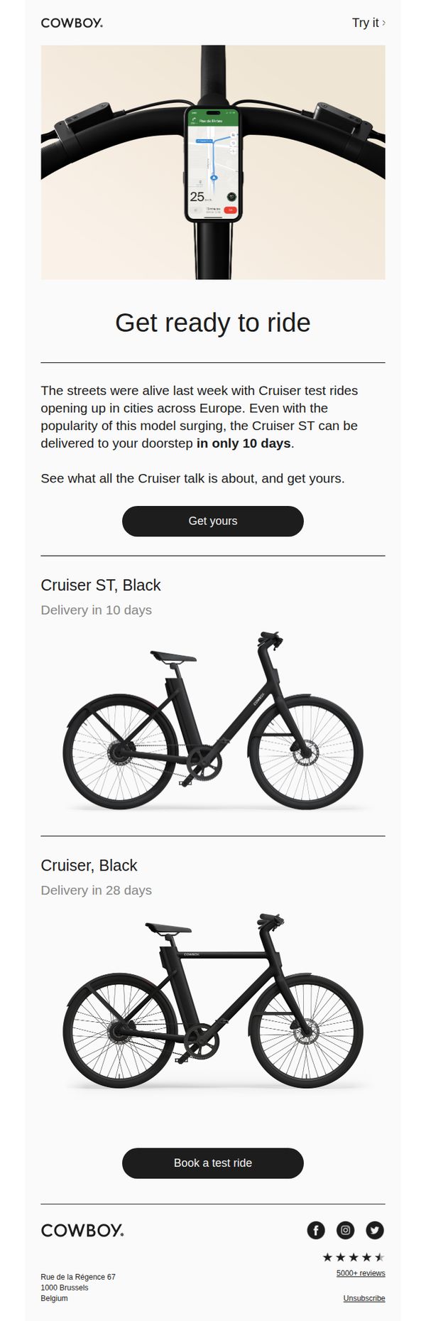
3. Cowboy - EN: Cruiser is ready to ride
Objective
The email aims to convert interest into action by highlighting the immediate availability of the Cruiser ST model and encouraging recipients to either purchase or book a test ride, leveraging social proof from recent test ride events across Europe.
Why this works
The email smartly leverages real-world momentum by referencing recent test rides across Europe, creating urgency and social validation that makes the product feel in-demand and worth acting on immediately.
How to implement
By clearly differentiating delivery timelines between the Cruiser ST (10 days) and Cruiser (28 days), the campaign subtly nudges users toward the faster option without being pushy, enhancing perceived value through scarcity and speed.
Pro Tip
Add a small countdown timer next to the 'Get yours' CTA to reinforce the urgency of the 10-day delivery promise, making the time-sensitive offer more visually compelling and harder to ignore. • Include a short customer testimonial or quote from a recent test rider beneath the hero section to strengthen social proof and emotionally connect with recipients who may be on the fence about booking or buying.
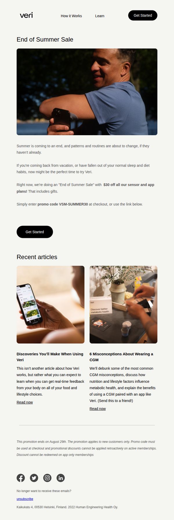
4. veri: End of Summer Sale: Get Started With Veri Today
Objective
The email aims to convert new customers by capitalizing on the seasonal transition from summer to fall, encouraging users to reset health habits with Veri’s metabolic tracking tools through a limited-time $30 discount on sensor and app plans.
Why this works
By tying the promotion to the natural rhythm of seasonal change and post-vacation routine resets, the email taps into a psychologically resonant moment when users are most open to adopting new health behaviors.
How to implement
The offer is clearly framed as a gift-inclusive discount with a specific promo code, reducing friction by giving users a concrete, actionable step that feels exclusive and time-sensitive without overwhelming them with choices.
Pro Tip
Add a countdown timer or visual urgency indicator near the CTA to reinforce the August 29th deadline and increase conversion pressure without cluttering the layout. • Include a short testimonial or user result snippet (e.g., 'I lost 8 lbs and stabilized my energy') near the offer to strengthen social proof and connect the discount to real outcomes.
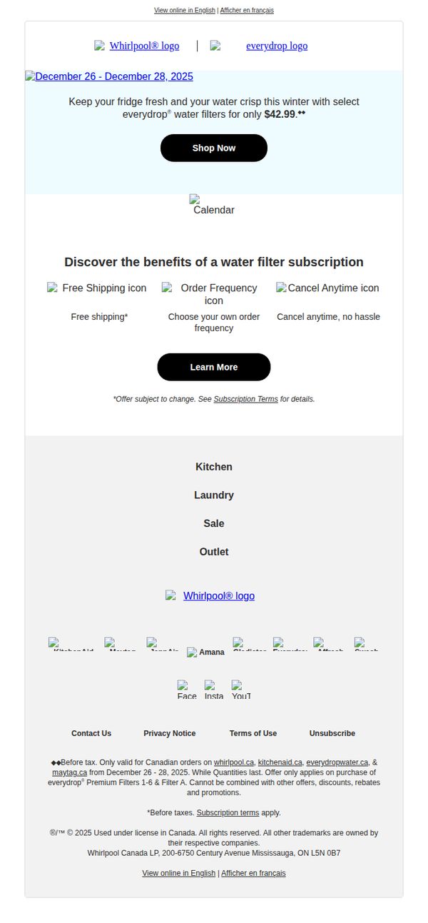
5. Whirlpool - CA: ⚡Hurry! $42.99 water filters ends today
Objective
This email aims to drive immediate purchases of everydrop® water filters by highlighting a limited-time price of $42.99, creating urgency with a time-bound offer valid only from December 26–28, 2025, for Canadian customers.
Why this works
The email masterfully combines urgency and specificity by anchoring the offer to a precise 3-day window, which psychologically compels recipients to act before the deal vanishes, reducing decision fatigue and increasing conversion likelihood.
How to implement
By visually separating the subscription benefits, free shipping, customizable frequency, and hassle-free cancellation, the email reduces perceived risk and builds trust, making the recurring purchase feel flexible and customer-centric rather than locked-in.
Pro Tip
Add a countdown timer beneath the 'Shop Now' button to visually reinforce urgency and create real-time pressure, which has been proven to increase click-through rates in time-sensitive promotions. • Include a customer testimonial or star rating near the offer section to build social proof, especially since water filters are a trust-based purchase, this would reduce hesitation and validate the value of the $42.99 price point.
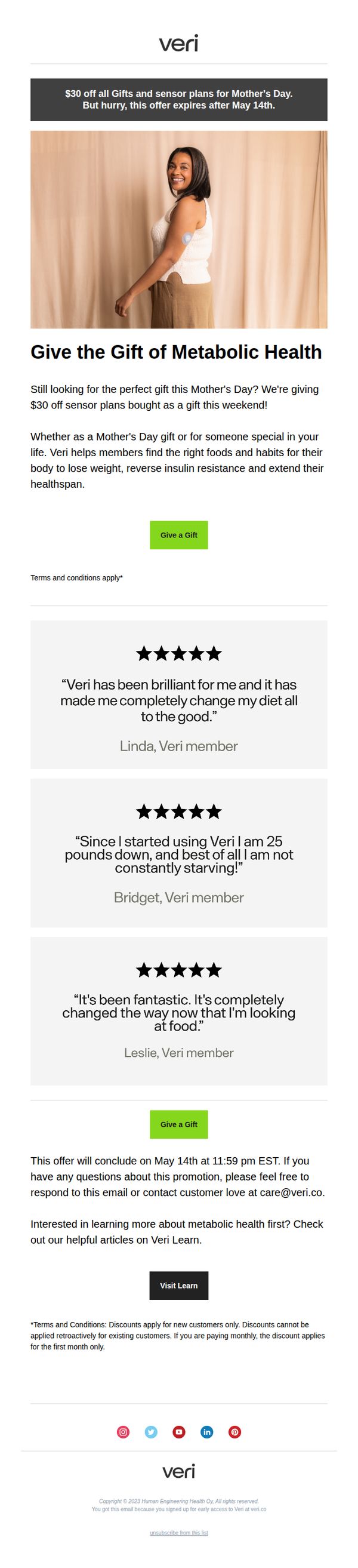
6. veri: Mother's Day Sale: Save $30 on gift plans
Objective
This email aims to drive Mother’s Day gift purchases by promoting a limited-time $30 discount on sensor plans, positioning Veri as a thoughtful, health-focused gift that supports metabolic wellness for loved ones.
Why this works
The email brilliantly frames a health tech product as an emotional Mother’s Day gift by focusing on metabolic wellness outcomes, not gadgets, making it feel personal, caring, and deeply relevant to gift-givers seeking meaningful presents.
How to implement
By featuring real member testimonials with specific, relatable results, like losing 25 pounds or no longer feeling constantly hungry, the campaign builds authentic social proof that reduces skepticism and makes the abstract concept of ‘metabolic health’ feel tangible and achievable.
Pro Tip
Add a small visual indicator, like a countdown timer or ‘Only X days left’ badge, near the CTA to reinforce urgency without disrupting the clean layout, since the deadline is currently buried in fine print at the bottom. • Include a brief ‘How It Works’ bullet list or icon strip under the hero section to clarify what the sensor plan actually is, many gift-givers may not understand metabolic tracking, and a quick explainer could reduce friction and boost conversions.
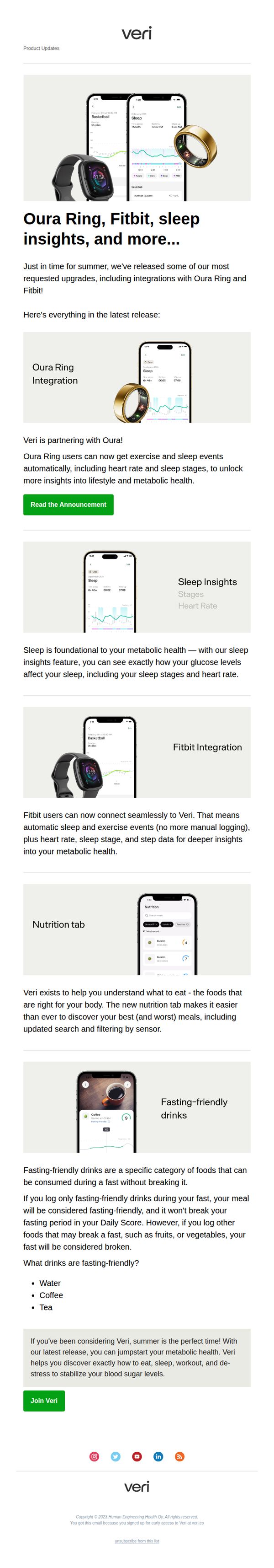
7. veri: NEW - Oura, Fitbit, Sleep Insights and More
Objective
This email aims to inform existing and potential users about Veri’s latest product updates, specifically highlighting new integrations with Oura Ring and Fitbit, enhanced sleep insights, and nutrition tracking features to position Veri as a comprehensive metabolic health platform. It also seeks to convert interested readers into new users by emphasizing timely relevance for summer wellness goals.
Why this works
By aligning product updates with seasonal timing, like summer wellness, the email creates urgency and relevance, making users feel the upgrades aren’t just new features but timely tools to enhance their current lifestyle goals.
How to implement
The email smartly groups each feature update with a clear visual (device + app screenshot) and a concise benefit statement, allowing readers to quickly grasp value without cognitive overload, ideal for busy health-conscious users.
Pro Tip
Add a short testimonial or user quote near the CTA to build social proof, since the email targets new users, hearing from existing users who benefited from these integrations could significantly boost conversion confidence. • Include a subtle visual hierarchy or numbered progression (e.g., '3 Ways Veri Just Got Smarter') to guide the reader through the updates more intentionally, reducing cognitive load and reinforcing the cumulative value of the release.
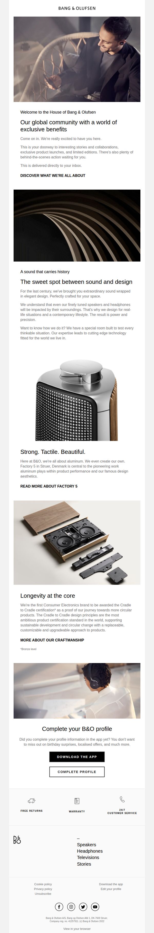
8. Bang & Olufsen: Welcome to the House of Bang & Olufsen
Objective
This email aims to warmly welcome new subscribers into the Bang & Olufsen community by introducing them to the brand’s heritage, design philosophy, and exclusive benefits, while encouraging profile completion to unlock personalized experiences.
Why this works
The email masterfully blends emotional storytelling with product craftsmanship, positioning Bang & Olufsen not just as a tech brand but as a curator of lifestyle moments shaped by sound and design excellence.
How to implement
By spotlighting Factory 5 and Cradle to Cradle certification, the brand leverages transparency and sustainability as powerful differentiators, turning technical details into compelling brand values that resonate with conscious consumers.
Pro Tip
Add a secondary CTA beneath the 'Complete your B&O profile' section that says 'Explore New Releases' to capitalize on the momentum of brand storytelling and drive immediate product discovery. • Include a subtle visual indicator, such as a progress bar or icon, next to 'Complete Profile' to gamify the action and increase completion rates by making the task feel more tangible and rewarding.
9. Bang & Olufsen: Verify your email
Objective
This email aims to confirm the user’s email address to ensure future communications about Bang & Olufsen products and services are delivered successfully, while reinforcing brand trust through a clean, minimalist design.
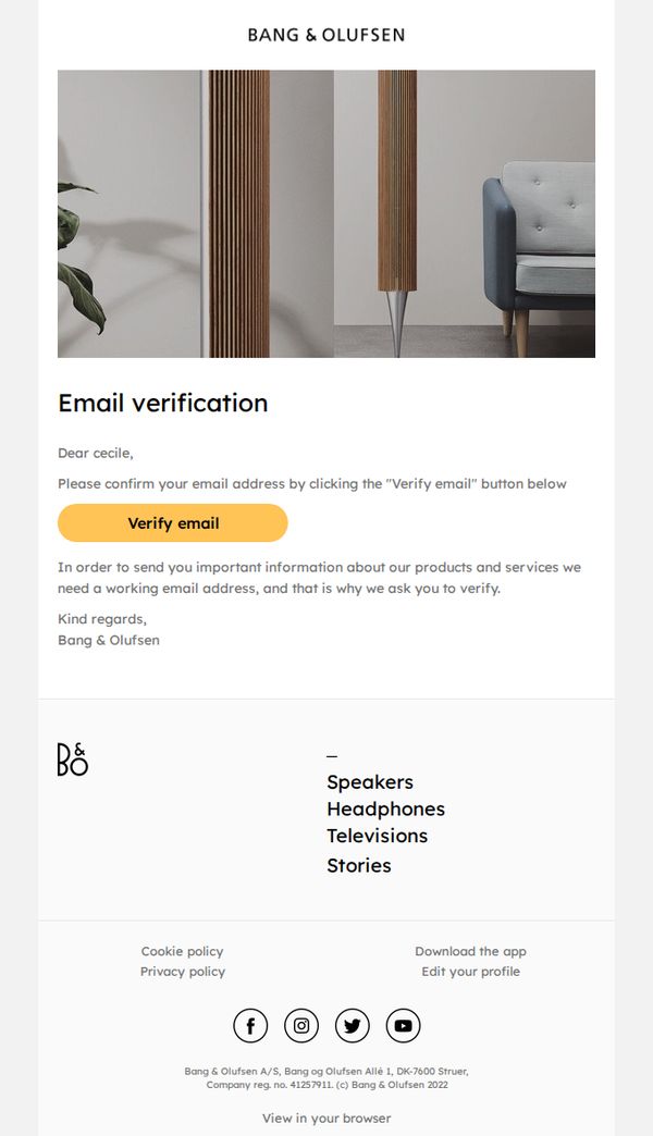
Why this works
The email uses a serene, high-end lifestyle image that subtly reinforces brand identity without distracting from the core action, a masterclass in luxury brand minimalism that prioritizes user focus.
How to implement
By personalizing the greeting with the recipient’s name and clearly explaining why verification matters, the email builds trust and reduces friction, making users more likely to complete the action without hesitation.
Pro Tip
Add a secondary CTA or reminder text near the bottom, such as 'Didn’t receive the email? Check spam or request a new link,' to reduce drop-offs from users who may have missed the initial verification prompt. • Include a subtle visual cue, like a progress bar or checkmark icon, next to the CTA to reinforce that this is a simple, one-step process, reducing perceived effort and increasing completion rates.
10. veri: The Truth About Ozempic And Other GLP-1 Agonists
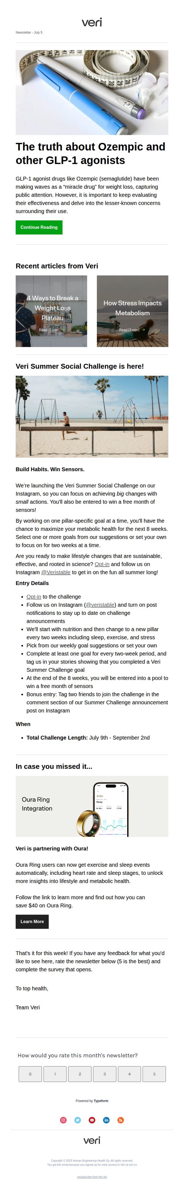
Objective
This email aims to educate subscribers on the realities of GLP-1 agonists like Ozempic while positioning Veri as a science-backed, holistic health partner that offers sustainable lifestyle solutions beyond pharmaceuticals. It also drives engagement through a social challenge and promotes a product partnership.
Why this works
The email smartly reframes the Ozempic conversation by acknowledging its popularity while redirecting focus to sustainable, science-backed lifestyle habits, positioning Veri as the thoughtful alternative to quick-fix solutions.
How to implement
By launching a time-bound social challenge with clear entry rules and a tangible reward (free sensors), the campaign turns passive readers into active participants, creating community momentum while subtly reinforcing Veri’s core mission of metabolic health.
Pro Tip
The primary CTA 'Continue Reading' is buried under a long hero paragraph; move it higher or add a secondary CTA button after the intro to reduce friction for readers who want to dive deeper immediately. • The Summer Challenge section is text-heavy and lacks visual hierarchy, break up the bullet points with icons or subheadings, and add a countdown timer or progress bar to reinforce urgency and participation.