The complete NPS email collection from real brands
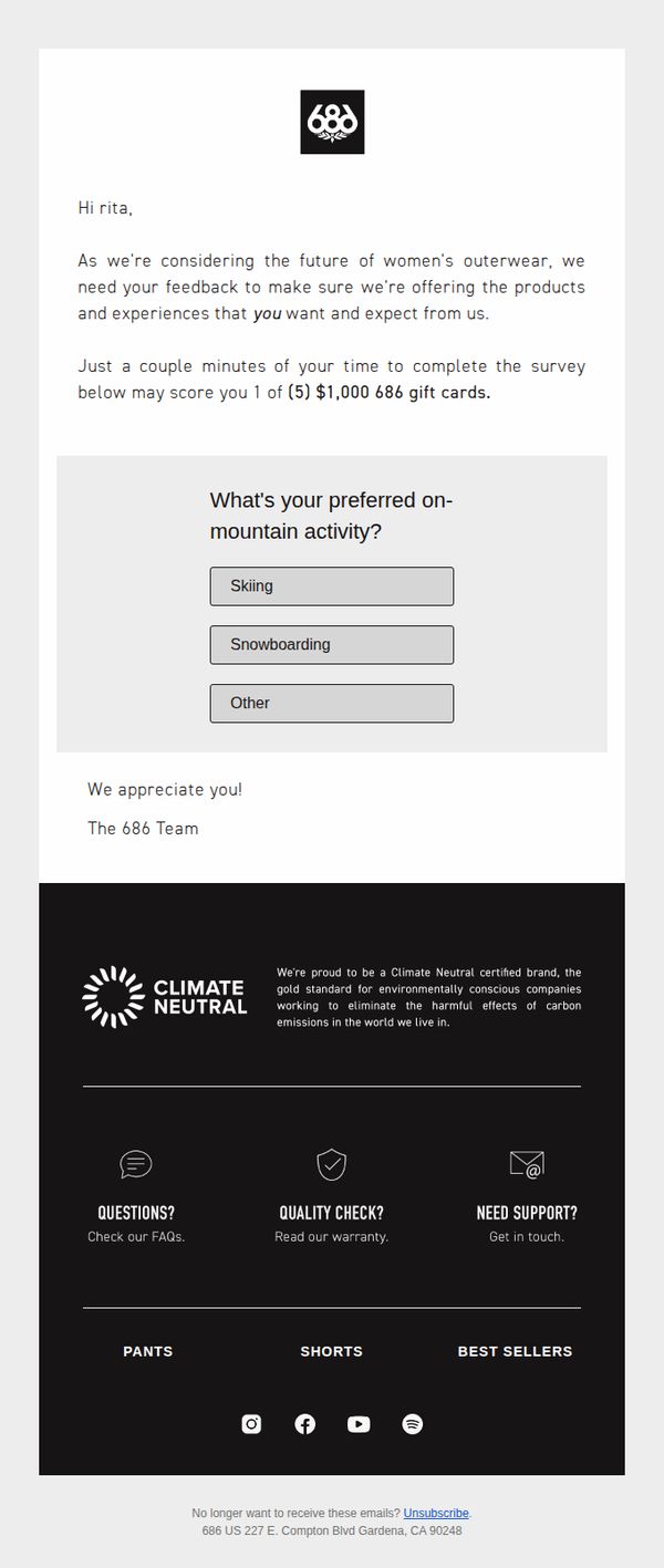
1. 686: Women's Outerwear Survey
Objective
The email aims to gather customer feedback on women’s outerwear preferences to inform future product development, while incentivizing participation with a chance to win one of five $1,000 gift cards.
Why this works
The email personalizes the recipient’s experience by addressing them by name and directly tying their input to future product decisions, which builds emotional investment and increases survey completion rates.
How to implement
By framing the survey as a collaborative effort to shape the future of women’s outerwear, the brand positions itself as customer-centric and values-driven, reinforcing loyalty beyond transactional engagement.
Pro Tip
Add a progress indicator or estimated time to complete the survey to reduce perceived effort and increase completion rates, especially since the incentive is high-value and the ask is minimal. • Include a visual element or icon next to the survey question to break up text-heavy sections and guide the eye toward the interactive buttons, improving engagement and reducing cognitive load.
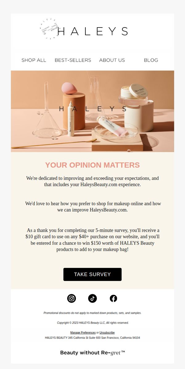
2. Haleys: Don't forget to fill out our 5-minute survey
Objective
This email aims to encourage recipients to complete a short customer feedback survey by emphasizing that their opinion directly shapes the brand’s online experience, while incentivizing participation with a $10 gift card and a chance to win $150 in products.
Why this works
The email positions the survey not as a chore but as a meaningful contribution to the brand’s evolution, making customers feel like co-creators of their shopping experience rather than passive respondents.
How to implement
By bundling a guaranteed $10 gift card with a high-value sweepstakes entry, the campaign transforms a low-effort task into a compelling win-win proposition that appeals to both practical and aspirational shoppers.
Pro Tip
Add a subtle countdown timer or urgency indicator near the CTA to nudge procrastinators, for example, 'Survey closes in 48 hours', to increase immediate click-through without compromising the email’s calm aesthetic. • Include a single short testimonial or quote from a past survey respondent (e.g., 'Your feedback helped us launch our best-selling setting spray!') to build social proof and reinforce that responses actually drive real product and experience changes.
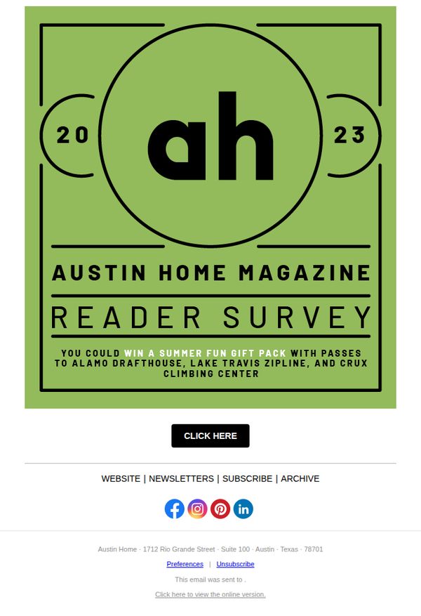
3. Austin Monthly: Take Our Reader Survey and You Could Win a Summer Fun Gift Pack
Objective
This email aims to drive reader engagement by encouraging participation in the Austin Home Magazine 2023 reader survey, with the incentive of winning a summer fun gift pack featuring local experiences. It seeks to gather audience insights while reinforcing brand loyalty through experiential rewards.
Why this works
The email effectively ties community-focused rewards, like passes to local attractions, to survey participation, making the ask feel less transactional and more like a shared local experience that readers genuinely want to be part of.
How to implement
Using a bold, minimalist graphic with the year and magazine initials creates instant brand recognition and visual authority, helping the survey feel like an official, annual tradition rather than a random request.
Pro Tip
Add a brief, compelling reason why the survey matters, such as 'Help us shape next year’s Austin Home Magazine content', to increase perceived value and reduce survey abandonment. • Include a small visual or icon next to the CTA button indicating urgency or exclusivity (e.g., 'Only 10 gift packs available') to create scarcity and boost click-through rates.
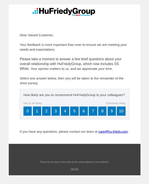
4. HuFriedyGroup : Reminder: HuFriedyGroup Requests Your Feedback
Objective
This email aims to gently remind valued customers to complete a short feedback survey, emphasizing the importance of their opinion in helping HuFriedyGroup meet expectations and improve service since the inclusion of SS White.
Why this works
By framing feedback as essential to meeting customer needs, not just collecting data, the email positions the recipient as a valued partner in the brand’s evolution, which increases emotional investment and response likelihood.
How to implement
Mentioning the SS White acquisition within the survey context subtly reinforces brand growth and integration without overshadowing the core ask, making the request feel timely and relevant rather than generic.
Pro Tip
Add a subtle visual cue like a progress bar or '1 of 3 questions' indicator after the first question to reduce perceived effort and encourage completion of the full survey. • Include a brief, personalized subject line or preheader text referencing the recipient’s recent purchase or interaction to increase relevance and open rates, especially since this is a reminder email.
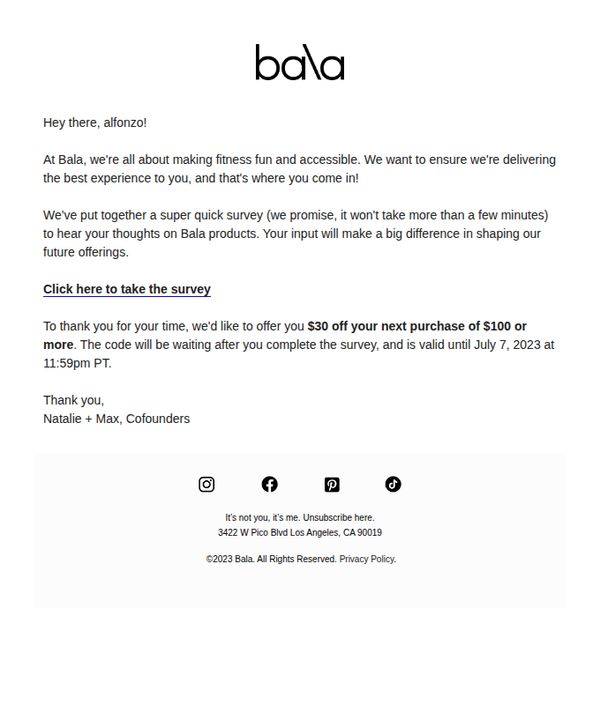
5. Bala: Take Our Survey, Get $30 🤸🏼♀️
Objective
This email aims to encourage customer participation in a short feedback survey by offering a $30 discount on a future $100+ purchase, strengthening customer loyalty while gathering insights to improve product offerings.
Why this works
The email opens with a warm, personalized greeting that immediately builds rapport, making the recipient feel seen and valued rather than just another customer in a database.
How to implement
By framing the survey as a quick, impactful way to shape future products, the brand transforms a routine request into a collaborative mission that flatters the customer’s opinion and boosts participation.
Pro Tip
Add a subtle visual cue or icon next to the CTA link to draw the eye, currently, the plain text link blends into the body and may be overlooked in a cluttered inbox. • Include a brief, bolded line above the CTA stating 'Survey takes 2 minutes' to reinforce the time commitment and reduce perceived friction for hesitant respondents.
6. Technology Therapy Group : Feedback vs Facts: There’s a Difference
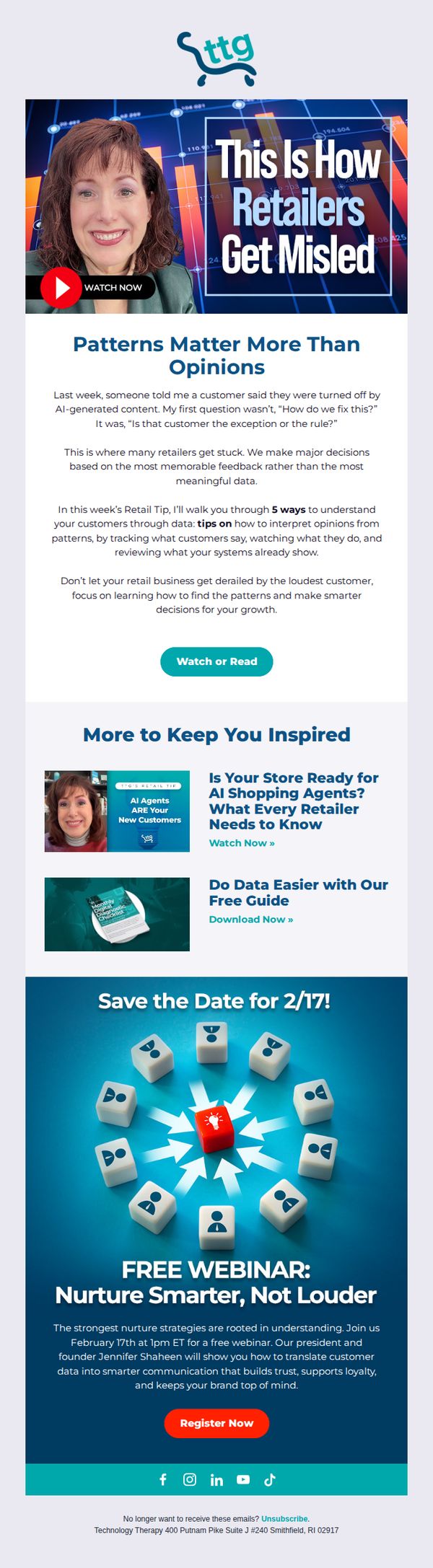
Objective
This email aims to educate retail professionals on distinguishing customer feedback from meaningful data patterns, while driving registrations for an upcoming webinar that teaches how to translate data into smarter, trust-building communication strategies.
Why this works
The email opens with a relatable retail pain point, customer backlash against AI content, and immediately reframes it as a data interpretation challenge, making the message feel urgent and personally relevant to the reader’s daily decisions.
How to implement
By positioning the founder as the webinar host and tying the event to a specific date with a visual countdown metaphor (dice with arrows), the email creates both authority and time-sensitive urgency without resorting to generic hype or pressure tactics.
Pro Tip
The primary CTA 'Watch or Read' is buried below a long educational section; moving it higher or adding a sticky CTA bar would improve conversion by reducing friction for readers who want immediate access to the content. • The webinar section uses a generic red button that clashes with the brand’s teal and blue palette; redesigning the CTA to match the brand’s dominant colors would improve visual cohesion and reinforce brand recognition.
7. Norwegian Cruise Line (NCL): Don't miss it!
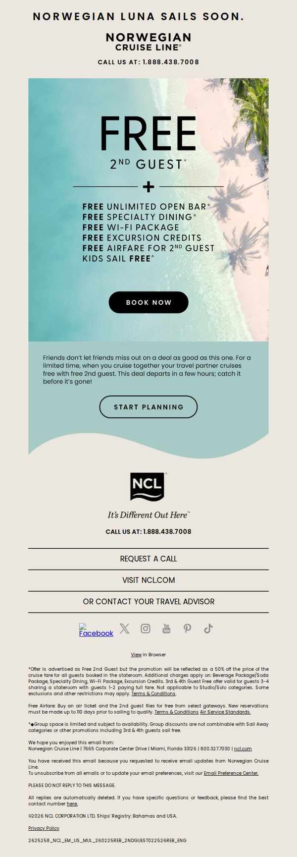
Objective
This email aims to drive immediate bookings for the Norwegian Luna by highlighting a limited-time offer that includes a free second guest and multiple complimentary amenities, creating urgency through time-sensitive messaging and social proof.
Why this works
The email brilliantly leverages the psychology of reciprocity by bundling multiple free perks, like open bar, Wi-Fi, and excursions, making the core offer feel like an irresistible value rather than just a price discount.
How to implement
By framing the deal as 'Friends don’t let friends miss out,' the campaign taps into social FOMO and relationship-driven decision-making, subtly positioning the cruise as a shared experience worth prioritizing with loved ones.
Pro Tip
Add a visible countdown timer near the 'BOOK NOW' button to visually reinforce urgency and reduce decision latency, especially since the email mentions the deal departs 'in a few hours.' • Include a testimonial or social proof element, such as a short quote or star rating from a past cruiser, between the offer section and CTA to build trust and reduce perceived risk for first-time buyers.
8. Fortune: Future employees are already burned out
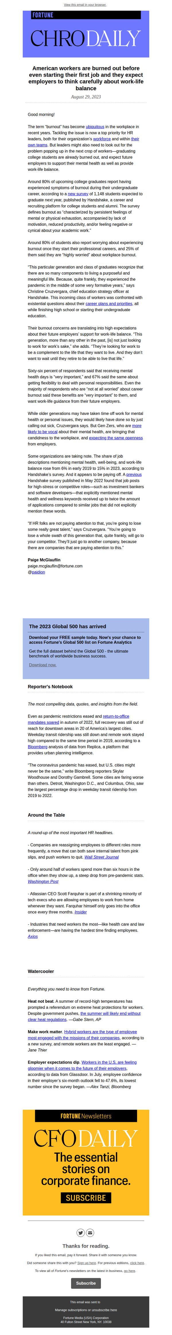
Objective
This email aims to inform HR leaders and business decision-makers about rising burnout among college graduates entering the workforce, urging employers to prioritize mental health and work-life balance to attract top talent. It also promotes Fortune’s Global 500 dataset and CFO Daily newsletter as valuable resources for strategic business insights.
Why this works
The email opens with a provocative, data-backed headline that immediately resonates with HR leaders by framing burnout as a pre-employment crisis, making the issue feel urgent and relevant to talent acquisition strategy rather than just employee retention.
How to implement
By embedding a high-value, gated offer, the Global 500 dataset, within a timely, emotionally compelling narrative, the email transforms a news digest into a lead generation engine without disrupting the reader’s experience or diluting the editorial tone.
Pro Tip
The primary CTA ‘Download now’ is visually underwhelming and buried beneath the article; it should be redesigned with higher contrast, larger font, and positioned immediately after the key statistic (‘80% of students report burnout’) to capitalize on emotional momentum. • The footer’s ‘Subscribe’ button competes with the main CTA and lacks context, it should be repositioned below the newsletter promo block with clearer value messaging (e.g., ‘Get daily finance insights like this’) to reduce friction and increase conversion.
9. Hargreaves Lansdown: Ready to make the move?
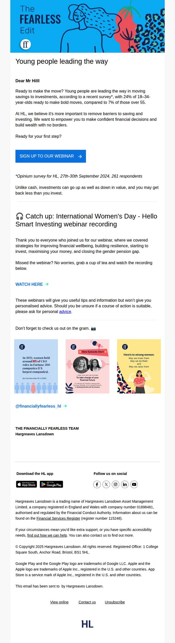
Objective
This email aims to inspire younger investors to take their first step into investing by highlighting generational trends and offering educational resources, while positioning Hargreaves Lansdown as a supportive, barrier-free partner in building long-term wealth.
Why this works
The email smartly leverages generational data to create urgency and relevance, showing younger audiences they’re not alone in taking bold financial steps, a powerful psychological nudge that turns statistics into social proof.
How to implement
By anchoring the CTA around a webinar rather than a direct product sale, the campaign builds trust through education first, subtly guiding users toward action without triggering resistance or perceived pressure to commit immediately.
Pro Tip
Add a subtle countdown timer or urgency indicator near the webinar CTA to increase immediate sign-ups, especially since the survey data implies time-sensitive behavioral momentum among younger investors. • Include a short testimonial or quote from a young investor who took action after a similar webinar, this would strengthen social proof and reduce perceived risk for first-time users.
10. Sobeys - CA: It’s game time: the Milano-Cortina Olympics have begun!
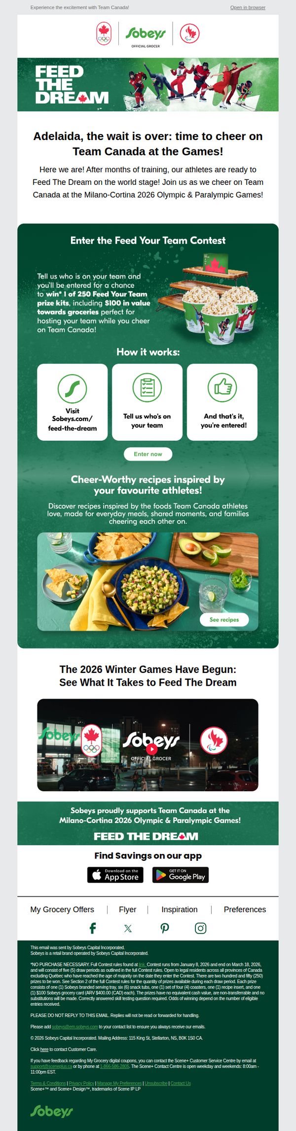
Objective
This email aims to energize customers around Team Canada’s participation in the Milano-Cortina 2026 Olympics while driving engagement through a branded contest and recipe content that ties grocery shopping to national pride and family moments.
Why this works
The email brilliantly ties national pride to everyday grocery shopping by framing Team Canada’s Olympic journey as a shared family experience, making the brand feel like a co-celebrant rather than just a retailer.
How to implement
By offering a contest with tangible grocery-related prizes and a simple three-step entry process, the campaign lowers the barrier to participation while subtly encouraging future store visits and app downloads.
Pro Tip
Add a countdown timer near the contest CTA to create urgency, since the contest runs until March 18, 2026, a distant date that currently lacks time-sensitive motivation for immediate action. • Include a small testimonial or quote from a Team Canada athlete about their favorite meal or grocery staple to humanize the campaign and strengthen the emotional link between athletes and everyday shoppers.