Gym Gum email examples & ideas
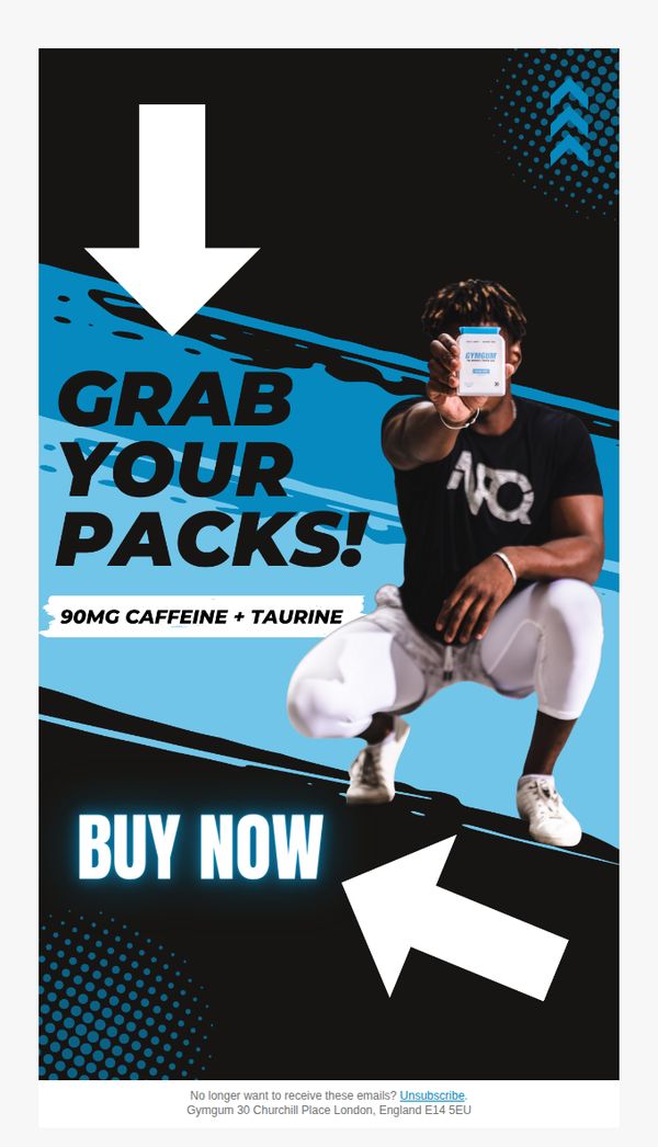
1. grab some Gymgum packs!
Objective
The email aims to drive immediate product purchases by highlighting Gym Gum’s energizing formula and using bold visual cues to create urgency and action. It targets fitness enthusiasts seeking a quick energy boost before or during workouts.
Why this works
The email uses a dynamic, action-oriented hero image with a real athlete holding the product, instantly communicating authenticity and performance benefits while drawing the eye to the core offering.
How to implement
Bold, high-contrast typography paired with directional arrows creates an intuitive visual flow that guides the reader straight to the CTA, reducing friction and increasing conversion likelihood.
Pro Tip
Add a short testimonial or social proof near the CTA to reinforce credibility, e.g., 'Trusted by 10,000+ athletes', to reduce hesitation for first-time buyers. • Include a subtle urgency element like a countdown timer or limited stock indicator near the 'BUY NOW' button to nudge immediate action without overwhelming the minimalist design.
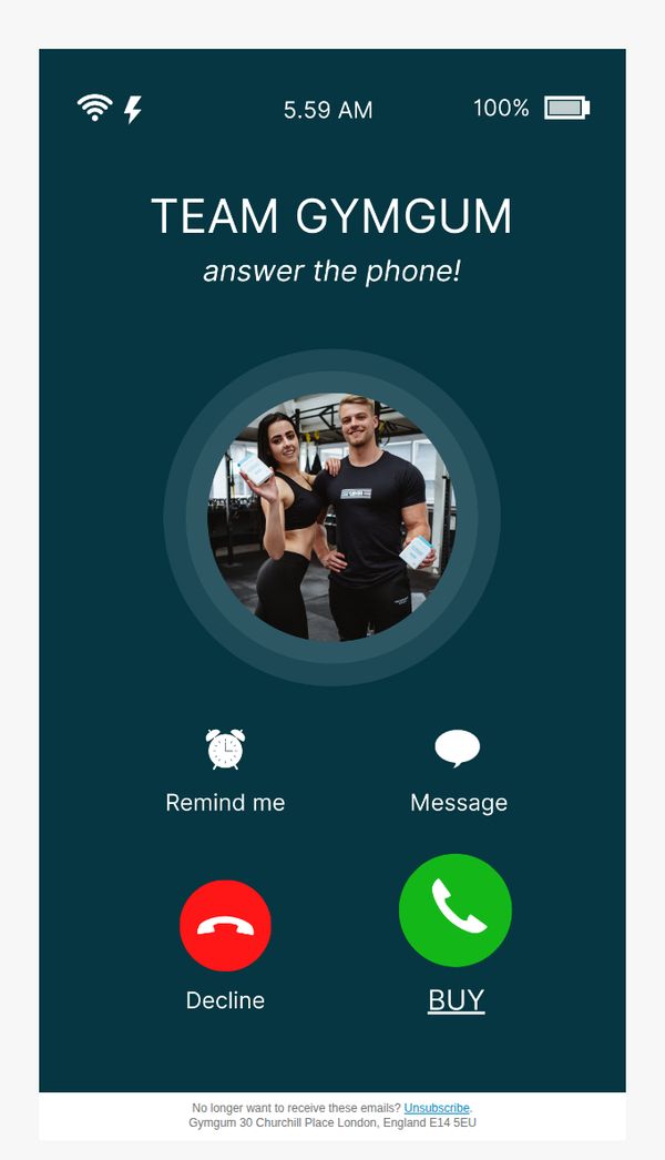
2. PHONE CALL INCOMING...
Objective
This email aims to create urgency and personal connection by mimicking an incoming phone call from the brand team, encouraging immediate engagement and conversion through a playful, interactive design that turns a purchase into a 'call to action'.
Why this works
The email brilliantly hijacks the user’s attention by simulating a phone call interface, turning a static email into an interactive moment that feels urgent, personal, and impossible to ignore, a masterclass in experiential marketing.
How to implement
By replacing the traditional 'Answer' button with 'BUY', the campaign seamlessly merges emotional engagement with conversion, making the purchase feel like a natural, instinctive response rather than a sales pitch, a clever psychological nudge.
Pro Tip
Add a micro-copy line under the 'BUY' button like 'Limited stock, 87% sold out' to reinforce urgency and reduce hesitation, since the current design lacks social proof or scarcity cues that could boost conversion. • Include a tiny 'What you’ll get' tooltip or hover hint near the 'BUY' button to clarify the product benefit instantly, many users may hesitate without knowing what they’re buying, especially in this playful, abstract format.
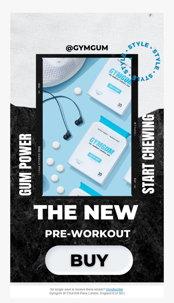
3. the new pre-workout 🧪
Objective
To introduce and drive immediate purchases of Gym Gum’s new pre-workout chewing gum by positioning it as a stylish, convenient, and effective alternative to traditional pre-workout supplements.
Why this works
The email brilliantly frames the product as a lifestyle upgrade, not just a supplement, by pairing it with trendy gym gear and using bold, vertical typography that screams modern fitness culture.
How to implement
By using a minimalist product shot against a clean blue background, the email instantly communicates freshness, science, and simplicity, subtly reassuring users that this pre-workout is both effective and easy to use.
Pro Tip
Add a short social proof element, like a micro-testimonial or star rating, near the CTA to reduce perceived risk and reinforce credibility for first-time buyers. • Include a brief benefit-driven subheadline under 'THE NEW PRE-WORKOUT' (e.g., 'Chew. Energize. Crush Your Workout.') to clarify the product’s value proposition before the user even scrolls.