Menshealth campaign ideas that work
1. Peter MD : There's more to what you saw 👀
Objective
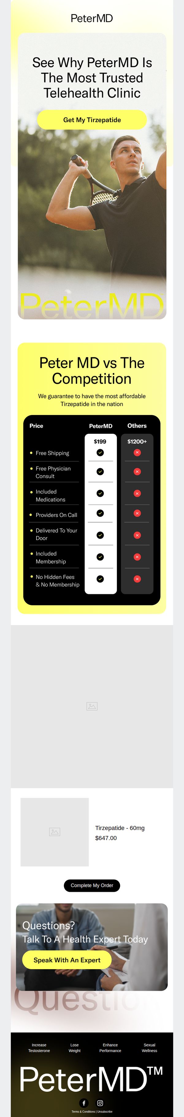
The email aims to convert curious prospects into customers by positioning PeterMD as the most trusted and affordable telehealth clinic for Tirzepatide, using social proof, price comparison, and urgency to drive immediate action.
Why this works
The email brilliantly leverages a competitive comparison table to visually reinforce value, making PeterMD’s $199 offer feel like an unbeatable deal against competitors charging $1200+, which instantly builds trust and justifies the purchase decision.
How to implement
By featuring a confident, active male model mid-swing, the campaign subtly associates the product with vitality and performance, tapping into aspirational identity rather than just medical need, a smart emotional hook for male audiences seeking wellness transformation.
Pro Tip
The product grid section shows a placeholder image and price ($647.00) that contradicts the hero’s $199 offer, this creates confusion and undermines trust; either remove the grid or align pricing and visuals to reflect the advertised deal. • The testimonial section lacks real user quotes or photos, making the ‘Talk To A Health Expert’ CTA feel generic; adding a short video clip or verified customer quote would significantly boost credibility and conversion potential.
2. Prime Male: Are Carbs Really the Enemy? 🍞 Ask a PT
Objective
This email aims to educate subscribers on the nuanced role of carbohydrates in weight loss while subtly positioning Prime Male and related supplements as smart, science-backed tools to support sustainable health goals. It also drives immediate sales through a time-sensitive Boxing Day promotion.
Why this works
The email brilliantly reframes a common diet myth by leading with education instead of a hard sell, building trust through nuance and science before ever mentioning a product, which makes the eventual offer feel like a natural next step rather than a pushy pitch.
How to implement
By anchoring the promotion to a real-time cultural moment, Boxing Day, and pairing it with a 'last chance' urgency trigger, the campaign leverages emotional timing and FOMO without sacrificing the educational tone that keeps the audience engaged and receptive.
Pro Tip
The CTA 'ORDER HERE' is visually underwhelming and repeated identically under each product; it should be personalized per product (e.g., 'Get Prime Male Vitality + Free Workout') and styled with stronger contrast or animation to draw the eye and reduce visual fatigue. • The educational section, while valuable, lacks a clear visual transition into the sales section, adding a subtle divider, icon, or micro-headline like 'Ready to Apply These Tips? Start With Your Perfect Supplement' would better guide the reader from learning to buying.
3. Jack: 🚨 Don't Miss Tomorrow's Flash Sale!
Objective
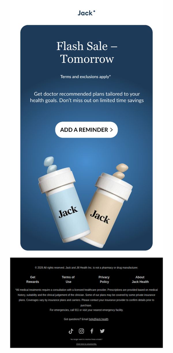
This email aims to drive urgency and anticipation for a flash sale happening tomorrow by positioning Jack’s offerings as doctor-recommended and personalized to the recipient’s health goals. It encourages immediate action through a reminder feature to ensure users don’t miss the limited-time savings.
Why this works
The email brilliantly leverages urgency by anchoring the flash sale to tomorrow, creating a time-bound psychological trigger that compels recipients to act now rather than delay, which is especially effective for health-related purchases where decision-making is often cautious.
How to implement
By emphasizing 'doctor recommended plans tailored to your health goals,' the campaign builds instant credibility and personalization, transforming a generic sale into a trusted, individualized health solution, a powerful emotional hook that elevates perceived value beyond price alone.
Pro Tip
Add a countdown timer or 'X hours left to set reminder' beneath the CTA to reinforce urgency and increase reminder opt-ins by making the time constraint visually immediate rather than abstract. • Include a brief testimonial or social proof near the CTA, such as 'Over 10,000 customers set reminders last flash sale', to reduce hesitation and boost conversion by validating the offer’s popularity and trustworthiness.
4. Peter MD : Say goodbye to this 👋
Objective
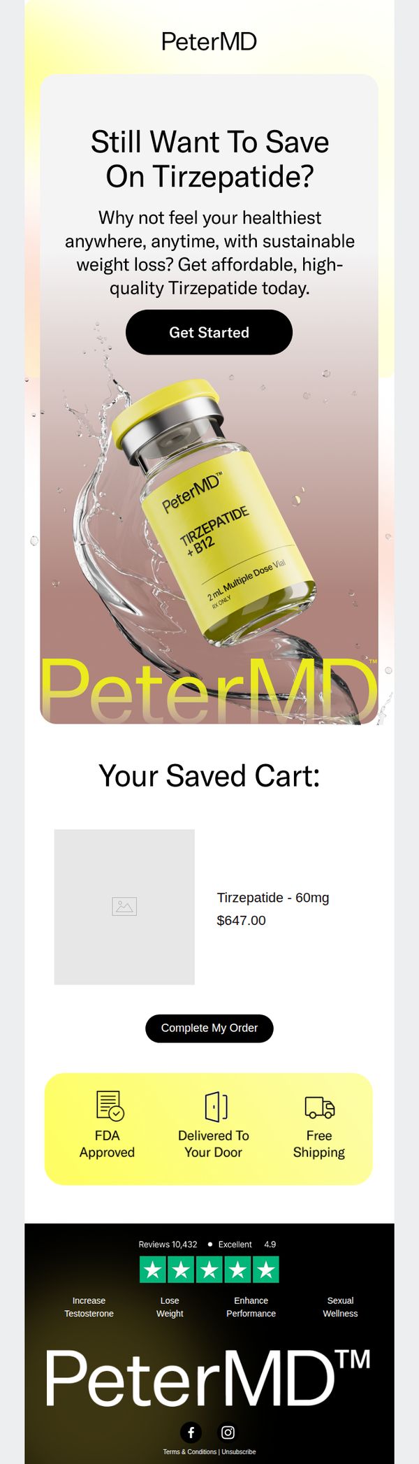
The email aims to re-engage users who previously showed interest in Tirzepatide by reminding them of their saved cart and encouraging immediate purchase through urgency and trust signals. It positions PeterMD as a reliable, FDA-approved source for affordable, high-quality weight loss solutions.
Why this works
The email leverages cart abandonment psychology by visually reminding users of their saved item, creating a sense of continuity and reducing friction in returning to complete the purchase.
How to implement
It strategically combines emotional appeal with clinical credibility, using phrases like 'FDA Approved' and 'sustainable weight loss' to reassure skeptical buyers while tapping into their desire for transformation.
Pro Tip
Add a countdown timer or limited-availability notice near the 'Complete My Order' button to amplify urgency and reduce hesitation for users who may still be on the fence. • Include a short, authentic customer testimonial or before/after visual near the saved cart section to reinforce social proof and reduce perceived risk for first-time buyers.
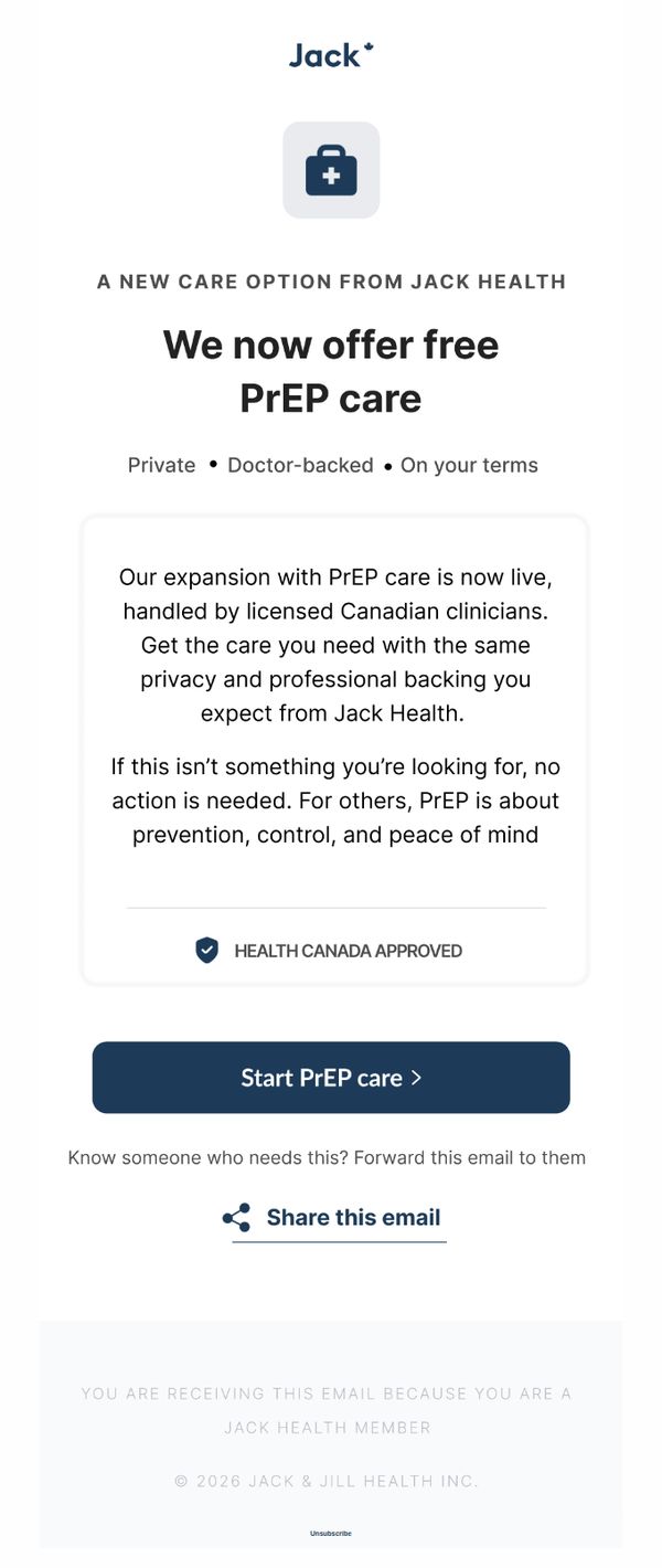
5. Jack: 🚨 New! Get PrEP with Jack Health
Objective
To inform existing Jack Health members about the new availability of free PrEP care, emphasizing privacy, medical backing, and Canadian regulatory approval, while encouraging immediate sign-up or sharing with others who may benefit.
Why this works
The email opens with a bold, benefit-driven headline that immediately communicates value, free PrEP care, while anchoring trust through descriptors like 'Private,' 'Doctor-backed,' and 'On your terms' to reduce hesitation and build credibility.
How to implement
By explicitly stating that no action is needed if the service isn’t relevant, the email reduces pressure and respects the recipient’s autonomy, which paradoxically increases the likelihood of engagement from those who do need it by removing perceived obligation.
Pro Tip
Add a brief FAQ or 'How It Works' section beneath the CTA to preemptively answer common questions about eligibility, prescription process, or delivery, reducing friction for hesitant users who may abandon before clicking. • Include a testimonial or user stat (e.g., '92% of users start care within 24 hours') near the CTA to build social proof and urgency, reinforcing that others have already taken the step successfully.
6. Jack: ⚠️ Last Call: Get 25% Off Today!
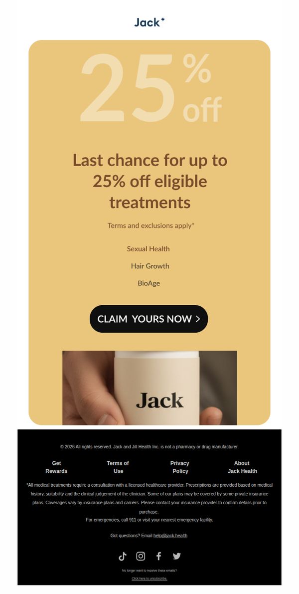
Objective
This email aims to create urgency and drive immediate conversions by reminding subscribers that today is their final opportunity to claim 25% off eligible health treatments, leveraging time-sensitive messaging to reduce cart abandonment and boost same-day sales.
Why this works
The email masterfully combines urgency with specificity by using 'Last Call' in the subject line and reinforcing it with 'Last chance for up to 25% off' in the body, which psychologically nudges recipients to act before the window closes permanently.
How to implement
By listing eligible treatment categories, Sexual Health, Hair Growth, BioAge, directly under the discount offer, the email reduces cognitive load and helps subscribers instantly self-qualify, making the decision to click through feel faster and more relevant to their personal needs.
Pro Tip
Add a countdown timer or 'Offer expires in [X] hours' directly above the CTA to amplify urgency visually, since the current design relies solely on text, which may not trigger the same immediate behavioral response in time-sensitive shoppers. • Include a small testimonial or social proof snippet near the CTA, such as 'Over 10,000 men claimed this offer last week', to reduce perceived risk and increase trust, especially since the treatments are health-related and require higher consumer confidence.
7. Rugiet : ED Med Guide: What to Know Before You Buy
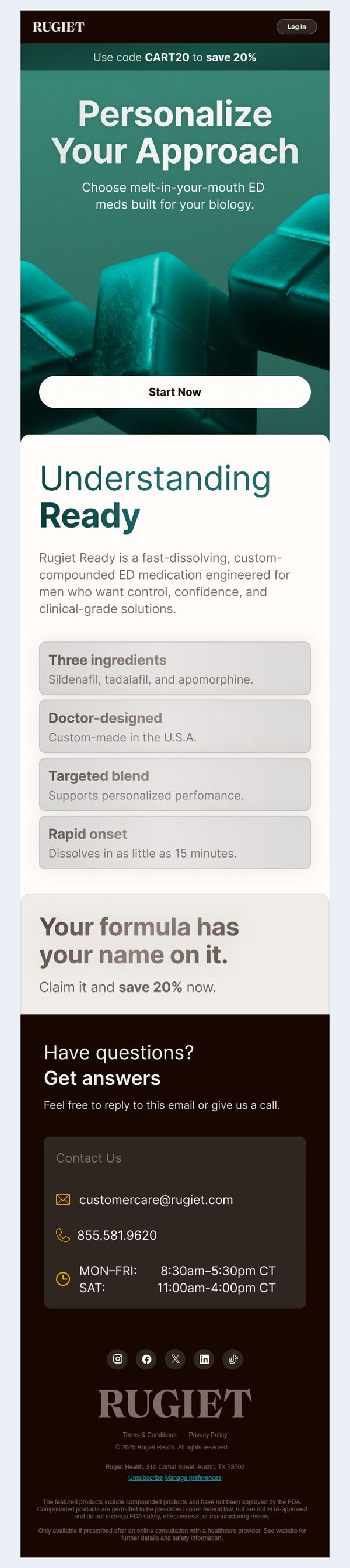
Objective
This email aims to educate potential customers about Rugiet Ready’s personalized, fast-dissolving ED medication while encouraging immediate action through a limited-time discount. It positions the product as clinically tailored and trustworthy to reduce hesitation and drive conversions.
Why this works
The email masterfully blends education with urgency by framing the product as doctor-designed and biologically personalized, which builds trust before prompting action with a time-sensitive discount that feels exclusive rather than pushy.
How to implement
By highlighting just four key benefits, ingredients, U.S. manufacturing, targeted blend, and rapid onset, the email avoids overwhelming the reader while still delivering enough clinical credibility to justify the premium positioning of a compounded medication.
Pro Tip
Add a subtle countdown timer or urgency indicator near the 'Start Now' CTA to reinforce the 20% discount’s limited availability, increasing perceived scarcity without cluttering the clean layout. • Include a short testimonial or satisfaction statistic (e.g., '92% of users report improved confidence within 30 days') in the Education Section to strengthen social proof alongside the clinical claims.
8. Peter MD : ...?
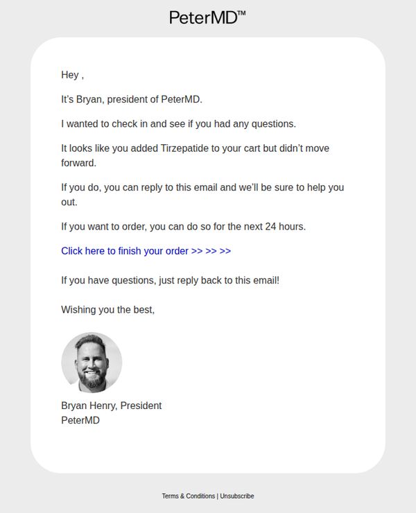
Objective
This email aims to recover an abandoned cart by personally reaching out to the customer through the brand’s president, offering direct support and creating urgency with a 24-hour window to complete the purchase.
Why this works
The email leverages high-level personalization by having the president directly address the customer, which builds trust and reduces perceived risk around a sensitive health product like Tirzepatide.
How to implement
It creates gentle urgency without being pushy by offering a 24-hour window to complete the order, which encourages action while still leaving room for customer questions and support.
Pro Tip
Add a visual element like a small product image or icon of Tirzepatide next to the product name to reinforce recognition and reduce cognitive load for the recipient. • Include a brief, reassuring line about security, privacy, or medical oversight near the CTA to alleviate potential concerns around purchasing a prescription medication online.
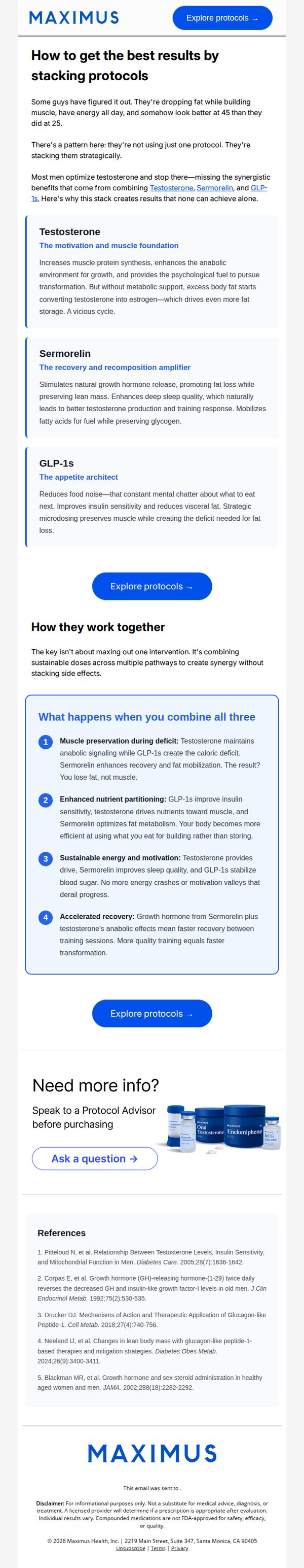
9. Maximus Tribe: Why testosterone alone isn't enough
Objective
This email aims to educate men over 40 on why stacking Testosterone, Sermorelin, and GLP-1s delivers superior body composition results compared to using testosterone alone, while guiding them toward personalized protocol consultations.
Why this works
The email brilliantly reframes testosterone as just one piece of a larger puzzle, positioning stacking as the secret weapon of high-performing men over 40, a narrative that elevates perceived value and justifies premium pricing.
How to implement
By breaking down each compound’s unique role, Testosterone for muscle, Sermorelin for recovery, GLP-1s for appetite control, the email transforms complex science into digestible, benefit-driven storytelling that builds trust and reduces buyer hesitation.
Pro Tip
Add a short testimonial or case study snippet near the 'How they work together' section to humanize the science, e.g., 'John, 47, lost 18 lbs and gained 6 lbs of muscle in 12 weeks using this stack', to boost social proof and emotional resonance. • Include a subtle visual hierarchy cue, like a progress bar or numbered steps, to guide the reader through the stacking logic, making the educational flow feel more structured and less text-heavy, especially for skimmers.
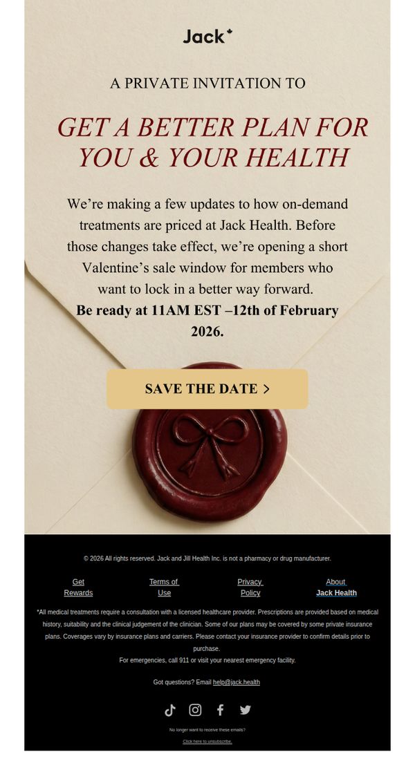
10. Jack: Valentine’s sale starts tomorrow ❤️
Objective
This email aims to create urgency and exclusivity around a limited-time Valentine’s sale, encouraging members to act before pricing changes take effect. It positions the sale as a private invitation to secure better health plans ahead of upcoming adjustments.
Why this works
The email brilliantly frames the sale as a private, time-sensitive invitation rather than a generic promotion, which elevates perceived value and triggers FOMO among existing members who feel specially selected.
How to implement
By anchoring the sale to an upcoming pricing change, the campaign creates a compelling reason to act now, not just for a discount, but to lock in current favorable terms before they disappear forever.
Pro Tip
Add a countdown timer above the CTA to visually reinforce urgency, seeing the exact hours until 11AM EST on February 12th would increase conversion by making the deadline feel immediate and real. • Include a brief bullet-point list under the main offer explaining what ‘better plan’ means, e.g., ‘lower co-pays,’ ‘expanded coverage,’ or ‘no price hike’, to clarify value and reduce ambiguity for hesitant readers.