MoMA email gallery from real brands
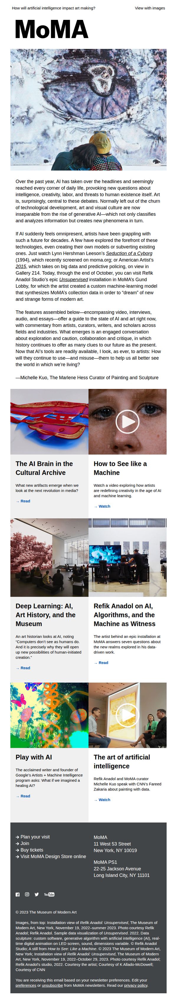
1. The MoMA Guide to AI and Art
Objective
This email aims to position MoMA as a thought leader at the intersection of AI and art by curating a rich, multidisciplinary guide that invites readers to explore how artists are engaging with AI, both critically and creatively, while subtly encouraging museum visits and deeper engagement with MoMA’s digital and physical offerings.
Why this works
MoMA brilliantly frames AI not as a threat to art but as a collaborator, using real artist projects and scholarly commentary to ground the conversation in creativity rather than fear, making the topic feel accessible and intellectually stimulating for a broad audience.
How to implement
The email’s structure mirrors a museum experience: it begins with a bold visual hook, moves into curated thematic sections with varied media formats, and ends with practical next steps, creating a seamless journey from curiosity to action without overwhelming the reader.
Pro Tip
Add a prominent, visually distinct CTA button above the fold, such as 'Explore AI at MoMA', that links directly to the exhibition page, since the current 'Read' links are buried and lack urgency or visual hierarchy to drive immediate action. • Include a short testimonial or quote from a visitor who experienced Refik Anadol’s installation in person to humanize the digital content and create emotional FOMO, bridging the gap between online engagement and physical attendance.
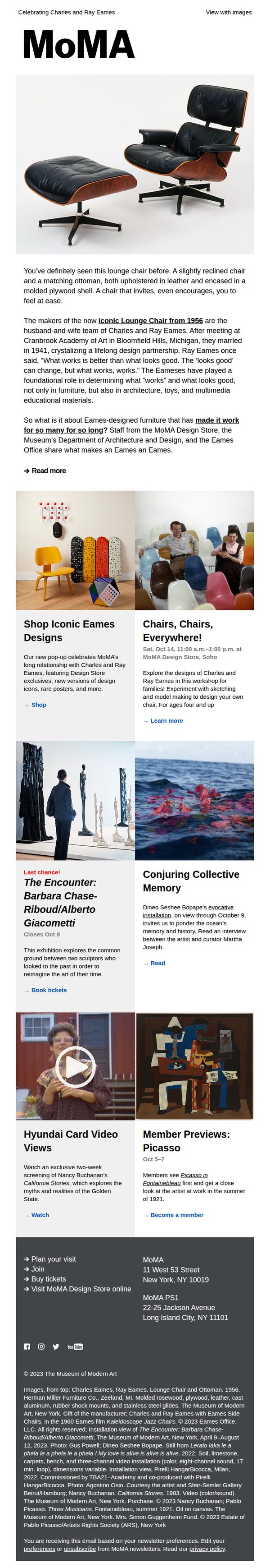
2. Have you seen this chair?
Objective
To celebrate the legacy of Charles and Ray Eames by highlighting their iconic Lounge Chair, educating subscribers on their design philosophy, and driving engagement through shopping, event attendance, and museum visits.
Why this works
The email brilliantly frames the Eames Lounge Chair not just as furniture but as a cultural artifact, using storytelling to connect its 1956 origins with timeless design principles that still resonate today.
How to implement
By weaving in both educational content and actionable CTAs, from shopping exclusives to family workshops, the campaign balances inspiration with conversion, making it feel enriching rather than promotional.
Pro Tip
The primary CTA 'Read more' is underwhelming for a campaign promoting both products and events; it should be context-specific, such as 'Shop the Collection' or 'Reserve Your Workshop Spot,' to match user intent. • The email lacks a visual hierarchy guiding users from the hero image to the most urgent action, adding a subtle arrow, bolded CTA button, or countdown timer for the 'Last chance!' exhibit would improve conversion flow.
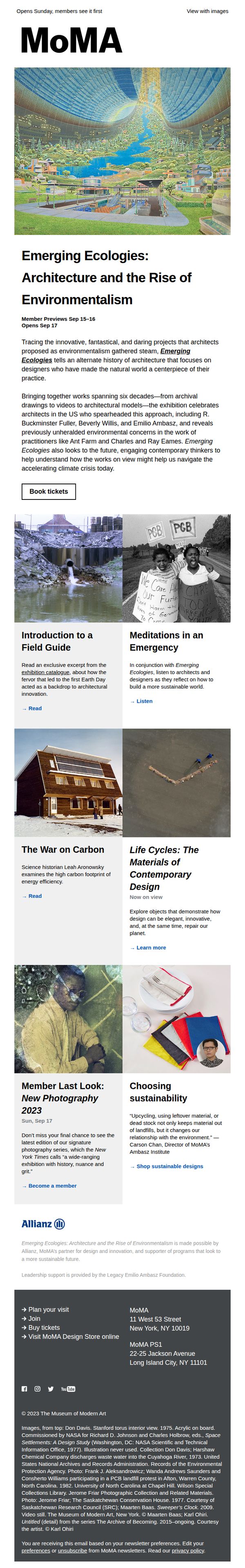
3. Daring architectural projects that changed how we see the natural world
Objective
This email aims to drive attendance and engagement for MoMA’s 'Emerging Ecologies' exhibition by highlighting its cultural relevance, historical depth, and urgent environmental themes while encouraging ticket bookings and membership sign-ups.
Why this works
The email masterfully frames architecture as an environmental movement, using bold visuals and historical context to position the exhibition not just as art but as a vital conversation about climate and design innovation.
How to implement
By weaving in multimedia elements like audio reflections and curated reading excerpts, the campaign deepens intellectual engagement without overwhelming the reader, making complex ideas feel accessible and personally relevant.
Pro Tip
Add a subtle countdown timer near the 'Book tickets' CTA to reinforce urgency around member previews and opening dates, leveraging FOMO without disrupting the editorial tone. • Include a small map or store locator icon next to the MoMA address in the footer to help users quickly visualize proximity, especially for those considering last-minute visits or planning travel.