National Geographic campaign ideas that work
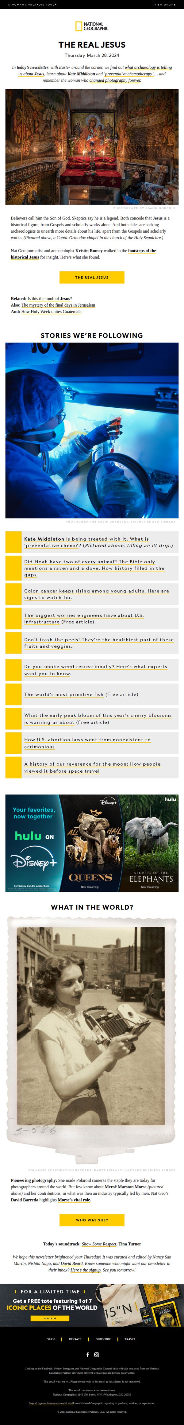
1. What archaeologists tell us about the real Jesus. Plus, Kate Middleton and ‘preventative chemo’
Objective
This email aims to engage subscribers with compelling, curiosity-driven storytelling around archaeology, health, and cultural history, while subtly promoting brand loyalty through educational content and a limited-time merchandise offer.
Why this works
The email brilliantly frames archaeological inquiry into Jesus not as a faith debate but as a historical detective story, inviting readers to explore evidence beyond scripture with intellectual curiosity rather than religious bias.
How to implement
By weaving together timely cultural hooks, like Kate Middleton’s health journey and the rise of preventative chemo, with evergreen science topics, the email creates a dynamic, magazine-style rhythm that keeps readers scrolling for more.
Pro Tip
The CTA 'THE REAL JESUS' is visually prominent but lacks urgency or benefit-driven language; rephrasing it to 'Uncover the Archaeological Truth Behind Jesus, Before Easter' would better align with the Easter timing and increase click-through intent. • The footer’s promotional offer for a free tote feels disconnected from the email’s intellectual tone; integrating it earlier, perhaps as a 'Reader’s Reward' after the main story, would create a smoother transition from content to conversion.
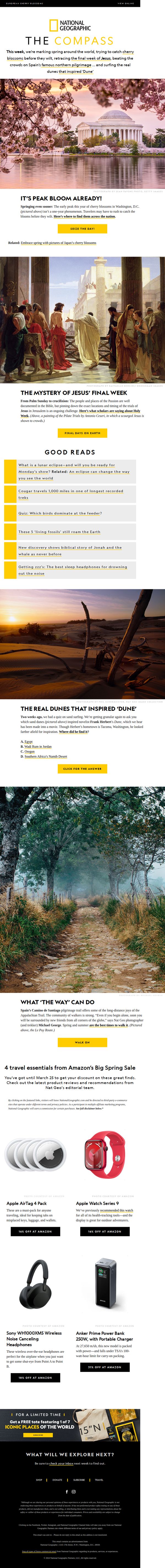
2. How did Jesus’ final days unfold? Plus, cherry blossoms, Monday’s eclipse, save on travel must-haves.
Objective
This email aims to engage subscribers with a curated mix of timely cultural, historical, and travel content while subtly promoting affiliate product sales and brand loyalty through exclusive offers and compelling storytelling. It balances education with commerce to keep readers returning weekly.
Why this works
The email masterfully blends high-curiosity cultural moments, like Jesus’ final days and cherry blossoms, with practical travel gear recommendations, making educational content feel personally relevant and commercially actionable without being pushy.
How to implement
By anchoring each section in a visually arresting photograph paired with a tight, question-driven headline, the email creates an immersive experience that invites exploration while maintaining a clear editorial voice that aligns with National Geographic’s trusted brand identity.
Pro Tip
The product grid section lacks visual hierarchy, the Apple Watch and AirTags are visually dominant but not clearly prioritized; consider using size, placement, or badges to highlight the highest-converting or most editorially relevant item first. • The footer’s ‘FREE tote’ offer is visually buried under dark background and small text; move it higher or add a bright accent color and icon to increase visibility and conversion potential without disrupting the editorial flow above.
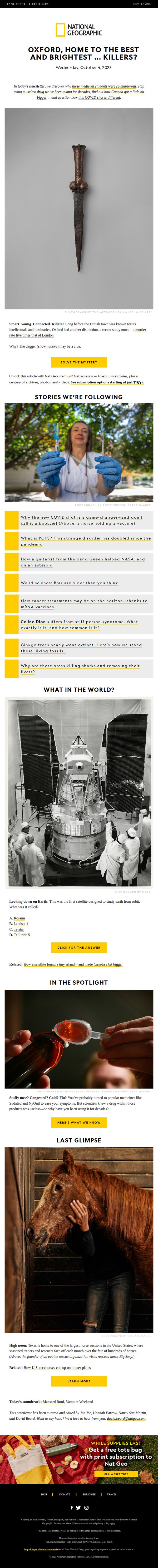
3. Only Murders in the University; a strange disorder that has doubled; why the new COVID shot is a game-changer
Objective
This email aims to drive engagement with National Geographic’s premium content by teasing intriguing, curiosity-driven stories while promoting a subscription. It also seeks to convert readers into paying members by offering exclusive access to archives and videos, paired with a limited-time tote bag incentive.
Why this works
The email masterfully opens with a provocative, mystery-driven headline that immediately hooks readers by juxtaposing academia with murder, leveraging curiosity gaps to compel clicks without resorting to clickbait clichés.
How to implement
By embedding a bold, yellow CTA button directly beneath a visually arresting image of a medieval dagger, the design creates an intuitive visual path that guides the reader from intrigue to action without overwhelming them with options.
Pro Tip
The 'Stories We’re Following' section lists headlines without visual thumbnails or clear hierarchy, making it feel cluttered; adding small images or icons next to each story would improve scannability and emotional pull. • The 'Last Glimpse' section featuring the horse photo lacks a clear CTA or contextual link to the story; adding a 'Read the Full Story' button or brief teaser would better guide users toward deeper engagement.
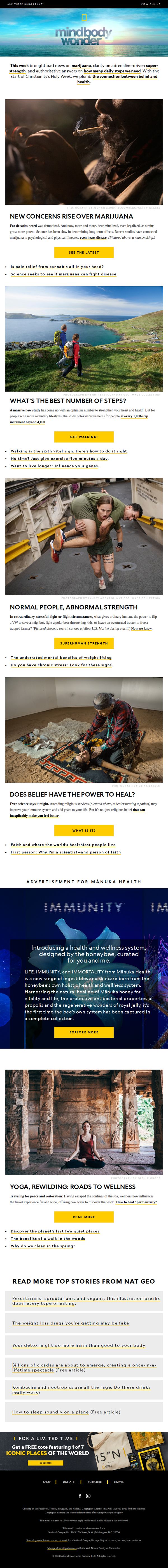
4. Does faith help health? Plus: Marijuana’s bad news; stress and superhuman strength; the new magic number for steps?
Objective
This email aims to engage readers with science-backed, curiosity-driven stories about health, belief, and human potential while subtly promoting National Geographic’s brand authority and driving traffic to deeper content. It also includes a promotional offer to convert interest into subscriptions.
Why this works
The email opens with a bold, question-driven subject line and immediately follows up with a punchy summary that teases multiple high-interest topics, creating instant curiosity and giving readers multiple reasons to keep scrolling.
How to implement
Each article section is anchored by a powerful, emotionally resonant image paired with a tight, benefit-focused headline and a single, action-oriented CTA button, making it effortless for readers to self-select their next deep dive without decision fatigue.
Pro Tip
The CTA 'SUBSCRIBE' at the bottom is visually underwhelming compared to the vibrant yellow article CTAs above it; it should be redesigned with higher contrast, larger size, or a more urgent label like 'Claim Your Free Tote Now' to match the promotional value offered. • The email lacks a clear visual hierarchy guiding the reader from curiosity to conversion, adding a subtle progress bar or 'Top 3 Stories You Can’t Miss' badge near the top would help funnel attention toward the most conversion-friendly content sections.
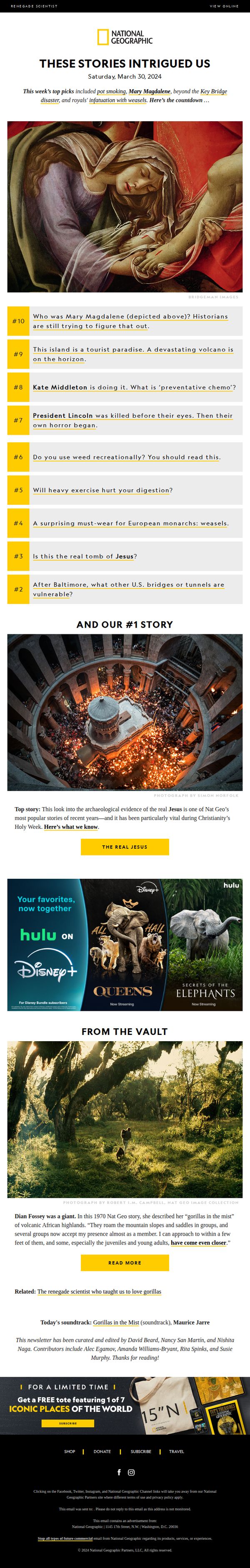
5. This week’s Top 10: Weed; Mary Magdalene; Santorini’s volcanic threat; why royals love weasels
Objective
To engage subscribers with a curated, curiosity-driven countdown of the week’s most intriguing stories while reinforcing National Geographic’s brand as a source of surprising, well-researched, and visually compelling content. The email also aims to drive traffic to featured articles and promote a limited-time merchandise offer.
Why this works
National Geographic masterfully hooks readers by teasing a mix of unexpected, emotionally resonant, and culturally relevant topics, like Mary Magdalene and royal weasels, then delivers them in a numbered countdown that creates a sense of urgency and discovery, making the email feel like a curated museum exhibit rather than a newsletter.
How to implement
By anchoring the #1 story in timely cultural relevance, Holy Week, the email transforms a historical investigation into the real tomb of Jesus into a must-read moment, demonstrating how to align editorial content with real-world events to boost engagement without sacrificing depth or journalistic integrity.
Pro Tip
The CTA ‘THE REAL JESUS’ is visually prominent but lacks persuasive urgency or benefit-driven language; rephrasing it to something like ‘Uncover the Archaeological Truth Behind Jesus’ Tomb’ would better align with the curiosity-driven tone and motivate clicks by promising revelation rather than just identification. • The ‘From the Vault’ section, while emotionally resonant, lacks a clear visual hierarchy or secondary CTA to guide users toward related content; adding a subtle ‘Explore More Legacy Stories’ button or thumbnail carousel would improve navigation and deepen engagement without disrupting the email’s flow.