Noie email gallery from real brands


1. Seasons change, does your skincare too?
Objective
The email aims to prompt the recipient to reassess their skincare routine as seasons change, encouraging them to take a personalized skin test to identify needed adjustments while reinforcing brand trust through a skin improvement guarantee.
Why this works
The email opens with a relatable seasonal transition hook that immediately connects with the reader’s lived experience, making the skincare advice feel timely and personally relevant rather than generic or salesy.
How to implement
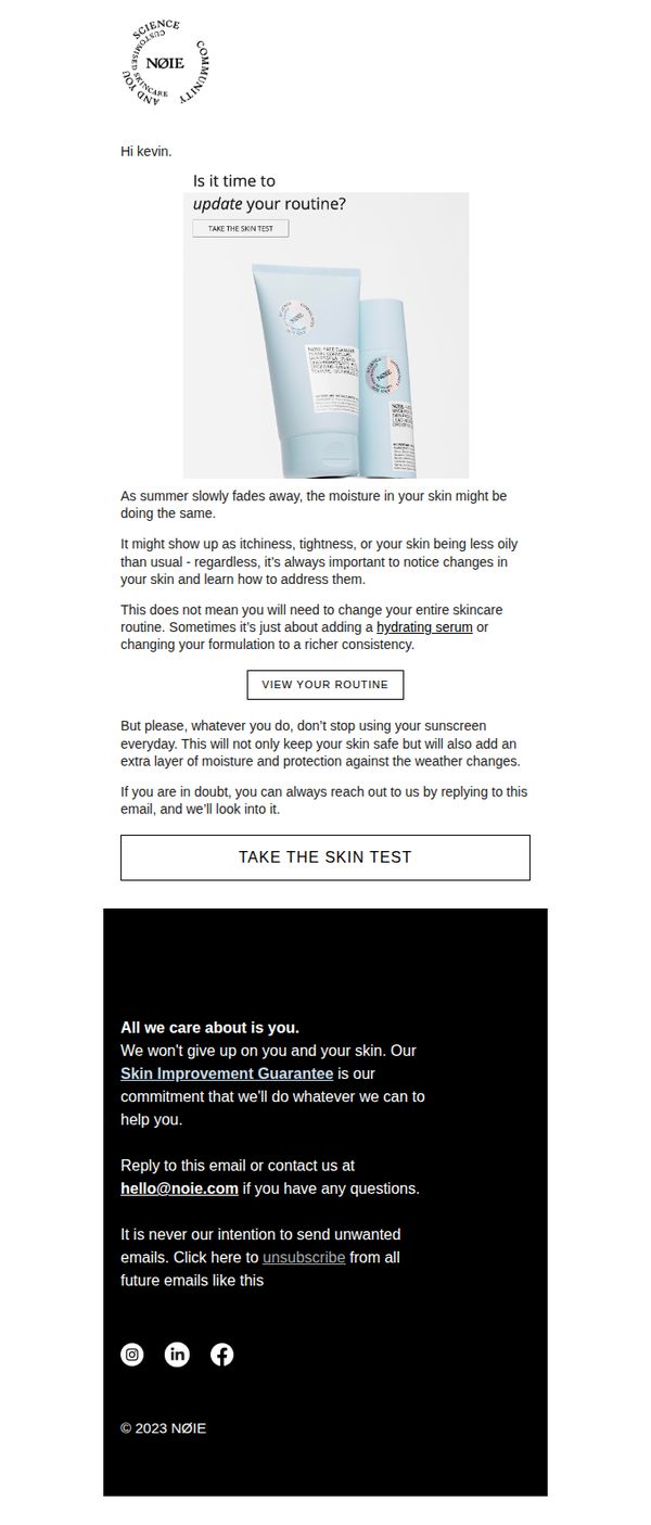
By acknowledging that users don’t always need a full routine overhaul, just a tweak like adding a hydrating serum, the brand reduces friction and positions itself as a thoughtful, non-pushy advisor rather than a product pusher.
Pro Tip
Add a secondary CTA button like 'View Your Routine' directly beneath the educational paragraph to create a clearer decision path, some users may want to review their current regimen before committing to the skin test. • Include a brief testimonial or user result snippet near the skin test CTA to build social proof, for example, '87% of users who took the test found a better product match within 3 days', to reduce hesitation and increase conversion.
2. Why’d you change, NØIE?
Objective
To transparently explain Noie’s rebranding and packaging redesign to existing customers, reassuring them that product quality and personalization remain unchanged while highlighting the brand’s deeper commitment to sustainability and eco-conscious innovation.
Why this works
The email opens with a disarmingly honest, conversational question that immediately acknowledges customer curiosity, turning potential confusion into an engaging story moment that builds trust before delivering the brand’s sustainability mission.
How to implement
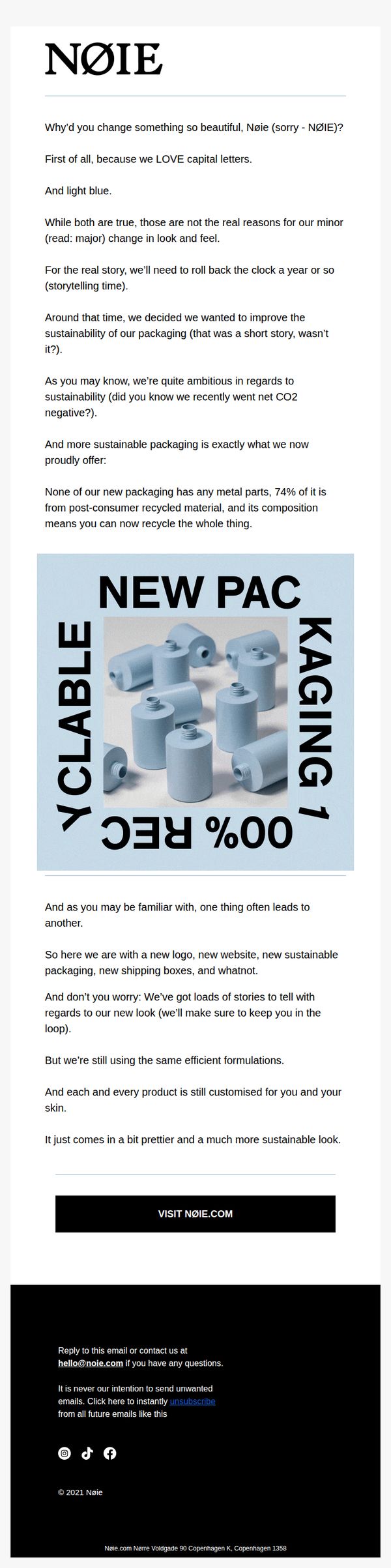
By anchoring the redesign in a tangible environmental win, 100% recyclable, metal-free packaging made from 74% post-consumer recycled material, the brand transforms a visual change into a values-driven upgrade that resonates with eco-conscious buyers.
Pro Tip
Add a subtle visual comparison slider or side-by-side image of old vs. new packaging to immediately show the aesthetic evolution, this would reduce cognitive load and reinforce the ‘same great product, better planet’ message visually. • Include a short customer testimonial or quote from a real user who appreciates the new packaging’s sustainability, this would strengthen social proof and validate the brand’s environmental claims with authentic third-party endorsement.
3. Seasons change, does your skincare too?
Objective
The email aims to prompt the recipient to reassess their skincare routine as seasons change, encouraging them to take a personalized skin test to identify needed adjustments while reinforcing brand trust through a skin improvement guarantee.
Why this works
The email smartly ties seasonal shifts to tangible skin concerns like itchiness or oiliness, making the need for routine updates feel personal and timely rather than sales-driven, which builds trust before asking for action.
How to implement
By reassuring users they don’t need to overhaul their entire routine, just tweak it with a hydrating serum or richer consistency, the message reduces friction and positions the brand as a helpful guide, not a pushy seller.
Pro Tip
Add a visual progress indicator or mini-skincare quiz preview near the 'TAKE THE SKIN TEST' CTA to reduce perceived effort and increase conversion by showing users exactly what to expect before clicking. • Include a brief testimonial or user result snippet (e.g., '87% saw improved hydration in 2 weeks') near the education section to strengthen social proof and validate the need for seasonal adjustments with real outcomes.
4. 4️⃣ types of Face Cleansers
Objective
To educate the recipient about the four different types of face cleansers and how each aligns with specific skin needs, while reinforcing brand trust through personalized skincare guidance and a strong satisfaction guarantee.
Why this works
The email smartly frames product education as personalized guidance, making the recipient feel seen and understood rather than just sold to, which builds deeper brand loyalty and trust.
How to implement
By visually pairing each cleanser type with a simple icon and bullet-pointed benefits, the email transforms complex skincare information into digestible, scannable takeaways that respect the reader’s time.
Pro Tip
Add a subtle visual cue or arrow pointing toward the CTA button to guide the eye naturally from the educational content to the next step, improving conversion flow without disrupting the clean design. • Include a short testimonial or user quote near the product breakdowns to add social proof and reinforce credibility, especially for readers who may still be undecided after reading the educational content.
5. 4️⃣ types of Face Cleansers
Objective
To educate the recipient about the four different types of face cleansers and how each aligns with specific skin needs, while reinforcing brand trust through personalized skincare guidance and a satisfaction guarantee.
Why this works
The email smartly frames product education as a personalized journey, using the recipient’s name and referencing a prior skin test to create relevance and trust before diving into technical details about cleanser types.
How to implement
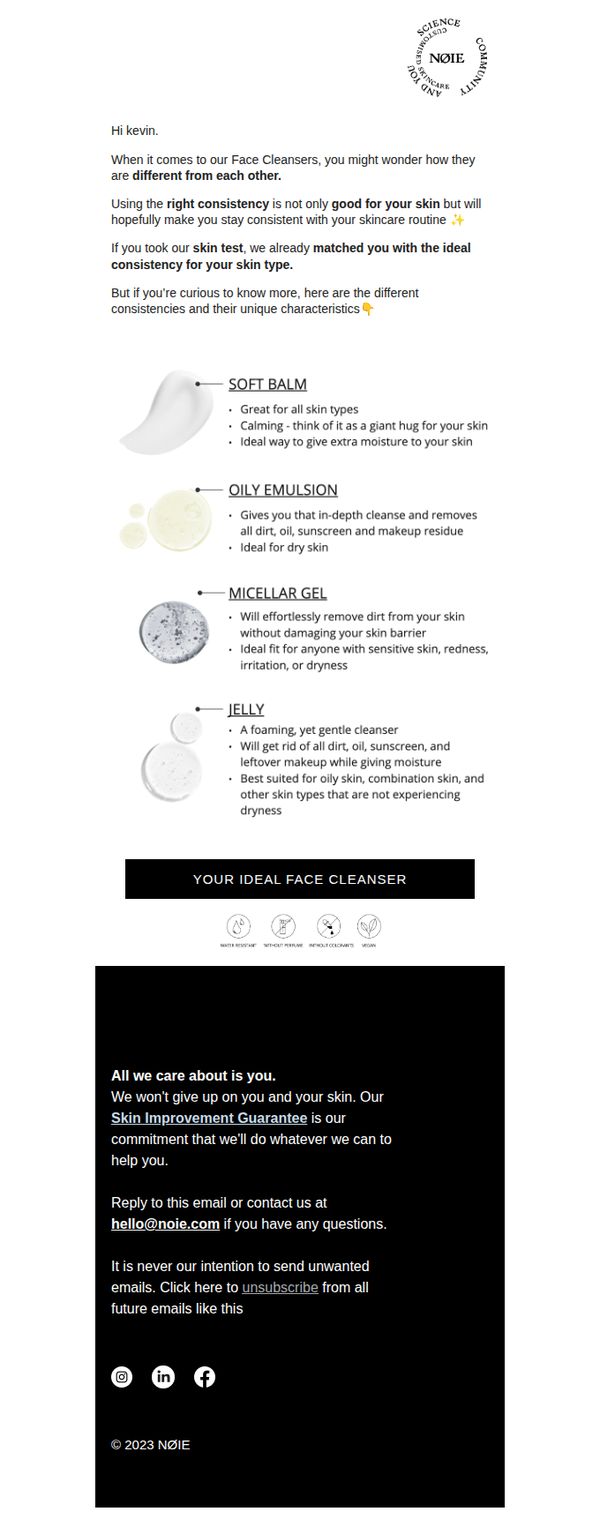
Each cleanser type is presented with a clear visual icon, bold heading, and three concise bullet points that highlight benefits, ideal skin types, and emotional appeal, making complex skincare info instantly digestible and actionable.
Pro Tip
Add a subtle visual cue or arrow pointing toward the 'YOUR IDEAL FACE CLEANSER' CTA to guide the eye downward after reading the product breakdown, improving conversion flow without disrupting the clean layout. • Include a micro-testimonial or user quote near the CTA (e.g., '92% of users found their perfect match after reading this guide') to reinforce social proof and nudge the reader toward taking action.
6. Simone is one of our most brave users
Objective
This email aims to humanize the Noie brand by sharing Simone’s personal journey with PTSD-related skin inflammation, positioning Noie as a compassionate solution that addresses real emotional and physical struggles. It seeks to build trust and emotional connection rather than push a direct sale.
Why this works
The email masterfully reframes a medical condition into an emotional narrative, making the product feel like a supportive ally rather than just another skincare item, this builds deep psychological resonance with vulnerable audiences.
How to implement
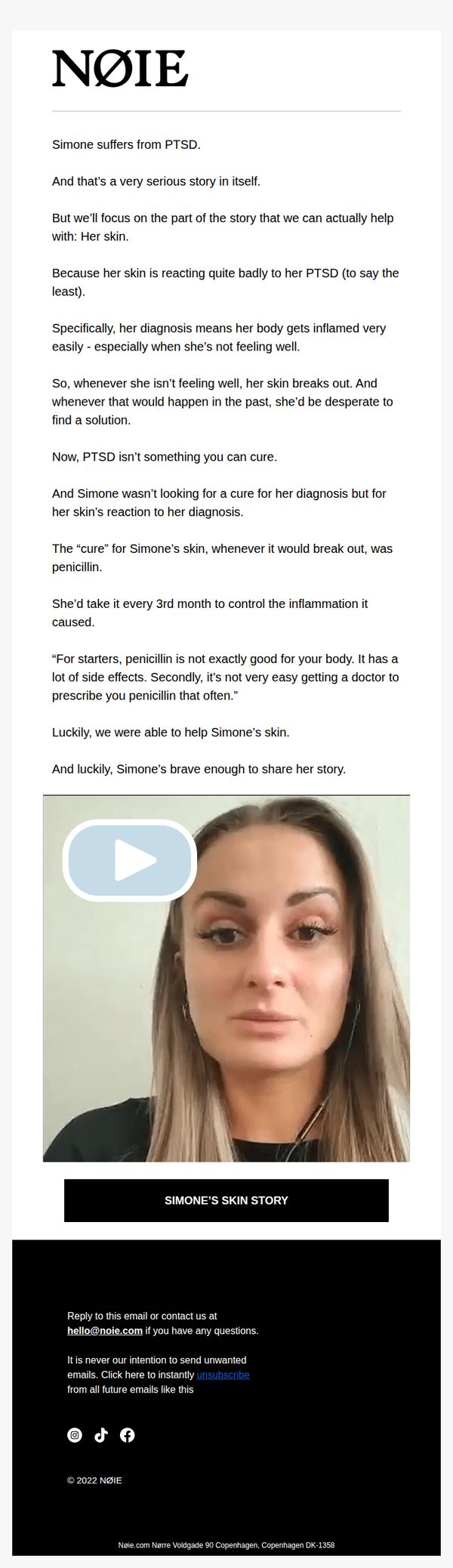
By spotlighting Simone’s bravery and focusing on her skin’s reaction rather than her diagnosis, the brand tactfully avoids overstepping while still validating the customer’s emotional experience, a delicate balance many brands fail to strike.
Pro Tip
Add a secondary CTA beneath the video, such as 'See How Noie Works for Skin Like Simone’s', to guide readers toward product education or purchase without breaking the emotional flow of the story. • Introduce a subtle visual cue or icon near the video play button indicating it’s a personal story (e.g., a heart or speech bubble) to prime viewers emotionally before they click, increasing engagement and reducing bounce rate.