The Complete Office Email Collection From Real Brands
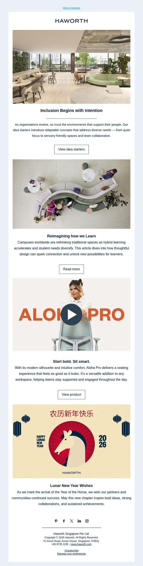
1. Haworth: How can workplaces adapt to people?
Objective
This email aims to position Haworth as a thought leader in human-centered workplace design by showcasing adaptable environments that support inclusion, learning, and well-being, while subtly promoting specific products and fostering brand loyalty through cultural celebration.
Why this works
Haworth masterfully ties workplace design to human outcomes, like inclusion and learning, making their message emotionally resonant and strategically relevant to decision-makers who care about culture, not just furniture.
How to implement
By embedding a product highlight within a broader narrative about learning environments, they avoid sounding salesy and instead position the Aloha Pro chair as a natural solution to a real, evolving workplace challenge.
Pro Tip
The CTA 'View idea starters' is buried under a long paragraph; reposition it immediately after the headline with a contrasting button color to increase click-through and align with the email’s goal of driving engagement with design concepts. • The product section for Aloha Pro lacks social proof, adding a short testimonial or usage stat (e.g., 'Used in 500+ campuses') would strengthen credibility and nudge readers from interest to action without disrupting the email’s tone.
2. Connecteam: Ferdinand, here's your copy of "6 Pillars for Improving Frontline Employee Retention"
Objective
To nurture a lead who downloaded a retention guide by reinforcing value, prompting immediate action, and guiding them toward further educational content that positions Connecteam as a trusted advisor in frontline workforce management.
Why this works
The email personalizes the experience by addressing the recipient by name and referencing their specific download, which builds rapport and signals that the brand pays attention to individual engagement, making the follow-up feel tailored rather than automated.
How to implement
By asking a reflective question, 'Which steps are you taking today to fight turnover?', the email nudges the reader into self-assessment, subtly priming them to recognize their own needs and increasing the likelihood they’ll seek out the suggested actionable article as a solution.
Pro Tip
Add a visually distinct button or bolded link for the secondary CTA ('check out this article') to increase click-through rates, as the current text-based link blends into the body and may be overlooked by skimmers. • Include a brief testimonial or stat from a customer who reduced turnover using the 6 Pillars framework to add social proof and reinforce credibility, making the next step feel more compelling and results-driven.
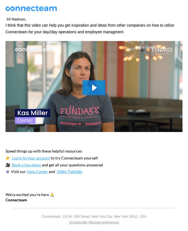
3. Connecteam: Nedvon, get inspired from others
Objective
This email aims to inspire Nedvon by showcasing a real customer story, demonstrating how another business uses Connecteam for daily operations and employee management, while encouraging immediate engagement through account access, demo booking, or resource exploration.
Why this works
By personalizing the greeting and framing the video as a tailored source of inspiration, the email immediately positions itself as helpful rather than promotional, building trust before asking for action.
How to implement
Featuring a real customer with visible branding and title creates authentic social proof that resonates emotionally and operationally, helping prospects visualize themselves succeeding with the platform.
Pro Tip
Add a brief testimonial quote from Kas Miller directly under her video thumbnail to reinforce credibility and give skimmers a reason to engage without watching the full video. • Include a visual progress indicator or time-sensitive cue (e.g., 'Join 5,000+ teams using Connecteam this week') near the CTAs to create gentle urgency and reduce decision inertia.
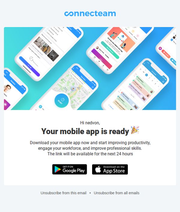
4. Connecteam: Your employee app is ready!
Objective
This email aims to prompt the recipient to download their custom-branded mobile app immediately, emphasizing urgency with a 24-hour link availability while highlighting key benefits like productivity, engagement, and skill development.
Why this works
The email creates instant personal relevance by addressing the recipient by name and framing the app as uniquely theirs, which boosts perceived ownership and urgency to act before the 24-hour window closes.
How to implement
By listing three concrete, outcome-driven benefits, productivity, workforce engagement, and professional skills, the message speaks directly to executive pain points while avoiding vague feature dumping, making the value proposition instantly digestible.
Pro Tip
Add a subtle countdown timer beneath the 24-hour notice to visually reinforce urgency and trigger FOMO, which could increase immediate downloads by making time scarcity more tangible than text alone. • Include a one-sentence testimonial or stat from a similar company (e.g., 'Teams using Connecteam see 30% faster onboarding') to build social proof and credibility right after the value proposition, reducing skepticism before the CTA.
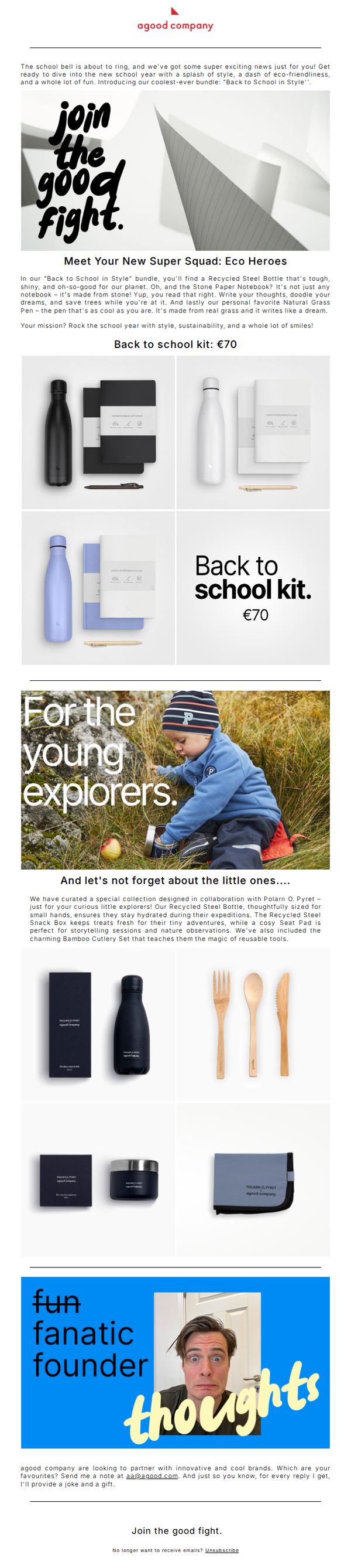
5. A Good Company: Back to school in style.
Objective
To promote A Good Company’s eco-friendly 'Back to School in Style' bundle by appealing to parents and students who value sustainability, design, and playful functionality, encouraging immediate purchase through emotional storytelling and product bundling.
Why this works
The email brilliantly frames school supplies as heroic tools for eco-conscious kids, turning everyday items into mission-driven gear that empowers young learners to save trees and stay hydrated, making sustainability feel adventurous and aspirational.
How to implement
By segmenting products into 'Eco Heroes' for older students and 'Young Explorers' for little ones, the campaign personalizes the offering with emotional resonance, helping parents visualize how each bundle fits their child’s developmental stage and daily adventures.
Pro Tip
Add a clear, visually distinct CTA button beneath each product grid (e.g., 'Get the Kit for €70') to reduce friction, currently, the only CTA is buried in the footer, which may cause drop-offs among users who don’t scroll fully. • Include a short testimonial or social proof near the product bundles, such as '92% of parents say their kids love the grass pen!', to reinforce credibility and reduce hesitation around the €70 price point.
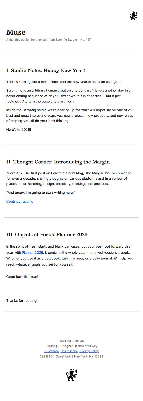
6. BaronFig: Happy New Year (and something new)!
Objective
This email aims to warmly welcome the new year while subtly introducing Baronfig’s latest product, the Planner 2026, and announcing the launch of their new blog, The Margin, to deepen engagement with their thoughtful, creative audience.
Why this works
The email opens with a reflective, human-centered tone that validates the reader’s desire for renewal, making the product launch feel like a natural, supportive next step rather than a sales pitch.
How to implement
By framing the new Planner 2026 as a tool for ‘fresh starts and blank canvases,’ the campaign taps into emotional motivation rather than functional specs, aligning the product with the reader’s personal aspirations for the year ahead.
Pro Tip
Add a secondary CTA button or link directly beneath the Planner 2026 section that says ‘Explore the Planner 2026’ to reduce friction for readers ready to buy, rather than forcing them to scroll to the footer or hunt for a link. • Include a small visual element, even a simple icon or thumbnail, next to the ‘Planner 2026’ mention to break up text density and give the product a tangible presence, increasing visual recall and desire.
7. Room: Is Back to School the New Back to Office?

Objective
This email aims to position ROOM as a thought leader in the evolving workplace by drawing parallels between back-to-school routines and the return-to-office movement, while subtly promoting their modular workspace solutions as the answer to hybrid work challenges.
Why this works
By framing the return-to-office conversation through the familiar lens of back-to-school, the email taps into emotional nostalgia and routine-driven behavior, making a complex workplace transition feel intuitive and manageable for readers.
How to implement
The strategic placement of a product CTA within an educational context, after establishing thought leadership, creates a natural, non-disruptive path to conversion, allowing the brand to sell by first serving value rather than pushing sales.
Pro Tip
Add a subtle countdown or urgency element near the 'SHOP THE COLLECTION' CTA, such as 'Limited modular units available for Fall installations', to nudge readers from insight to action without disrupting the editorial tone. • Include a mini visual comparison (e.g., side-by-side icons or a simple graphic) between traditional offices and ROOM’s agile workspaces in the 'Make ROOM for a better way to work' section to quickly communicate spatial innovation without requiring extra reading.
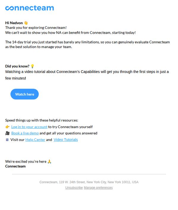
8. Connecteam: Ready to move your Retail business forward?
Objective
This email aims to convert a trial user into an active customer by reinforcing the value of Connecteam for retail teams, encouraging immediate engagement through a video tutorial, and guiding the user toward next steps like booking a demo or logging in.
Why this works
The email opens with a personalized greeting and immediate appreciation, which builds rapport and positions the brand as attentive and customer-centric from the very first line.
How to implement
It strategically frames the trial as nearly unlimited to reduce perceived risk, making it easier for the recipient to justify investing time in exploring the platform without hesitation.
Pro Tip
Add a visual element like a short animated GIF or screenshot of the platform in action near the 'Watch here' CTA to increase click-through by showing value before the click. • Include a brief testimonial or social proof from a retail business in the hero section to build credibility and reinforce relevance for the target audience.
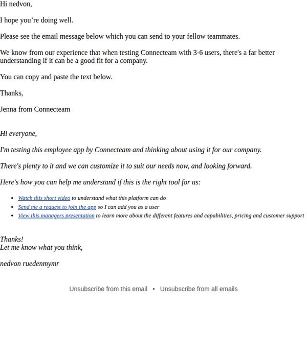
9. Connecteam: Need your help with testing Connecteam
Objective
The email aims to enlist the recipient’s help in testing Connecteam by sharing a pre-written message with teammates, encouraging collaborative evaluation of the platform’s fit for their company with 3–6 users.
Why this works
The email smartly leverages peer influence by asking the recipient to forward a pre-crafted message to teammates, turning one user into a mini-advocate and accelerating group evaluation without extra effort.
How to implement
By framing the test around a small team of 3–6 users, the email lowers the perceived risk and commitment, making it easier for prospects to say yes and experience real value before scaling adoption.
Pro Tip
Add a visual cue or button around the CTA 'Send me a request to join the app' to make it stand out more, currently buried in bullet points, it lacks visual hierarchy and urgency. • Include a short testimonial or stat from another company that tested Connecteam with 3–6 users and saw value, to build social proof and reduce perceived risk for the recipient’s team.
10. Room: Is Back to School the New Back to Office?
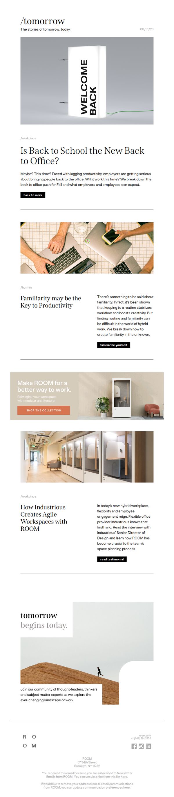
Objective
This email aims to position ROOM as a thought leader in the evolving workplace by drawing a cultural parallel between 'Back to School' and 'Back to Office,' while subtly promoting their modular workspace solutions as the answer to hybrid work challenges.
Why this works
The email brilliantly reframes a seasonal cultural moment, Back to School, as a workplace metaphor, making the content feel timely and emotionally resonant while positioning ROOM as a strategic partner in navigating hybrid work transitions.
How to implement
By blending editorial-style storytelling with product promotion, the campaign avoids sounding salesy; instead, it builds authority and trust by offering insights on productivity and workplace design before ever mentioning a product.
Pro Tip
Add a subtle visual cue or icon next to the 'SHOP THE COLLECTION' CTA to increase click-through by signaling interactivity, especially since the button blends into the neutral background and may be overlooked in a scroll-heavy email. • Include a short, punchy testimonial quote directly under the CTA section to reinforce social proof at the moment of decision, this would bridge the gap between the educational content and the commercial ask more persuasively.