The Complete Outdoor Goods Email Collection
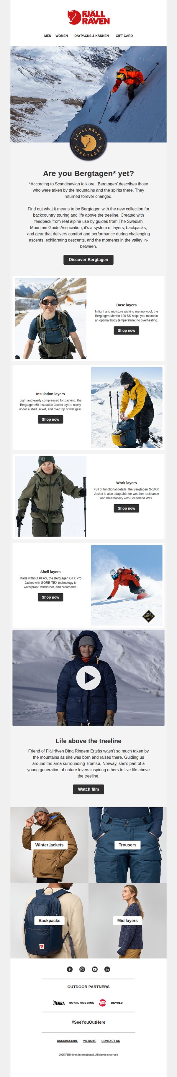
1. Fjällräven: First look! New Bergtagen
Objective
To introduce and generate excitement for Fjällräven’s new Bergtagen collection by connecting it to Scandinavian mountain culture and real alpine use, while driving immediate engagement through layered product discovery and storytelling that inspires outdoor adventure above the treeline.
Why this works
The email brilliantly anchors the new Bergtagen collection in Scandinavian folklore, transforming a product launch into a cultural narrative that resonates emotionally with outdoor enthusiasts who value heritage and authenticity in their gear choices.
How to implement
By breaking down the collection into functional layering systems, base, insulation, work, and shell, the email educates the customer while subtly guiding them toward complete outfit purchases, turning casual browsers into intentional buyers with clear next steps.
Pro Tip
Add a subtle countdown timer or limited-edition badge near the 'Discover Bergtagen' CTA to create urgency, especially since this is a 'first look' launch, this would nudge hesitant shoppers toward immediate action without disrupting the narrative flow. • Include a small 'Shop the Look' carousel beneath the video or testimonial section that visually bundles complementary items (e.g., jacket + pants + backpack) to reduce decision fatigue and increase average order value through intuitive cross-selling.
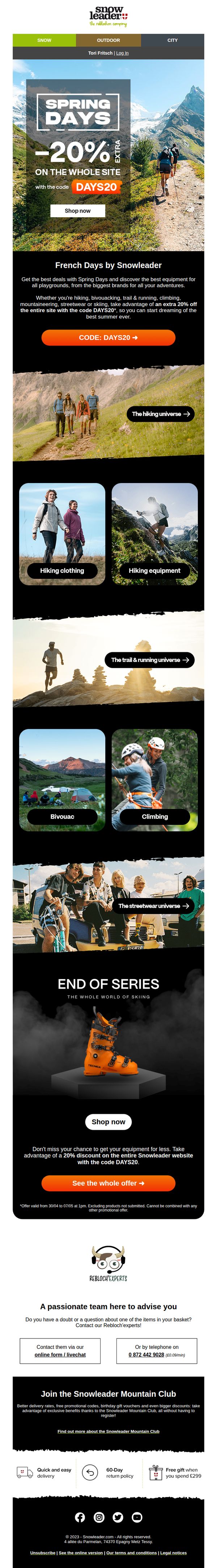
2. Snowleader: Spring Days: an extra 20% off the entire site
Objective
This email aims to drive immediate site-wide sales by promoting a limited-time 20% discount during the Spring Days event, encouraging outdoor enthusiasts to explore gear across multiple adventure categories while reinforcing brand loyalty through community and expert support.
Why this works
The email brilliantly ties seasonal excitement to product discovery by using vivid outdoor imagery and adventure-specific categories, making the discount feel like an invitation to explore rather than just a price cut.
How to implement
By repeating the promo code and discount across multiple sections with clear visual hierarchy, the campaign reduces friction and ensures the offer stays top-of-mind without overwhelming the reader with redundancy.
Pro Tip
Add a countdown timer near the hero section to create urgency around the offer’s expiration, which would reinforce the limited-time nature of the 20% discount and encourage faster conversions. • Reposition the 'End of Series' ski boot section higher in the email or integrate it into the main category grid to avoid visual disconnect and better align with the 'Spring Days' theme, which may feel misaligned with winter gear.
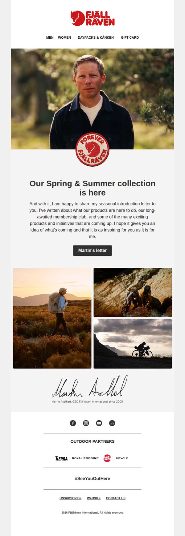
3. Fjällräven - GB: A seasonal letter from our CEO
Objective
To introduce Fjällräven’s Spring & Summer collection through a personal letter from the CEO, fostering emotional connection while teasing upcoming products and initiatives to inspire customer anticipation and engagement.
Why this works
The CEO’s personal letter format transforms a product launch into a storytelling moment, building trust and emotional resonance by framing the collection as part of a shared outdoor philosophy rather than just a retail update.
How to implement
Strategically placing the CTA as 'Martin’s letter' rather than 'Shop Now' invites curiosity and prioritizes brand narrative over immediate conversion, subtly guiding the reader toward deeper engagement before purchase consideration.
Pro Tip
Add a secondary CTA below the hero section, such as 'Explore the Collection', to gently guide readers who may not want to read the full letter but are ready to browse products, improving conversion pathways without disrupting the narrative flow. • Include a small visual cue or badge near the CEO’s photo or letter CTA indicating 'New Products Inside' or 'Membership Launch Teaser' to better align reader expectations with the email’s promotional intent and reduce bounce risk.
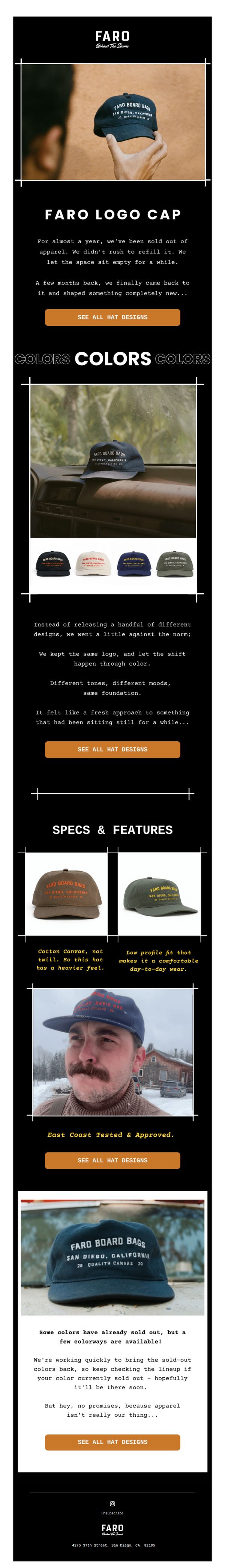
4. Faro : FARO's BTS #027
Objective
To reintroduce the Faro Logo Cap with a refreshed color palette after a deliberate hiatus, building anticipation and driving traffic to the product page by emphasizing scarcity, quality, and brand storytelling.
Why this works
By intentionally leaving the product line empty for nearly a year, Faro created narrative tension and positioned the cap’s return as a meaningful event rather than just another restock, deepening emotional connection with loyal customers.
How to implement
Instead of overwhelming customers with new designs, Faro focused on color as the hero of the relaunch, a smart, minimalist strategy that reinforces brand identity while offering perceived variety without diluting the core product.
Pro Tip
Add a subtle visual indicator (like a small badge or progress bar) near the CTA to show which colors are currently in stock versus sold out, reducing friction for users who want to act immediately. • Include a short customer testimonial or social proof snippet under the 'East Coast Tested & Approved' section to reinforce credibility and encourage trust in the product’s durability and fit.
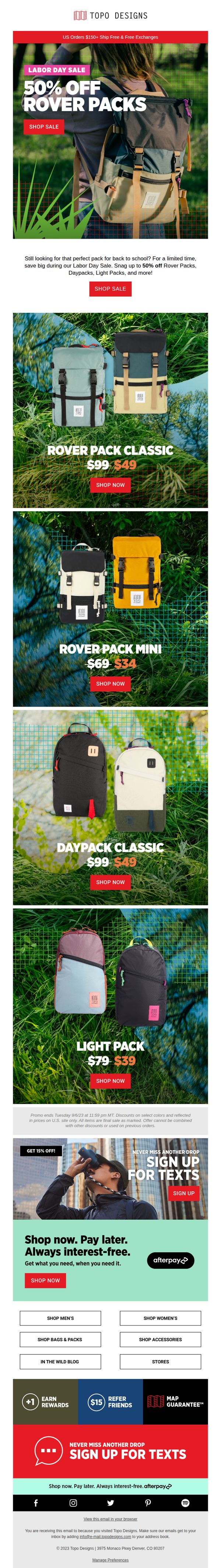
5. Topo Designs: Still shopping for back to school?
Objective
This email aims to convert last-minute back-to-school shoppers by highlighting a limited-time Labor Day Sale with up to 50% off popular backpacks, while also encouraging sign-ups for text alerts and promoting flexible payment options to reduce purchase friction.
Why this works
The email brilliantly ties seasonal urgency to a specific product category, backpacks, by framing the Labor Day Sale as the final chance for back-to-school shoppers, making the discount feel timely and personally relevant rather than generic.
How to implement
Each product tile uses a consistent visual rhythm with bold pricing, crossed-out original values, and a clear 'Shop Now' button, which reduces cognitive load and trains the eye to scan quickly while reinforcing the value proposition with every glance.
Pro Tip
Add a countdown timer near the promo disclaimer to visually reinforce urgency, since the current text-only deadline (9/5/23) lacks emotional impact and may be overlooked by skimmers. • Reposition the 'Shop Men’s / Women’s' category buttons higher, perhaps below the hero section, to help users self-segment faster, since the current placement at the bottom may cause drop-off before users find their preferred category.
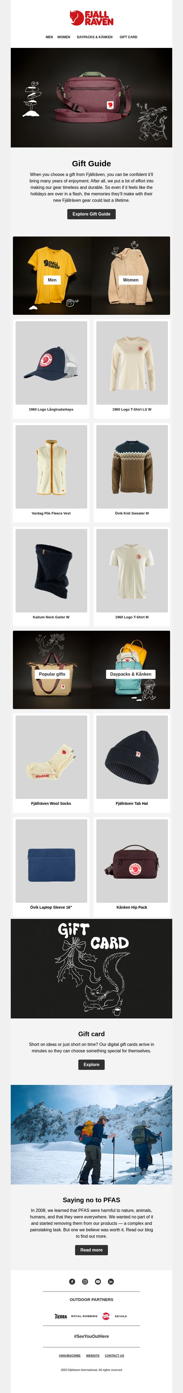
6. Fjällräven: The gifts that keep on giving
Objective
This email campaign aims to inspire holiday gifting by positioning Fjällräven products as timeless, durable gifts that create lasting memories, while also promoting digital gift cards for last-minute shoppers and reinforcing the brand’s environmental values.
Why this works
Fjällräven brilliantly frames its products not just as gear, but as vessels of enduring memories, a powerful emotional hook that transforms functional items into meaningful holiday gifts rooted in experience rather than consumption.
How to implement
By segmenting gift options into men’s and women’s categories alongside curated collections like ‘Popular Gifts’ and ‘Daypacks & Kånken,’ the email simplifies decision-making for overwhelmed shoppers without diluting the brand’s minimalist aesthetic or product integrity.
Pro Tip
Add a visual countdown timer near the 'Explore Gift Guide' CTA to create urgency for holiday shoppers, especially since the email’s goal is time-sensitive gifting, this would strengthen conversion intent without cluttering the clean layout. • Reposition the 'Saying no to PFAS' section higher in the flow, perhaps after the hero or before the product grid, so sustainability messaging supports product selection rather than appearing as an afterthought, reinforcing trust during consideration.
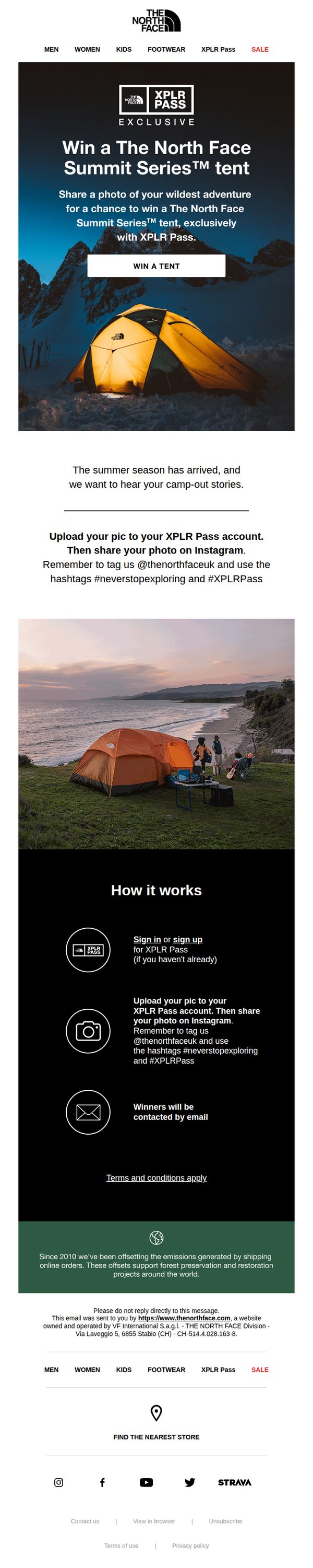
7. The North Face - UK: Win a The North Face Summit Series™ tent
Objective
This email aims to drive engagement with The North Face’s XPLR Pass community by encouraging users to share adventure photos on Instagram for a chance to win a premium Summit Series™ tent, while reinforcing brand values around exploration and sustainability.
Why this works
The email brilliantly ties product aspiration to user-generated storytelling by asking customers to share their wildest adventures, turning a giveaway into a community-driven brand experience that feels authentic and emotionally resonant.
How to implement
By anchoring the contest in the XPLR Pass ecosystem and requiring Instagram sharing with branded hashtags, the campaign cleverly expands reach organically while deepening loyalty among an already engaged audience of outdoor enthusiasts.
Pro Tip
Add a visual countdown timer near the CTA to create urgency, since no end date is mentioned, users may delay participation, reducing conversion momentum for this time-sensitive contest. • Include a small gallery of past winning photos or user submissions to inspire participation, seeing real examples reduces friction and gives users a clearer idea of what kind of content performs well.
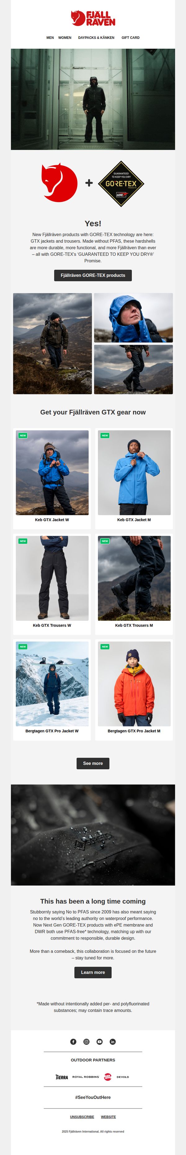
8. Fjällräven: Yes!
Objective
To announce and drive excitement around Fjällräven’s new GTX collection made with PFAS-free GORE-TEX technology, positioning it as a durable, functional, and environmentally responsible upgrade for outdoor enthusiasts.
Why this works
The email brilliantly frames the product launch as a moral and technical milestone, not just new gear, but a bold stand against PFAS, aligning performance with environmental responsibility to deepen brand loyalty among conscious adventurers.
How to implement
By pairing dramatic outdoor imagery with clear product labels and gender-specific sizing, the email creates an immersive, aspirational experience that speaks directly to the identity of its target audience, serious hikers and mountaineers who value both function and ethics.
Pro Tip
Add a visual countdown timer or limited-availability badge near the 'See more' CTA to create urgency, since the email positions this as a milestone launch rather than a routine product drop. • Include a short customer testimonial or quote from an outdoor influencer beneath the product grid to build social proof and validate the performance claims before users scroll to the educational section.
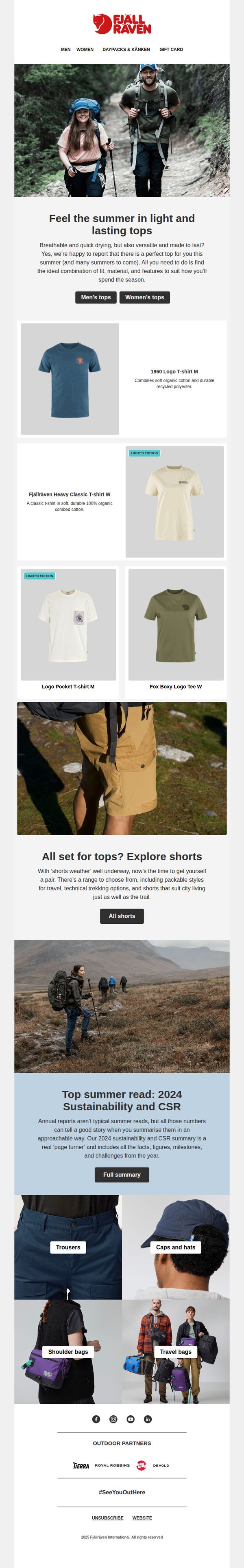
9. Fjällräven: Light tops that last
Objective
This email aims to drive summer apparel sales by showcasing durable, breathable tops while subtly reinforcing brand values through sustainability storytelling and cross-category exploration. It encourages immediate browsing with clear category CTAs and leverages aspirational outdoor imagery to connect emotionally with active lifestyles.
Why this works
The email brilliantly ties product functionality to seasonal lifestyle needs by positioning breathable, durable tops as essential summer companions, not just clothing, but gear for lasting adventures that match the customer’s active rhythm.
How to implement
By embedding a sustainability report as a ‘summer read,’ the brand elevates its CSR message into a compelling narrative rather than a footnote, making ethical values feel relevant and digestible while reinforcing long-term brand trust without overt sales pressure.
Pro Tip
Add a subtle countdown timer or urgency cue near the ‘Limited Edition’ product tiles to nudge immediate action without disrupting the calm, exploratory tone, especially effective for time-sensitive items like the cream-colored limited edition tee. • Reposition the ‘All shorts’ CTA to appear immediately after the top product grid, creating a tighter visual and behavioral flow that capitalizes on the momentum of browsing tops before prompting the next logical category, shorts, for complete summer outfit planning.
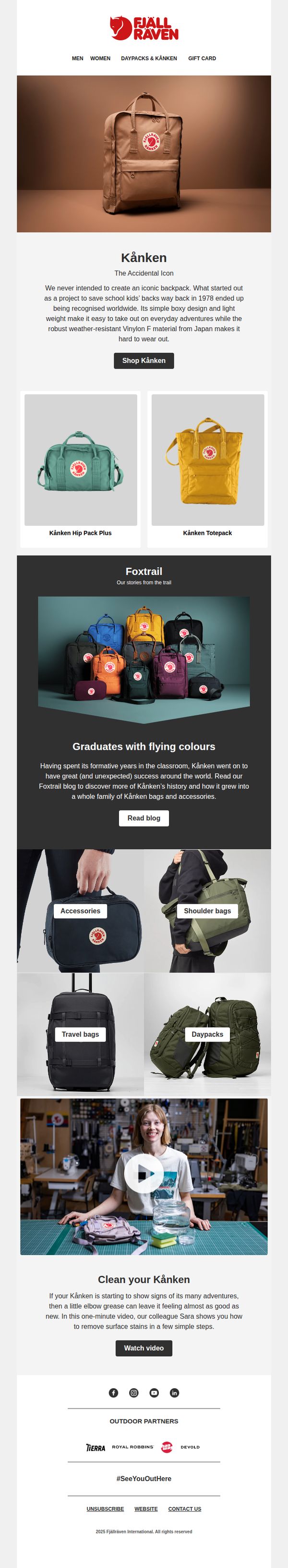
10. Fjällräven: Kånken
Objective
This email aims to celebrate and reinforce the cultural legacy of the Kånken backpack while driving product discovery and engagement across its extended family of bags and accessories. It blends storytelling, education, and visual merchandising to convert interest into action.
Why this works
The email brilliantly frames the Kånken not just as a product but as a cultural artifact with a compelling origin story, turning functional design into emotional resonance that invites customers to become part of its legacy.
How to implement
By visually grouping related products like the Hip Pack Plus and Tote Pack under the Kånken umbrella, the email subtly expands perceived value without overwhelming the user, making cross-category exploration feel natural and intuitive.
Pro Tip
Add a subtle countdown or limited-edition badge near the 'Shop Kånken' CTA to create urgency, especially since the email highlights heritage, scarcity would amplify the emotional pull of owning a piece of iconic design history. • Reposition the 'Watch video' CTA directly beneath the hero image or integrate it into the product grid as a hover-triggered tooltip, currently buried, it misses the chance to immediately engage users who are visually drawn to the backpack’s story and care.