Proven Exclusive Sneak Peek email designs you can use
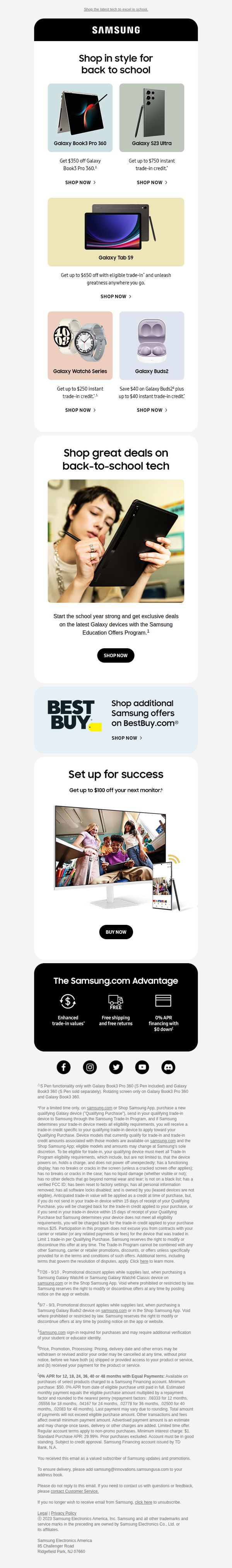
1. Samsung: Tanner, hurry! Back-to-school savings ending soon. 🎒
Objective
This email aims to drive immediate back-to-school tech purchases by highlighting time-sensitive savings on Samsung devices, leveraging urgency and trade-in incentives to convert students and parents into buyers before the promotion ends.
Why this works
The email masterfully combines urgency with personalization by addressing the recipient by name and using a time-sensitive subject line, which immediately triggers FOMO and increases the likelihood of immediate engagement from back-to-school shoppers.
How to implement
Each product tile is strategically paired with a clear, benefit-driven discount message and a direct 'SHOP NOW' CTA, reducing friction and decision fatigue by making the value proposition instantly scannable and actionable for time-pressed parents and students.
Pro Tip
Add a visible countdown timer near the top of the email to reinforce urgency visually, since the subject line implies time sensitivity but the body lacks a dynamic element to sustain that pressure throughout the scroll. • Reposition the Best Buy cross-sell section higher or integrate it into the main product grid with a clear label like 'Also Available at Best Buy' to avoid breaking the flow and diluting Samsung.com’s conversion focus.
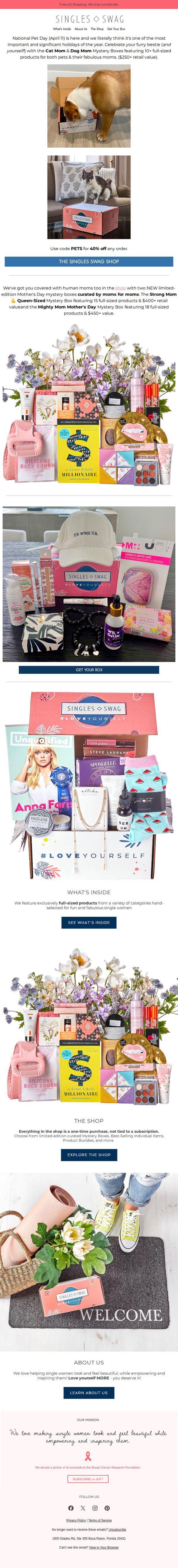
2. SinglesSwag: Celebrate National Pet Day With Dog Mom & Cat Mom Mystery Boxes
Objective
This email aims to drive immediate purchases by celebrating National Pet Day with themed mystery boxes for pet-loving moms, while also promoting limited-edition Mother’s Day boxes to capitalize on seasonal gifting behavior and emotional connection.
Why this works
The email brilliantly ties a cultural moment, National Pet Day, to a product launch, creating urgency and emotional resonance by positioning the mystery box as a gift for both pet and owner, which deepens the perceived value and personal relevance.
How to implement
By showcasing two distinct mystery box themes, one for pet moms and another for human moms, the campaign expands its audience without diluting its core message, allowing customers to self-select based on identity while feeling seen and celebrated.
Pro Tip
Add a countdown timer near the CTA to reinforce urgency for the National Pet Day promotion, especially since the offer is time-sensitive and tied to a specific calendar date. • Include a short customer testimonial or social proof near the product grid to validate the mystery box experience, as the value proposition relies heavily on trust in the curation and quality of unknown items.
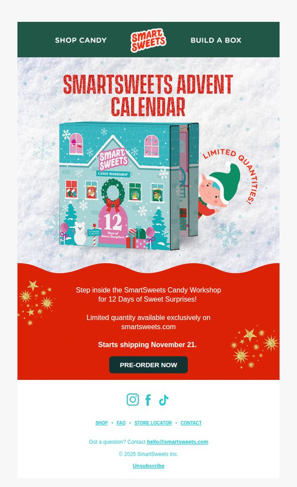
3. Smart Sweets: Limited Edition Advent calendars are here! 🍭
Objective
To drive immediate pre-orders for Smart Sweets’ limited-edition Advent calendar by creating urgency around exclusive availability and holiday-themed excitement. The email aims to convert holiday shoppers by positioning the product as a must-have seasonal treat.
Why this works
The email brilliantly ties the product to a beloved holiday ritual, the Advent calendar, while adding a unique twist with '12 Days of Sweet Surprises,' making it feel both familiar and fresh to seasonal shoppers.
How to implement
Using a playful elf peeking from the side and snowflake background creates instant holiday cheer without clutter, helping the product stand out while reinforcing the limited-edition, festive urgency in a visually cohesive way.
Pro Tip
Add a countdown timer near the CTA to visually reinforce 'Limited Quantities' and create real-time urgency, encouraging immediate pre-orders before stock runs out. • Include a short testimonial or social proof snippet (e.g., 'Over 10,000 calendars sold last year!') near the product image to build trust and validate the product’s popularity among past customers.
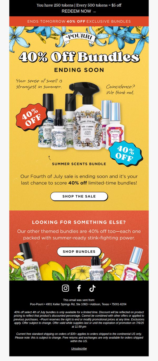
4. Poo-Pourri: Savings end tomorrow!
Objective
The email aims to drive immediate purchases by creating urgency around a limited-time 40% off sale on Poo-Pourri bundles, specifically targeting customers who may be shopping for summer-themed scent collections before the promotion ends.
Why this works
The email brilliantly ties the product’s core benefit, odor control, to seasonal behavior by reminding readers that ‘Your sense of smell is strongest in summer,’ making the offer feel timely and personally relevant rather than just promotional.
How to implement
Using dual visual discount badges, one red and one blue, strategically placed on opposite sides of the product lineup creates a dynamic, eye-catching layout that reinforces the 40% discount without overwhelming the viewer or diluting the message.
Pro Tip
Add a countdown timer beneath the 'ENDS TOMORROW' banner to visually reinforce urgency and reduce cognitive load, customers shouldn’t have to mentally calculate how much time remains before the sale expires. • Include a short testimonial or social proof near the CTA button, such as 'Over 10,000 customers stocked up before the sale ends', to reduce hesitation and increase conversion by validating the offer’s popularity.
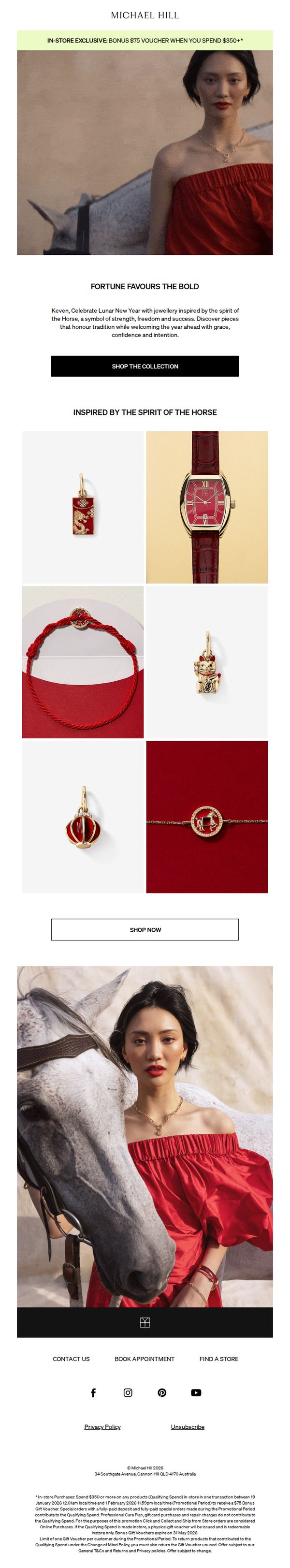
5. Michael Hill: Limited edition Lunar New Year designs
Objective
To drive in-store sales by promoting a limited-edition Lunar New Year collection inspired by the spirit of the Horse, while incentivizing purchases over $350 with a bonus $75 voucher. The campaign also aims to position Michael Hill as a culturally resonant luxury brand during the festive season.
Why this works
The email brilliantly ties cultural symbolism to luxury product storytelling by anchoring the Lunar New Year collection around the Horse, a powerful emblem of strength and success, making the jewelry feel meaningful, not just decorative.
How to implement
By offering a tangible in-store incentive, a $75 voucher for $350+ spend, the campaign transforms seasonal browsing into a compelling reason to visit physical stores, effectively bridging digital engagement with real-world foot traffic.
Pro Tip
Add a countdown timer near the offer section to emphasize the limited-time nature of the $75 voucher, increasing urgency and reducing decision latency for in-store shoppers. • Include a small testimonial or customer quote near the product grid to build social proof, for example, 'Over 80% of customers who bought Lunar pieces said they felt more confident wearing them', to reinforce emotional resonance.
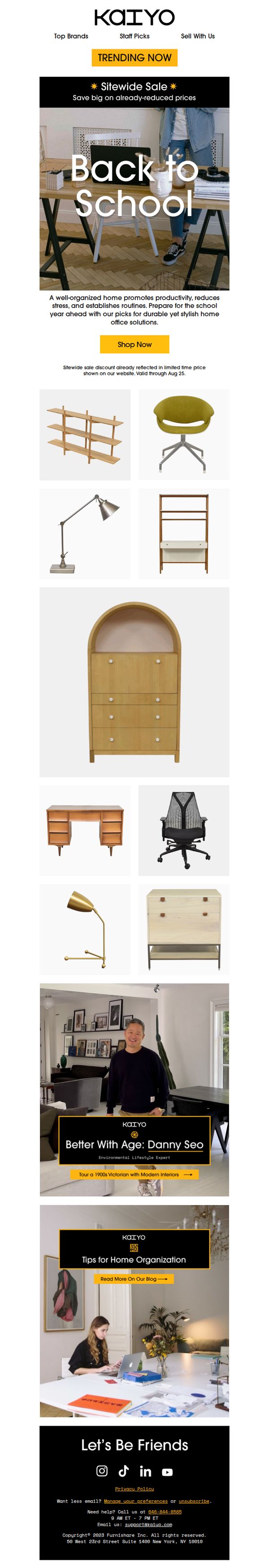
6. Kaiyo: ✏️ Trending Now: Back to School
Objective
This email aims to drive sales by promoting Kaiyo’s Back to School collection, positioning home office furniture as essential for productivity and routine during the school year, while leveraging a sitewide sale to create urgency and encourage immediate purchases.
Why this works
The email smartly ties back-to-school timing to home office needs, reframing furniture not as decor but as a productivity tool, making the purchase feel necessary rather than optional for parents and students alike.
How to implement
By featuring a curated grid of functional yet stylish items like ergonomic chairs and modular desks, the campaign visually communicates versatility and quality, helping shoppers imagine how each piece fits into their real-life routines.
Pro Tip
Add a countdown timer under the 'Shop Now' CTA to reinforce urgency, since the sale ends Aug 25, this visual cue would increase conversion by making the deadline feel immediate and tangible. • Include customer testimonials or star ratings beneath key products in the grid to reduce perceived risk and boost confidence in purchasing pre-owned furniture, especially for first-time buyers.
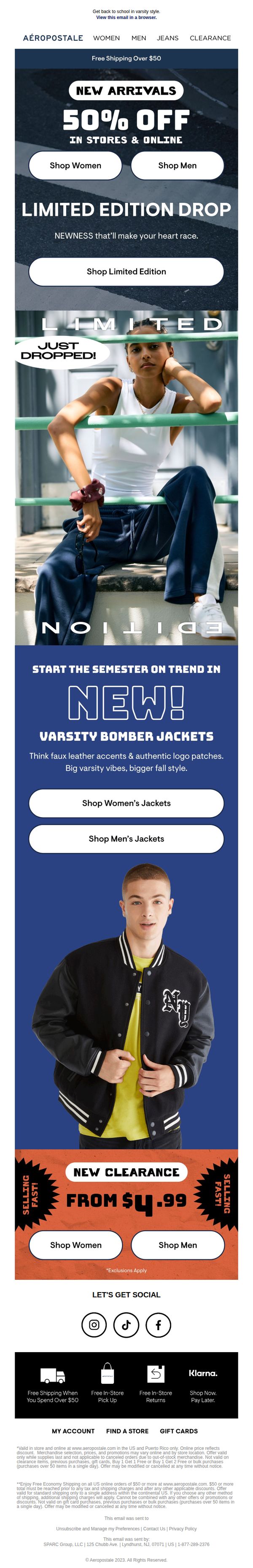
7. Aeropostale: 50% OFF + NEW! Limited Edition Drop ⚠️
Objective
This email aims to drive immediate traffic and sales by promoting a limited-time 50% off sale across new arrivals and clearance items, while highlighting a fresh product drop to create urgency and excitement around back-to-school fashion.
Why this works
The email masterfully combines urgency with exclusivity by pairing a bold 50% off headline with a 'Limited Edition Drop' tagline, making shoppers feel they’re accessing something rare and time-sensitive rather than just another sale.
How to implement
By visually separating new arrivals, limited drops, and clearance sections with distinct color blocks and imagery, the email guides the eye naturally through different shopping motivations, novelty, urgency, and value, without overwhelming the reader.
Pro Tip
Add a countdown timer near the 'Limited Edition Drop' section to visually reinforce urgency and encourage immediate action, since the current design relies solely on text to convey time sensitivity. • Include a short testimonial or social proof snippet under the 'Varsity Bomber Jackets' section to build trust and validate the product’s appeal, especially since it’s positioned as a new, trend-driven item.
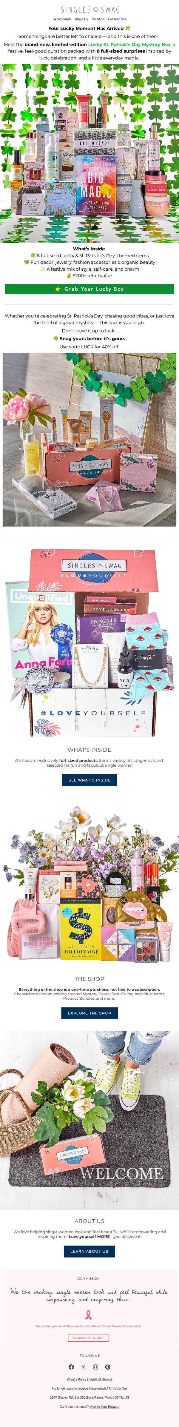
8. SinglesSwag: Just Dropped: 🍀 Lucky St. Patrick's Day Mystery Box 🍀
Objective
This email aims to drive immediate sales of the limited-edition Lucky St. Patrick’s Day Mystery Box by creating urgency and excitement around its festive, surprise-filled contents while reinforcing the brand’s empowering message for single women.
Why this works
The email brilliantly leverages seasonal excitement by framing the mystery box as a lucky, limited-edition experience, tapping into emotional anticipation and FOMO while aligning perfectly with St. Patrick’s Day’s themes of fortune and fun.
How to implement
By emphasizing full-sized, high-value products and explicitly stating the $200+ retail value, the campaign builds perceived worth and justifies the purchase, making the mystery feel like a smart, indulgent treat rather than a gamble.
Pro Tip
Add a visible countdown timer near the CTA to reinforce scarcity and urgency, since the 'limited-edition' claim is strong but lacks a time-bound trigger to push immediate action. • Include a short customer testimonial or social proof near the product grid to validate the box’s value and surprise factor, especially since mystery boxes rely heavily on trust and past buyer satisfaction.
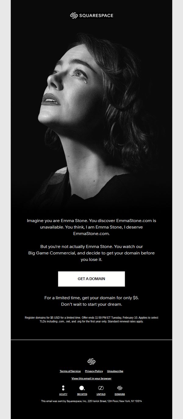
9. Squarespace: Get your domain for $5
Objective
The email aims to drive immediate domain registrations by creating emotional urgency through a relatable narrative, positioning Squarespace as the solution to securing a personal brand identity before it’s lost to someone else.
Why this works
The email brilliantly uses narrative psychology by casting the reader as a celebrity who almost lost their dream domain, making the offer feel personal and emotionally urgent rather than transactional.
How to implement
By anchoring the $5 domain offer to a time-sensitive deadline and tying it to a fictional commercial, the campaign transforms a routine purchase into a high-stakes moment of identity ownership.
Pro Tip
Add a subtle countdown timer beneath the CTA to visually reinforce urgency and reduce the cognitive load of calculating the deadline, increasing conversion likelihood. • Include a micro-testimonial or social proof near the CTA, such as 'Over 50,000 domains claimed this week', to reduce perceived risk and validate the offer’s popularity.
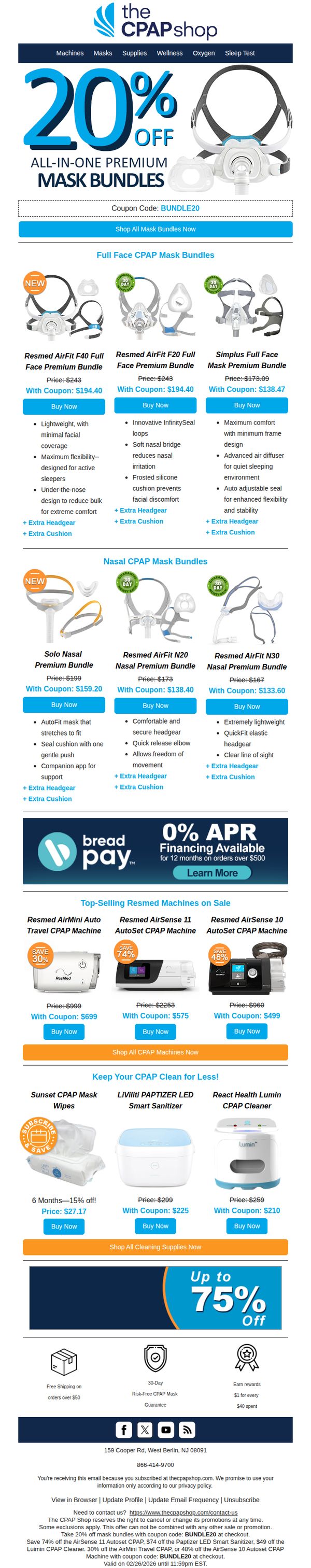
10. The CPAP Shop: 20% Off CPAP Premium Bundles (Mask + One Year of Supplies)—Starting at ONLY $133
Objective
This email aims to drive immediate sales of CPAP mask bundles by highlighting a limited-time 20% discount, while also cross-promoting machines and cleaning supplies to increase average order value. It seeks to position The CPAP Shop as a one-stop solution for comprehensive sleep therapy needs.
Why this works
The email brilliantly anchors attention with a bold, oversized discount headline paired with a visual of the product, immediately communicating value and relevance to the target audience without requiring them to scroll or decode the offer.
How to implement
By organizing products into clearly labeled categories like 'Full Face' and 'Nasal' bundles, the email reduces decision fatigue and guides users toward the right solution based on their comfort preference, making the shopping experience feel personalized and intuitive.
Pro Tip
Add a countdown timer beneath the coupon code to create urgency around the 20% off offer, especially since the fine print indicates the promotion expires on 02/26/2026, a date that feels distant and reduces perceived scarcity. • Reposition the '0% APR Financing' banner higher in the email, perhaps directly under the hero section, so users who are price-sensitive or budget-conscious see financing options before scrolling past, increasing conversion likelihood.