Quay Australia email examples & ideas

1. 40% OFF HAPPENING NOW 🛍️
Objective
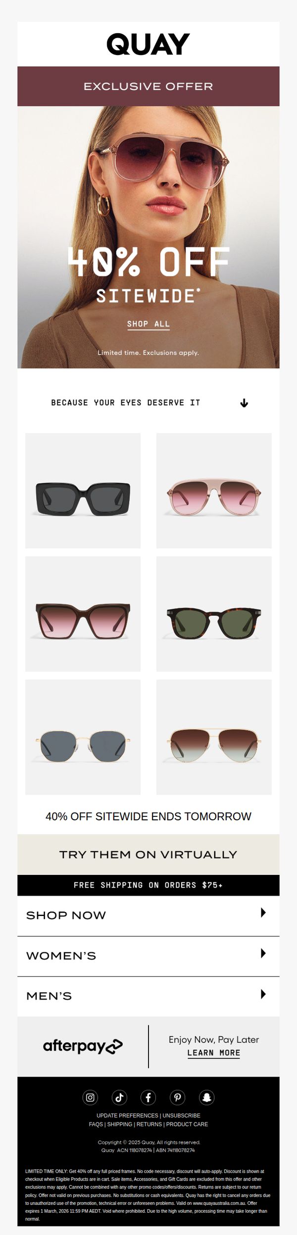
This email aims to drive immediate sales by promoting a time-sensitive 40% sitewide discount on Quay Australia sunglasses, leveraging urgency and visual appeal to encourage quick clicks and purchases before the offer expires.
Why this works
The email masterfully combines urgency with visual storytelling by placing a bold '40% OFF' headline over a high-quality model shot, instantly communicating value while anchoring the brand’s aesthetic in the customer’s mind.
How to implement
By featuring a clean, six-product grid beneath the hero, the campaign reduces decision fatigue while showcasing variety, a smart balance between promotion and product discovery that keeps the user engaged without overwhelming them.
Pro Tip
Add a countdown timer beneath the '40% OFF SITEWIDE ENDS TOMORROW' banner to visually reinforce urgency and trigger FOMO, increasing conversion likelihood for hesitant shoppers. • Include a short testimonial or social proof snippet near the product grid, such as 'Over 10,000 customers bought these last week', to build trust and validate the offer’s popularity before users scroll to the footer.
2. ⚡ 40% OFF EVERYTHING
Objective
To drive immediate sales by promoting a limited-time 40% off sitewide discount, encouraging recipients to browse and purchase sunglasses across gender categories while leveraging virtual try-on and payment flexibility to reduce friction.
Why this works
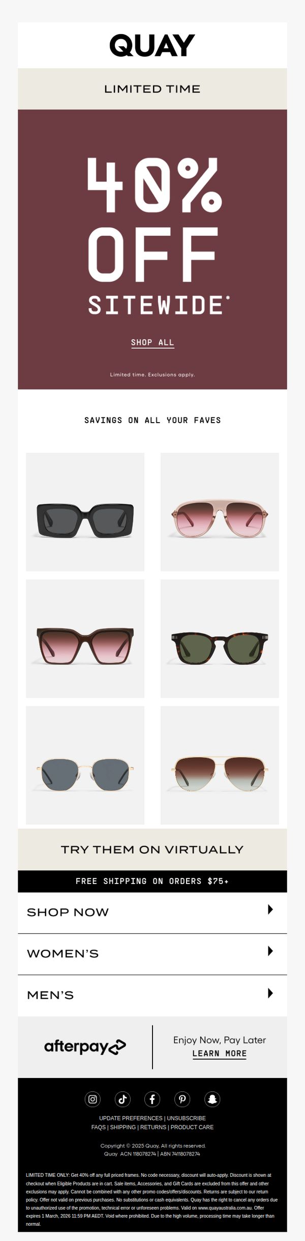
The email leverages urgency and exclusivity by pairing a bold '40% OFF SITEWIDE' headline with a 'LIMITED TIME' tagline, creating immediate psychological pressure to act before the deal vanishes.
How to implement
By featuring a clean 2x3 product grid of top sunglasses with neutral backgrounds, the email visually reinforces variety and style without overwhelming the user, making it easy to scan and select favorites.
Pro Tip
Add a countdown timer beneath the hero section to visually reinforce urgency and encourage immediate clicks, especially since the offer expires March 1, 2026, a date currently buried in fine print. • Replace the generic 'SHOP ALL' CTA with a more benefit-driven phrase like 'Grab 40% Off Before It’s Gone' to better align with the emotional trigger of scarcity and increase conversion intent.
3. ⚡ 40% OFF EVERYTHING
Objective
This email aims to drive immediate site traffic and conversions by promoting a limited-time, sitewide 40% discount, encouraging recipients to shop popular sunglasses while emphasizing urgency and virtual try-on convenience.
Why this works
The email leverages bold, high-contrast typography and a deep maroon background to instantly communicate urgency and value, making the 40% discount impossible to miss and psychologically compelling for impulse buyers.
How to implement
By showcasing six best-selling frames in a clean grid under 'Savings on All Your Faves,' the campaign taps into social proof and visual appeal, reducing decision fatigue while subtly guiding users toward top-performing products.
Pro Tip
Add a countdown timer beneath the 'Limited Time' banner to visually reinforce urgency and encourage faster decision-making, especially since the offer expires on a specific date mentioned only in the fine print. • Reposition the 'Shop All' CTA button to be more prominent, perhaps larger or with a contrasting color, since it’s the primary conversion point and currently blends into the hero section’s minimal design.