Eyewear campaign ideas that work
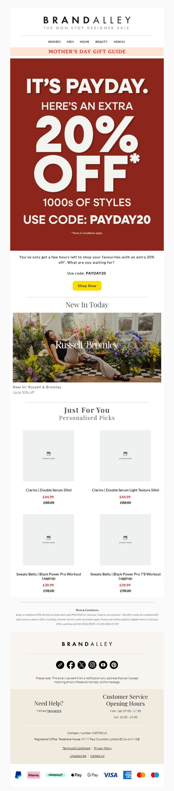
1. BrandAlley: Your Payday Deal Ends Today | Plus up to 50% off New In Russell & Bromley
Objective
This email aims to drive immediate sales by leveraging urgency around a limited-time payday discount while cross-promoting new arrivals from Russell & Bromley to expand purchase consideration. It also personalizes product recommendations to increase relevance and conversion likelihood.
Why this works
The email masterfully combines urgency with exclusivity by framing the 20% off as a payday bonus, making the discount feel like a personal reward rather than a generic sale, which boosts emotional engagement and conversion intent.
How to implement
By spotlighting Russell & Bromley’s new arrivals immediately after the main offer, the campaign strategically bridges urgency with discovery, encouraging shoppers to explore fresh inventory while still under the influence of the promotional mindset.
Pro Tip
Add a visible countdown timer in the hero section to reinforce urgency beyond text, as visual time pressure significantly increases conversion rates for time-limited offers. • Include a short testimonial or social proof near the personalized picks to build trust and validate product quality, especially since the items are from premium brands like Clarins and Sweaty Betty.
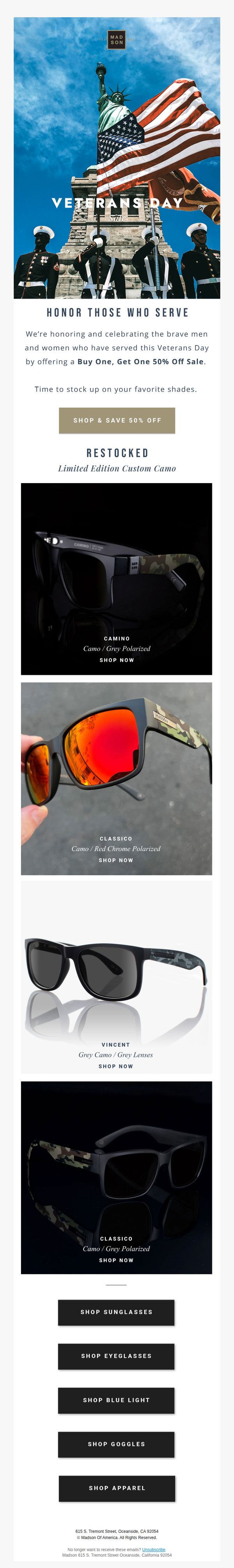
2. Madson: 🇺🇸🇺🇸 Exclusive Veterans Day Offer: BOGO 50% Off!🇺🇸 🇺🇸
Objective
This email aims to drive immediate sales by honoring Veterans Day with a limited-time BOGO 50% off promotion, while also reinforcing brand patriotism and encouraging customers to stock up on popular sunglasses styles.
Why this works
The email brilliantly ties a patriotic holiday to a tangible discount, making the promotion feel emotionally resonant rather than purely transactional, which deepens customer connection and urgency.
How to implement
By featuring specific product names and lens details beneath each image, the email educates shoppers while reducing friction, helping them make confident, informed decisions without leaving the email.
Pro Tip
Add a countdown timer near the CTA to amplify urgency, since the offer is tied to a specific holiday, a visible timer would reinforce the limited-time nature and push hesitant buyers to act. • Include a short testimonial or social proof near the product grid to build trust, for example, a quote like 'These shades survived my deployment, still look brand new!' would resonate with the target audience.
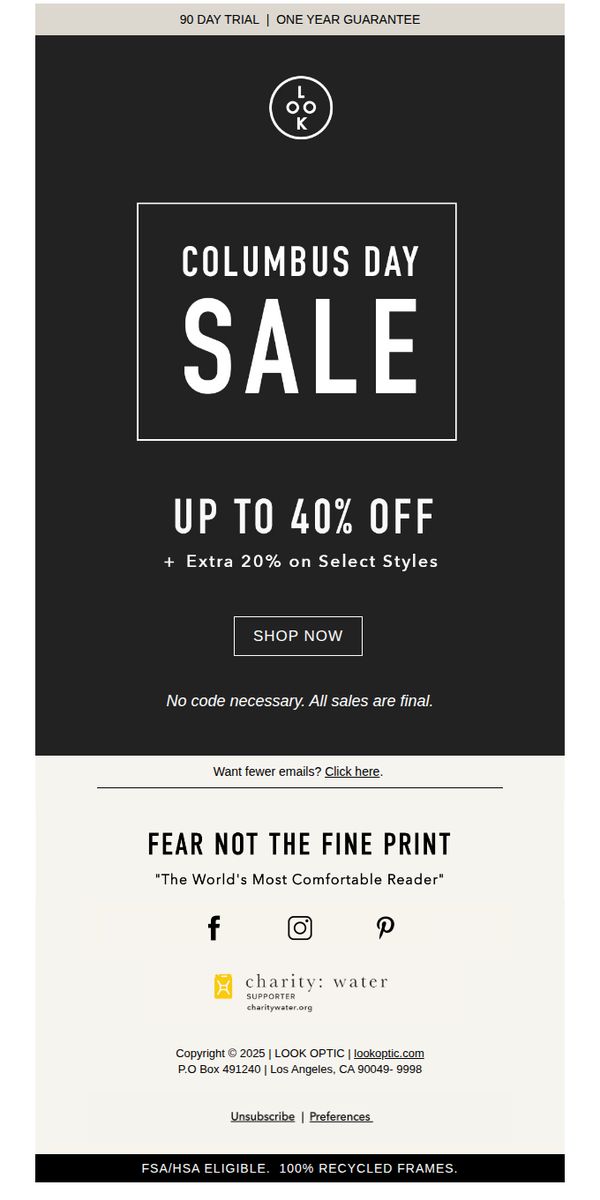
3. LOOK OPTIC: Our Columbus Day Sale Just Got Better
Objective
This email aims to drive immediate sales by promoting a limited-time Columbus Day discount while reinforcing brand trust through guarantees and social proof. It encourages urgency with bold discount messaging and a clear call to action.
Why this works
The email leverages a bold, high-contrast hero section with oversized typography to instantly communicate the sale’s value, ensuring the discount message dominates the viewer’s attention within milliseconds of opening.
How to implement
By combining a primary discount with an additional layer of savings on select styles, the campaign creates perceived exclusivity and urgency, nudging customers to explore more products while feeling they’re getting a unique, time-sensitive deal.
Pro Tip
Add a countdown timer beneath the 'UP TO 40% OFF' headline to visually reinforce urgency and encourage immediate action, especially since the sale is tied to a specific holiday. • Include a small product grid or featured frame image in the hero section to give visual context to the offer, helping customers immediately connect the discount with tangible products they might want.
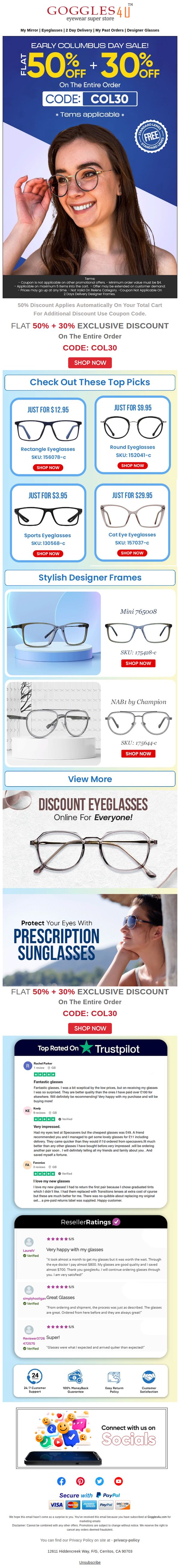
4. Goggles4u: ❤ Early Columbus Day Sale Starts NOW.
Objective
This email aims to drive immediate sales by promoting an early Columbus Day discount event with a layered discount structure, while also building trust through social proof and customer reviews to reduce purchase hesitation.
Why this works
The email brilliantly layers discounts, 50% off automatically plus 30% with a code, to create a perception of exclusivity and urgency, making the offer feel more valuable than a single flat discount while encouraging immediate action.
How to implement
By featuring real customer reviews from Trustpilot and ResellerRatings with star ratings and personal stories, the campaign builds authentic social proof that directly addresses price-quality skepticism, which is critical for a value-driven eyewear brand.
Pro Tip
Add a countdown timer near the hero section to reinforce urgency, since the 'Early Columbus Day Sale' implies time sensitivity but currently lacks a visual cue to prompt immediate action. • Include a small icon or badge next to the 'FREE STANDARD LENSES' seal indicating it’s a limited-time perk, to elevate perceived value and prevent it from being overlooked as a standard feature.
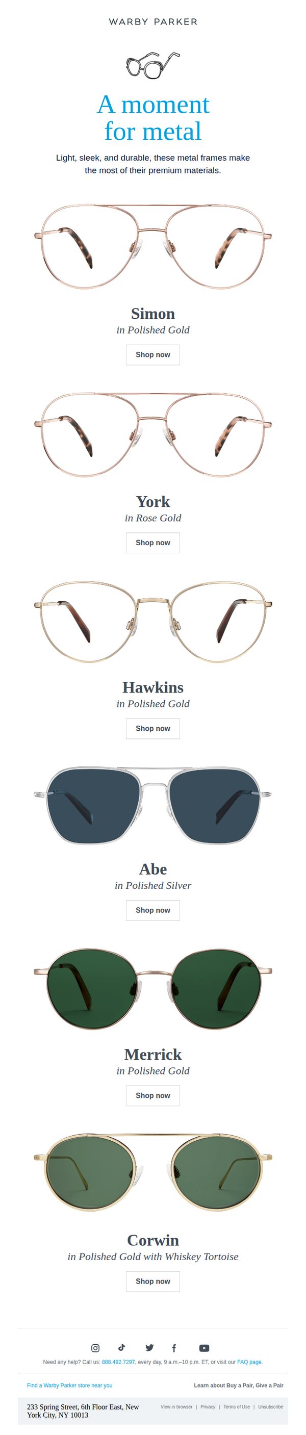
5. Warby Parker: Got metal on the mind?
Objective
This email aims to highlight Warby Parker’s metal-framed eyewear collection by showcasing its premium materials and stylish designs, encouraging recipients to explore and purchase specific models through direct product links.
Why this works
The email smartly frames metal frames as a premium, intentional choice by emphasizing their lightness, sleekness, and durability, turning material into a lifestyle statement rather than just a feature.
How to implement
Each product is presented with a clean, consistent layout that pairs high-res imagery with minimal copy and a direct 'Shop now' CTA, reducing friction and guiding the user toward immediate exploration.
Pro Tip
Add a subtle visual hierarchy to the product grid by varying image size or adding a 'Best Seller' badge to top-performing frames, helping guide attention without overwhelming the clean layout. • Include a short testimonial or customer rating beneath 1–2 featured frames to build social proof and reduce perceived risk for first-time buyers of metal frames.
6. Secret Sales - UK: Outlet | 70% or More Off Everything
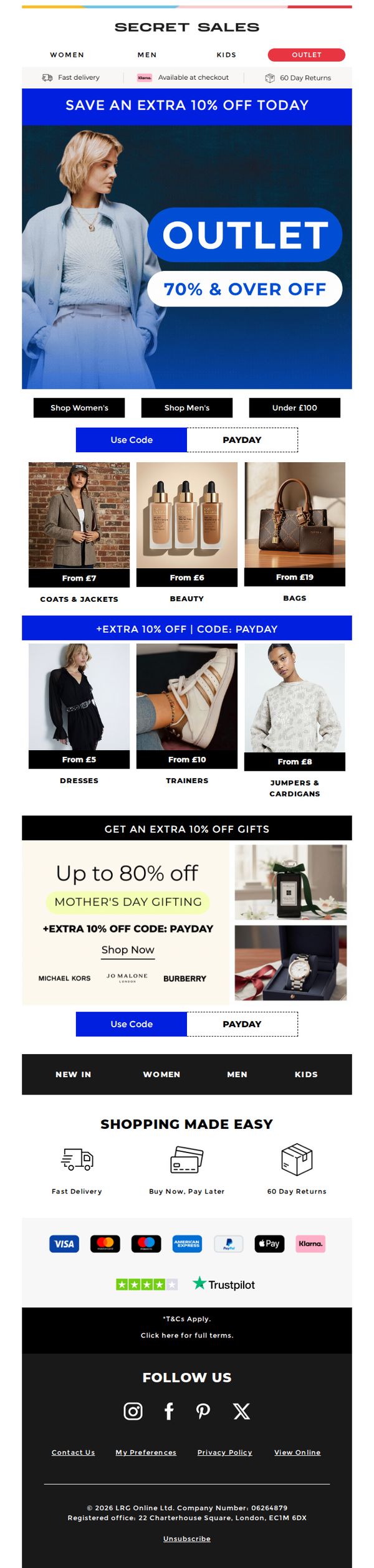
Objective
This email aims to drive immediate sales by highlighting deep discounts across all categories while incentivizing urgency with an extra 10% off for same-day purchases. It also promotes Mother’s Day gifting with curated brand selections and reinforces trust through payment flexibility and return policies.
Why this works
The email brilliantly layers urgency and value by combining a massive outlet discount with a time-sensitive extra 10% off, making the offer feel exclusive and impossible to ignore for bargain hunters.
How to implement
By segmenting products into visually distinct categories with clear price anchors like 'From £5' or 'From £6', the email reduces decision fatigue and guides shoppers effortlessly toward high-conversion items.
Pro Tip
Add a visible countdown timer near the 'Use Code' CTA to reinforce urgency for the extra 10% off, as the current design lacks temporal pressure despite promoting a same-day discount. • Reposition the 'PAYDAY' payment option closer to the primary CTA or integrate it into the hero section to reduce friction for users who may abandon carts due to payment concerns.
7. Otra Eyewear : Roses are red, Violets are blue...
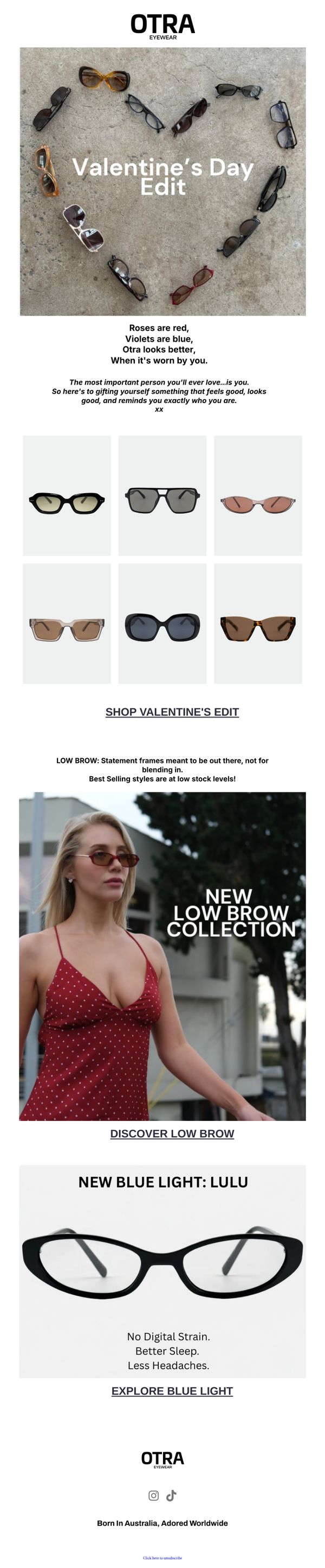
Objective
This email campaign aims to celebrate Valentine’s Day by encouraging self-gifting with Otra Eyewear, positioning their sunglasses and blue light glasses as thoughtful, stylish, and personally empowering purchases. It subtly shifts the romantic narrative to self-love while driving traffic to new and best-selling collections.
Why this works
The email brilliantly reframes Valentine’s Day as a celebration of self-love, using poetic copy to emotionally connect with the recipient while positioning Otra’s eyewear as the perfect gift you give yourself, a clever twist that boosts purchase intent without alienating single customers.
How to implement
By featuring a curated grid of six sunglasses styled in a heart shape, the campaign visually reinforces the Valentine’s theme while showcasing product variety, making it easy for shoppers to browse and choose, a smart blend of aesthetic storytelling and functional product presentation that drives engagement.
Pro Tip
Add a subtle urgency element like a low-stock indicator or limited-time offer badge next to the 'Low Brow Collection' section to nudge hesitant shoppers, since the copy already mentions 'best selling styles are at low stock levels,' visual reinforcement would strengthen conversion pressure. • Reposition the 'Explore Blue Light' CTA to appear immediately after the Lulu glasses image instead of below the benefit bullet points, this reduces friction by aligning the action with the visual and message, improving click-through likelihood for that high-value product segment.
8. Warby Parker: For those overthinkers out there
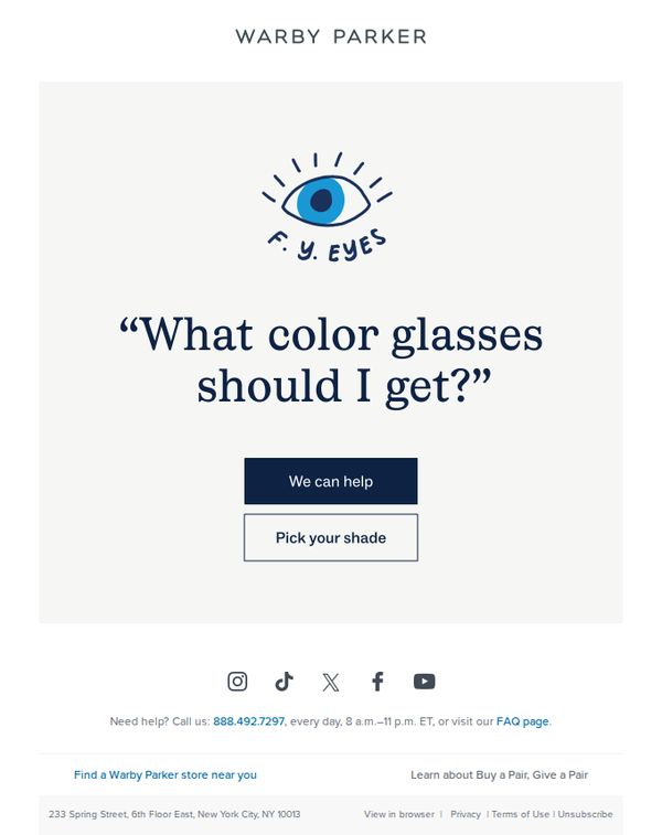
Objective
This email aims to reduce decision fatigue for customers overwhelmed by color choices, positioning Warby Parker as a helpful guide while driving engagement toward personalized shade selection. It turns hesitation into action with empathetic, solution-oriented messaging.
Why this works
Warby Parker brilliantly reframes customer indecision as a shared, relatable struggle, using the phrase 'For those overthinkers out there' to build instant emotional rapport and position the brand as a trusted ally rather than just a seller.
How to implement
The minimalist hero section with a single bold question, 'What color glasses should I get?', mirrors the customer’s internal monologue, creating psychological alignment and making the CTA feel like a natural, comforting next step instead of a sales push.
Pro Tip
Add a subtle visual cue or micro-animation near the 'We can help' button to draw attention, since the hero section is sparse, a small motion element could increase CTA engagement without compromising the clean aesthetic. • Include a one-sentence social proof snippet beneath the headline (e.g., '92% of customers say our shade quiz made their decision easy') to reinforce credibility and reduce perceived risk for hesitant shoppers.
9. Secret Sales - UK: Half Price + Extra 10% off Beauty & Fragrance
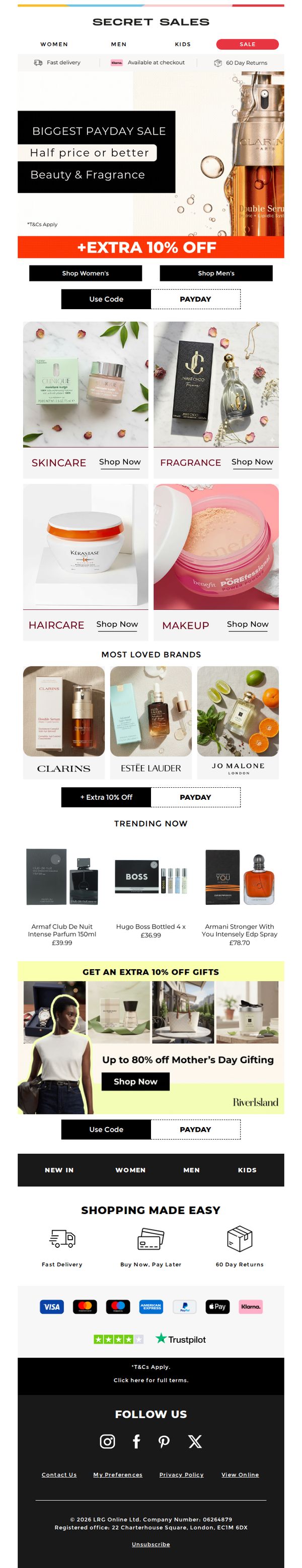
Objective
This email aims to drive immediate sales by promoting a limited-time Payday Sale offering half-price deals plus an extra 10% off beauty and fragrance products, while also encouraging gift purchases for Mother’s Day with targeted discounts and curated brand highlights.
Why this works
The email brilliantly layers urgency and value by combining a headline ‘Half Price or Better’ with a secondary ‘Extra 10% Off’ banner, creating a psychological double incentive that compels immediate action without overwhelming the reader.
How to implement
By visually segmenting product categories like Skincare, Fragrance, Haircare, and Makeup with clean imagery and direct ‘Shop Now’ links, the email reduces decision fatigue and guides users effortlessly toward their preferred product type, boosting conversion potential.
Pro Tip
Add a countdown timer near the hero section to reinforce urgency for the Payday Sale, as the current design relies solely on text which may not trigger immediate action as effectively as a visual time constraint. • Reposition the ‘Use Code’ and ‘PAYDAY’ buttons to be more visually distinct and aligned with the primary CTA, currently, they’re visually buried under the category grid and may be overlooked by users scanning quickly.
10. Quay Australia: ⚡ 40% OFF EVERYTHING
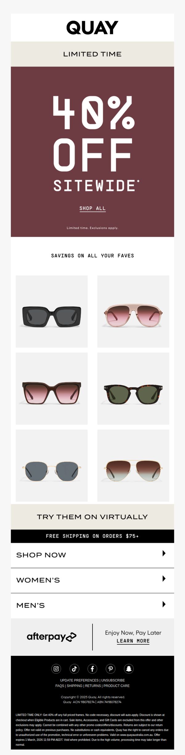
Objective
This email aims to drive immediate site traffic and conversions by promoting a limited-time, sitewide 40% discount, encouraging recipients to shop popular sunglasses while emphasizing urgency and virtual try-on convenience.
Why this works
The email leverages bold, high-contrast typography and a deep maroon background to instantly communicate urgency and value, making the 40% discount impossible to miss and psychologically compelling for impulse buyers.
How to implement
By showcasing six best-selling frames in a clean grid under 'Savings on All Your Faves,' the campaign taps into social proof and visual appeal, reducing decision fatigue while subtly guiding users toward top-performing products.
Pro Tip
Add a countdown timer beneath the 'Limited Time' banner to visually reinforce urgency and encourage faster decision-making, especially since the offer expires on a specific date mentioned only in the fine print. • Reposition the 'Shop All' CTA button to be more prominent, perhaps larger or with a contrasting color, since it’s the primary conversion point and currently blends into the hero section’s minimal design.