quip email examples & ideas from real campaigns
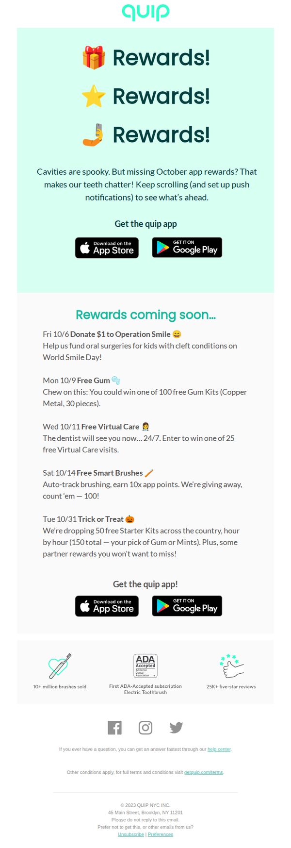

1. 🔥 October app rewards coming in hot
Objective
This email aims to re-engage users by teasing upcoming October app rewards while encouraging app downloads and push notification opt-ins. It leverages urgency and social impact to drive immediate action and sustained app usage.
Why this works
The email brilliantly uses playful, emoji-driven repetition of 'Rewards!' to create instant visual rhythm and emotional anticipation, making the offer feel celebratory rather than transactional, a smart hook for casual scrollers.
How to implement
By tying each reward to a specific date and cause, like donating to Operation Smile or giving away free gum kits, the campaign transforms generic promotions into a narrative-driven calendar event, boosting perceived value and FOMO.
Pro Tip
Add a countdown timer or 'X days until next reward' indicator next to each date to amplify urgency and encourage users to return daily, rather than treating the calendar as a static list. • Include a short testimonial or user quote near the '25K+ five-star reviews' badge to humanize social proof, right now it’s a statistic, but a real voice would strengthen trust and emotional connection.
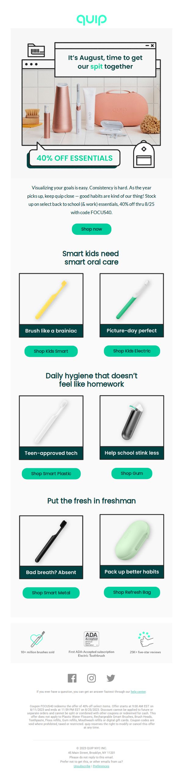
2. 🪥 Fresh, focused, & 40% off
Objective
This email aims to drive urgency-driven purchases of Quip’s oral care essentials by offering a 40% discount tied to the back-to-school season, while segmenting product recommendations for kids, teens, and college students to increase relevance and conversion.
Why this works
The email brilliantly ties oral hygiene to back-to-school routines by framing toothbrushes as essential tools for focus and confidence, making the product feel indispensable rather than optional during a high-intent shopping season.
How to implement
By segmenting product recommendations into ‘Smart Kids,’ ‘Teen-approved tech,’ and ‘Freshman’ categories, Quip transforms a generic discount into a personalized journey that speaks directly to different life stages and pain points.
Pro Tip
Add a countdown timer near the CTA to amplify urgency, since the offer expires 8/25, visually reinforcing the deadline could reduce hesitation and increase immediate click-throughs. • Reposition the ‘Shop now’ CTA to appear immediately after the hero image and offer copy, currently, it’s buried under paragraph text, which may cause users to scroll past without acting.
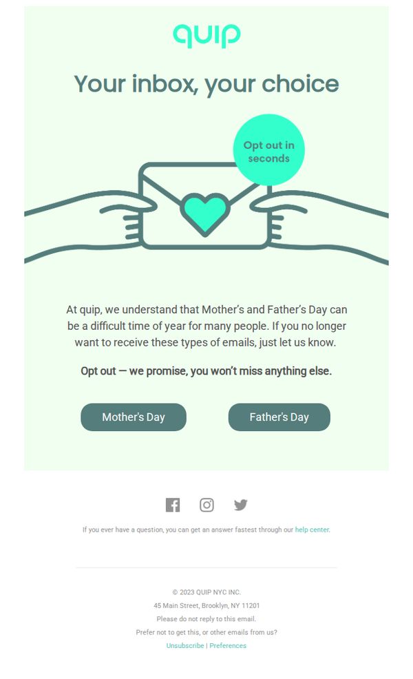
3. Don’t want Mother’s & Father’s Day emails?
Objective
This email aims to respectfully allow subscribers to opt out of Mother’s and Father’s Day-themed marketing messages, acknowledging the emotional sensitivity of these holidays while preserving the relationship by assuring them they won’t miss other important communications.
Why this works
Quip demonstrates emotional intelligence by proactively acknowledging that Mother’s and Father’s Day can be painful for some subscribers, turning a potential point of friction into a moment of brand empathy and trust-building.
How to implement
The email’s minimalist design and clear opt-out buttons reduce cognitive load, making it easy for users to take action without feeling pressured, which reinforces the brand’s commitment to user autonomy and respect.
Pro Tip
Add a brief, reassuring sentence above the buttons explaining what types of emails they’ll still receive (e.g., product updates, restock alerts) to reduce anxiety about missing out and reinforce the value of staying subscribed. • Include a small icon or visual cue next to each holiday button (e.g., a flower for Mother’s Day, a tie for Father’s Day) to improve visual scanning and emotional recognition, helping users quickly identify which option applies to them.
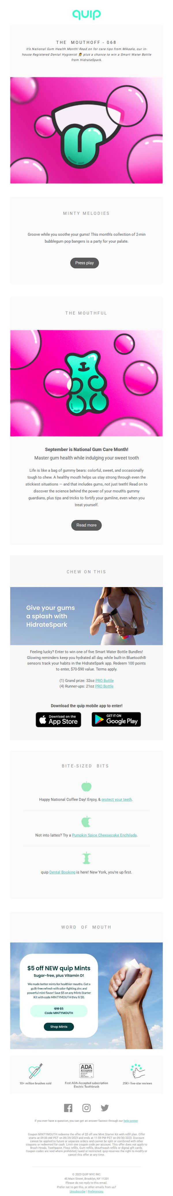
4. Tooth tip: Chase your PSL with a swig of H2O
Objective
This email aims to educate subscribers on gum health during National Gum Care Month while promoting quip’s oral care products and HidrateSpark hydration tech through playful, seasonal content and a giveaway. It blends dental education with lifestyle appeal to drive app downloads, product sales, and brand engagement.
Why this works
The email brilliantly ties seasonal indulgences like PSLs to oral health by reframing hydration as a dental defense, making the message feel timely, relatable, and non-preachy while subtly promoting HidrateSpark as a smart solution.
How to implement
By embedding a giveaway with tangible value, smart water bottles, the campaign transforms passive readers into active participants, leveraging FOMO and utility to boost app downloads and brand loyalty without feeling transactional.
Pro Tip
The CTA 'Shop Mints' is buried at the bottom and lacks urgency or visual hierarchy; repositioning it above the fold with a contrasting color and adding a countdown timer for the promo code would increase conversion. • The email lacks a clear visual path from education to action, adding a sticky 'Shop Now' button or a product carousel after the 'Read more' section would better guide users from learning to purchasing.
5. 🪥 Fresh, focused, & 40% off
Objective
This email aims to drive urgency-driven purchases of Quip’s oral care essentials by offering a 40% discount tied to the back-to-school season, while positioning the brand as a partner in building consistent, smart hygiene habits for kids, teens, and adults.
Why this works
The email brilliantly ties a seasonal discount to behavioral psychology, framing oral care as a ‘back-to-school & work essential’ makes the purchase feel necessary rather than optional, increasing conversion potential through contextual relevance.
How to implement
By segmenting products into audience-specific categories, kids, teens, and freshmen, Quip transforms a generic sale into a personalized experience, subtly guiding users to the right product without overwhelming them with choice.
Pro Tip
Add a visible countdown timer near the CTA to reinforce urgency, the current offer end date (8/25) is buried in fine print, and a dynamic timer would create stronger FOMO without disrupting the clean layout. • Include a short, benefit-driven tagline under each product tile, for example, ‘Reduces plaque 2x faster’, to help users quickly grasp value beyond the visual, especially for products like ‘Smart Metal’ where function isn’t immediately obvious.
6. 🪥 Happy National Brush Day! Win $1000
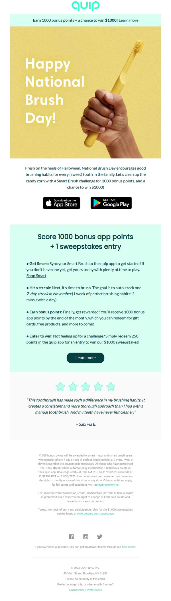
Objective
This email aims to celebrate National Brush Day by encouraging users to adopt consistent brushing habits through a gamified challenge, while incentivizing app engagement and product adoption with bonus points and a $1000 sweepstakes entry.
Why this works
By tying a national observance to a behavioral challenge, the email transforms routine hygiene into a fun, time-bound event that drives immediate user action while reinforcing brand values around consistent oral care.
How to implement
The campaign cleverly layers incentives, bonus points for habit-building and a sweepstakes for low-effort participation, creating multiple entry points for users regardless of their motivation or current engagement level with the product.
Pro Tip
Add a visual countdown timer in the Offer Section to create urgency around the November 30 deadline, making the time-sensitive nature of the challenge more prominent and increasing immediate participation. • Reposition the primary CTA 'Learn more' closer to the top of the email, ideally beneath the hero image, to reduce friction for users who want to act immediately after seeing the headline and visual hook.
7. Don’t miss your mintiest (& healthiest) mouth yet 🌿
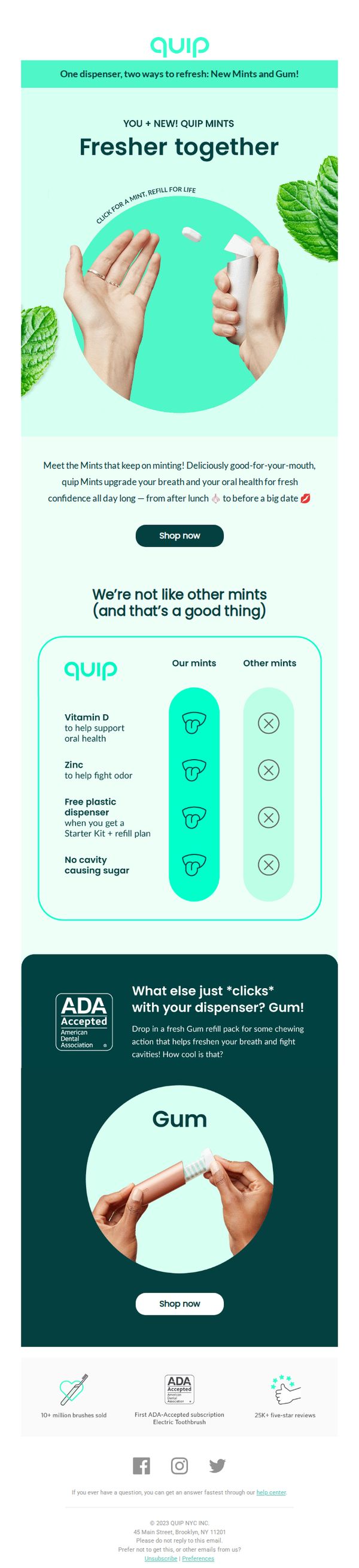
Objective
This email aims to introduce and drive sales of Quip’s new Mints and Gum by positioning them as fresh, healthy, and uniquely beneficial oral care companions that integrate seamlessly with their existing dispenser system. It seeks to convert interest into immediate purchases through clear product differentiation and social proof.
Why this works
The email brilliantly frames mints and gum not as snacks but as oral health tools, tying Vitamin D, zinc, and ADA acceptance to everyday confidence, which elevates the product beyond typical breath fresheners and aligns with modern wellness-driven consumer values.
How to implement
By visually contrasting Quip’s mints against ‘other mints’ using clean icons and checkmarks, the email instantly communicates superiority without overwhelming the reader, a smart, scannable way to build trust and justify premium positioning in a crowded category.
Pro Tip
Add a subtle countdown timer or limited-time offer badge near the CTA to create urgency, since the email currently lacks any time-sensitive incentive that could nudge hesitant buyers toward immediate action. • Include a short customer quote or micro-testimonial near the product comparison section to humanize the claims, for example, ‘I never knew mints could actually help my teeth until I tried Quip’, to strengthen emotional resonance and credibility.
8. Up to 40% off essentials ends tonight
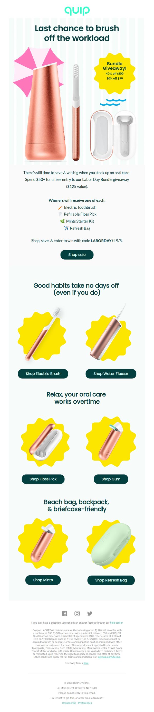
Objective
This email aims to drive urgency-driven purchases by promoting a limited-time sale with up to 40% off oral care essentials while incentivizing higher spend through a Labor Day Bundle Giveaway. It seeks to convert subscribers into customers before the promotion ends tonight.
Why this works
The email brilliantly combines urgency with aspiration by framing the sale as a 'last chance to brush off the workload,' making oral care feel like a self-care reward rather than a chore, which emotionally aligns with the audience’s daily rhythm.
How to implement
By tying the discount to a high-value giveaway, offering a $125 bundle for spending $50, the campaign transforms a simple sale into a gamified experience, encouraging larger cart values while making the customer feel like they’re winning, not just saving.
Pro Tip
Add a visible countdown timer near the hero section to reinforce urgency beyond the subject line, especially since the sale ends 'tonight', this would visually anchor the time-sensitive nature of the offer and reduce decision latency. • Include a small testimonial or social proof badge near the giveaway section (e.g., 'Over 5,000 winners last month') to build trust in the giveaway’s legitimacy and encourage participation from skeptical subscribers.
9. Umm… real fairy sighting!? 👀🧚♀️
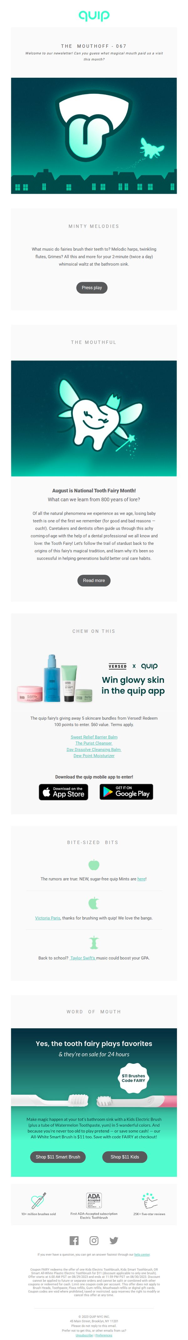
Objective
This email aims to engage subscribers with whimsical, fairy-themed storytelling while promoting limited-time product offers and app engagement. It blends education, entertainment, and conversion by tying oral care traditions to playful marketing around National Tooth Fairy Month.
Why this works
The email masterfully blends fantasy with function by personifying the tooth fairy as a relatable, modern character that ties childhood nostalgia to adult oral care habits, making the brand feel both playful and purposeful without sacrificing credibility.
How to implement
By anchoring the campaign to National Tooth Fairy Month, Quip transforms a cultural tradition into a timely, shareable marketing moment that educates while promoting products, turning a sentimental milestone into a strategic sales window with emotional resonance.
Pro Tip
The 'Press play' button in the 'Minty Melodies' section lacks context, adding a brief audio preview or visual cue (like a waveform or speaker icon) would better signal interactivity and increase click-through rates. • The product grid in the 'Word of Mouth' section shows two identical brushes with different CTAs, consolidating them into one unified CTA with a toggle or dropdown for 'Kids' vs. 'Adult' would reduce visual clutter and improve decision clarity.
10. 💛 We’ve never sold this for $5 before…
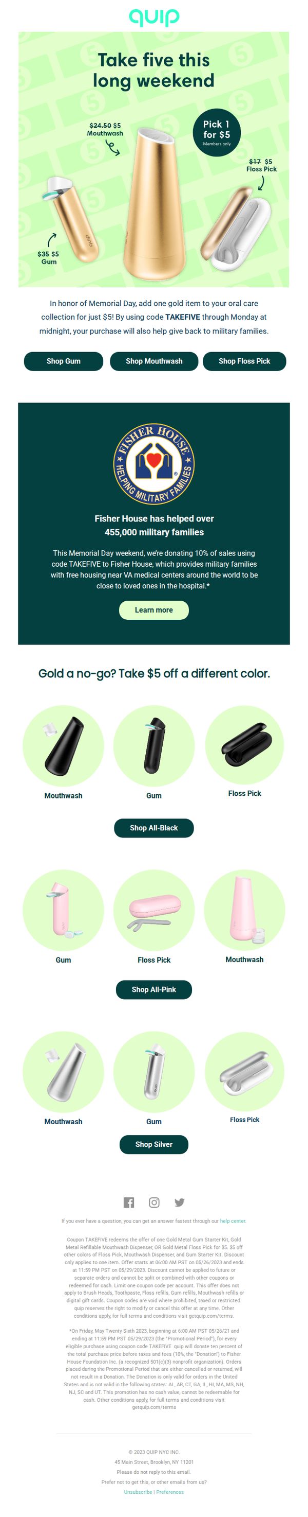
Objective
This email aims to drive immediate purchases by offering select gold-colored oral care products for just $5 during a Memorial Day promotion, while also encouraging brand loyalty through a charitable donation to Fisher House for military families.
Why this works
The email brilliantly leverages emotional timing by tying a steep discount to Memorial Day, transforming a transactional offer into a purpose-driven purchase that supports military families through a visible charity partnership.
How to implement
By showcasing gold products at $5 with strikethrough pricing, the campaign creates instant perceived value and urgency, making the deal feel exclusive and time-sensitive without relying on fake scarcity tactics.
Pro Tip
Add a countdown timer near the CTA buttons to reinforce urgency, since the offer ends Monday at midnight, this would reduce hesitation and increase conversion by making the deadline visually unavoidable. • Reposition the Fisher House donation message higher in the email, ideally right under the hero headline, to strengthen the emotional hook before users reach the product grid and make the cause feel integral to the offer, not an afterthought.